All estimates are a function of three things: the truth, bias, and noise.
Statistical tests provide us with a way to reason about uncertainty and the role of random chance in explaining the relationships we see in the world.
Once we have model estimates and summaries of statistical uncertainty, we can visualize the results to make them easier to present to audiences.
5.2 Where do estimates come from?
In the last chapter, we talked about modeling data using linear regression. The utility of using linear models to summarize relationships in data is that they offer a consistent and replicable way to boil down to a single number the relationship between an outcome variable and an explanatory variable.
This model estimate, while informative, often doesn’t tell us the whole story. You see, more than just data goes into our estimate. On a more fundamental level, estimates are the sum of three factors:
Take the slope from a regression model, \(\beta_1\). When we fit our model to data using OLS, the estimated slope we get is one part the truth (estimand) and two parts sources of error. One of those sources of error is completely random (noise), while the other is a systematic source of error that consistently causes our estimate to deviate from the truth (bias).
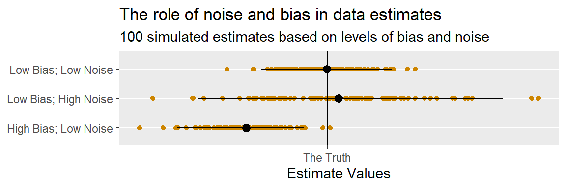
Modeling data provides us with an estimate of a relationship. Statistics gives us a way to calculate the role of error. The below figure offers a visualization of why statistical testing is so helpful (and necessary). I wrote a little simulation in R (you can unfold the code block to take a look at it) that generates random estimates from a normal distribution based on the three factors that go into an estimate summarized above: the estimand, bias, and noise.
Code
est <-function(its =1, x =10, b =0, e =2) {rnorm(its, x + b, e)## x = the truth## b = the bias## e = the noise} library(tidyverse)library(socsci)set.seed(111)its <-100tibble("Low Bias; Low Noise"=est(its),"High Bias; Low Noise"=est(its, b =-5),"Low Bias; High Noise"=est(its, e =5)) |>pivot_longer(everything() ) |>ggplot() +aes(x = value, y = name) +geom_point(color ="orange3" ) +geom_pointrange(data = . %>%group_by(name) %>%summarize(lower =quantile(value, .025),upper =quantile(value, .975),value =mean(value) ),aes(xmin = lower, xmax = upper) ) +geom_vline(xintercept =10 ) +scale_x_continuous(breaks =10,labels ="The Truth" ) +labs(title ="The role of noise and bias in data estimates",subtitle ="100 simulated estimates based on levels of bias and noise",x ="Estimate Values",y =NULL )
In one example, the bias is zero and noise is relatively small, so most of the estimates I get by repeating the simulation are concentrated around the truth. In another, the bias is zero, but I turned up the noise. Sure enough, while the estimates are still centered around the truth, they have a tendency to deviate farther from the truth at random. In the final example, I kept the noise relatively small but threw in some bias. The result is a set of estimates that cluster around a point far to the left of the truth.
The lesson is that you should be cautious about interpreting the estimates you get from modeling data. Not only is it possible that some unseen factors are biasing the result in one or another direction, random chance can influence the result, too. Sometimes you’ll potentially face a trade-off between estimating the truth with low precision or getting a biased result with high precision. Like I mentioned in the last chapter, life comes with choices that have trade-offs. You have to make your choice, defend it, and learn to live with the consequences.
Sources of bias might include invalid data and unobserved confounding variables that you fail to adjust for. Sources of noise might include random errors in data collection or simply chance differences in the behavior of the actors you’re studying. Before you can draw conclusions from data with confidence, you need to think about these issues.
5.3 Quantifying and reasoning about chance
There isn’t always a clear-cut way to identify sources of bias in model estimates. Instead, it requires careful thinking and reasoning about where your data came from and the theoretical process that gave rise to it. But when it comes to noise, there are methods for quantifying how much it plays a role in data. In the below sub-sections I want to talk about three key statistical concepts that are relevant for quantifying the role of chance and summarizing its implications. The first of these is the standard error. The next is the p-value. The last is the confidence interval.
5.3.1 Standard errors
Remember the standard deviation from the last chapter? It’s calculated by taking the square root of the variance of some variable:
\[\sigma_x = \sqrt{var(x_i)}\]
This \(\sigma_x\) represents how much, on average, data points deviate from the mean.
There’s another concept called the standard error which captures a related idea. Instead of quantifying the average deviation of data points from their mean, it quantifies the average deviation of estimates from the truth.
Take our friend, the linear regression model:
\[y_i = \beta_0 + \beta_1 x_i + \epsilon_i\]
Let’s say we fit this model to some data using OLS and get an estimate for the slope \(\hat \beta_1\). If we could somehow repeat the process of getting this estimate using new versions of our data drawn from whatever sampling or historical process generated it, this would give us a bunch of different estimates of \(\hat \beta_1\). With these estimates compiled, we could then calculate their standard error by just taking the square root of their variance:
What kind of dark magic would we need to employ to get all of these alternative estimates? I certainly don’t have the power to repeat history over and over again. It turns out, you can actually simulate the process of estimating a model with a new version of the data using a method called bootstrapping.
Invented by Brad Efron in the late 1970s, bootstrapping involves taking new samples from your existing data (resampling) and estimating whatever quantity is of interest to you on this new version of the data. This resampling procedure is a bit like taking all the observations (rows) in your data and throwing them into a hat. You then pull, at random, an observation out of the hat, record it, then put it back in. You repeat this process until the number of random observations you record equals the total number of observations in the original data. That’s one bootstrap resample. Once you have this resample, you then re-estimate whatever model or statistic you calculated with the original data and record that new estimate. Then you repeat this whole process again, and again, and again, as many times as is feasible given the computing power at your disposal.
This method is called bootstrapping because it feels a little bit like you’re trying to pick yourself up by your own bootstraps (an improbable proposition, which you’d quickly discover if you ever tried to do it). But, amazingly, it works. The reason is that it assumes your data are just a random draw from the set of all possible versions of your data that could have been drawn from the process that generated them.
In survey research, this process might be that you surveyed a random subset of a population. In the case of the U.S. aid data that I’ve been using in previous applied examples, you might imagine that the dataset is drawn from the population of all possible histories that might have taken place that gave rise to the pattern in U.S. aid cuts in 2025.
This is a little multiverse-y, but imagining the data in this way forces you to think about how small, chance differences across time could have lead to slightly or potentially dramatically different patterns in U.S. aid giving. By quantifying the variation in you data that would come from these random differences, you can begin to reason about the role of chance.
Let’s try out an example using the U.S. aid dataset. Here’s the code to read the data into R.
First, let’s get the OLS estimates for multiple regression model I estimated in the last chapter. Here’s the formal specification for the model in case you forgot:
It represents U.S. aid cuts in 2025 relative to 2024 for a given country \(i\) as a linear, additive function of a country’s democracy score, GDP per capita, and alliance status with the U.S. Recall that aid cuts are measured as the difference between asinh-transformed values of aid disbursements to countries in 2025 compared to 2024, democracy is measured on a 0-1 scale based on V-Dem’s Polyarchy Index, GDP per capita is the asinh-transformed ratio of GDP to country population in 2024, and the alliance indicator is a 0 or 1 based on whether a country has a military alliance with the United States.
A couple of those variables need to be constructed from other variables already in the data. So, first things first, I need to do some data wrangling. The below R code shows what I did:
As I mentioned in the last chapter, these results all suggest that the U.S. was strategic about its aid cuts in 2025. Rather than cutting aid equally across the board, aid cuts were deepest in democracies, countries with higher levels of economic development, and non-allies.
But not so fast. What about the role of chance? The U.S. could have cut aid more in some countries versus others for reasons that have more to do with dumb luck than strategy. Statistics can help with reasoning about the role of chance in these estimated patterns in the data.
The first step in doing this is to obtain an estimate of how much, on average, we can expect the model estimates to vary on average due to chance variations in the data. I need to calculate standard errors.
I can do this by bootstrapping. The below code will implement this method on my linear model. It creates a new R function called boot_lm() (this is one of the nice things about the R language—it’s easy to create new functions that automate tedious routines). This new function will bootstrap the data and re-estimate the same linear model using the slightly different bootstrapped versions of the original dataset. It will then record all the slope and coefficient estimates that are produced from this procedure and save them in a data table to be returned.
boot_lm <-function(formula, data, its =100) {map_dfr(1:its, ~lm( formula,data = data |>sample_n(n(), T) ) |>coef() )}
Now that I have the function, I can use it to estimate bootstrapped versions of the model I just estimated above with the original data. By default, this function will bootstrap the data 100 times. I probably would want to do this more times than this, but for the sake of this example, this is enough.
The below code lets me take a look at the first three rows of the output. You can see that the function worked. I have a table with a column for the intercept and the slope for each of the model’s variables, and each row is a different bootstrapped estimate that the function recorded.
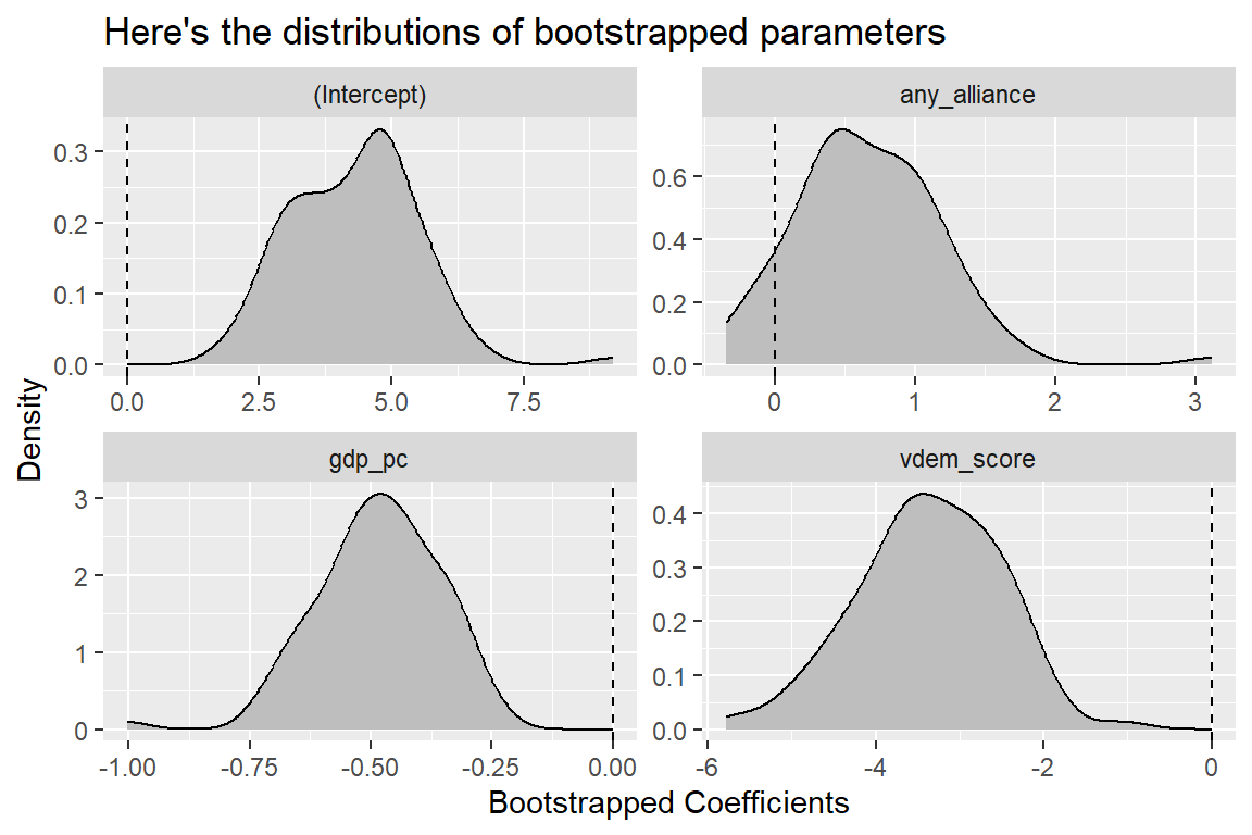
How about I check out the distributions of these different estimates? The below code makes a density plot that shows how often the bootstrapping procedure yielded different estimates. Specifically, it relies on some data wrangling on the front end to reshape the bootstrapped data table so that I can then have ggplot() generate sub-plots for each bootstrapped parameter. Kind of useful to see the output this way, no? I also added a vertical line at zero so that it’s easier to see how common it is for estimates to reach zero or even flip their sign from positive to negative, or negative to positive.
Now that I have a range of estimates for the model parameters, I can take their variance and standard deviation. Remember that the standard deviation of a set of different possible estimates is also their standard error. The below code calculates the standard error for each parameter by taking the standard deviation of the set of bootstrapped estimates.
There you go. I now have estimates for how much the regression model estimates might vary, on average, due to random chance.
Now, I admit that bootstrapping can be a pretty intensive procedure. It’s pretty trivial to bootstrap some data 100 times, but to get an accurate estimate of the standard error, 10,000 bootstraps might be in order. For really large datasets, this can be impractical.
Thankfully, there are other ways to estimate regression model standard errors. These methods leverage information contained in the model residuals and variation in the model’s explanatory variables.
There are, however, multiple methods, and each makes different assumptions about the data. In the last chapter I talked about the assumptions of linear models. I indicated that there are two assumptions that matter most and three that matter less. Just to reiterate, the assumptions that matter most are:
The data are valid.
The outcome variable is a linear additive function of the explanatory variables.
The three that matter less are:
The error term is normally distributed.
The error term is independently distributed.
The error term is identically distributed.
These assumptions matter less for linear models because they actually don’t have that much to do with the linear model estimates themselves. The matter more when it comes to calculating standard errors (if you don’t want to do bootstrapping).
The classical way of computing linear model standard errors makes all three of these assumptions. I won’t walk you through the math behind this method, but I will show you how to calculate this kind of standard error in R. Just use the summary() function on a linear model object:
summary(multi_fit)
Call:
lm(formula = aid_cut ~ vdem_score + gdp_pc + any_alliance, data = dt)

Residuals:
     Min       1Q   Median       3Q      Max
-13.7606  -0.3992   0.4916   1.3084   4.6330

Coefficients:
             Estimate Std. Error t value Pr(>|t|)
(Intercept)    4.2103     1.2964   3.248 0.001427 **
vdem_score    -3.3664     0.8808  -3.822 0.000191 ***
gdp_pc        -0.4726     0.1378  -3.429 0.000776 ***
any_alliance   0.6421     0.4556   1.409 0.160788
---
Signif. codes:  0 '***' 0.001 '**' 0.01 '*' 0.05 '.' 0.1 ' ' 1

Residual standard error: 2.531 on 155 degrees of freedom
  (21 observations deleted due to missingness)
Multiple R-squared:  0.1854,    Adjusted R-squared:  0.1697
F-statistic: 11.76 on 3 and 155 DF,  p-value: 5.51e-07
You can see a lot of stuff is produced by taking the summary of a linear model. Some outputs I’ll ask you to completely ignore, and others (like R-squared) I’ll wait to talk about down the road. Right now, just focus on the values under Std. Error. These are the regression model standard errors, and summary() uses the classical method to calculate them (the one that assumes independence, equal variance, and normality).
Now what if you don’t want to make these assumptions about the data to get standard errors? There is a class of standard errors called “heteroskedasticity consistent” (HC) standard errors that you can use instead. You can also call these “robust” standard errors. They’re called this because they don’t impose the assumptions that the model error term is normally distributed or that it is identically distributed. They still assume independence, but I’ll address that in just a bit.
To refer to the different versions of these robust standard errors we number them: HC0, HC1, HC2, … The most common variety used in political science research is HC1. What’s cool about HC1 standard errors is that they are analytically approximate to what you’d get by bootstrapping. Even better, you can calculate them using some straightforward matrix algebra (which your computer will do for you).
Here’s one way that I like to go about getting regression estimates with robust standard errors in R. First, I open a package called {estimatr} which gives me access to a function called lm_robust(). It’s a similar function lm(), but it gives me the option to estimate different kinds of standard errors using its se_type option. Here’s some code that will do this for my regression model of aid cuts given democracy, GDP per capita, and alliances.
If you compare the standard errors shown above to the classical standard errors produced using summary(), you’ll notice that the classical standard errors are different. Sometimes you’ll find that classical standard errors are too conservative (e.g., too big), and other times you’ll find that they’re too optimistic (e.g., too small). In this case, it seems they’re too big. The robust standard errors are actually smaller than the classic standard errors. The below code tells R to show them side-by-side so it’s easier to compare:
Now, how do you know if you need to use robust standard errors? The answer is that you don’t. HC1 standard errors are appropriate whether or not the assumptions needed for classical standard errors are met. The reason is that HC1 standard errors don’t assume that normality and constant variance aren’t true; they don’t make an assumption one way or the other. This is the beauty of them, and this is why I recommend you use them as your default choice. (Later, when I introduce causation, I’ll talk about an alternative kind of standard error, but all in due time.)
One more thing. What about the independence assumption? HC1 standard errors still assume independence, or that one observation in the data isn’t related to any other observations in the data. This is sometimes a fine assumption to make, but other times it’s unrealistic. However, I would argue that it’s a good enough assumption in the case of cross-section U.S. aid giving.
It would be a different story if I were working with a cross-sectional time-series dataset (also known as a panel dataset). Say I had U.S. aid giving to countries over the course of several years. In such a dataset, individual countries might be (mostly) independent of each other, but observations for an individual country in the past are probably not independent of country observations in the future. Ergo, I’d have a violation of the independence assumption.
When independence is violated, we say that the data is clustered, and we can account for this by estimating clustered robust (CR) standard errors. Just like we have different numbered HCs, we have different numbered CRs: CR0, CR1, CR2, and so on.
CR1 standard errors are the clustered counterpart to HC1 standard errors, and if I had a time-series version of my dataset, I could update my code to estimate clustered standard errors with the lm_robust() function. Assume, for example’s sake, that I have U.S. aid cut data for many different years and a year column in my dataset to indicate which year a country observation corresponds to. I might write code like this:
In sum, standard errors are an estimate of how much on average an estimate is expected to vary due to random chance. You can calculate these a bunch of different ways, but it’s best to choose a method that doesn’t make a lot of strong assumptions. Such methods include bootstrapping or various kinds of robust standard errors such as the HC1 standard error that many political scientists use.
Standard errors aren’t enough to conclude whether a particular estimate is likely to occur due to random chance. But they are necessary to estimate the chance, which leads me to talk about p-values.
5.3.2 p-values
What do you do with standard errors once you’ve calculated them? Usually, two things. First, you can use them to calculate p-values. Second, you can use them to calculate confidence intervals (next section). Both are useful for hypothesis testing.
A hypothesis test is a formal statistical test. It involves calculating the likelihood of an estimate assuming the truth (the estimand) has a particular value. The p-value is this likelihood.
Say I propose that the truth is that the U.S. didn’t base its aid cuts on anything. This implies that for my linear model, the truth is that the regression slopes for democracy, GDP per capita, and alliances are all zero. If I estimate my model with data, I’m probably not going to get an estimate of zero, even if this is the truth. But if this hypothesis is true, I’d be pretty surprised if the estimate I got with my data is unlikely to occur by random chance. The p-value captures the probability of seeing a particular estimate due to random chance if the truth is that no relationship actually exists.
If the p-value is really small, that might be reason for rejecting a hypothesis. In fact, researchers often specify a level of the test (a p-value threshold) for formally rejecting a hypothesis. The standard convention is to use a 5% threshold. If the likelihood of the estimate we get using our data is less than 5%, assuming the zero (null) hypothesis is true, a 5% level test implies you should reject the null hypothesis.
Now you should be scratching your head right about now. Do you know of many studies where the authors wanted to test a theory that generated a null hypothesis? Probably not. Most studies don’t argue that the null is true. To the contrary, many make the argument that some alternative hypothesis is true.
But science proceeds, not by proving something is true, but by falsification. So the best evidence we can come up with to support an argument is not to provide a basis for accepting a hypothesis as true; it’s to provide a basis for rejecting a hypothesis as false. This is why the standard approach is to see if the null hypothesis can be rejected. We can only reject, or fail to reject a hypothesis; we can never accept one as true. That means if you would observe an estimate less than 5% of the time if the null hypothesis were true, all you can do is reject the null hypothesis. You can’t say that you’ve proved that the alternative hypothesis is true.
So let’s go back to the model of U.S. aid. Here’s the model summary with the HC1 standard errors again. Pay attention this time to the Pr(>|t|) column that is returned by the rob_fit object. This is the p-value.
Annoyingly, the results are in scientific notation. Let me write some code that will tidy this summary up a bit and round values to 3 decimal points (going beyond three decimal points in most political science research is splitting hairs).
This is much nicer, and check out the results. It looks like variation in aid cuts explained by democracy and GDP per capita are very unlikely to happen if the null hypothesis were true. With rounding, the likelihood is basically zero in both cases.
The results are different for alliances, though. The p-value for the alliance estimate is 0.128. That means you’d see an alliance estimate at least as extreme as the one estimated by the model 12.8% of the time if the null hypothesis were true. That’s not a very big chance, but it’s still bigger than the conventional 5% threshold.
In short, it looks like democracy and economic development may explain variation in U.S. aid cuts, but military alliances may not.
Another common way to put it is that the difference in U.S. aid cuts due to democracy and economic development, but not alliances, are statistically significant.
So exactly where does this p-value come from? It’s based on the null distribution for a t-statistic, which sounds fancy, but really it isn’t.
First, what’s the t-statistic or, as it’s also called, the t-value? For a regression model, we get the t-value by taking the ratio of a model parameter and its standard error:
\[\hat t = \frac{\hat \beta_1}{se(\hat \beta_1)}\]
Once we have this estimated t-value we compare it to a known distribution of possible t-values if the null hypothesis is true. This distribution tells us, given a t-value of a certain size, what’s the probability of seeing one at least this extreme? That probability is the p-value.
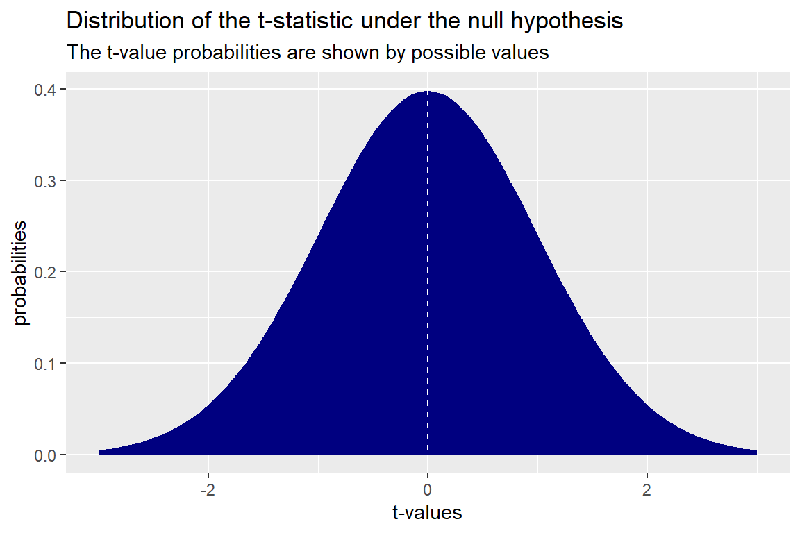
The below figure shows what the t-distribution looks like. It appears similar to a bell-shaped normal distribution. It’s centered at zero and as you head farther to the left and right the probabilities of seeing more extreme t-values declines. Values greater than 2 or less than -2 start to become vanishingly rare.
I should note that IF the null hypothesis is true, these are the probabilities of seeing a t-value of a particular size with our data. The probabilities DO NOT tell us the likelihood that the null is true (a common misconception). Remember, hypothesis testing is a process of falsification; not confirmation.
Also, the nice thing about your statistical software is that it automates the process of connecting an estimated t-value from your model to the appropriate p-value in the t-value distribution under the null. This is helpful, not only because this is tedious to do “by hand” but also because the shape of the t-value distribution changes based on how many observations are in your data. I love computers.
5.3.3 Confidence intervals
Confidence intervals are another a way of summarizing information contained in p-values and t-values, and they directly correspond to p-value thresholds for rejecting the null hypothesis. They also happen to be really handy for visualizing regression estimates.
So here’s how they relate to p-values. Say you wanted to use a 5% level test for rejecting the null hypothesis. That means you’d reject the null if you got a p-value less than 0.05. To do this test with confidence intervals you’d need to calculate 95% confidence intervals. You could then visually inspect whether the intervals contain zero. If they do, then you’re p-value is greater than the 5% level. If they don’t, they you’re p-value is less than the 5% level and you can reject the null.
You need a t-value to calculate a confidence interval at a certain level. To do this, you need to find the t-value that corresponds with you pre-determined p-value for rejecting the null. If you look back at the t-distribution in the previous section, you can see that different t-values occur with different probabilities if the null is true. If you want to reject the null at the 0.05 level, you need to find the t-values to the left and right of the distribution that leave you with a 5% probability of seeing a t-value more extreme than the selected values. It just so happens that this t-value is approximately +/-1.96.
Once you have this value selected, all you have to do is multiply this by the standard error and then subtract this value from the model estimate for the lower bound of the CI, and add it to the estimate for the upper bound of the CI. Ergo:
Rarely will you have to do this calculation manually. Just like model fitting and the calculation of standard errors and p-values, getting confidence intervals is easy to do with your software.
As you may have noticed, the rob_fit object created using lm_robust() automatically returns some confidence intervals. These are under the headings CI Lower and CI Upper.
Notice that, consistent with my point that confidence intervals are ways of summarizing p-values, the 95% confidence intervals for democracy and GDP per capita do not contain zero. Both the upper and lower bounds are negative, consistent with the conclusion that both estimates are statistically significant. Conversely, the 95% confidence intervals for alliances do contain zero. The lower bound is negative, but the upper bound is positive. This is consistent with the conclusion that alliances don’t explain variation in aid cuts.
In sum, confidence intervals are yet another way to judge statistical significance. You can use them, or p-values, to accomplish the same goal because both are constructed using the same information about the random variation in estimated quantities of interest.
5.4 How to visualize model results
Now that you know how to estimate a linear model and draw some statistical inferences with the results, it’d probably help to know some ways to present the results. Ideally, you’ll present regression results in research papers or other kinds of media, and you’ll want the results to look good (e.g., easy to interpret and aesthetically pleasing).
So let me show you some ways that I like to go about visualizing model summaries to quickly communicate results to others.
5.4.1 Coefficient plots
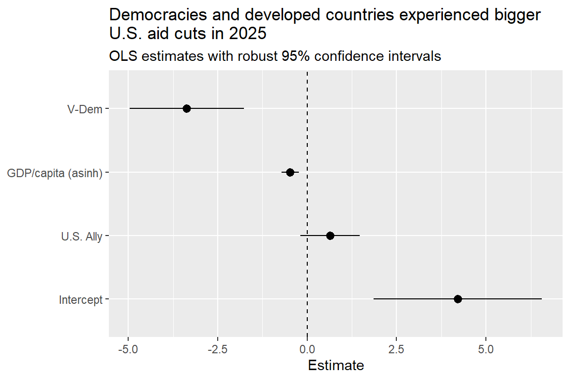
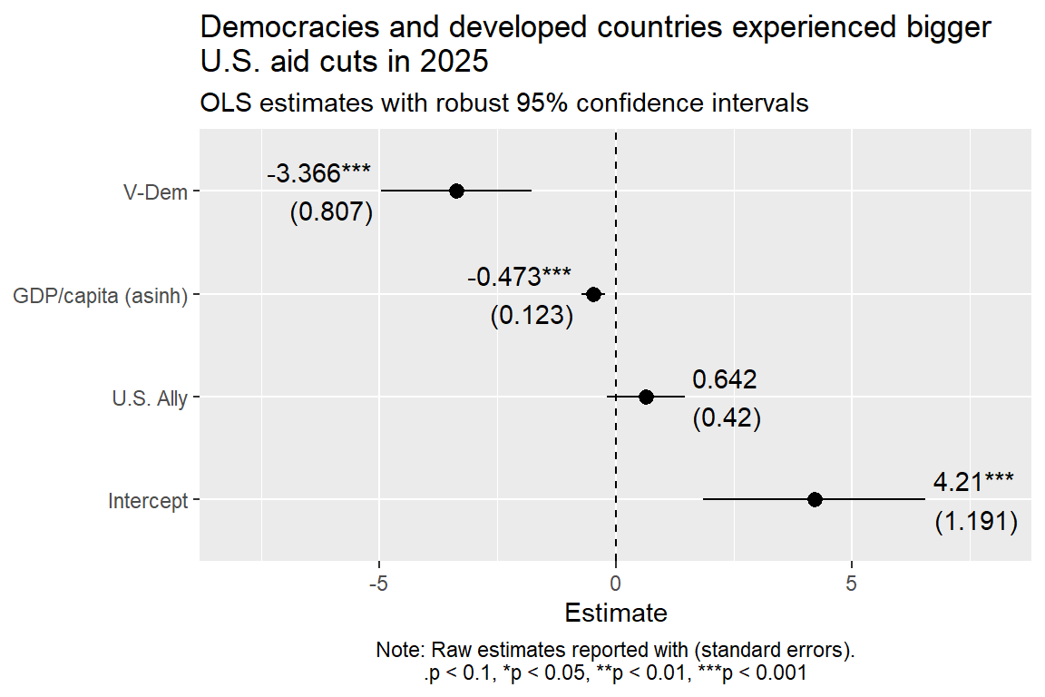
One of my favorite approaches is to make a coefficient plot. These look similar to the dot-whisker plots I introduced a couple of chapters ago. The difference is that they show regression estimates with their 95% confidence intervals.
There are some R packages that exist that provide some “opinionated” wrappers for ggplot() to make coefficient plots. I like a lot of these packages, but sometimes they have unexpected downsides. They can be difficult to customize, or they can behave in weird ways depending on the types of variables you use in your models.
Therefore, I want to show you how to make a coefficient plot using ggplot() directly. This often is the approach I personally take because it gives me the greatest amount of control over the appearance of my plots, so naturally this is the approach I want to show you.
Here’s how I’d proceed with the multiple regression results for my aid cuts model. I through in all the works so you can see how I’d go about making the final product look mostly publication-ready. Coefficient plots nearly all involve putting the regression estimates with their confidence intervals on the x-axis and the names of the explanatory variables they correspond to on the y-axis.
rob_fit |> estimatr::tidy() |>ggplot() +aes(x = estimate,xmin = conf.low,xmax = conf.high,y = term ) +geom_pointrange() +geom_vline(xintercept =0, linetype =2) +scale_y_discrete(labels =c("Intercept", "U.S. Ally", "GDP/capita (asinh)", "V-Dem") ) +labs(title ="Democracies and developed countries experienced bigger\nU.S. aid cuts in 2025",subtitle ="OLS estimates with robust 95% confidence intervals",x ="Estimate",y =NULL )
I like coefficient plots because they make it easy to quickly see how different variables explain variation in an outcome. When you start doing research projects for this class, I’ll expect you to use them in your reports as well.
5.4.2 Prediction plots
Coefficient plots are great, but they don’t always provide an accurate sense of proportion. That is, they don’t always make it easy to judge the practical significance of model estimates. Different explanatory variables are often on different scales, and just because one has a larger estimate than another doesn’t mean that it actually explains a bigger change in the outcome than another.
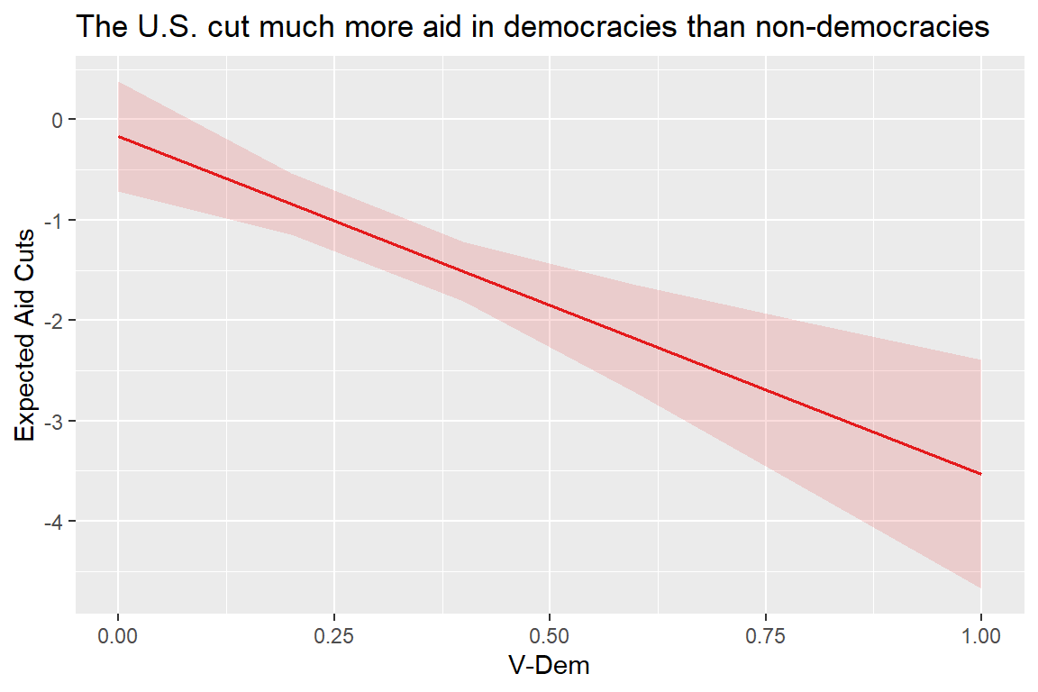
Prediction plots are a nice way to solve this problem. The let you show how much the outcome variable is predicted to change across all possible values of an explanatory variable, all the while holding everything else in the model constant.
I usually don’t like to use ggplot() directly for making these, because the code can be tedious. Instead, I like to use a function called plot_model() from the {sjPlot} package. Here’s some code that shows how I might use it to report how democracy scores explain variation in aid cuts. The output looks similar to geom_smooth() (and that’s because plot_model() uses ggplot() functions under the hood). It reports a fitted linear regression line based on the model, along with 95% confidence intervals. Most of all, it makes it really easy to see how big a difference going from 0 to 1 on the democracy index makes for aid cuts.
library(sjPlot)
Attaching package: 'sjPlot'
The following object is masked from 'package:ggplot2':

    set_theme
plot_model( rob_fit,type ="pred",terms ="vdem_score") +labs(title ="The U.S. cut much more aid in democracies than non-democracies",x ="V-Dem",y ="Expected Aid Cuts" )
5.5 What about regression tables?
Another common way researchers present regression results is with a regression table. I’m not going to talk about them here, for two reasons.
First, I generally don’t like regression tables. I’m a visual person, and it helps me a lot to actually see the magnitude of a relationship. Coefficient plots and prediction plots accomplish this goal. Regression tables don’t (not for me anyway).
Now, some claim that regression tables are superior because they report the raw estimates, making it possible for your audience to draw their own conclusions from the analysis.
I have two counter points to each of these claims: (1) with some extra flourishes you can report raw numbers inside a coefficient plot, negating the need to include a regression table; and (2) I see no reason my audience can’t also draw their own conclusions from a coefficient plot or prediction plot.
I don’t mean to be glib, but I roll my eyes when I see academics complain about coefficient plots on social media (yes, academics are just as petty as the rest of humanity). I am sympathetic to the argument that it’s a good idea to report the raw model results, and regression tables do accomplish this goal; but they aren’t the only way, and my first counter point offers a solution.
However, I have no patience for the argument that only regression tables make it possible for readers to draw their own conclusions. Really? I have a hard time believing that a graphical presentation of the very same numerical results shown in a regression table is immune to alternative interpretations.
Okay, rant over. Let me actually do something productive and give you some example code for how you can update a coefficient plot to include raw regression estimates. The code is more involved, but here’s the good news: now you have a good starting place if you want to implement this yourself.
The below code first creates a little helper function that formats regression results in a common way academics expect them to look. Typically, they want to see the coefficient estimate, the standard error, and little stars “*” to signify statistical significance at different possible p-value thresholds (usually 0.1, 0.05, 0.01, and 0.001). It then includes a geom_text() layer with some unconventional settings to make sure the regression results appear in a sensible place with respect to their corresponding “dot-whisker.” Finally, I updated how wide the x-axis scale is to ensure that the raw numerical results are fully visible. I think the plot looks pretty good (and I didn’t even use AI to work this out—just five minutes of creative thinking, which is probably less time than it’d take a novice coder to work out using an AI coding agent. Plus it was more fun.).
## function to format regression resultsformat_coef <-function(est, se, p, digits =3) { est <-round(est, digits) se <-round(se, digits) out <-paste0( est, gtools::stars.pval(p),"\n(", se, ")" )}## make coefficient plotrob_fit |> estimatr::tidy() |>ggplot() +aes(x = estimate,xmin = conf.low,xmax = conf.high,y = term ) +geom_pointrange() +geom_text( ## report regression estimatesaes(x =ifelse(estimate <0, conf.low, conf.high),label =format_coef(estimate, std.error, p.value) ),hjust =c(-.1, 1.1, 1.1, -.1) ) +geom_vline(xintercept =0, linetype =2) +scale_x_continuous(limits =c(-8, 8) ) +scale_y_discrete(labels =c("Intercept", "U.S. Ally", "GDP/capita (asinh)", "V-Dem") ) +labs(title ="Democracies and developed countries experienced bigger\nU.S. aid cuts in 2025",subtitle ="OLS estimates with robust 95% confidence intervals",x ="Estimate",y =NULL,caption ="Note: Raw estimates reported with (standard errors).\n.p < 0.1, *p < 0.05, **p < 0.01, ***p < 0.001" ) +theme(plot.caption =element_text(hjust = .5) )
5.6 The assumption that matters most
Now that you have a sense for how to quantify the role of chance when measuring relationships in data, it’s time we have a quick chat about the assumptions you have to make when doing statistical inference.
There’s one assumption that matters most. It’s not any one of the three that are relevant for trusting our OLS standard errors. This assumption is more fundamental.
Here it is: To reason about the role of random chance in your data, you must assume that your data is a random draw from whatever sampling or historical process generated it.
Remember that equation for our estimates shown at the beginning of this chapter?
Our estimate is always an imprecise measure of quantities or relationships in data because of a combination of bias and noise. Statistical inference is all about capturing the role of noise in our estimates, but it can’t tell us about the role of bias. To address bias, we need a combination of a good working theory about the process that gave us our data and some assurances that our data is valid. These things are hard to quantify (outside of a computer simulation where we know the capital “T” Truth).
This all means that our efforts to quantify uncertainty actually tell us nothing useful or trustworthy if our data isn’t actually a random draw from the process that generated it, or if our measures are themselves biased or deeply flawed.
I know this sounds a lot like the first basic assumption of regression analysis (valid data), and I agree. My objective is to draw your attention to one potential factor that can invalidate your analysis that many people ignore. And in the case of studying U.S. foreign aid giving, this concern has a lot of relevance. I can’t repeat history an infinite number of times to assess the range of possible aid disbursements the U.S. would give to different countries if little chance variations in history could have gone in different directions. I therefore have no way to prove that my statistical inferences are valid.
This is one reason why many people question the idea of doing statistical inference with historical event data (like aid allocations) where (nearly) all the data is available. This is a sound critique. I have only two counter points, which you may or may not find convincing, for why you should do statistical inference anyway.
First, even when you have all the data, doing statistical inference inclines you toward being more conservative about the claims you can make based on the data. Case in point, the raw regression estimates shown in the previous sections suggest the U.S. showed favoritism toward allies when making aid cuts in 2025. But statistical inference suggests chance might have had a sizable hand in this happening. As a result, we can’t reject the hypothesis that the U.S. didn’t base aid cuts on alliances. Statistics, in short, forced me to be more conservative in my conclusions about which countries the U.S. favored in 2025. Raising the bar for claiming that a pattern exists in some data can help us avoid making claims with undue confidence.
Second, building on the idea that statistics raise the bar for drawing conclusions from data, it can help to think of statistics as a means of quantifying how much signal versus noise is in the data. Think of the t-statistic. It’s the ratio of an estimate to its standard error. Assuming no bias, it’s essentially the ratio of a signal to the noise obscuring it. I think it’s helpful to know (and to quantify) the strength of a signal that appears in data. You could find a lot of signals, but a bunch of them could be flukes. By accounting for the noise that goes along with a signal (that is, by measuring how strong the signal is), we can make more informed decisions about whether a signal should be taken seriously. You can even think of statistics as providing an estimate of a signal’s strength without smuggling in the additional assumption that you’re making an inference to a historical data generating process. Instead, think of statistics as quantifying the strength of a signal. A bigger t-statistic (or a small p-value) = a stronger signal.
One caveat to the last point, though. The strength of the signal you measure with statistics is model-dependent in the context of regression analysis. That means a different model, with different variables or different ways of transforming the data could increase or decrease the strength of the signal independent of whether the signal is really worth paying attention to. So be careful. A strong signal doesn’t prove anything. Nothing in science is ever proved true. (By the way, if you ever say that you proved something is true with data, that’s a good way to signal to people in the know that you don’t actually know how science works. You’ve been warned!)
Ultimately, you may not find my arguments for using statistics to study something like foreign aid convincing, and you don’t have to. My goal in using statistics to study U.S. aid cuts in 2025 isn’t to convince you that this is a good idea. It’s just a vehicle for showing you how data modeling works for doing descriptive analysis. It’s only an exercise. So you don’t have to take the results from my analyses seriously; but you should take seriously the process by which I got these results.
5.7 Wrapping up
I’ve barely scratched the surface of what it is to do statistical inference. Not only is there so much more we could talk about with respect to confidence intervals and the meaning of uncertainty, we could also discuss different schools of statistical inference. The approach covered here and in all subsequent chapters is known as Frequentist statistics. This school of thought involves imagining that our estimates tell us something about the expected frequency of seeing values if we could repeat our data sampling process over time.
Bayesian statistics is the alternative approach. It involves incorporating our beliefs about the world into our calculation of probabilities. It’s premised on the idea that we have a prior set of beliefs about the world, perhaps informed by existing research. It then provides a framework for updating these beliefs using new data.
There’s nothing inherently right or wrong about the Frequentist and Bayesian approaches. They have their strengths and weaknesses. However, researchers tend to favor one or the other, and often can be defensive about their choice. So while we will not be doing Bayesian inference in this class, don’t take this to mean that I think Frequentist statistics are superior. Actually, my reasons for avoiding Bayesian statistics are more personal and practical.
By the way, if you do find yourself taking up Bayesian statistics later on, I think knowing a bit about Frequentist statistics is helpful. Many of the learning materials for Bayesian approaches I’ve seen use the Frequentist approach as a foil or point of reference. I hope that means learning Bayesian methods down the road will be much easier when you know the method that is its chief alternative.
5.8 Coming up
The next chapter will also begin the next part of this book. It will deal with a new kind of research design: predictive analysis. As you’ll see, many of the concepts discussed up to now are equally relevant for developing forecasts. The key difference is the way we’ll be using them — not just to model existing trends and reason about the role of chance, but to predict future outcomes and reason about the role of uncertainty in our predictions.