6 Make Predictions
6.1 Goals
Learning objectives:
- Talk about using linear models for making predictions.
- Learn how to quantify uncertainty in your predictions.
- Use R to forecast presidential election outcomes.
6.2 From Description to Prediction
In the last unit I talked about descriptive research designs. These involve identifying relationships in data and establishing basic facts. I used the example of sweeping U.S. foreign aid cuts in 2025 and posed the question: was there a rhyme or reason to the depth of aid cuts in aid recipients?
Descriptive analysis is well-suited to answering this question, because it provides a data-driven, statistically-informed basis for gathering evidence either in favor of or opposed to the idea that the U.S. targeted its 2025 aid cuts in systematic ways based on certain aid recipient characteristics or their relationship with the U.S.
Not every research question can be answered the same way, of course. Sometimes you may want to go beyond establishing facts to make predictions about the future. In particular, you might want to know: how well is an incumbent candidate for U.S. President expected to do in an upcoming election?
To answer this question you need to do a predictive analysis. This involves developing a data model that gives a reasonably good forecast of presidential election outcomes.
In this chapter and the next, I’ll talk about predictive data modeling and how to do it in R. As I do so, I’ll see if I can come up with a reasonable forecast of future presidential elections. My analysis won’t be comprehensive, and by most accounts it will look elementary. But that’s the point. I want you to understand the basics. If you can’t wrap your head around my simple analysis, you should think twice before trying something more complex. And believe me, there are quite complex forecast models of presidential elections.
The next section provides a conceptual overview of making predictions. After that, I talk about how to quantify uncertainty in predictions. I then introduce how to make predictions using R. Finally, I talk briefly about hypothesis testing with predictions.
6.3 What is predictive modeling?
Let’s revisit the simple linear model:
\(y_i = \beta_0 + \beta_1 x_i + \epsilon_i\)
Remember that \(y_i\) is the outcome variable and \(x_i\) is the explanatory variable. When doing predictive modeling, you can also refer to the latter as a predictor. Why? Instead of just using \(x_i\) to explain variation in \(y_i\), we’re going to use it to predict values of \(y_i\).
The difference is subtle. “Explanatory” and “predictor” can be used interchangeably (and I often slip into using one or the other regardless of the context), but I aspirationally like make this distinction when my goals shift from descriptive to predictive analysis. When using a factor to explain variation in an outcome, I’m interested in the relationship between these variables. I want to establish that a pattern or regularity exists in the world (in the linear model shown above, this relationship is summarized by \(\beta_1\)). When using a factor to predict variation in an outcome, I’m not as interested in the summarized relationship between factors captured by \(\beta_1\) as the overall model fit for \(y_i\).
Remember the simple equation I gave you in the last chapter for where data estimates come from?
\(\text{Estimate} = \text{Estimand} + \text{Bias} + \text{Noise}\)
When using linear regression for descriptive analysis, the estimand, which is the thing we’re interested in estimating, is the \(\beta\) (slope coefficient) from our regression model for the explanatory variable of interest. For predictive modeling, the estimand isn’t any of the model parameters; it’s the predicted outcome.
This change in priority means that my approach to data modeling will be different. Where before the goal was to get a good, unbiased estimate of the relationship between a particular factor and the outcome, now the goal is to get the most precise model fit.
Importantly, this doesn’t mean I should ignore \(\hat \beta\), because I need it to calculate a predicted value for the outcome. As shown below, the estimated model parameters are part of my equation for mapping observed values of my predictor to expected values of my outcome of interest.
\(\hat y_i = \hat \beta_0 + \hat \beta_1 x_i\)
Notice that the error term is gone. The model fit is based purely on the estimated slope and intercept values ignoring the left-over noise. So if \(\hat \beta_0 = 2\) and \(\hat \beta_1 = 0.5\), an \(x_i\) value of 4 would give a predicted value of \(y_i\) equal to 4:
\(4 = 2 + 0.5 \times 4\)
As I mentioned, with predictive modeling the focus is on ensuring that the model fit produces the least errors in predicting the outcome. This means my approach to which variables to include or exclude from the model, or the kinds of variable transformations I employ, will shift from my approach in descriptive analysis.
For example, say I have the following competing models for \(y_i\):
- \(y_i = \beta_0 + \beta_1 x_i + \epsilon_i\)
- \(y_i = \beta_0 + \beta_1 x_i + \beta_2 z_i + \epsilon_i\)
- \(y_i = \beta_0 + \beta_1 x_i + \beta_2 z_i + \beta_3 z_i^2 + \epsilon_i\)
The first is a simple linear model, the second is a multiple regression model, and the third is a multiple regression model with a quadratic term (that means I’ve allowed the linear model to become non-linear in one of the predictors).
The last one is the most complex of the three. It might also be the best at predicting \(y_i\). But one of the most important things to keep in mind with predictive modeling is that complexity is orthogonal to performance. “Orthogonal” is just a fancy term that means “unrelated to” or “independent of.” A complex model might be more precise than a simple one, but precision is not always optimal.
I’m speaking, of course, about the problem of overfitting. An overfit model is one that makes predictions that are too accurate. I know it sounds odd, but it’s possible to make such a model.
The problem with too much accuracy lies in the fact that model estimates aren’t just a function of the truth, but also bias and noise. When it comes to noise in particular, it’s hard to know for sure what relationships in the data are based on the truth, and which are just artifacts of random chance. If you make your model too flexible, too sensitive to every bump and curve in the data, you run the risk of making a model that is so specialized to the data you have that it won’t do a good job of making predictions with new data. The ultimate goal with predictive modeling isn’t to come up with a good within-sample prediction; it’s to get a good out-of-sample prediction. Think about it. How useful would a model be if it’s only good at predicting things you already know are true, but useless at predicting anything new?
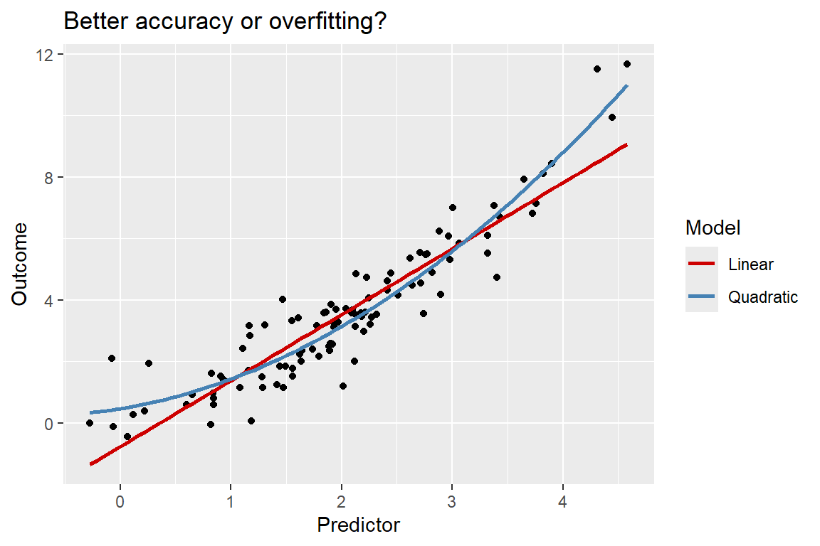
The below figure helps to demonstrate the problem. It shows how a hypothetical numerical predictor variable is related to a hypothetical numerical outcome using a scatter plot. Overlaying the data are two lines of best fit. One is based on a simple linear model, and the other is based on a quadratic model. It looks as if the second one is a better fit for the data, but how do we know if a quadratic model really is best? Is this just random noise tricking us, or is this model capturing the fundamental truth?
The trade-off between accuracy and overfitting is one of the key challenges in predictive modeling because it’s tricky to tell if your model has strayed into overfit territory if you don’t have new data to validate how well your model generalizes beyond the data you already have. However, all is not lost. In the next chapter, I’ll introduce ways to handle this trade-off using the existing data you have to simulate what it would be like to have new data. This process will help you to better identify which among a set of possible models is the best for making forecasts. But before I do that, I first want to talk about the role of chance in predictive modeling.
6.4 How to quantify uncertainty in predictions?
In the last chapter I talked about standard errors. These provide a summary of how much, on average, you’d expect your estimates to vary if you could repeatedly collect your data from the process that generated it. I also talked about how to compute standard errors for parameters of a regression model.
As I also discussed, standard errors are useful for calculating p-values and confidence intervals. These make it possible to do hypothesis testing, which is useful for setting a more rigorous set of criteria for building evidence for or against certain descriptive claims.
These concepts can also be applied to predictive modeling. For something like a presidential election, you might want to forecast how well an incumbent candidate is expected to perform. Using statistical inference, you not only can get a prediction for an upcoming election, you also can infer if the prediction is statistically distinguishable from a tied outcome. If your client happens to be one of the candidates running for office, this is obviously an important bit of analysis.
Remember that the standard error of a regression coefficient \(\hat \beta\) is just the standard deviation of that estimate if you could repeat the process of calculating it multiple times using different versions of your data. That is: \(se(\hat \beta) = \sqrt{var(\hat \beta)}\).
This idea can be extended to regression model predictions. The standard error of a regression model prediction is just the standard deviation of all possible predictions the model might be consistent with if you could get new versions of your data from the process that generated the dataset you already have. That is: \(se(\hat y_i) = \sqrt{var(\hat y_i)}\).
Notice that I used the \(i\) subscript. The reason is that every unique prediction you make using the model has its own unique standard error. That is, the magnitude of uncertainty isn’t constant across all predictions. Some predictions will be made with more precision than others.
So how do you calculate this standard error? Well, you could return to the bootstrap. In the last chapter I talked about how to take random redraws from existing data and, for each one, estimate a new regression model. By repeating this process many times and recording the new model estimates with each iteration, this gives a distribution of model estimates. From this distribution, you can calculate standard errors by just computing the standard deviation of each regression coefficient.
You can do something similar for model predictions. But instead of recording the model coefficients from each iteration, you’d record a model fit for the data. The below figure offers an example distribution of model predictions based on some data that I simulated. If you want to check out the code, you can unfold it. To get this distribution of predictions, all I did was re-estimate a regression model on bootstrapped versions of the data. I then used these bootstrapped models to get predictions for my outcome variable based on a particular value of my predictor. This distribution shows a range of predictions that the data is consistent with.
Code
library(tidyverse)

Data <- tibble(
  x = rnorm(100, mean = 10, sd = 2),
  y = rnorm(100, mean = 2 - 0.5 * x, sd = 1)
)

boot_pred <- function(
    formula,
    data,
    iter = 200,
    newdata = NULL
) {
  ## get and save all bootstrapped model fits
  boot_fit <- 1:iter |>
    map(
      ~ lm(
        formula,
        data = data |>
          sample_n(
            size = nrow(data),
            replace = T
          )
      )
    )
  ## get predictions for each bootstrap iteration
  boot_pred <- 1:iter |>
    map_dfr(
      ~ tibble(
        it = .x,
        pred = predict(
          boot_fit[[.x]],
          newdata = newdata
        )
      )
    )
  ## return bootstrapped predictions
  boot_pred
}

new_data <- tibble(
  x = 10
)

boot_pred(y ~ x, Data, iter = 100, new_data) |>
  ggplot() +
  aes(x = pred) +
  geom_histogram(
    fill = "gray",
    color = "black"
  ) +
  labs(
    x = "Bootstrapped Predictions",
    y = "Frequency",
    title = "Bootstrapped predictions based on 100 resamples"
  )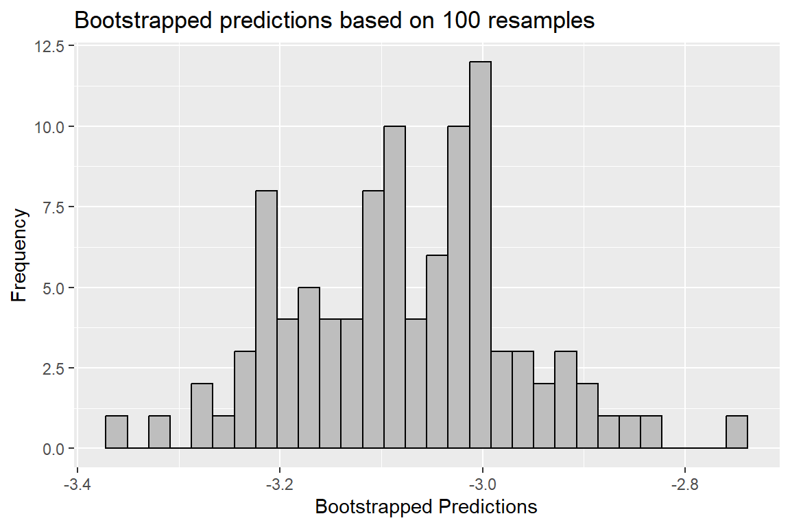
To get the standard error of these predictions, I’d just need to take their standard deviation. I could also use this to get confidence intervals and test against the null that my prediction is different from some other quantity of interest.
6.5 Doing predictive modeling in R
There are lots of ways to go about predictive modeling in R. Among all the options, there isn’t one right way. It’s really a matter of preference. I’m going to show you one approach that I find useful and intuitive, but you should feel free to explore other options. A quick query on your favorite search engine should give you a range options and resources.
My preferred approach for linear models is to use a combination of {estimatr} and lm_robust() for model fitting, and then a simple custom function that I use to simulate a range of predicted values consistent with the model.
But before I can show you this process I need some data. The below code will read into R a dataset that I’ve saved on my GitHub. It contains information related to all U.S. presidential elections that have taken place from 1948 to 2020. I’m going to use it to see if I can come up with a good prediction model of U.S. presidential election outcomes in 2024.
library(tidyverse)
presdt <- read_csv(
  "https://tinyurl.com/pres-forecast"
)
This dataset is much smaller that the one I used in the last unit. It has just 19 rows. One of the main limitations that election forecasters have to contend with each presidential election year is the fact that these elections are rare. This makes ensuring the accuracy of predictions incredibly hard. In fact, one recent and hotly debated study made the case that we may need decades, if not centuries more presidential elections before we’ll be in a position to make solid forecasts.
Now, you might think that this problem goes away if we looked at state-level outcomes instead of nation-wide outcomes. You’d be wrong, at least according to the authors of the previously mentioned study. The reason is that election results across states in a given election year are strongly correlated with each other. As a result, state-level outcomes don’t actually provide much new information beyond just looking at nation-wide results.
So, here we are with a dataset with less than 20 observations. Though this means we’re data-limited, I say “so what?” In life, you often have to work with the data you have, not the data you would like to have.
Its limitations aside, there’s plenty of useful information in the data. Here’s a quick summary of each of its 13 columns:
year: The year a presidential election is held. It runs from 1948 to 2020 in intervals of 4.inc_party: A categorical variable indicating whether the Republican or Democratic party is the incumbent party.inc_running: A binary (0-1) variable indicating whether the incumbent president is running.inc_net_approval: The percent net approval of the president measured before the election took place.third_party_present: A binary (0-1) variable indicating whether there is a third party candidate running for president.total_votes: Total voter turnout for president.inflation_pct_change: The year-over-year change in inflation during a given election year.gdp_pct_change: The year-over-year change in gross domestic product during a given election year.inc_vote_share: The total vote share (proportion) of the vote that the incumbent party received in the election.inc_vote_margin: The two-party vote share margin of the incumbent party.inc_elec_total: The total Electoral College vote received by the incumbent party candidate.inc_elec_margin: The Electoral College vote margin received by the incumbent party candidate relative to the minimum total necessary to win the election.
This dataset contains a mix of potential predictor variables and outcome variables. Let’s talk about the outcomes first. There are four: inc_vote_share, inc_vote_margin, inc_elec, and inc_elec_margin. Each of these provides some metric of the incumbent party candidate’s performance. Why the incumbent party? Because we need a consistent outcome to predict. The challenger party’s outcomes would work just as well.
Next, let’s talk about the predictors. There are eight: everything else in the data. These predictors include three that many people often think are good indicators of incumbent party performance: percent change in inflation, percent change in GDP, and the current president’s net approval. The theory is that if the economy is doing well and the sitting president is popular, the incumbent party has a good shot at winning the election. But if the economy is reeling due to high inflation and depressed economic growth, and if the president is unpopular, the challenging party stands a fighting chance.
Beyond these core predictors, there are others for us to consider, too. Things like voter turnout, which party is the incumbent party, or whether the incumbent candidate is running might also matter. The presence of a third party challenger might also affect the incumbent party’s performance. The election year, too, might matter. Elections have become tighter over time, and this might influence predictions.
In short, there are a lot of potential predictors to consider. I’ll take up the question of which combination of them offers the best forecast in the next chapter. But first, let me show you how you can go about estimating a prediction model and getting a forecast with it.
6.5.1 Step 1: Make a predictive model
There’s not much new to this step of the process beyond what I already covered in previous chapters. You just need to estimate a model. Here’s a really simple one predicting the incumbent party’s Electoral College margin based on the sitting president’s approval rating and whether a third party candidate is running in the election. Note that I have elected to use lm_robust() from {estimatr} to make it easier to do robust inference (which still matters for making good inferences in forecasts, too).
library(estimatr)
lm_robust(
  inc_elec_margin ~
    inc_net_approval +
    third_party_present,
  data = presdt,
  se_type = "HC1"
) -> m1
Let’s check out the model summary of the fit to see if these predictors actually explain variation in the outcome:
summary(m1)
Call:
lm_robust(formula = inc_elec_margin ~ inc_net_approval + third_party_present,
    data = presdt, se_type = "HC1")

Standard error type:  HC1

Coefficients:
                    Estimate Std. Error t value  Pr(>|t|) CI Lower CI Upper DF
(Intercept)           21.176      48.85  0.4335 6.704e-01  -82.381   124.73 16
inc_net_approval       7.643       1.41  5.4213 5.654e-05    4.654    10.63 16
third_party_present -102.205      87.00 -1.1748 2.573e-01 -286.635    82.22 16

Multiple R-squared:  0.6123 ,   Adjusted R-squared:  0.5639
F-statistic:  16.5 on 2 and 16 DF,  p-value: 0.000129
It looks like incumbent party approval is a statistically significant and positive predictor of the incumbent party’s Electoral College margin, but the presence of a third party is a negative, statistically insignificant predictor. If you were trying to develop an optimal forecast model, you might look at this summary and conclude that you should drop the third party variable because it isn’t a statistically significant predictor. This isn’t a good way to judge which variables to keep or drop for predictive modeling. As I’ll discuss in the next chapter, a better way to validate whether a model is good is to look at its overall predictive performance on new data.
At any rate, one thing that might help to reassure us that this is a decent model is the results shown for the F-test included with the output of the model summary. This F-test is like a t-test for model coefficients, except it’s based on the overall model fit for the data. Its p-value tells us the probability of seeing a model fit for the data as good as the one we’re getting if the null hypothesis is true for all model predictors. The p-value for this model is less than 0.01, which is quite small. Overall, this means the model does much better than random chance would predict.
6.5.2 Step 2: Use new data to generate a forecast
Once you have a prediction model, the next step is to simulate a forecast. In base R, there’s a function called predict() which will do this for you. All you have to do is give it your model and a new dataset, and it will give you a prediction:
## use tibble() to make a new dataset of predictor values
newdt <- tibble(
  inc_net_approval = 3,
  third_party_present = 0
)

## use predict() to get predictions
predict(m1, newdata = newdt)
1
44.10478 The output says that an incumbent party can expect to win about 26 Electoral College votes more than would be needed to secure the presidency if the sitting president’s net approval is +3 and there is not a third party challenger in the race.
This result seems encouraging for a modestly popular incumbent, but how much uncertainty is there about this predicted +26 Electoral College margin of victory?
To bring uncertainty into the equation, we need to take model standard errors into account which help quantify how much model parameters might vary based on chance differences in election outcomes over time.
This can be produced using the predict() function I used above, but only for certain base R modeling functions such as lm(). It won’t work for something estimated with lm_robust(). I therefore needed to make my own function that will handle this. The below code block has everything you need to make it. I’ve called it sim_pred() because it simulates predicted values from a regression model.
sim_pred <- function(model, newdata, its = 1000) {
  if(missing(newdata)) stop("The 'newdata' option is missing.")
  if(!identical(class(model), "lm_robust")) stop("The model should be a 'lm_robust' class object.")
  sim_pres <- replicate(
    n = its,
    expr = {
      nmodel <- model
      nmodel$coefficients <- MASS::mvrnorm(
        n = length(model$coefficients),
        mu = model$coefficients,
        Sigma = nmodel$vcov
      ) |> diag()
      ndata  <- newdata
      ndata$pred <- predict(nmodel, newdata = newdata)
      list(ndata)
    }
  )
  out <- dplyr::bind_rows(sim_pres)

  ## return out
  out
}
The function has three inputs. The first is an lm_robust() object you created, and the second is a new dataset you want to base predictions on. The third option controls how many simulations to run. By default, it runs 1,000.
Here’s how it works with the newdt object I made earlier:
sim_pred(
  m1, newdt
) -> forecast_dt
I saved the range of simulated predictions in an object called forecast_dt. Let’s take a peek at the first five rows:
forecast_dt |>
  slice_head(n = 5)
# A tibble: 5 × 3
inc_net_approval third_party_present pred
<dbl> <dbl> <dbl>
1 3 0 45.9
2 3 0 -94.5
3 3 0 66.5
4 3 0 78.3
5 3 0 -59.6Each of these rows is a prediction simulated from the model. They’re all different because sim_pred() isn’t just generating a unique forecast based on the model coefficients; it’s factoring in the uncertainty in the model coefficients captured by their standard errors. In this case, the standard errors are the robust “HC1” standard errors I introduced you to in the last chapter.
I can do all kinds of things with these simulated predictions. For example, I can visualize their distribution to see the range of values the model is consistent with given the values of the predictor variables I included in newdt:
ggplot(forecast_dt) +
  aes(x = pred) +
  geom_histogram(
    bins = 50,
    fill = "gray",
    color = "black"
  ) +
  labs(
    x = "Range of Predicted\nElectoral College Marings",
    y = "Frequency",
    title = "Simulated election outcomes"
  )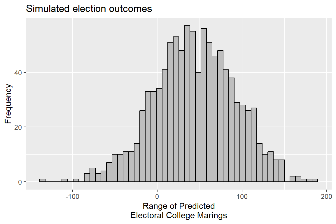
I can also calculate some quantities of interest by summarizing the data. For example, I might want to know the 2.5% and 97.5% quantiles (equivalent to 95% confidence intervals) of the predictions, along with their mean and the share of outcomes that are consistent with the incumbent party winning the Electoral College vote:
forecast_dt |>
  summarize(
    mean = mean(pred),
    lower = quantile(pred, 0.025),
    upper = quantile(pred, 0.975),
    pct_win = 100 * mean(pred > 0)
  )
# A tibble: 1 × 4
mean lower upper pct_win
<dbl> <dbl> <dbl> <dbl>
1 44.1 -53.1 133. 82.3Based on the model predictions, the data is consistent with the incumbent party’s candidate winning the election with about a +44 Electoral College margin with 82% of all predictions consistent with an incumbent party victory.
I can also simulate how changing certain factors affects the forecast. Say I wanted to see how the presence of a third party challenger might change the incumbent party’s expected margin. I can update the data I give sim_pred() to see:
## make a new version of the data
newdt <- tibble(
  inc_net_approval = 3,
  third_party_present = c(0, 1)
)

## get simulated predictions
m1 |>
  sim_pred(
    newdata = newdt
  ) -> forecast_dt
Since I now have some different values for the presence of a third-party candidate in the race, I can factor this into my summary of the predictions:
forecast_dt |>
  group_by(third_party_present) |>
  summarize(
    mean = mean(pred),
    lower = quantile(pred, 0.025),
    upper = quantile(pred, 0.975),
    pct_win = 100 * mean(pred > 0)
  )
# A tibble: 2 × 5
third_party_present mean lower upper pct_win
<dbl> <dbl> <dbl> <dbl> <dbl>
1 0 43.2 -47.5 138. 80.6
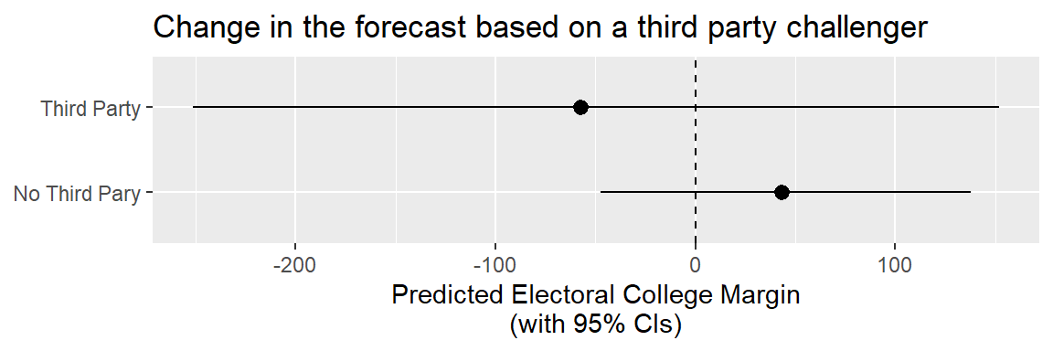
2 1 -57.3 -251. 152. 27.4The above output compares the simulated model predictions based on a +3 net approval rating for the sitting president but changing whether a third party candidate is in the race. Clearly, having a third party challenger hurts the incumbent party’s odds.
(Quick parenthetical: note that the simulated results will be a bit different from one run of the sim_pred() function to the next. The reasons is that the function is generating random draws from possible predictions the model is consistent with. By running a larger number of simulations per run, you can minimize random differences across multiple runs of the function.)
Now that I have some results I might want to compare, I can use something like a dot-whisker, as I do below. Notice the difference in the predictions. Not only does the presence of a third party challenger hurt the incumbent party candidate’s chances with the Electoral College, it also generates more uncertainty in the model. If I were running an election campaign, I’d see these results and really hope that no third party challengers enter the race.
forecast_dt |>
  group_by(third_party_present) |>
  summarize(
    mean = mean(pred),
    lower = quantile(pred, 0.025),
    upper = quantile(pred, 0.975)
  ) |>
  ggplot() +
  aes(
    x = mean,
    y = ifelse(
      third_party_present == 1,
      "Third Party",
      "No Third Pary"
    ),
    xmin = lower,
    xmax = upper
  ) +
  geom_pointrange() +
  geom_vline(
    xintercept = 0,
    lty = 2
  ) +
  labs(
    x = "Predicted Electoral College Margin\n(with 95% CIs)",
    y = NULL,
    title = "Change in the forecast based on a third party challenger"
  )
Because I can calculate confidence intervals for predictions (as above), I also can do hypothesis testing. In the case of an election forecast, the hypothesis that I might want to test against is whether the model is consistent with a tied race.
I can easily perform such a test using the output from sim_pred(). Remember the pct_win column I produced from the simulated output? This is similar a p-value. Note, however, that by convention the p-value we want calculate is two-sided, but the quantity I calculated before is one-sided. Two-sided p-values are agnostic about whether an estimate is positive or negative, but a one-sided p-value assumes that we want to take the direction of an estimate into account.
The two-sided variety is the kind of p-value that I got in the last chapter when I introduced statistical inference. A two-sided p-value is based on the likelihood that an estimate of a certain absolute magnitude is observed under the null. In short, it only factors in the extremity of the estimates; not their direction.
The below code creates a function called get_pvalue(), which will take the simulation results, and return a p-value based on the null hypothesis that the model predicts a tie.
## function to get two-sided p-values
get_pvalue <- function(x) {
  2 * pmin(
    mean(x > 0),
    mean(x < 0)
  )
}

## output
forecast_dt |>
  group_by(third_party_present) |>
  summarize(
    mean = mean(pred),
    lower = quantile(pred, 0.025),
    upper = quantile(pred, 0.975),
    p.value = get_pvalue(pred)
  )
# A tibble: 2 × 5
third_party_present mean lower upper p.value
<dbl> <dbl> <dbl> <dbl> <dbl>
1 0 43.2 -47.5 138. 0.388
2 1 -57.3 -251. 152. 0.548The output is less than exciting. I can’t reject the null for either prediction based on third-party presence in the race. In other words, whether there’s a third party candidate or not, predicted candidate performance is not statistically different from a tie.
But all may not be lost for the incumbent party’s candidate. Say the sitting president could improve their net approval rating? I can also simulate how different approval ratings might impact predicted performance. The below code will simulate predictions for each unique value of the net approval variable and the presence of a third party challenger. Note the use of expand_grid(). This function will generate a dataset of all unique combinations of the variables that I give it. When I give its output to sim_qi() it will give me a unique distribution of predictions that the model is consistent with for each combination of predictor values in the data.
newdt <- expand_grid(
  inc_net_approval = unique(presdt$inc_net_approval),
  third_party_present = c(0, 1)
)

m1 |>
  sim_pred(
    newdata = newdt
  ) -> forecast_dt
I can visualize the results using a line plot with confidence intervals. The geom_ribbon() layer in the code below will produce these intervals as a transparent band, similar to what you’d see using geom_smooth(). As you can tell, there are values of net approval that will yield a model prediction that is statistically different from a tied election. But you need pretty high or low net approval levels to get this kind of precision.
forecast_dt |>
  group_by(inc_net_approval, third_party_present) |>
  summarize(
    mean = mean(pred),
    lower = quantile(pred, 0.025),
    upper = quantile(pred, 0.975)
  ) |>
  ggplot() +
  aes(
    x = inc_net_approval,
    y = mean,
    ymin = lower,
    ymax = upper
  ) +
  geom_line(
    size = 1
  ) +
  geom_ribbon(
    alpha = 0.2
  ) +
  geom_hline(
    yintercept = 0,
    lty = 2
  ) +
  facet_wrap(
    ~ ifelse(
        third_party_present == 1,
        "Third Party",
        "No Third Party"
      )
  ) +
  labs(
    x = "Incumbent Party Net Approval",
    y = "Electoral College Margin",
    title = str_wrap(
      "Predicted incumbent outcomes by incumbent party approval and the presence of a third party challenger",
      width = 60
    )
  )
`summarise()` has grouped output by 'inc_net_approval'. You can override using
the `.groups` argument.Warning: Using `size` aesthetic for lines was deprecated in ggplot2 3.4.0.
ℹ Please use `linewidth` instead.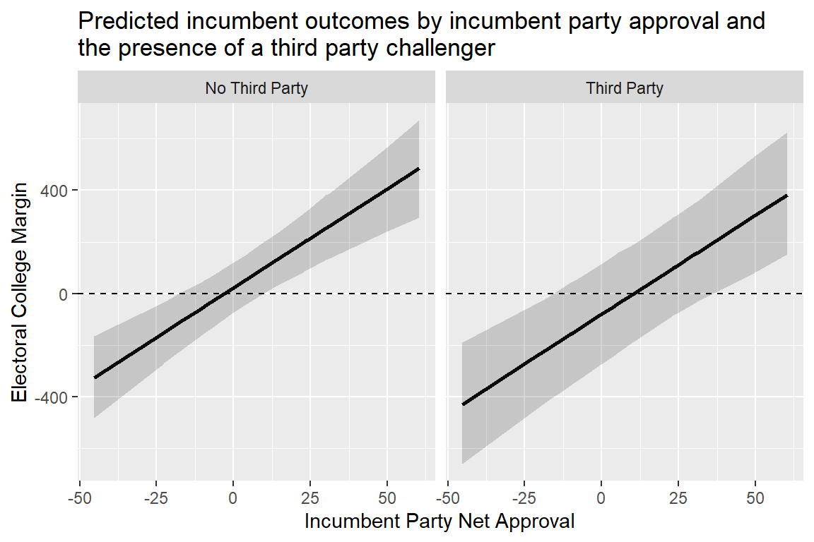
6.6 Wrapping up
Just like data modeling for descriptive analysis is trivial to do with the right software, so is data modeling for predictive analysis. Even for more complex kinds of models you’ll encounter, the R code will look pretty similar to what I showed you here.
There’s more territory to cover though. Having a predictive model is great, but you want to be sure that your model is the best one you can come up with using your data. In the next chapter, I’ll introduce methods for model validation and selection that will help with this goal.