Randomized experiments are ideal for making causal inferences, but sometimes, experiments aren’t feasible for logistical or ethical reasons.
Your next best option is to use data from a non-experiment (real-world events like civil wars, elections, protests) and try to control for observed confounders.
Thinking about a theoretical model of causation can help guide your design.
This won’t solve all problems, because you can only control for what you can observe or measure.
10.2 When Experiments Aren’t an Option
Back when I talked about descriptive research, I discussed controlling for different factors in a regression model. When you include different factors in a model, this adjusts what variation in the outcome and variable of interest counts toward measuring their relationship with each other. When done well, this approach can help to reduce bias and improve statistical precision. When done poorly, it can make one or both of these problems worse.
A research design where you control for variables in a regression analysis is sometimes referred to as selection on observables (SOO). The idea is that there are a number of observed factors or characteristics of observations in your data that predict or determine who does or doesn’t get treated by a causal variable of interest that also predict the outcome you want to study. You should use the term “treated” loosely, because in an SOO design you’re not dealing with an experimental study where treatment assignment is random. However, assuming you have sufficient data to explain why a causal variable is distributed/assigned the way that it is, an SOO design allows you to draw out variation in this causal variable that is as-if-random (close enough to a randomized trial), which you can then use to estimate its causal effect.
Regression analysis is the most commonly used tool for SOO, and in many cases it works just fine. However, you have to rely on a few assumptions to make the most of this research design. The following sections walk through some issues you need to consider when controlling for covariates in a regression analysis. Among the many lessons I hope you take away from this discussion is that there is no magic solution to the problem of confounding in non-experimental data. When data are observational, you often don’t really know the true process that generated them. You may have some theories, but these theories are always contingent and subject to change.
For this reason, many SOO designs are heavily susceptible to researcher degrees of freedom and, even worse, p-hacking. The former refers to the seemingly boundless, equally justifiable research design choices researchers can make to analyze data, while the latter refers to the intentional design of a study to generate a desired finding. For these reasons, SOO designs are increasingly received with skepticism.
The lesson here is not to avoid SOO research designs. Rather, it is to be clear-eyed about the limitations of SOO and to treat the results from your analysis with the appropriate level of caution.
10.3 Motivating SOO Designs with DAGs
SOO designs may be hard to do, but you can set yourself up for success by first thinking carefully about the potentially many and overlapping causal relationships you believe are at work in your data. The best (and most annoying) way to do this is to create a “DAG.”
A directed acyclic graph or DAG is a useful way of visualizing both simple and complex causal relationships between variables. By using DAGs, you can start to think more clearly about your data and what variables you need to control for (and not control for) in your analysis.
Visualizing a DAG in R is really easy with the {ggdag} package, which you can install by writing:
install.packages("ggdag")
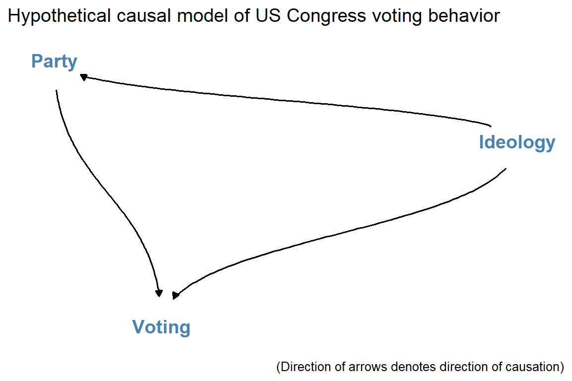
I’ll make an example DAG that summarizes the theoretical causal relationship among three variables: Voting, Ideology, and Party Membership in the U.S. Congress.
First open the {tidyverse} along with {ggdag}:
library(tidyverse)
Warning: package 'tidyverse' was built under R version 4.2.3
Warning: package 'readr' was built under R version 4.2.3
Warning: package 'purrr' was built under R version 4.2.3
Warning: package 'dplyr' was built under R version 4.2.3
Warning: package 'forcats' was built under R version 4.2.3
Warning: package 'lubridate' was built under R version 4.2.3
── Attaching core tidyverse packages ──────────────────────── tidyverse 2.0.0 ──
✔ dplyr     1.1.2     ✔ readr     2.1.4
✔ forcats   1.0.0     ✔ stringr   1.6.0
✔ ggplot2   4.0.2     ✔ tibble    3.3.1
✔ lubridate 1.9.3     ✔ tidyr     1.3.2
✔ purrr     1.0.2
── Conflicts ────────────────────────────────────────── tidyverse_conflicts() ──
✖ dplyr::filter() masks stats::filter()
✖ dplyr::lag()    masks stats::lag()
ℹ Use the conflicted package (<http://conflicted.r-lib.org/>) to force all conflicts to become errors
library(ggdag)
Attaching package: 'ggdag'

The following object is masked from 'package:stats':

    filter
Next, to make a DAG, give R some instructions about the relationships between variables using dagify(). You can then pipe these instructions to a function called tidy_dagitty() and then to ggdag() for plotting. The below code does so and adds some customization along the way. Notice that using the dagify() function you can specify causal relationships using formula objects, just like what you’d give to the lm() function to estimate a regression model.
dagify("Voting"~"Ideology"+"Party","Party"~"Ideology") |>tidy_dagitty() |>ggdag(text_col ="steelblue",node = F,text_size =5,edge_type ="diagonal" ) +theme_dag() +labs(title ="Hypothetical causal model of US Congress voting behavior",caption ="(Direction of arrows denotes direction of causation)" )
The above represents a theoretical model of the causal relationships between political ideology, partisanship, and voting behavior in Congress. Specifically, it asserts that ideology influences how individuals vote and their party ID, and that party ID in turn also influences how individuals vote.
For the sake of example, I’ll simulate some data based on this model:
dt <-tibble(ideology =c(rep(1, len =70),rep(2, len =70),rep(3, len =69),rep(4, len =70),rep(5, len =70) ),republican = randomizr::block_ra(blocks = ideology,block_m =c(0, 4, 45, 69, 69) ),voting = republican + ideology +rnorm(length(ideology))) |>mutate(voting =100* (voting -min(voting)) / (max(voting) -min(voting)) )
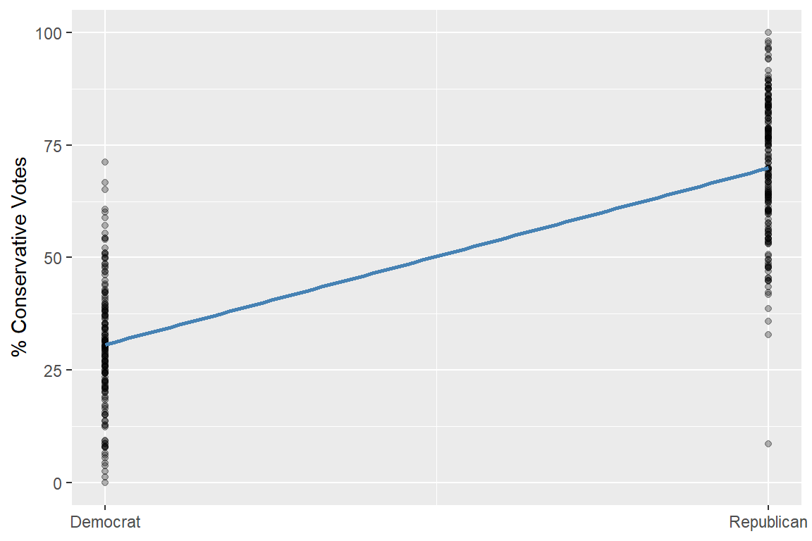
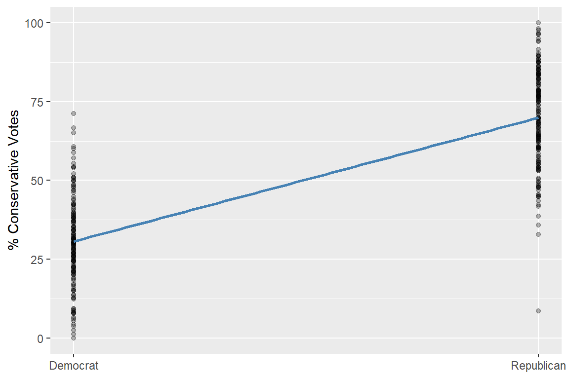
If you look at the raw data, you can see a clear relationship between party ID (republican) and voting behavior (voting). Check out the figure I made below. Voting behavior is just a measure of the share of times a member of Congress voted in a way that was consistent with conservative ideology. It should be unsurprising that more Republicans cast conservative votes than Democrats. But is party ID all there is to it? The causal DAG indicates that a mix of party ID and ideology influence voting. However, since it also tells us that ideology influences party membership, you should be careful about drawing conclusions from looking at the raw data. The reasons why someone is a Republican or a Democrat are not random.
A skeptic could make the argument that the relationship between partisanship and voting is spurious (a fluke). People pick which party they belong to on the basis of their ideology, and their ideology also determines how they vote. So the observed relationship between party ID and voting could just be a reflection of this underlying behavior. If true, controlling for ideology would make the relationship between party and voting behavior disappear.
However, an alternative argument can be made that partisanship, even though it is partly explained by ideology, still has a direct effect on voting. The mechanism driving this might be partisan peer-pressure. Once someone is in Congress, they may face strong pressure to conform to the party line. This can create an extra incentive, on top of ideology, to vote a certain way.
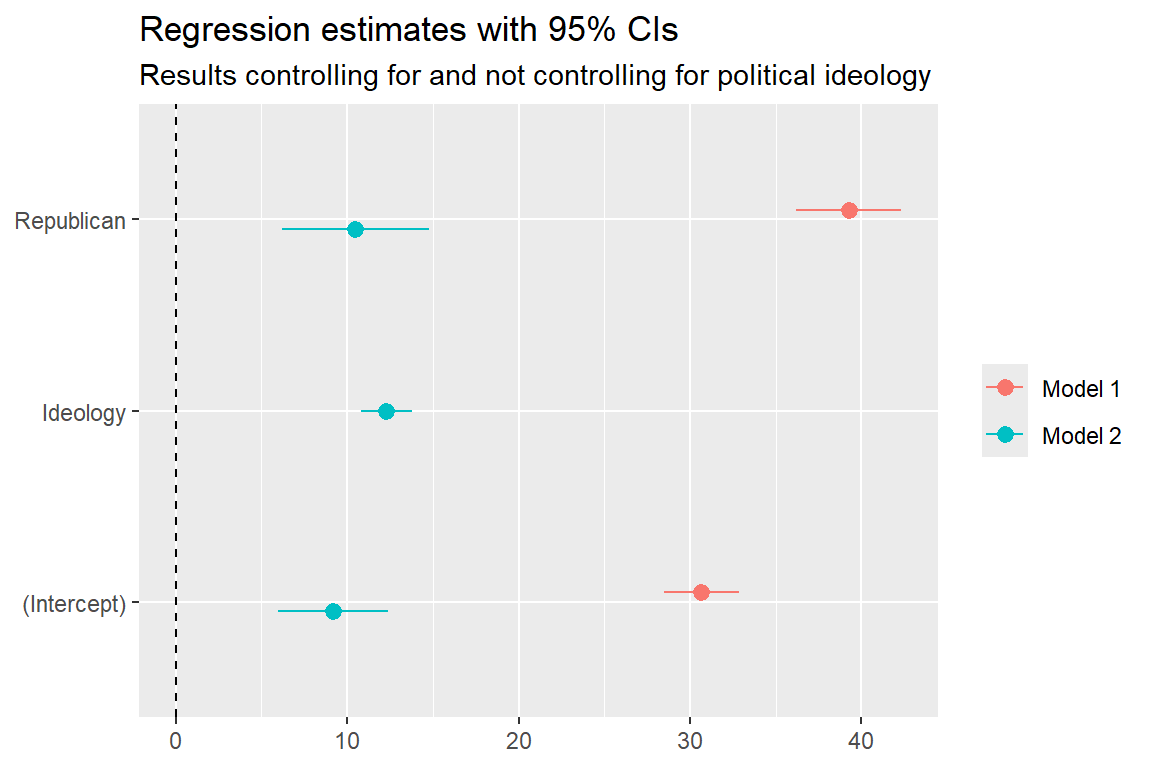
Both of the above arguments sound plausible. The best way to adjudicate between them is to control for ideology in your analysis. If the first argument is true, once you adjust for ideology, party ID should no longer be a statistically significant predictor of voting. However, if the alternative argument is true, you should still see a significant relationship between party ID and voting even after ideology is adjusted for.
You can estimate a pair of regression models to see how controlling for ideology changes your inferences about party ID. The below code uses lm_robust() from the {estimatr} package and uses HC1 robust standard errors to determine statistical significance. Note that these are not the same standard errors I said to use the previous chapter. These are the run-of-the-mill robust standard errors I introduced when talking about descriptive research. In non-RCT research designs, you usually cannot fully justify randomization-based inference, so you have to revert back to sampling-based inference instead.
# Open {estimatr}library(estimatr)# A simple regression modelfit1 <-lm_robust(voting ~ republican, dt, se_type ="HC1")# A multiple regression model that controls for ideologyfit2 <-lm_robust(voting ~ republican + ideology, dt, se_type ="HC1")# Visualize resultsbind_rows(tidy(fit1) |>mutate(model ="Model 1"),tidy(fit2) |>mutate(model ="Model 2")) |>ggplot() +aes(estimate, term, xmin = conf.low, xmax = conf.high, color = model) +geom_pointrange(position =position_dodge(-.2) ) +geom_vline(xintercept =0,linetype =2 ) +labs(title ="Regression estimates with 95% CIs",subtitle ="Results controlling for and not controlling for political ideology",x =NULL,y =NULL,color =NULL ) +scale_y_discrete(labels =c("(Intercept)", "Ideology", "Republican") )
Warning: `position_dodge()` requires non-overlapping x intervals.
With the first model, you clearly see that partisan ID is a strong predictor of voting. Specifically, being Republican increases conservative voting behavior by 39.24 percentage points. However, once ideology is controlled for, the estimated effect of party ID shrinks to 10.49 percentage points. Both estimates are statistically significant, but the first is inflated because I haven’t accounted for the role ideology plays in driving voting behavior and in driving party membership. Making a DAG helped me to see that I need to control for this factor to get a reliable causal estimate.
10.4 Measuring Bias
The inflated result in the first regression model above is a product of a special kind of bias called omitted variable bias. By failing to control for a confounding variable, estimates of a causal relationship of interest can deviate systematically from the truth.
There are four general scenarios that influence the direction of the bias in a study with confounding. If the confounder is omitted from the analysis, it will result in one the following biases:
If the omitted variable has a positive correlation with treatment and the outcome, the bias will be positive (this is what you saw in the example in the previous section)
If the omitted variable has a positive correlation with treatment and a negative correlation with the outcome, the bias will be negative
If the omitted variable has a negative correlation with treatment and a positive correlation with the outcome, the bias will be negative
If the omitted variable has a negative relationship with the treatment and the outcome, the bias will be positive
It might be easier to think about this by way of a simple formula:
\[
\text{bias} = (\text{effect of D on Y}) \times (\text{effect of Z on D})
\]
Say Y is whether a person turns out to vote in an election, D is exposure to a social media ad encouraging people to vote, and Z is a confounder, like income status or age, that determines whether someone has a social media account and is likely to get exposed to D. Depending on the direction of the effect of D on Y, and of Z on D, the bias will either be positive or negative. If age makes someone less like to see the ad, but the ad has a positive effect on turnout, then you’re estimate of the effect of the ad on turnout will be subject to downward bias if you fail to control for age. Conversely, if income makes someone more likely to see the ad, your estimate of the effect of the ad on turnout will be subject to upward bias.
I can run a simple simulation to illustrate this problem:
d1 <-tibble(z =rnorm(1000),x = z +rnorm(1000),y = z + x +rnorm(1000))d2 <-tibble(z =rnorm(1000),x =-z +rnorm(1000),y = z + x +rnorm(1000))d3 <-tibble(z =rnorm(1000),x = z +rnorm(1000),y =-z + x +rnorm(1000))d4 <-tibble(z =rnorm(1000),x =-z +rnorm(1000),y =-z + x +rnorm(1000))
Each of these datasets is going to give me a different direction of bias. To calculate the bias I’ll first need to estimate some simple regression models:
sf <- y ~ xs1 <-lm_robust(sf, d1)s2 <-lm_robust(sf, d2)s3 <-lm_robust(sf, d3)s4 <-lm_robust(sf, d4)
Then I’ll estimate the full (correct) regression models:
mf <- y ~ x + zm1 <-lm_robust(mf, d1)m2 <-lm_robust(mf, d2)m3 <-lm_robust(mf, d3)m4 <-lm_robust(mf, d4)
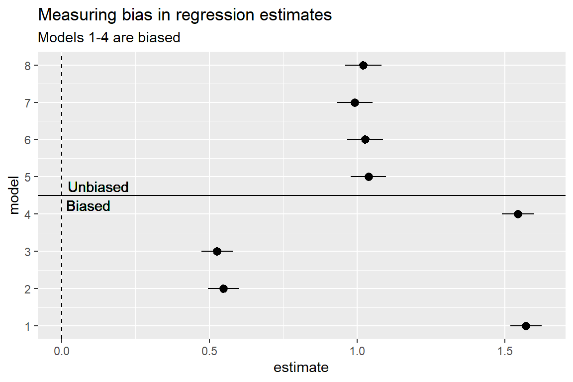
If I put all these results in a coefficient plot, you can clearly see that the simple models have different estimates for the effect x on y than the full models:
Does it look like the bias runs in the expected directions? Indeed, they do.
Unfortunately, in real-world settings doing this kind of exercise is difficult because you don’t know for sure what the true data-generating process was that gave rise to your observational data. However, the ability to perform a simulation like this can help you understand how omitted variable bias can be at work. If you think of a confounder that is important but that you don’t have data for, you can still guess the expected direction of omitted variable bias and caution your audience accordingly.
10.5 How does regression control?
You can use regression models to control for confounders, but what does it really mean to control for something? As you’ve seen, including a confounding variable in a regression model changes the estimate for a causal variable of interest. I want to give you a peek under the hood of regression models for a second so you can see how controlling for factors changes your estimates.
Consider the simulated ideology, partisanship, and voting data I made earlier. Below, I visualized the relationship between party and conservative votes:
This shows the raw relationship between these variables, which you already know is subject to omitted variable bias. When you control for ideology, the difference made by party ID is still positive, but much smaller than suggested by the raw data.
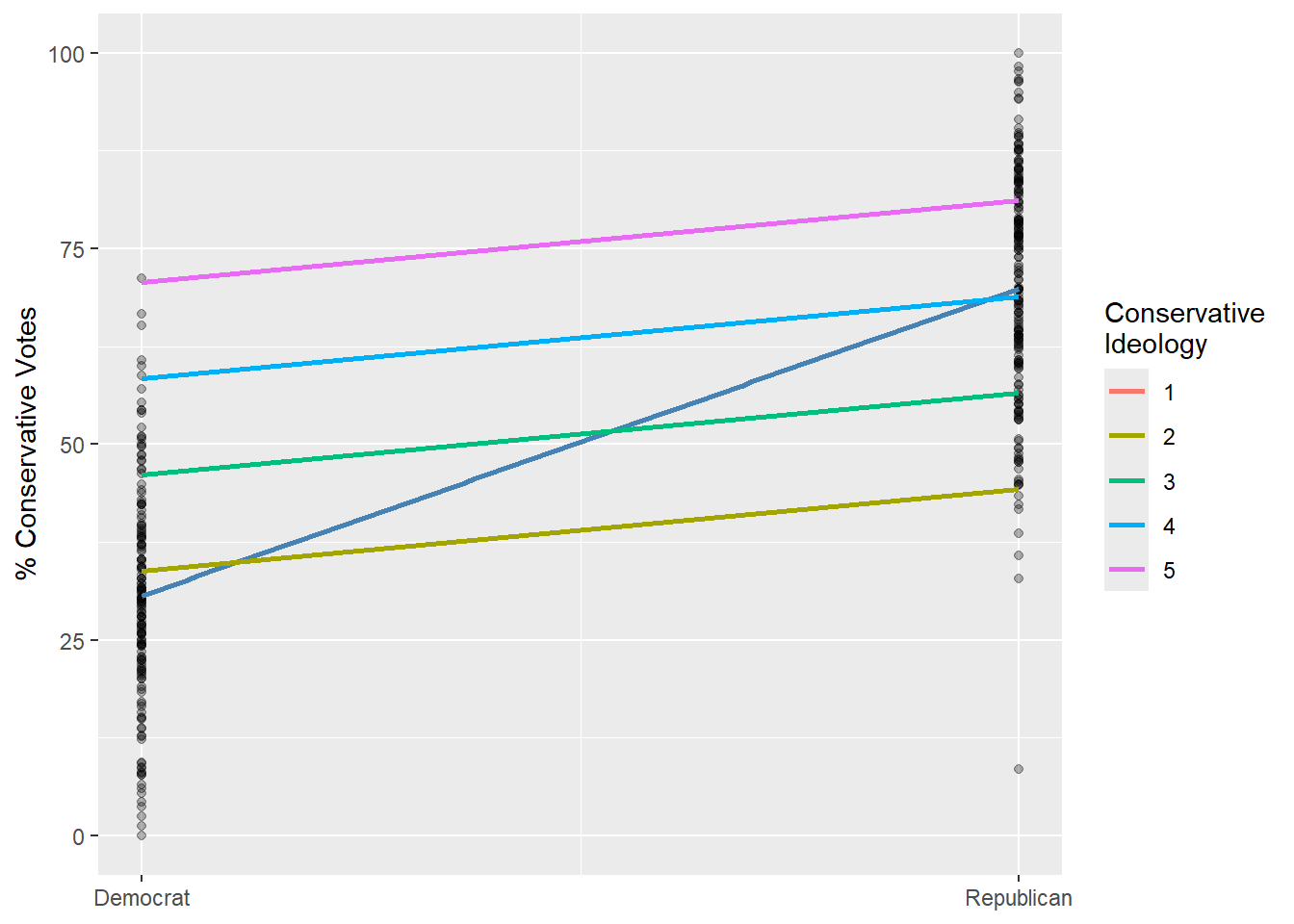
When you estimate a multiple regression model that controls for ideology, you’re calculating a weighted average difference after removing variation in the data explained by ideology. Imagine there is a separate slope relating party ID to voting within each of the ideology scores a person could have in the data, as captured in the following figure. There is a unique line per each level on the discrete ideology scale in the data, and each is shallower than the original line that doesn’t account for ideology. This example helps demonstrate that when you control for factors in your data, it ensures that you’re making better comparisons that reduce bias.
Warning: Using `size` aesthetic for lines was deprecated in ggplot2 3.4.0.
ℹ Please use `linewidth` instead.
`geom_smooth()` using formula = 'y ~ x'
This example also shows that certain observations might get up- or down-weighted by controlling for factors as well. Notice that there are five ideology levels but only four ideology specific lines. In the least conservative group (1s on the ideology scale) there is no variation between the parties. There are 1s that are Democrats, but none are Republicans. These people therefore don’t count when you estimate the correlation between party and voting.
Keep both of these truths in mind. When you control for things, you change the variation that counts toward measuring a correlation between a causal factor and an outcome, and the observations that matter. You might have a representative dataset, but once you control for one or more factors the effect your model produces might be based on an unrepresentative subset of the data.
Also keep in mind that controlling for variables with multiple regression makes it easy to make the data say what you want it to say. New variables give you the ability to manipulate variation in the outcome and causal variable, and to control which observations are under- and over-represented in the data. This is a p-hacker’s playground.
10.6 Introducing bias by accident
Controlling for factors in a regression model should hopefully remove omitted variable bias. But sometimes it makes things worse.
Here’s some simulated data based on a classic example of this problem from the political scientist Christopher Achen, which he talks about in a provocatively titled article called “Let’s Put Garbage-Can Regressions and Garbage-Can Probits Where They Belong.” In this article, Achen argues that using control variables that are closely correlated with, but not identical to, the confounding factors you need to account for can actually introduce new forms of bias into your analysis. Basically, you end up replacing omitted variable bias with bias from model mis-specification. That is, your model fails to accurately capture the true relationships of interest in your data.
If you take a look at the dataset I simulated above, you can see a few different variables. There’s an outcome (y), and two explanatory variables (x1 and x2). Notice an extra column called x1_obs. The last variable is meant to be a version of x1 that you are able to observe, rather than x1 itself, and notice that in the code that created the data, x1_obs is a squared version of x1 (with some rounding error), and that x2 is a function of the square root of x1. Further, the outcome (y) is a simple linear function of x1 (which can’t be observed in this exercise) and x2 (which is correlated with x1).
Example Data
x1
x1_obs
x2
y
0.0
0.0
0.0
0.00
0.1
0.0
0.1
0.09
0.2
0.0
0.1
0.19
0.3
0.1
0.2
0.28
0.4
0.2
0.2
0.38
0.5
0.2
0.2
0.48
0.6
0.4
0.3
0.57
0.7
0.5
0.3
0.67
0.8
0.6
0.3
0.77
0.9
0.8
0.3
0.87
1.0
1.0
0.3
0.97
This hypothetical data assumes a data-generating process for the outcome (y) that looks like this:
\[
y_i = x_{1i} - 0.1 \times x_{2_i}
\]
If you used a linear model and estimated its parameters with OLS, you’d get a perfectly fitted model where the coefficient for x1 is a perfect 1, and the coefficient for x2 is a perfect negative 0.1.
But, remember, in this exercise you should pretend that x1 can’t be observed, and only x1_obs can. What would happen if you estimated a regression model where you substitute x1_obs for x1? Will you still be able to measure the effect of x2 on y accurately?
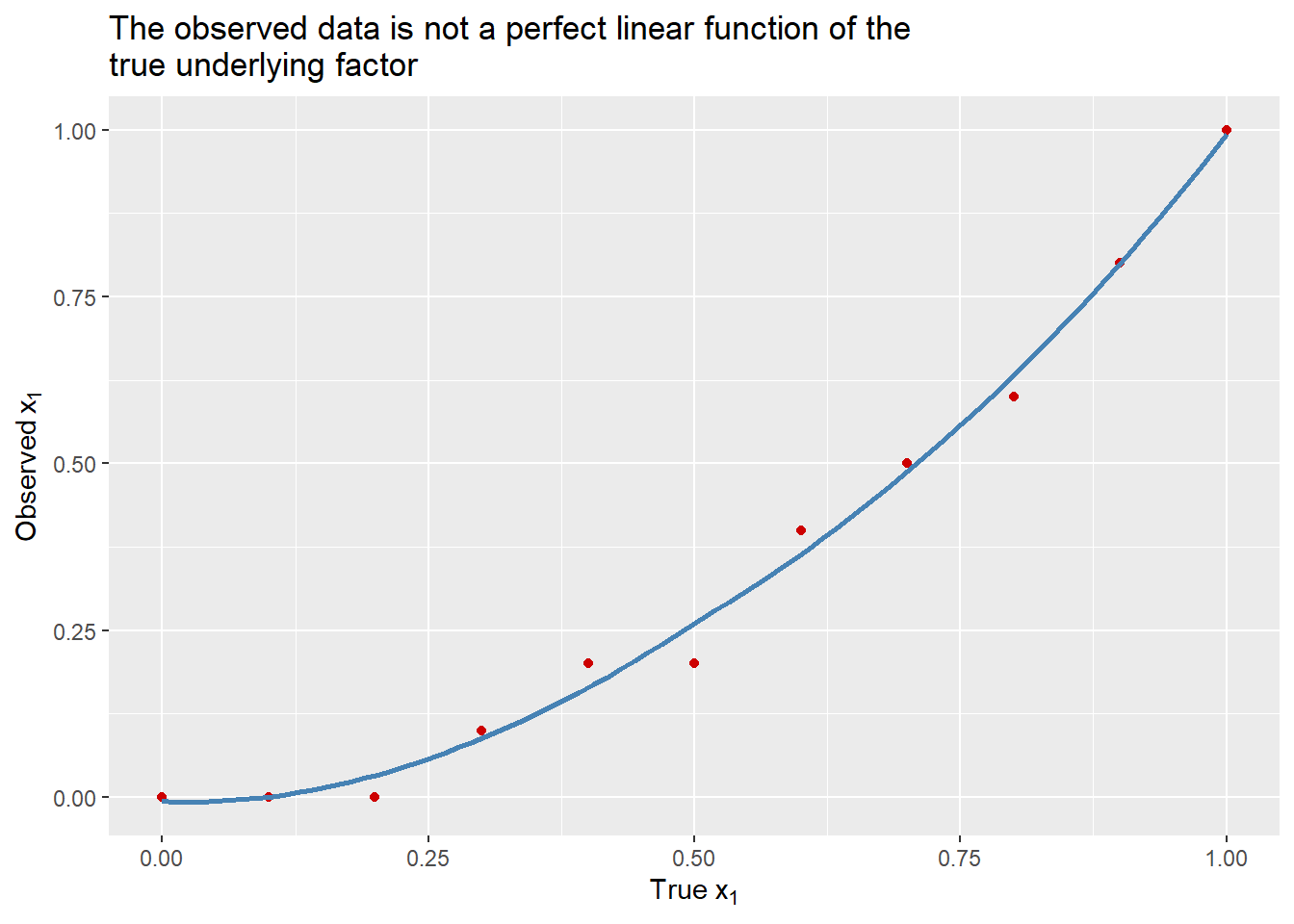
Many people assume, or even expect, that the control variables they are able to measure and observe in their data aren’t perfect. They hope these variables are correlated with the true underlying factor they are intended to capture, but they recognize these variables aren’t a one-to-one match. As you can see in the visualization produced below, this is certainly true for x1 and x1_obs. As x1 increases, so does x1_obs, but the relationship is exponential. x1_obs increases at a faster rate than x1.
ggplot(dt) +aes(x = x1,y = x1_obs ) +geom_point(color ="red3" ) +geom_smooth(se = F,color ="steelblue" ) +labs(x =expression("True "*x[1]),y =expression("Observed "*x[1]),title ="The observed data is not a perfect linear function of the\ntrue underlying factor" )
`geom_smooth()` using method = 'loess' and formula = 'y ~ x'
A common view is that this kind of discrepancy between your data and the truth isn’t a big deal. As long as your variable is correlated with the truth, that’s all you need for a control variable to work.
In this simulated example, you need to control for x1 if you want to identify the effect of x2 on y. If you look at the coefficient for x2 produced below, you can clearly see that it is hugely biased if you use it on its own. While the true effect of x2 is -0.1, the effect produced without controlling for x1 is 2.8333. It is positive, and several times larger in absolute magnitude than the truth.
lm(y ~ x2, dt) |>coef()
(Intercept)          x2
 -0.1133333   2.8333333
If you control for x1, this bias will go away, but remember that x1 can’t be observed; only x1_obs can. What happens when you control for it instead? As you can see below, the estimate is a bit closer to the truth, but it’s still biased. The coefficient for x2 is 1.2, which is larger in absolute magnitude than the true effect of x2 and still positive. Notice, too, that the estimate for x1_obs has a downward bias. While the coefficient for x1 should be 1, the estimated coefficient for x1_obs is about 0.6, which is just a fraction of what it should be.
The message here is clear. Controlling for confounders is important, but it is not a magic bullet. Even if you observe all the relevant confounders, if your data is flawed in some way, controlling for confounders can introduce bias due to model mis-specification. While you can make educated guesses and theoretically informed choices, you never will know for sure that you’ve eliminated these problems.
10.7 Other limitations of controlling
To summarize everything I’ve covered so far, when you control for confounding covariates, you are assuming selection on observables, which is the idea that the process of treatment assignment is determined by other observed factors. If you fail to control for them, your estimate of a causal effect will be subject to omitted variable bias. To eliminate this bias using a multiple regression model, you need to assume a few things:
You observe all the factors that influence the treatment and outcome.
You have good data on these factors.
A linear regression model is the best model for the data.
These problems haunt all observational studies, even those that control for dozens of possible confounding factors.
You can use some methods, like sensitivity analysis, to at least speculate about how big omitted variable bias would have to be to change the results of your study. This is a more advanced technique that I won’t cover, but if you’re curious, check out the {sensemakr} package.
There are other landmines. Perhaps two of the most common are:
mistaking confounders for mechanisms;
post-treatment bias.
An example of mistaking a confounder for a mechanism is controlling for incidence of lung cancer in a study about the effect of smoking on mortality. It should go without saying that smoking is deadly. But one of the mechanisms that explains its deadliness is its effect on the incidence of lung cancer. If you want to estimate the effect of smoking on mortality, it doesn’t make sense to control for lung cancer, and doing so could actually bias the results against finding an effect. If a factor is a means by which your theoretical argument works, then think twice before including it in your model.
Post-treatment bias is a related but different problem. It involves controlling for a variable in your model that is also caused by the treatment. Post-treatment bias can accidentally create spurious correlations or make other relationships disappear in the data. Imagine you’re running a trial for a new math and reading curriculum and you want to measure its effect on SAT scores. A way that you might introduce post-treatment bias into your analysis is controlling for student GPA post-intervention. If the curriculum is meant to improve test scores, it probably improves GPA, too. Therefore, you can’t control for GPA (at least not GPA measured post-treatment).
In both of the case of smoking and the curriculum intervention, avoiding controlling for mechanisms and post-treatment bias are easy. But in many real-world scenarios in politics and policy, avoiding these issues can be tricky. Politics and policy are messy, and causal arrows plausibly can go in many different directions. So, use a DAG to help you reason through the causal mechanisms at work. Don’t trust yourself to be able to just intuit the correct research design.
None of these issues are reasons to avoid SOO as a research design. Much of my own research relies on this approach because I study issues in international politics where RCTs are practically impossible and ethically dubious. It is important, however, to be a critical consumer and practitioner of observational research.
10.8 What’s the value of SOO designs if they have so many problems?
At this point you may be wondering about the value of SOO designs if they have so many pitfalls. However, there is still a lot of value that can come from this approach to research.
A big one is that it can help identify problems or issues that deserve deeper study. For example, I and some colleagues published a study in Studies in Comparative International Development showing that Chinese foreign aid for helping countries develop their communication infrastructure predicts a decline in their level of internet freedom. However, our data is purely observational, so we can’t claim this is a causal relationship. But if it were causal, this would be troubling, because every time a country accepts assistance from China for building up its communication technology, it also risks importing authoritarian practices for governing citizens’ online activities. That’s a normatively weighty problem, and our hope is that by identifying this relationship we can motivate additional research on this issue.
Not all observational studies are motivated in this way, but the SOO research design can often serve as the first cut at a problem or issue that then serves as a basis for further study.
10.9 Wrapping up
Observational studies are incredibly important and necessary for making causal inferences when logistics and ethics make it impossible to run a randomized controlled trial. But, observational studies have limitations, so you need to be clear eyed about what conclusions you can and can’t confidently draw.
In the next chapter, I’ll talk about a research design that has a little more going for it. It’s called a regression discontinuity design. Unlike SOOs, this design takes advantage of a seemingly random natural experiment to estimate causal effects, giving it a leg up on SOO designs.