3 Looking at Data
3.1 Goals
Learning objectives:
Understand the value of looking at data before you jump into analyzing it.
Learn the basics of the grammar of graphics with the
{ggplot2}package in R so that you can visualize data.Think critically about the best way to visualize data.
Become familiar with tidy data principles.
3.2 Before you analyze, visualize
The bulk of this course is centered around data analysis and research design. Before we do this, we need to first talk about the importance of looking at our data.
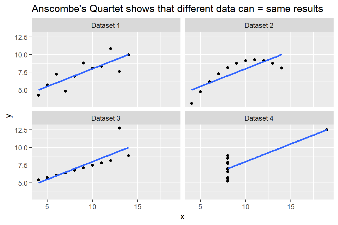
One of the best examples of why looking at data is so important is Anscombe’s Quartet, a classic dataset that contains four sets of variables (factors that we are interested in studying) that are related to each other.
This dataset comes with a twist. Each of the four sets of variables have the same estimated correlation with each other, but if you look at the data you can clearly see that the actual data points are vastly different from one pairing to the next. You can see this in the figure below, which shows all four examples from Anscombe’s Quartet. Each shows the relationship between some variable “x” and another variable called “y” using a kind of data visualization called a scatter plot. For each dataset, a blue linear regression line has been included. We’ll talk more about regression in the next chapter, but in brief, this line just represents the best estimate we have of how a change in “x” on average corresponds to a change in “y.”
You should notice two things in this figure. First, the slope of the regression line is identical across datasets – the value of this slope tells you how much the average value in “y” changes given a change in “x”. Second, even though the calculated relationship between “x” and “y” is the same, the actual datasets are very different. In dataset 1, the linear regression line provides a good summary how the variables are related to each other. However, in datasets 2-4 this isn’t the case. In 2, the data have a curvilinear relationship (like an upside down “U”), in 3 there’s an outlier that makes the regression slope steeper than it otherwise would be, and in 4 one “x” value is doing all the work in letting us estimate the regression line.
There’s a simple lesson to be learned here. If you had never looked at the data before you analyzed it, you would have no way of knowing if you were accurately summarizing the relationship between these variables. This is why it’s so important to look at your data before you start crunching numbers. Many datasets will give you similar top-line calculations despite being very different from each other. By failing to look at the data you may miss important details – details that might totally change the conclusions you draw.
This is one reason why data visualization is so essential to doing good descriptive analysis, which is the focus of this part of the book. According to the Harvard Business School, descriptive analysis is:
…the process of using current and historical data to identify trends and relationships. It’s sometimes called the simplest form of data analysis because it describes trends and relationships but doesn’t dig deeper.
With all due respect to the folks at Harvard, I think this definition is half true. Descriptive analysis does, indeed, entail using data to identify trends and relationships in data. However, I take exception with the idea that it doesn’t go deeper. Good descriptive analysis is about fact-finding, and often times the basic facts won’t make themselves immediately obvious. Descriptive analysts are like detectives, sifting through data to uncover patterns that are not always observable to the naked eye. This requires some deep digging. I hope that you’ll appreciate just how true this is as you progress through this course.
3.3 Looking at data with {ggplot2}
One of the best ways to look at your data is by way of data visualization. This is the process of using geometry and graphics to represent patterns or relationships in a dataset.
There are many ways to visualize data. In fact, you can teach a whole course on it, which I in fact do. Here’s a link to my Quarto book on data visualization if you’re interested.
In this course, we’re going to focus on the basics – just enough to get you started. Thankfully, there are a lot of resources out there on using R for data visualization, so if you ever get stuck, your preferred search engine is your best friend. And don’t forget about my other Quarto book that I linked to above.
There are many approaches to data visualization in R. We’re going to use the {ggplot2} package. Why? Simply put, it’s the state-of-the-art for data visualization with the R programming language. Other programming languages are jealous of it, too, and have tried to make their own versions – so it’s not just good by R’s standards, it’s good period.
Let me walk you through some of the basics of using the package. To do this, I’m going to use a dataset I put together and saved on my GitHub. The below code first opens the {tidyverse} package using the call library(tidyverse). Like I mentioned in the previous chapter, many R functions live in packages, and we can’t use them until the package has been opened. {tidyverse} is a universe of sub-packages that are meant to work together, and they represent a unique culture and dialect within the R programming community (one that I believe is quite useful).
After I open {tidyverse} I use a function called read_csv(). I’ve given it a url to the location of a .csv (comma separated) file called dpr201_unit1_data.csv. Note that I use dt <- in front of the function to ensure that the dataset is saved as a object in R.
## open {tidyverse}
library(tidyverse)

## read in US aid and human rights data
dt <- read_csv("https://raw.githubusercontent.com/milesdwilliams15/Teaching/refs/heads/main/DPR%20201/Data/dpr201_unit1_data.csv")
We’re going to use this dataset throughout the first part of the book. It’s called a “cross-sectional” dataset. It has that name because it provides a snapshot of a cross-section of the world at a moment in time. It contains information on U.S. foreign aid obligations and disbursements to different countries in 2024 and 2025, and it includes additional details about these countries, like their gross domestic product (GDP), population, and trade with the United States. Some variables have missing values, and some may need to be modified to be useful to us. Basically, the data gives us a lot to work with, but it isn’t perfect – no dataset ever is.
As we use this data, I want us to get to the bottom of puzzle that descriptive data analysis can help us solve: was there a rhyme or reason to the depth of U.S. aid cuts in 2025? Since World War II, the United States has offered economic assistance to countries across the world. It does so for a variety of reasons. Some of it is driven by altruism – wanting to help other countries develop economically to improve the lives of their own citizens. But self-interest and national security is a big part of the story, too. As the United States Agency for International Development (USAID) used to indicate on its website, it’s in America’s interest to offer assistance to other countries to help maintain political stability, prevent the spread of global diseases, build up markets for U.S. exports, and promote closer diplomatic ties abroad. Foreign assistance was also a big part of U.S. foreign policy during the Cold War as policymakers realized that offering aid could gain the U.S. influence and buy loyalty from dictators vis-a-vis the Soviet Union.
As you can imagine, it is really easy to justify giving aid to a wide variety of countries in the name of promoting national interests – even to some rather nasty foreign governments. But a lot of good comes from giving aid, too, including millions of saved lives in some of the most impoverished parts of the world. But, if you pay any attention to the news, you’ll remember that everything changed in 2025 when, under the direction of DOGE (the brand new Department of Government Efficiency, then headed by Elon Musk), the Trump Administration decided to shut down USAID and make massive cuts to the overall foreign assistance budget. The stated goal was to bring U.S. foreign aid more in line with U.S. security and economic interests.
As a quantitative social scientist who studies why countries give foreign aid, I can tell you that most of the empirical evidence shows U.S. foreign aid already was closely aligned with these objectives. So could these recent cuts be related to different objectives? Were the cuts general, or targeted? Who lost the most aid from the U.S. in 2025 and why?
In this unit, we’ll use the tools of descriptive data analysis to answer these questions. And the first step is to start looking at the data and producing some data visualizations.
3.3.1 What’s in the data?
Before we even visualize the data, we need to take a look at the data itself. A good tool for doing this quickly is to use the view() function. If you write view(dt) in the R console a pop-up table will appear, and you can scroll around the dataset as if it were a spreadsheet – quite handy. If you don’t want to open it this way, you can also write glimpse(dt) and it will spit out a brief overview in the R console.
This is what the below code does. The output tells us a few things about the data. First, it has 180 rows and 25 columns. Each row is an observation—in this case, a particular country. There are also a variety of other variables in the data—all information relevant to each country observation. Some of the names of these variables are intuitive, but others not so much. We can see that some are character strings (indicated by <chr>) and others are real numbers (indicated <dbl>).
glimpse(dt)Rows: 180
Columns: 25
$ ccode <dbl> 20, 31, 40, 41, 42, 51, 52, 53, 54, 55, 56, 57, 58, …
$ country_name <chr> "Canada", "Bahamas", "Cuba", "Haiti", "Dominican Rep…
$ region_name <chr> "Western Hemisphere", "Western Hemisphere", "Western…
$ income_group_name <chr> "High Income Country", "High Income Country", "Upper…
$ obligated_2024 <dbl> 259253, 2579631, 7604107, 591097742, 107845995, 4865…
$ obligated_2025 <dbl> 206393, 1541, 732802, 138291917, 31065606, 9900069, …
$ disbursed_2024 <dbl> 259253, 2757741, 7042254, 434975090, 91595512, 53240…
$ disbursed_2025 <dbl> 352, 576863, 4882672, 226327134, 43996576, 20269572,…
$ gdp_2024 <dbl> 2725299.7500, 17976.0488, NA, 60176.3789, 243306.921…
$ gdp_2025 <dbl> 2883487.750, 18281.264, NA, 60778.133, 255576.312, 3…
$ pop_2024 <dbl> 41.107712, 0.401283, 10.979783, 11.772557, 11.427557…
$ pop_2025 <dbl> 41.72467804, 0.40328440, 10.87996674, 11.87232399, 1…
$ inf_2024 <dbl> 2.3622506, 0.4091625, NA, 26.9490566, 3.3022335, 5.4…
$ inf_2025 <dbl> 1.986083, 1.569761, NA, 20.721994, 4.532511, 5.00033…
$ unemp_2024 <dbl> 6.312495, 9.974000, NA, NA, 5.309916, NA, 4.005750, …
$ unemp_2025 <dbl> 6.511146, 9.774000, NA, NA, 6.000000, NA, NA, 7.8550…
$ vdem_score <dbl> 0.842, NA, 0.178, 0.218, 0.705, 0.803, 0.755, 0.786,…
$ any_alliance <dbl> 1, 1, 0, 1, 1, 1, 1, 1, 1, 1, 1, 1, 1, 1, 1, 1, 1, 1…
$ defense <dbl> 1, 1, 0, 1, 1, 1, 1, 1, 1, 1, 1, 1, 1, 1, 1, 1, 1, 1…
$ nonagg <dbl> 1, 1, 0, 1, 1, 1, 1, 1, 1, 1, 1, 1, 1, 1, 1, 1, 1, 1…
$ consul <dbl> 1, 1, 0, 1, 1, 1, 1, 1, 1, 1, 1, 1, 1, 1, 1, 1, 1, 1…
$ distance <dbl> 734.8694, 1538.3414, 1825.4282, 2310.1217, 2373.7545…
$ export <dbl> 348413969749, 5639722090, 586499825, 1214423999, 130…
$ import <dbl> 421206326689, 1839129647, 4885434, 641768953, 772631…
$ us_troops <dbl> 153, 63, 616, 54, 19, 13, 10, 13, 0, 0, 0, 0, 0, 0, …Since I put this dataset together (you’re welcome by the way), let me give you a quick run-down of what everything is:
ccode: The Correlates of War country code (just a numerical identifier for different countries that helped me merge a bunch of different datasets together to make the one before you now).country_name: The name of a given country.region_name: Region names.income_group_name: The income category of a given country, designating whether a country is considered high income, upper middle income, lower middle income, or low income.obligated_2024: The inflation-adjusted amount of aid the U.S. obligated (promised) to give to a country in 2024.obligated_2025: The inflation-adjusted amount of aid the U.S. obligated (promised) to give to a country in 2025.disbursed_2024: The inflation-adjusted amount of aid the U.S. disbursed (actually gave) to a country in 2024.disbursed_2025: The inflation-adjusted amount of aid the U.S. disbursed (actually gave) to a country in 2025.gdp_2024: Country gross domestic product (GDP) in millions of inflation-adjusted values in 2024.gdp_2025: Country gross domestic product (GDP) in millions of inflation-adjusted values in 2025.pop_2024: Country population in millions in 2024.pop_2025: Country population in millions in 2025.inf_2024: The percent inflation rate for a country in 2024.inf_2025: The percent inflation rate for a country in 2025.unemp_2024: The percent unemployment rate for a country in 2024.unemp_2025: The percent unemployment rate for a country in 2025.vdem_score: The Varieties of Democracy (V-Dem) Polyarchy Index for each country as of 2024. The index runs from 0 to 1 where 1 is the strongest democracy a country can be, and a 0 is the strongest autocracy a country can be.any_alliance: As of 2018, a 0-1 indicator of whether a country is a formal treaty ally of the U.S.defense: As of 2018 a 0-1 indicator of whether a country is a formal defensive ally of the U.S.nonagg: As of 2018 a 0-1 indicator of whether a country is a formal non-aggression ally of the U.S.consul: As of 2018 a 0-1 indicator of whether a country is a formal consultation ally of the U.S.distance: The distance in kilometers between Washington, D.C. and the capital of another country.exports: U.S. exports to another country in 2024.imports: U.S. imports from another country in 2024.us_troops: The number of U.S. military personnel stationed in a country in 2024.
Now that we have a handle on what’s in the data, let’s start visualizing some trends. In the next few subsections I walk through a few different ways of showing data based on the types of variables we’re looking at.
3.3.2 Scatter plots
The first type of visualization I want to show you is called a scatter plot. It gets this name from the fact that it looks like scattered points across a grid. The idea is to use data points with x and y coordinates to represent how two different numerical variables are distributed with respect to each other. The below code uses a series of functions from the {ggplot2} package to make a scatter plotting using the gdp_2024 and disbursed_2024 columns in the dataset.
ggplot(dt) +
  aes(x = gdp_2024, y = disbursed_2024) +
geom_point() 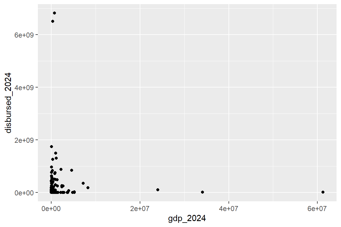
Notice a few things about the code. First of all, I should say that the “gg” part of {ggplot2} stands for “grammar of graphics.” The entire package is built around a particular grammar for communicating with your computer about how it should visualize data for you. It follows a simple set of conventions:
- Use the
ggplot()function (this is the main starting function for making a visualization) to specify the data that you want use. - Use the
+operator to indicate that you’re providing additional instructions, and then useaes()(this stands for aesthetics) to map (connect) certain variables in the data to particular parameters. For example,aes(x = gdp_2024, y = disbursed_2024)means that you want to put 2024 GDP on the x-axis, and 2024 aid disbursements on the y-axis. - Use the
+operator again and then use a geometry function – here,geom_point()– to tell your computer what kind of geometry it should use to represent the data you’ve told it to visualize. There are many different geometry functions, all starting withgeom_followed by something to indicate the kind of geometry.geom_point()will draw data points for a scatter plot.
Summarizing 1-3, ggplot’s grammar of graphics boils down to this: specify the data you want to use, indicate which variables you want to show, and then set the geometry you want drawn. Simple.
Everything you do with data visualization using {ggplot2} is going to be some variation on this general theme. Of course, there are many ways you can riff on this to produce a wide variety of plots and customize them to your liking. Take the next bit of code below where I build on the base established above by adding some extra twists – namely, I add another geometry layer, update the tick labels to dollars, and include custom labels for things like the title and axis labels using the labs() function.
ggplot(dt) +
  aes(x = gdp_2024, y = disbursed_2024) +
  geom_point() +
  geom_smooth( # adds a linear model fit for the data
    method = "lm",
    se = F
  ) +
  scale_x_continuous(
    labels = scales::dollar
  ) +
  scale_y_continuous(
    labels = scales::dollar
  ) +
  labs(
    title = "Wealthier countries get less aid",
    subtitle = "U.S. aid disbursements in 2024 by recipient GDP",
    x = "Gross Domestic Product",
    y = "U.S. Aid"
) 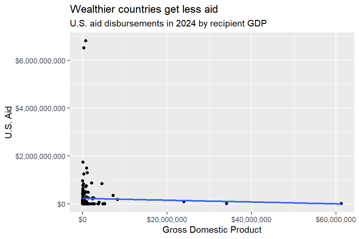
Note that the title makes a claim about a key finding in the data: wealthier countries get less aid. As a rule, you should make a firm declarative statement about what you found in the data in your plot titles. This is called the “assertion-evidence” approach. The idea is that your title makes an assertion, and the plot provides the evidence to back it up.
I could have used a non-assertive title, like “A scatter plot of U.S. aid disbursements by recipient GDP.” That title would technically be accurate, but also boring and unhelpful. One of the most important habits you can develop when making data visualizations is giving your plots assertive titles.
3.3.3 Line plots
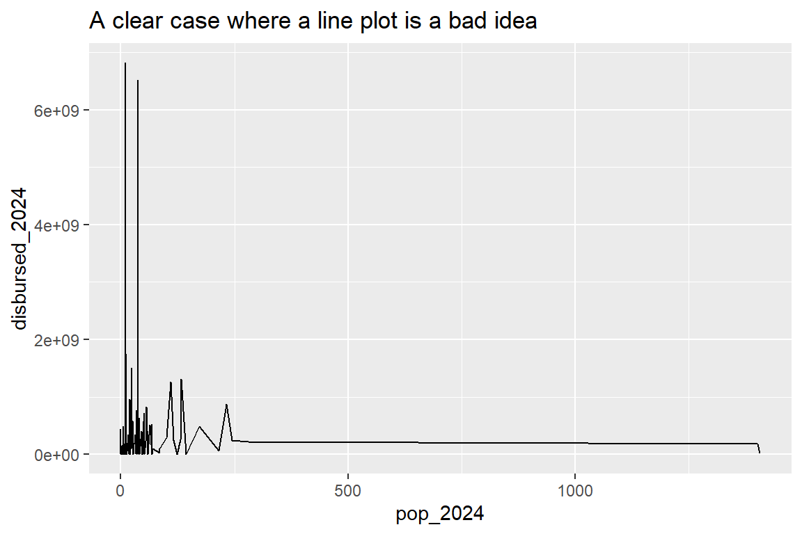
Another kind of plot you might consider when showing numerical data is called a line plot. You need to be careful about when you use line plots, however. Each type of geometry has strengths and weaknesses, most of which are determined by biases in human cognition. Optical illusions are a good example. If you aren’t careful, you may inadvertently create an optical illusion with your data visualization if you make poor choices about how to present the data.
Compare a scatter plot (covered in the previous section) to a line plot. By using separate points to represent how values of one variable correspond to those of another, it creates the perception that the data points are independent. That is, one observation does not have any meaningful relationship with another. But a line plot is different. It connects data points together with a line, which creates the perception that one data point is connected to next. Sometimes this choice makes sense, and sometimes it doesn’t.
The below code and the data visualization it creates offers a clear case where a line plot doesn’t make sense. It shows 2024 population on the x-axis, and 2024 aid disbursements on the y-axis. Instead of using geom_point(), like in the previous example, I used geom_line(), which, as the name implies, draws a line to connect data points. Specifically, it connects points based on how they’re ordered by population. Here’s the problem: each data point is a different country, and one country is not related to another country simply by virtue of how close their population sizes are. But the lines create the perception that this is the case, which is clearly misleading.
ggplot(dt) +
  aes(
    x = pop_2024,
    y = disbursed_2024
  ) +
  geom_line() +
  labs(
    title = "A clear case where a line plot is a bad idea"
  )
However, there is a way to use a line to show how population is related to aid that isn’t misleading. We can use another geom function called geom_smooth(), which draws a different kind of line through the data (one that makes much more sense). Check out the code and plot below. I made some changes to the previous code to the axis scales by putting them each on the log-10 scale (this helps to normalize the data without changing the order of the data values). I also used geom_smooth() and had it draw a line based on a method called "gam" (this stands for GAM or generalized additive model, which is a way of drawing a flexible line of best fit through data).
ggplot(dt) +
  aes(
    x = pop_2024,
    y = disbursed_2024
  ) +
  geom_smooth(
    method = "gam"
  ) +
  scale_x_log10() +
  scale_y_log10() +
  labs(
    title = "A better use-case of a line"
  )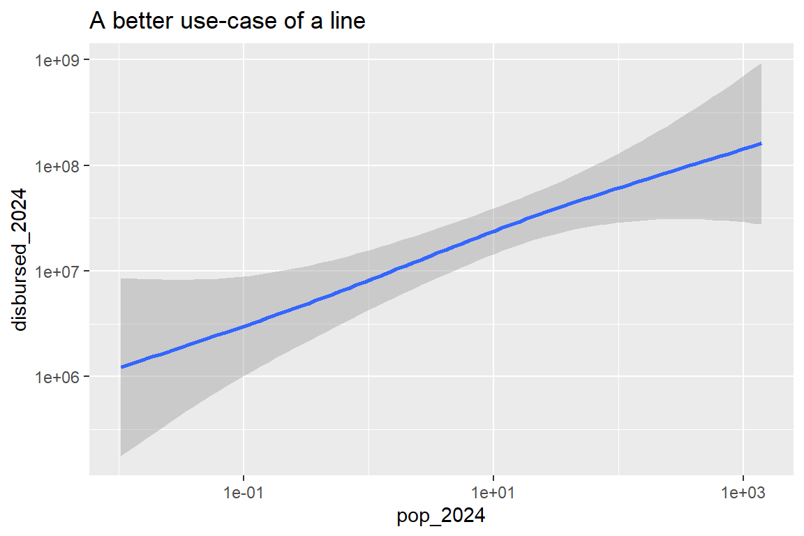
Do you see the difference in the line? First of all, it’s much smoother, and the reason is that the line is drawn based on an estimate of the average level of aid given to countries based on country population. Put another way, the line represents how much you should expect aid values to change based on a change to population. This is a much better use-case of a line. The line no longer is connecting unrelated data points together; it’s connecting smoothed over estimates of how an average for one variable changes based on another. This is a helpful way to use a line plot, in contrast to the previous example.
3.3.4 Column or bar plots
Scatter plots and line plots work well when showing how two numerical variables are related to each other. But when you have non-numerical data, they don’t work so well. However, a bar/column plot might.
Say I wanted to look at total aid disbursed to different income groups. I might put disbursed_2024 on the x-axis and put income_group_name on the y-axis. Then I could use the geom function called geom_col(), which draws columns/bars (depending on whether your x or y variable is a discrete category). The below code shows what that gives me:
ggplot(dt) +
  aes(
    x = disbursed_2024,
    y = income_group_name
  ) +
  geom_col()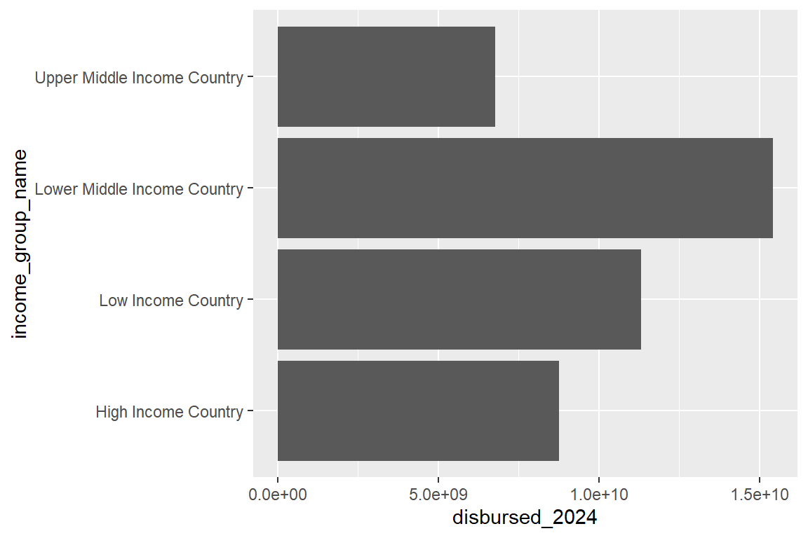
This doesn’t look so good, but I don’t have to tell you that. Often times, making data visualizations is a process of trial and error. Clearly there are a couple things that we need to fix.
First, the income groups aren’t in a sensible order (they’re in alphabetical order, but they should go from low to high income status).
Second, there’s a “NULL” category. We need to figure out how to drop that. It’s just a placeholder for observations that don’t have a defined income group label.
To fix these problems, we need to do some data wrangling (the act of cleaning data to make it more useful for analysis). In this case, I need to wrangle the income_group_name column so that values appear in the right order and the NULL category is dropped.
The below code shows one way I might solve this problem. I start by opening another package called {socsci} which has a function called frcode() that I like to use to create ordered categorical variables. Once I open the package, I pipe my data into a function called mutate(), which is a function that lets me make changes to my dataset. Inside that function I say that I want to create a new variable called new_income_label, and I specify what labels I want to use and their order using the frcode() function. Inside frcode() I provide some logical statements about what to do if the original income_group_name is equal to a certain value, and the order in which I provide these statements controls the order that the new variable will take. I then use reverse assignment at the end so that my changes to the data are saved.
library(socsci)
dt |>
  mutate(
    new_income_label = frcode(
      income_group_name == "Low Income Country" ~ "Low Income",
      income_group_name == "Lower Middle Income Country" ~ "Lower Middle Income",
      income_group_name == "Upper Middle Income Country" ~ "Upper Middle Income",
      income_group_name == "High Income Country" ~ "High Income",
      TRUE ~ NA
    )
  ) -> dt
Now, check out what happens when I make a plot using this new variable. I do something a bit different on the front end. I start with my data, then pipe it into a function called drop_na(), to which I give the variable new_income_label. This drops all the rows in the data that don’t have a valid income group label. Then I pipe the data into ggplot() so that it knows I want to use this slightly modified version of the data for plotting. I then put 2024 aid disbursements on the x-axis like before, but now I put my new income label variable on the y-axis. Finally, I use geom_col() to say that I want to use columns/bars.
dt |>
  drop_na(new_income_label) |>
  ggplot() +
  aes(
    x = disbursed_2024,
    y = new_income_label
  ) +
  geom_col()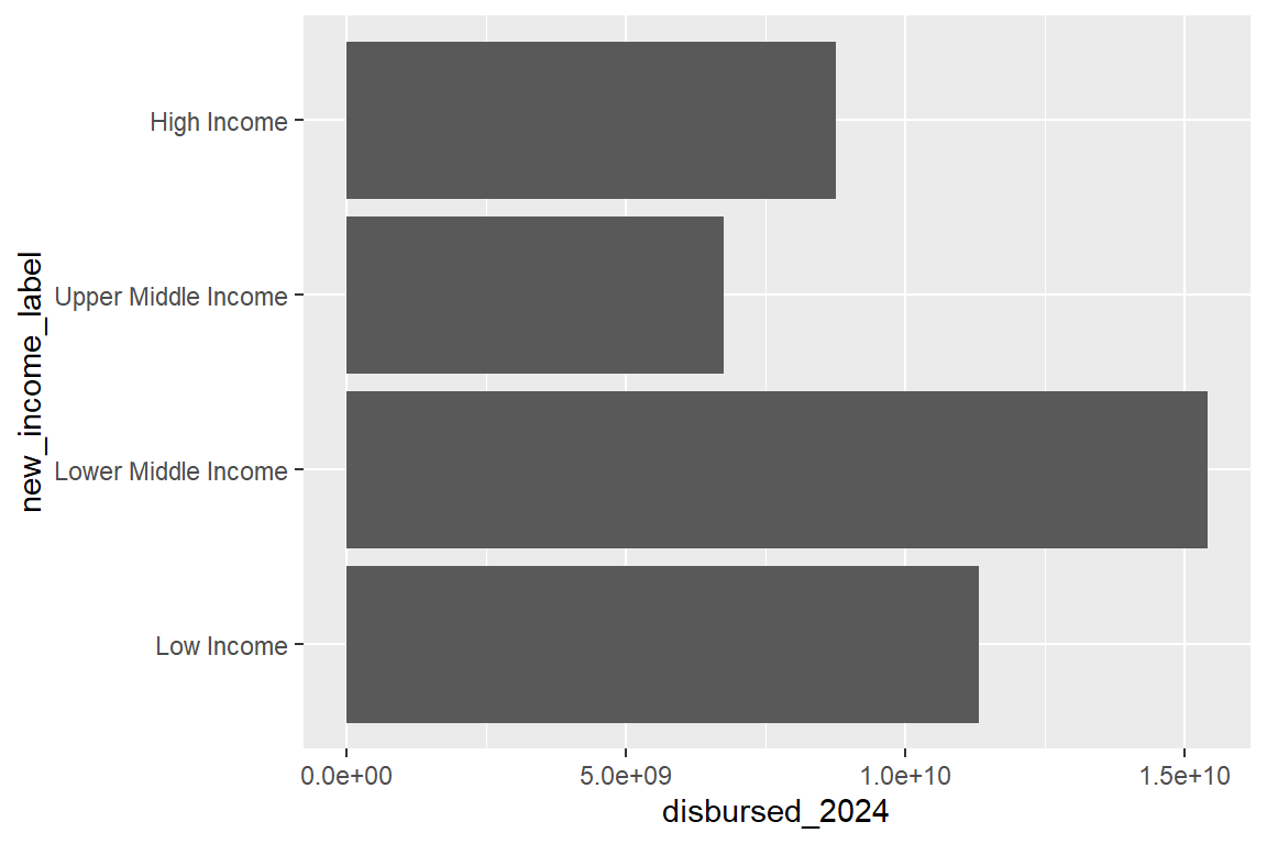
The summary in the above figure is interesting. It shows that lower middle income countries as a group got the plurality of U.S. foreign aid disbursed in 2024 rather than the lowest income group (which you would assume would benefit the most from economic assistance). But depending on the point we want to make with the data, this may or may not be a sensible set of values to show. Say, for example, I were interested in the average amount of aid countries got from the U.S. based on their income status. I would need to do something different, because the above example shows the sum of aid to countries by income group (not the same thing).
Here’s where some more data wrangling can come in handy. In the below code I start with my data, then drop rows without a valid income label. Next, I use group_by() to group my data by new_income_label and pipe into a function called mean_ci() (another function I like to use from {socsci} which reports the mean and some other summary stats for a variable in a tidy data table). Finally, I pipe into ggplot() and tell it to show the estimated mean for disbursed aid I calculated with mean_ci() on the x-axis instead of the raw aid values. Notice how the values suggest a slightly different relationship between income status and aid received compared to looking at the sum of aid by income status. The lowest income group on average got the most aid in 2024, followed by the lower middle income and upper middle income groups.
dt |>
  drop_na(new_income_label) |>
  group_by(new_income_label) |>
  mean_ci(disbursed_2024) |>
  ggplot() +
  aes(
    x = mean,
    y = new_income_label
  ) +
  geom_col()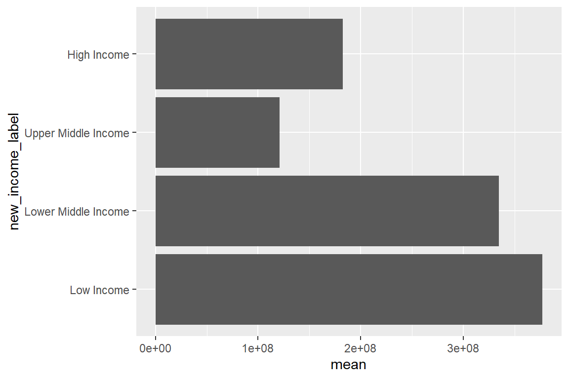
Interestingly, high income countries got slightly more aid on average than upper middle income countries. If that seems weird to you, let me clue you in on a long-standing pattern in U.S. foreign policy: America gives a lot of aid to Israel, which is even sometimes America’s top aid recipient. Israel is also a high income country. If you dropped it from the data, the average amount of aid to high income countries should decline dramatically. The below code is nearly identical to the last, but it adds a line that filters out Israel from the data. Sure enough, when you drop Israel, average aid to the high income group declines by a lot.
dt |>
  filter(country_name != "Israel") |>
  drop_na(new_income_label) |>
  group_by(new_income_label) |>
  mean_ci(disbursed_2024) |>
  ggplot() +
  aes(
    x = mean,
    y = new_income_label
  ) +
  geom_col()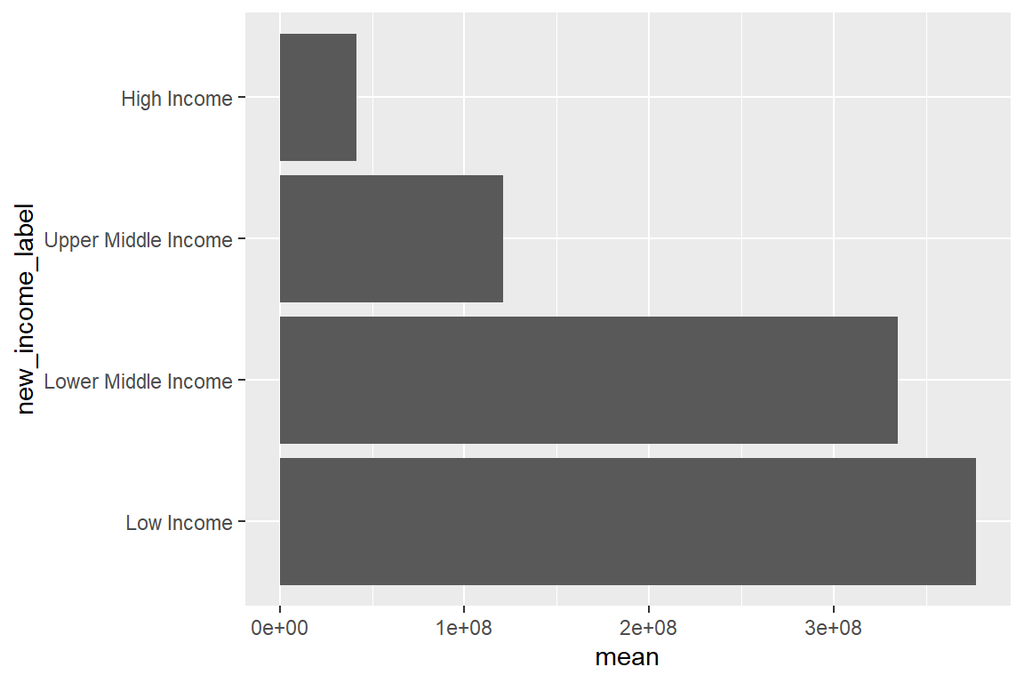
3.3.5 Dot plots and dot-whisker plots
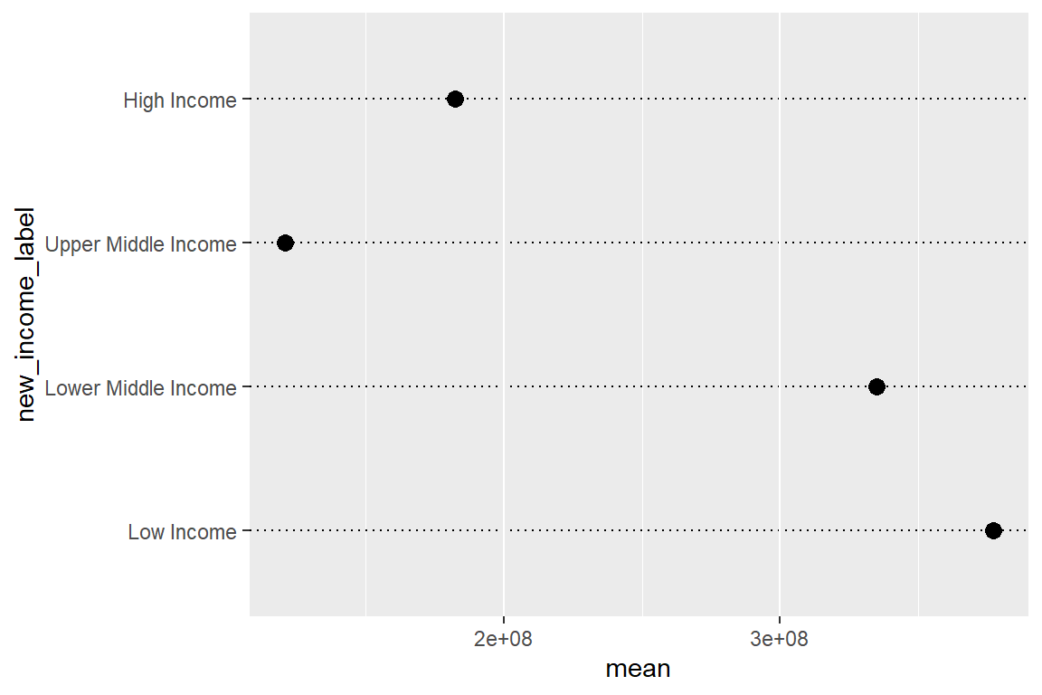
An option other than bars/columns when you have a categorical variable is to use points. But when you do this, it’s not called a scatter plot, because one of the variables is still category. We use a different name to refer to this kind of plot: a dot plot. The below code shows the same data as the previous plot, but it uses geom_point() instead of geom_col(). Generally, it’s a good idea to spice up the horizontal grid lines for dot plots to make it easier to tell which category goes with each dot. I did that using options set with the theme() function in the below code. You’ll find that theme() is like a Swiss army knife for updating features of your data visualizations. I also made the data points bigger by updating the size option in geom_point().
dt |>
  drop_na(new_income_label) |>
  group_by(new_income_label) |>
  mean_ci(disbursed_2024) |>
  ggplot() +
  aes(
    x = mean,
    y = new_income_label
  ) +
  geom_point(size = 3) +
  theme(
    panel.grid.major.y = element_line(
      linetype = 3,
      color = "black"
    )
  )
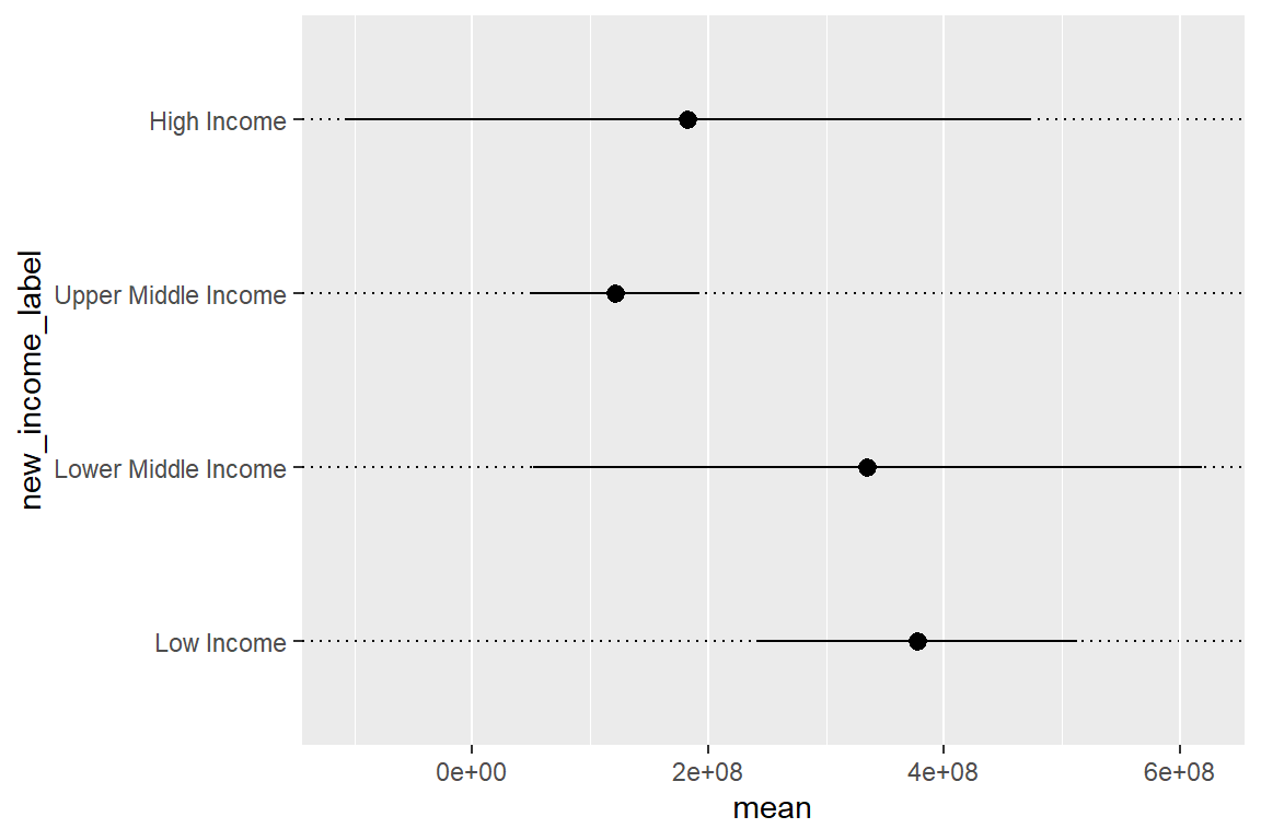
We might also consider using a dot-whisker plot, which is very similar to a dot plot, though with one big difference. Around each dot we’ll include whiskers (lines) that represent 95% confidence intervals. We’ll talk more about what these are in a later chapter. For now, I’ll just say that they quantify the role of chance/uncertainty in estimating the mean of U.S. aid. The mean_ci() function that I’ve used several times now includes some additional columns for the lower and upper bounds of the 95% confidence intervals. I can use that information in combination with a geom function called geom_pointrange() to draw both a dot for the mean and a line/whisker covering the range of the confidence interval.
dt |>
  drop_na(new_income_label) |>
  group_by(new_income_label) |>
  mean_ci(disbursed_2024) |>
  ggplot() +
  aes(
    x = mean,
    xmin = lower,
    xmax = upper,
    y = new_income_label
  ) +
  geom_pointrange() +
  theme(
    panel.grid.major.y = element_line(
      linetype = 3,
      color = "black"
    )
  )
3.3.6 Histograms and density plots
Sometimes you may not want to look at the relationship between variables. Instead, you may just want to know the breakdown of a single variable. Histograms and density plots are a good choice when this is the case. Let’s take histograms first.
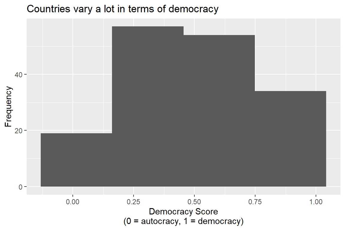
Technically, histograms are just bar plots. They’re useful for showing the distribution of a single numerical factor. Here’s a histogram of the range of V-Dem democracy scores for countries in the data:
ggplot(dt) +
  aes(x = vdem_score) +
  geom_histogram() +
  labs(
    title = "Countries vary a lot in terms of democracy",
    x = "Democracy Score\n(0 = autocracy, 1 = democracy)",
    y = "Frequency"
  )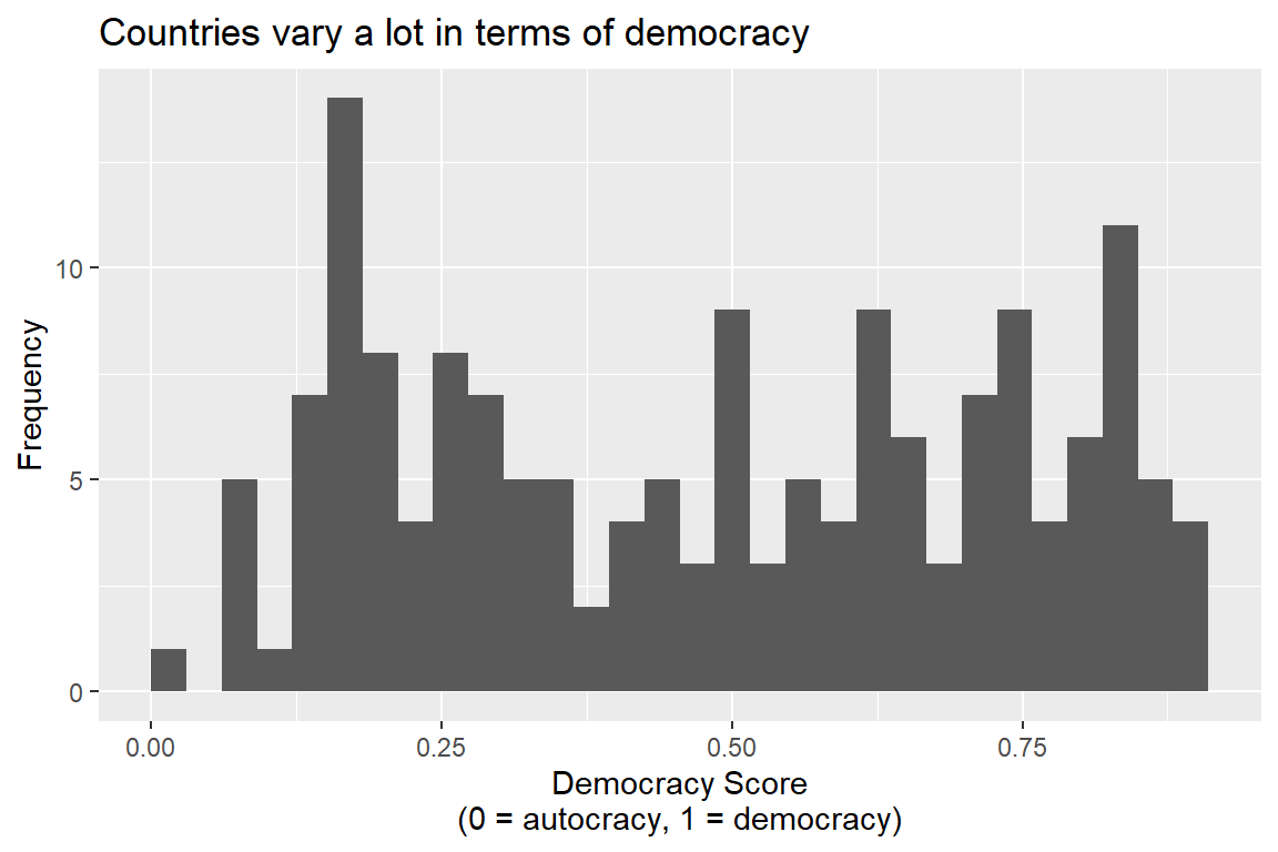
Histograms work by “binning” a numerical value into discrete buckets. Then, for each bucket, the number of observations are counted up. You can control the number of bins using the bins option inside geom_histogram(). Say we just wanted four buckets, here’s what that would look like:
ggplot(dt) +
  aes(x = vdem_score) +
  geom_histogram(bins = 4) +
  labs(
    title = "Countries vary a lot in terms of democracy",
    x = "Democracy Score\n(0 = autocracy, 1 = democracy)",
    y = "Frequency"
  )
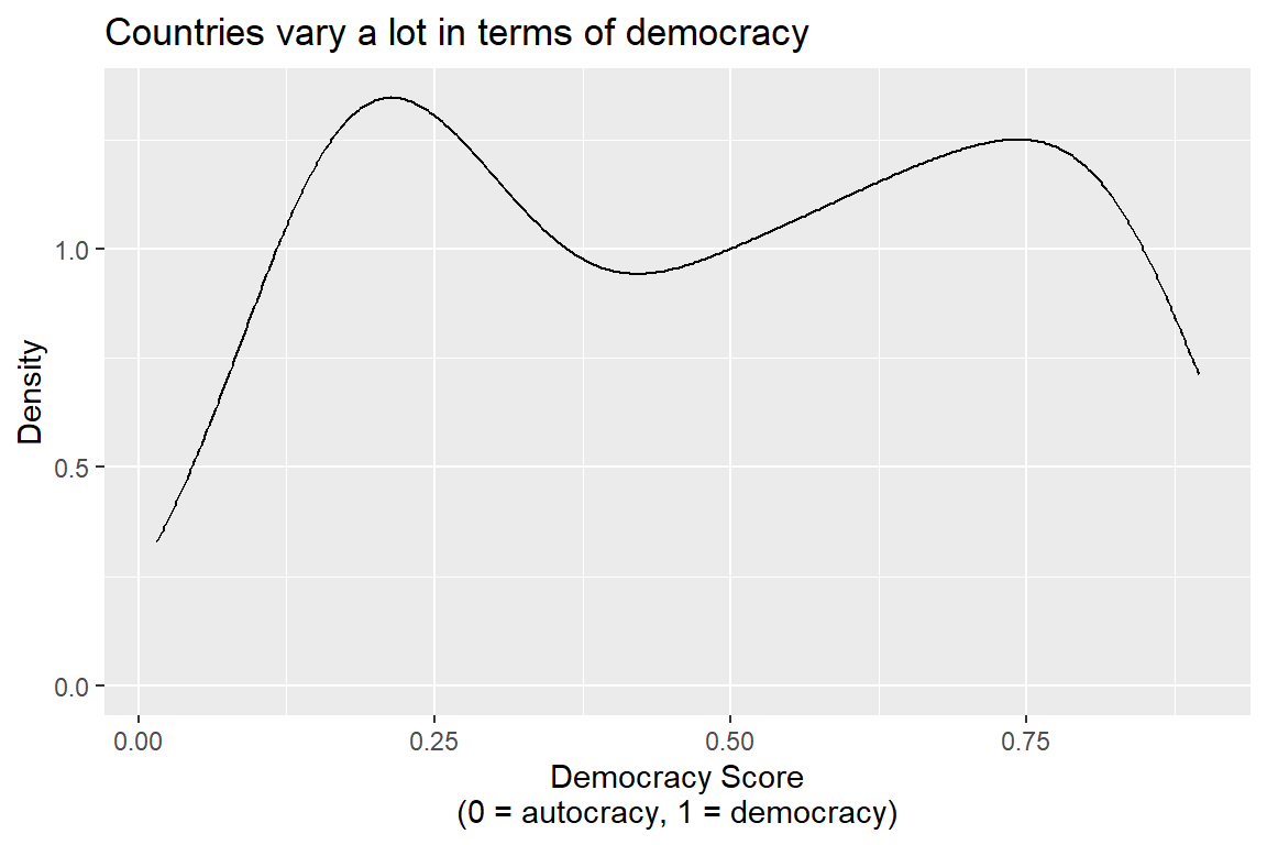
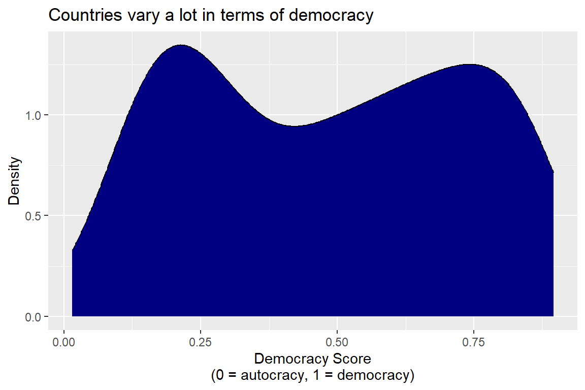
Density plots are sometimes a good alternative to histograms. Instead of binning the data and then counting up observations in each bin, density plots calculate a continuous density function for the data. Higher density means that there is a greater concentration of observations around a particular value. For democracy scores, this looks something like the below.
ggplot(dt) +
  aes(x = vdem_score) +
  geom_density() +
  labs(
    title = "Countries vary a lot in terms of democracy",
    x = "Democracy Score\n(0 = autocracy, 1 = democracy)",
    y = "Density"
  )
I don’t really like the default presentation for density plots. I prefer to fill in the space under the density curve using some color. You can do this by updating the fill option inside geom_density(), like so:
ggplot(dt) +
  aes(x = vdem_score) +
  geom_density(fill = "navy") +
  labs(
    title = "Countries vary a lot in terms of democracy",
    x = "Democracy Score\n(0 = autocracy, 1 = democracy)",
    y = "Density"
  )
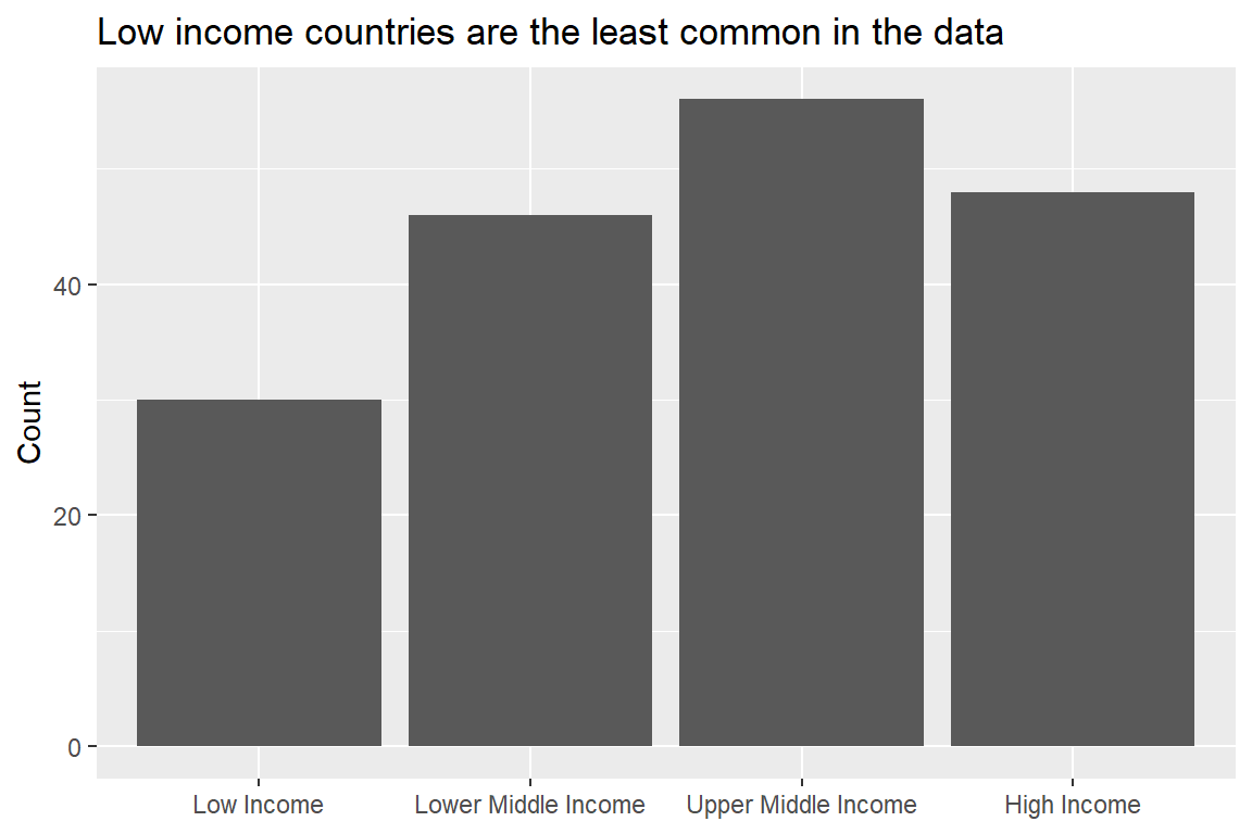
You can show the distribution of a categorical variable, too. You can do this with geom_bar() which takes a categorical x variable and counts up how often it occurs in the data. The next bit of code does this using the new income group column I created earlier in the data.
dt |>
  drop_na(new_income_label) |>
  ggplot() +
  aes(x = new_income_label) +
  geom_bar() +
  labs(
    title = "Low income countries are the least common in the data",
    x = NULL,
    y = "Count"
  )
3.3.7 Grouping geometries
Sometimes you may want to visualize your data using three or more variables at once. One way to go about this is to map certain variables to aesthetics that will adjust something like the size, shape, transparency, or color of geometries.
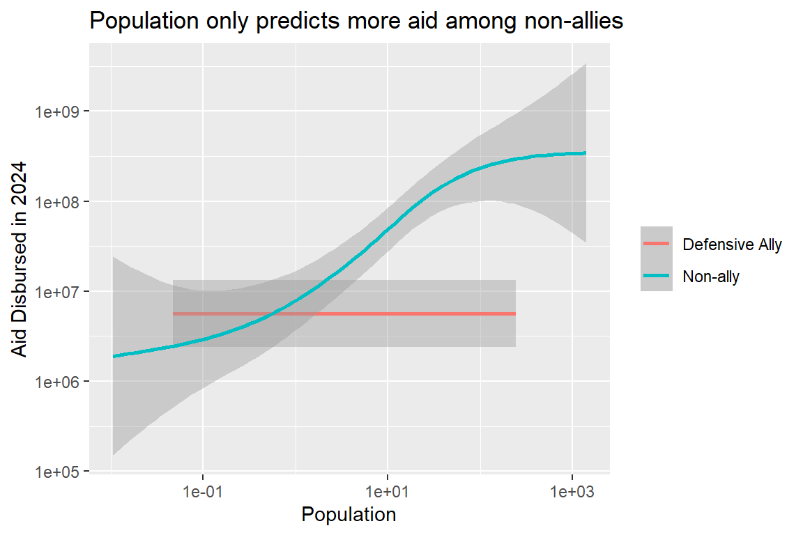
Here’s an example where I use a smoothed line of best fit to show the relationship between population and aid, with one twist: I set the color equal to whether a country is a defensive ally of the U.S. Notice the use of some extra options along the way. On the data wrangling side, I recoded the defense column to character labels rather than just 0 or 1. I further set the color option in the labs() function to NULL so that the legend that ggplot automatically produces for colors doesn’t have a title. The results suggest that population only predicts aid giving among non-allies (an odd looking finding if you asked me).
dt |>
  mutate(
    defense_lab = ifelse(
      defense == 1, "Defensive Ally",
      "Non-ally"
    )
  ) |>
  ggplot() +
  aes(
    x = pop_2024,
    y = disbursed_2024,
    color = defense_lab
  ) +
  geom_smooth(
    method = "gam"
  ) +
  scale_x_log10() +
  scale_y_log10() +
  labs(
    title = "Population only predicts more aid among non-allies",
    x = "Population",
    y = "Aid Disbursed in 2024",
    color = NULL
  )
3.3.8 Extra resources
Since this course isn’t primarily about data visualization, there’s only so much I can cover, but there will be plenty of additional data visualization examples to come in the following chapters. If you’re curious about what else you can do with ggplot or just want some more ideas, I can recommend various chapters in my other Quarto book on data visualization, like those below:
For more on ggplot basics and grouping data by color and size, check out `ggplot()` Basics
For more on customizing labels and text in your plots, check out Adding Labels and Text
For details about making subplots by groups in your data, check out the section called Small Multiples in one of the Quarto book chapters.
For more on wrangling datasets, check out Data Wrangling.
3.4 A note on tidy data
Data visualization with ggplot is easiest when your dataset follows tidy data principles. These principles deal with the shape of your dataset. For a dataset to be tidy it must have the following characteristics:
Each row is a unique observation
Each column is a unique variable
Each data entry by row and column is exactly one value.
Tidy data isn’t just useful for visualization, it’s useful for data analysis and statistical modeling, too (which I’ll cover later). Lots of headaches can be avoided by ensuring your dataset is tidy. You should have this definition either tattooed on your arm or grafted into the fabric of your soul.
Here are examples of a tidy and an untidy dataset. First, the tidy one: the dataset we’ve been using this all time. Below is a table with a selection of rows and columns from dt. It includes just the first 10 rows and 10 columns so that it’s easier to look at.
| ccode | country_name | region_name | income_group_name | obligated_2024 | obligated_2025 | disbursed_2024 | disbursed_2025 | gdp_2024 | gdp_2025 |
|---|---|---|---|---|---|---|---|---|---|
| 20 | Canada | Western Hemisphere | High Income Country | 259253 | 206393 | 259253 | 352 | 2725299.7500 | 2883487.750 |
| 31 | Bahamas | Western Hemisphere | High Income Country | 2579631 | 1541 | 2757741 | 576863 | 17976.0488 | 18281.264 |
| 40 | Cuba | Western Hemisphere | Upper Middle Income Country | 7604107 | 732802 | 7042254 | 4882672 | NA | NA |
| 41 | Haiti | Western Hemisphere | Low Income Country | 591097742 | 138291917 | 434975090 | 226327134 | 60176.3789 | 60778.133 |
| 42 | Dominican Republic | Western Hemisphere | Upper Middle Income Country | 107845995 | 31065606 | 91595512 | 43996576 | 243306.9219 | 255576.312 |
| 51 | Jamaica | Western Hemisphere | Upper Middle Income Country | 48650981 | 9900069 | 53240883 | 20269572 | 32294.2988 | 32972.453 |
| 52 | Trinidad and Tobago | Western Hemisphere | High Income Country | 4746014 | 74101 | 4430754 | 1163781 | 22649.3008 | 23190.254 |
| 53 | Barbados | Western Hemisphere | High Income Country | 3154602 | 2274787 | 3355712 | 363653 | 7444.2407 | 7667.581 |
| 54 | Dominica | Western Hemisphere | Upper Middle Income Country | 210000 | 0 | 574251 | 0 | 665.1462 | 693.098 |
| 55 | Grenada | Western Hemisphere | Upper Middle Income Country | 1406342 | 0 | 728170 | 459076 | 1644.4252 | 1708.888 |
Here’s an untidy version of the same data. Two things in particular make it untidy. First, there are multiple observations in a single row. Second, the same variable (aid obligations) is spread across multiple columns. Some use the term “wide format” to refer to a dataset that looks like this. In contrast, they would use the term “long format” for the tidy dataset.
| Canada | Bahamas | Cuba | Haiti | Dominican Republic |
|---|---|---|---|---|
| 259253 | 2579631 | 7604107 | 591097742 | 107845995 |
I should warn you that many datasets you encounter in the real world aren’t tidy. I should also warn you that “tidy” is not synonymous with “clean.” While the process of cleaning a dataset does involve making sure it’s tidy, it also entails making sure that all the variables in the data are in a format useful for analysis (just like how I needed to modify the income status variable to make it more useful).
3.5 Conclusion
Before you even start crunching numbers with your dataset, you need to look at it (both at the raw data and by way of data visualization). As Anscombe’s Quartet teaches, many different datasets can give you similar results. If you aren’t careful, you risk drawing bad conclusions from data if you only ever pay attention to numerical summaries.
In this chapter, I covered a variety of ways to visualize data, but there’s only so much I can address in one chapter. This is a starting point, but if you want to go further you should consult additional sources, such as the ones I mentioned earlier.
In the next chapter, I’ll cover the analytical tools you’ll use throughout this course to quantify trends in data. I’ll introduce you to the linear regression model – a versatile and powerful tool for descriptive data analysis (and also prediction and causal inference).