5Showing the Right Numbers with ggplot() Data Transformations
5.1 Goals
In this chapter, the goal is to help you understand:
where different errors in plotting come from;
ways you can break your data visualization down by groups;
how you can use ggplot commands to transform and summarize data;
how to use ggplot to show distributions;
why transforming data before plotting is more efficient.
5.2 Introduction
In this chapter, we’re going to get more into the weeds of what you can do with different geometry functions, or “geoms” as we refer to them. We actually briefly introduced this in the last chapter in the final example where we used geom_bar() to count up counties in our election dataset that were won by Barack Obama as opposed to John McCain in 2008. To produce this output, geom_bar() is transforming the data for us under the hood. Other geoms will do transformations for us as well.
The ability to transform data with geoms is an amazing power of ggplot, but if we aren’t careful, we can end up producing misleading or incorrect numbers in our data visualizations. Sometimes when we want to show counts, we might produce proportions, or vice versa, and the output will be nonsensical. We therefore need to make sure we use geoms effectively. Later on, we will take steps to pre-process our data prior to visualization to avoid any mishaps from taking place. In fact, even though this chapter is mostly dedicated to doing some common data transformations with built-in ggplot functions, I actually think pre-processing is the better route to go. As you’ll see, some of the commands we need to write to make our geoms do the data transformations for us can be somewhat convoluted, confusing, unintuitive, and…you get the picture.
As we talk about showing the right numbers, we’ll also talk about whether our numbers are providing a complete picture about what’s going on in our data. This matters when considering an issue like election fraud and other kinds of voting mishaps. Depending on what numbers we show, we can either miss obvious anomalies, or, more nefariously, mislead others into seeing anomalies that aren’t actually there. Let’s get to it.
5.3 Data visualization is an iterative process
The first time you write some code to produce your data viz, it won’t always look amazing. Sometimes you will try to tell R to do one thing, but the way you say it won’t be sensible or meaningful to R. You’ll have to write and rewrite your code until you get it right. After years and years of using R, I still have to do this. Coding can be both hard and tedious, and even if you know exactly what you’re doing, you can still make some sloppy mistakes. This gets better with time, but as you progress in your skills your code will also become more complex, and little typos will become harder to find.
You might also (correctly) tell R to do one thing and after the fact change your mind. Maybe you don’t like one of your labels. Maybe an entirely different geom would be a better choice. I personally find the process of tweaking my plots fun, but there’s no accounting for personal taste.
Here’s an example of what this iterative process can look like. From the {socviz} package we’ll access some data called county_data. This provides information at the county level in the US about different population demographics and election outcomes in 2016.
Let’s look at the relationship between population size and the share of the population that’s black. Let’s also try using geom_line(), which draws lines by connecting observations in order of the variable on the x-axis. Does this seem like a sensible choice?
## open tools in the tidyverselibrary(tidyverse)## open socviz to access county_datalibrary(socviz)## This drops rows from the data with NAsData <-drop_na(county_data)## here's the plot:ggplot(Data) +aes(x = pop, y = black) +geom_line() +scale_x_log10()
What went wrong? R did exactly what we told it to do. It just so happens that our choice of geom was not the most useful way to show the data. Maybe geom_point() would be a better option? Let’s see.
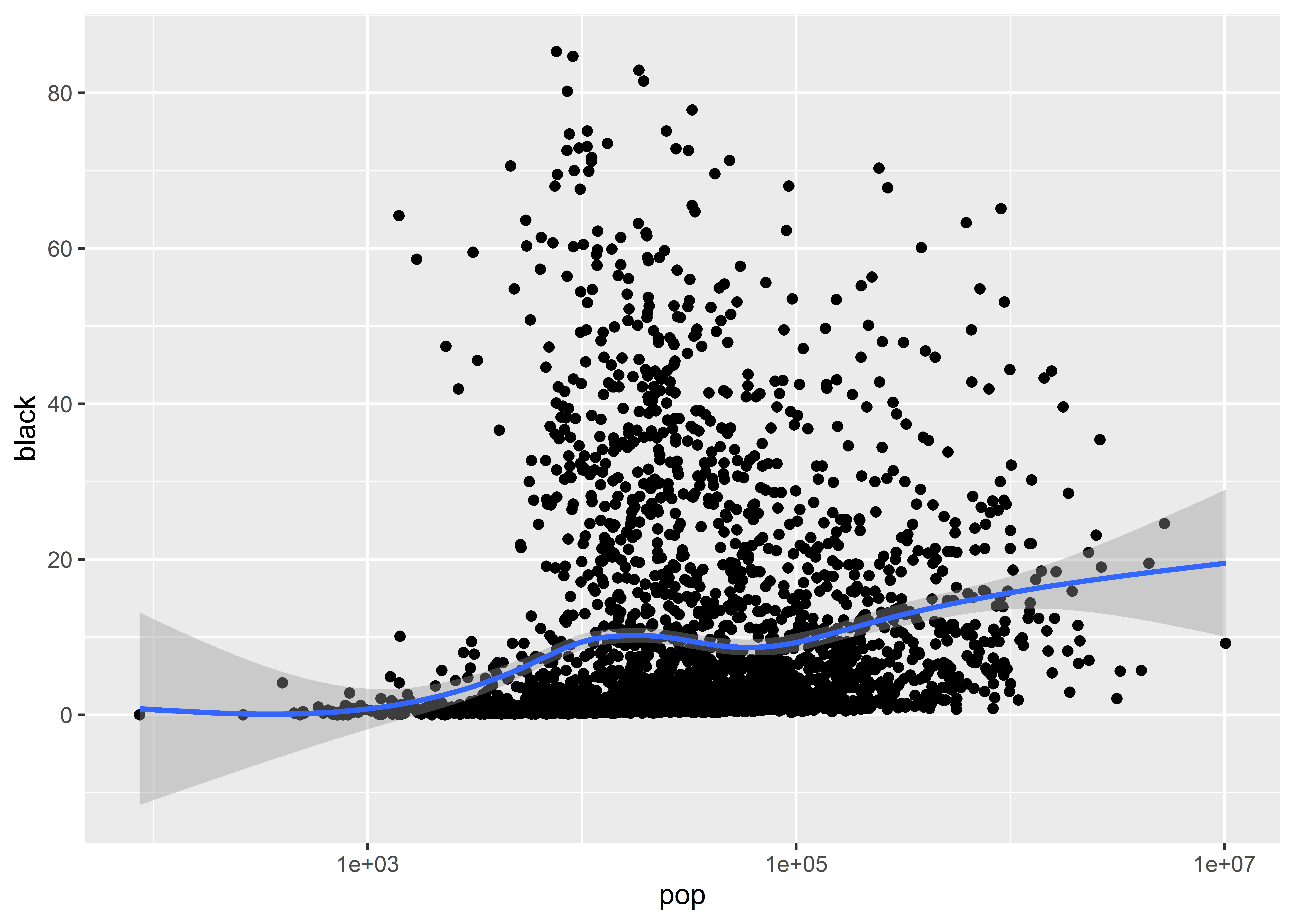
ggplot(Data) +aes(x = pop, y = black) +geom_point() +scale_x_log10()
That looks much better! The problem with using a line plot to show the relationship between population and the share of the population that is black is that it creates the perception that the data points are related. The official term for this inference is connection, and it follows from a simple fact of human cognition: when things are visually tied or connected to each other, they are automatically interpreted as being related. Don’t forget that a good data visualization is defined in reference to its goal. In this case, our goal is to show how the share of a population that is black is correlated with the overall county population size. We do not want to also convey the idea that one county is related to another.
Other geoms are consistent with our goal as well. We might add a smoother geom to show how the average of our variable in the y-axis changes given the variable on our x-axis.
ggplot(Data) +aes(x = pop, y = black) +geom_point() +geom_smooth() +scale_x_log10()
5.4 Grouping geometry
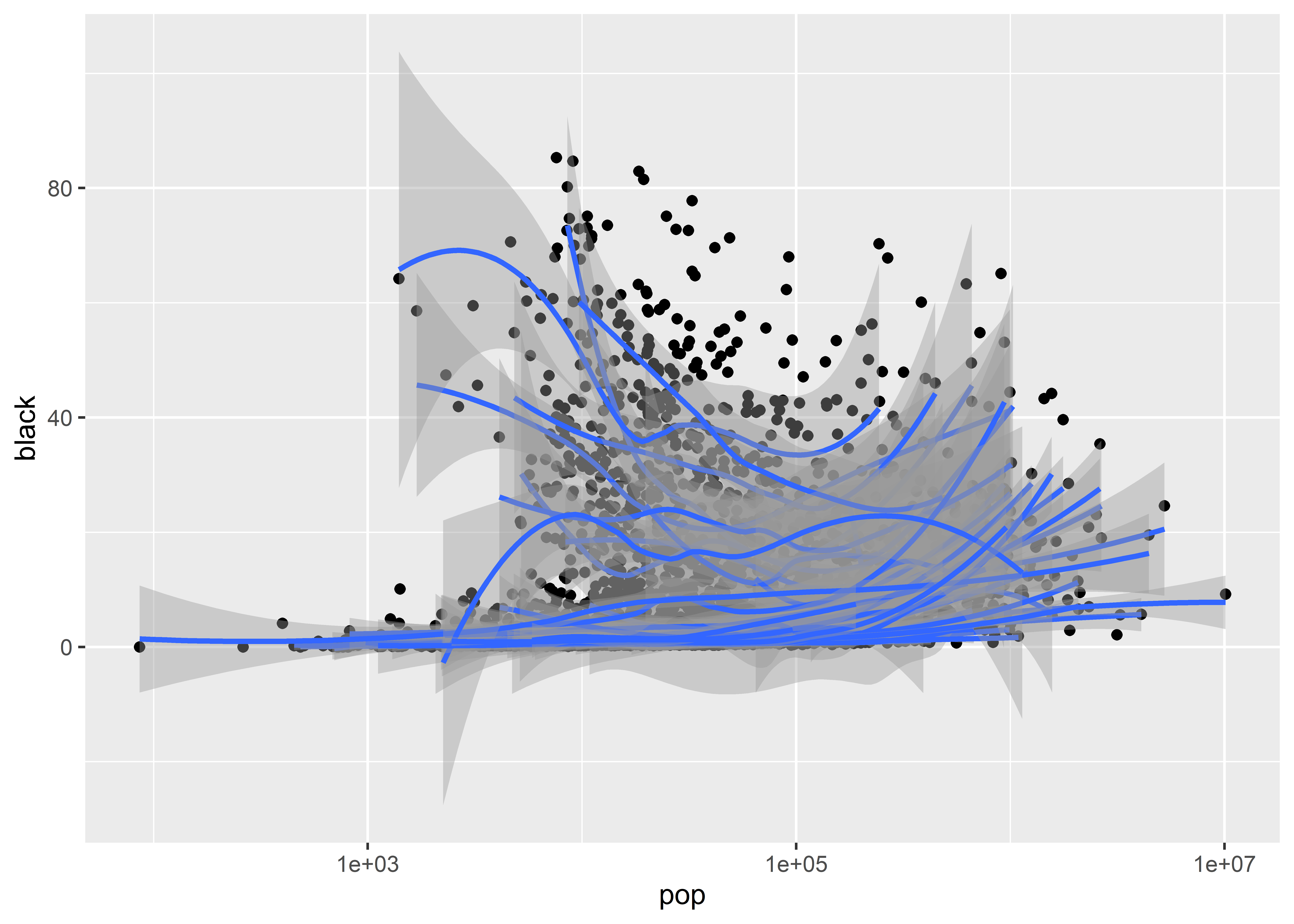
There are a lot of points in this data and there’s a lot of noise, too. We might wonder how reliable the overall sample trend is. For instance, we might wonder whether it makes sense to show the relationship between population size and the share of a county that’s black all together or broken down by groups. Counties are organized into states and states are organized into regions, and maybe the trend in one state or region is different than in another. As it turns out, we can easily group our geoms by certain categories when we plot them.
The way we’ve done this before is to map an aesthetic, like color, to a particular category. We can do this with our data, but there’s one possible problem: there are 50 states! If we map color to state how will we even make sense of the plot, let alone have a legend that will fit in our figure?
Thankfully we have another option for mapping aesthetics: grouping. Rather than map a color or something like that to state, we can just tell ggplot to draw a different smoothed trend per state but not to add different colors or a legend. We do this with the group command inside of aes(). Let’s try it out and see how it looks. Notice that in the below code I map the group aesthetic to state locally inside geom_smooth().
What do you think? It’s a little hard to look at. Maybe it would be better if we got rid of the confidence intervals, which we can do by setting se = F. We’ll also make the lines a little thinner using the size option and add some transparency using alpha. Now, pay attention here, to update the transparency we need to use a different geom than geom_smooth(). The reason is that its alpha command applies for the confidence intervals it produces rather than the smoothed regression lines. Instead, we need to use geom_line(). Now, I know what you’re thinking: geom_line() connected all the data points to each other in a previous example and it looked terrible! That’s right, but it turns out that you can tell geom_line() to draw different kinds of lines by using its stat option. In this case, we can use stat = "smooth" to tell geom_line() to act like geom_smooth(). Check it out:
That’s better, but we don’t have a finished product yet. We have black lines on black points, so it’s really hard to see what’s going on. It might also be useful to see an average overall trend along with state-level trends. Let’s try again with a few extra flourishes:
Still not great, but getting better. We can clearly see that the overall trend is positive but that it doesn’t always hold up at the state level. In some states the relationship is actually negative and strongly so.
5.5 Small multiples
In addition to grouping geoms by categories, we can also create multiple panels that show relationships by different groups. This might be another useful approach to incorporate as we visualize the relationship between population size and the share of the county that is black.
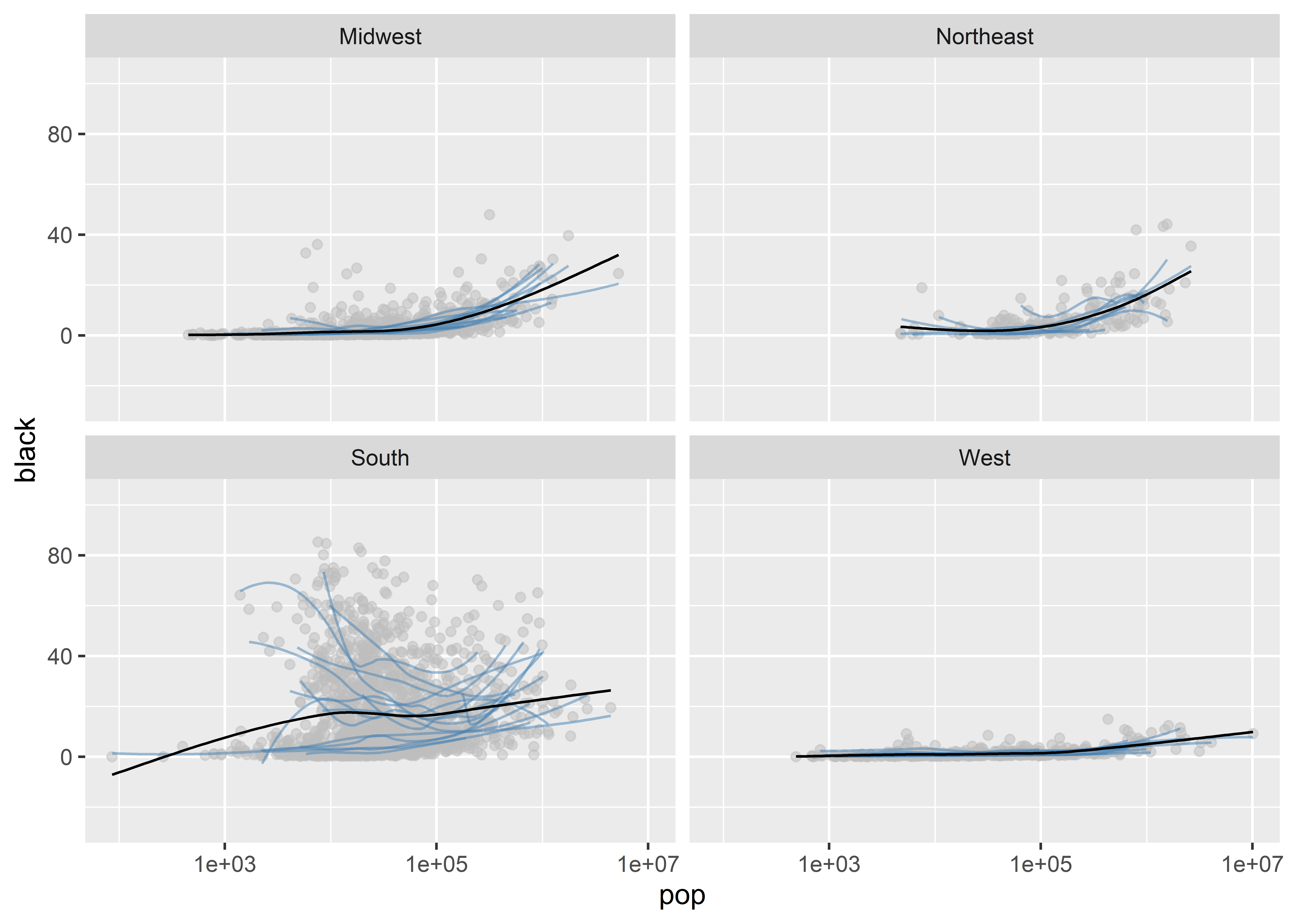
Enter facet_wrap(). This function lets us facet our data by a variable (or multiple variables). The result is what’s called a small multiple plot.
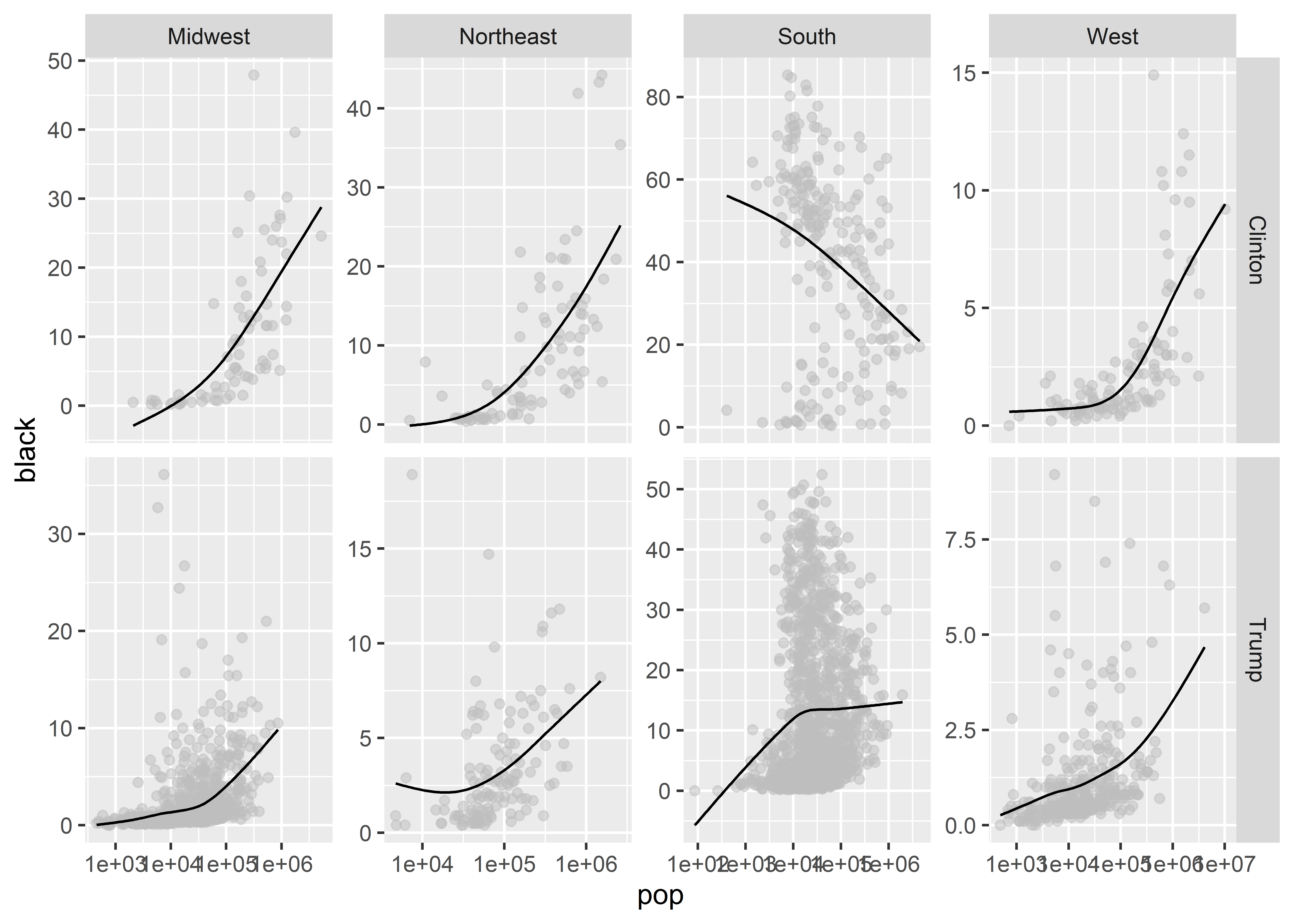
Let’s see what this looks like by using the variable called census_region. This column in our data has four values indicating whether a state is in the Northeast, Midwest, South, or West.
How does that look? What facet_wrap() has done is tell ggplot to make four different sub-plots, one for each census region in the data. We used the phrase ~ census_region inside the function to give it instructions to facet by the values in the census_region column in the data.
This way of splitting up the data helps us to see a number of things. For example, the South is really weird. Just about everywhere else, as county population goes up, so does the share of the population that’s black. But in the South the relationship goes in the opposite direction in several states.
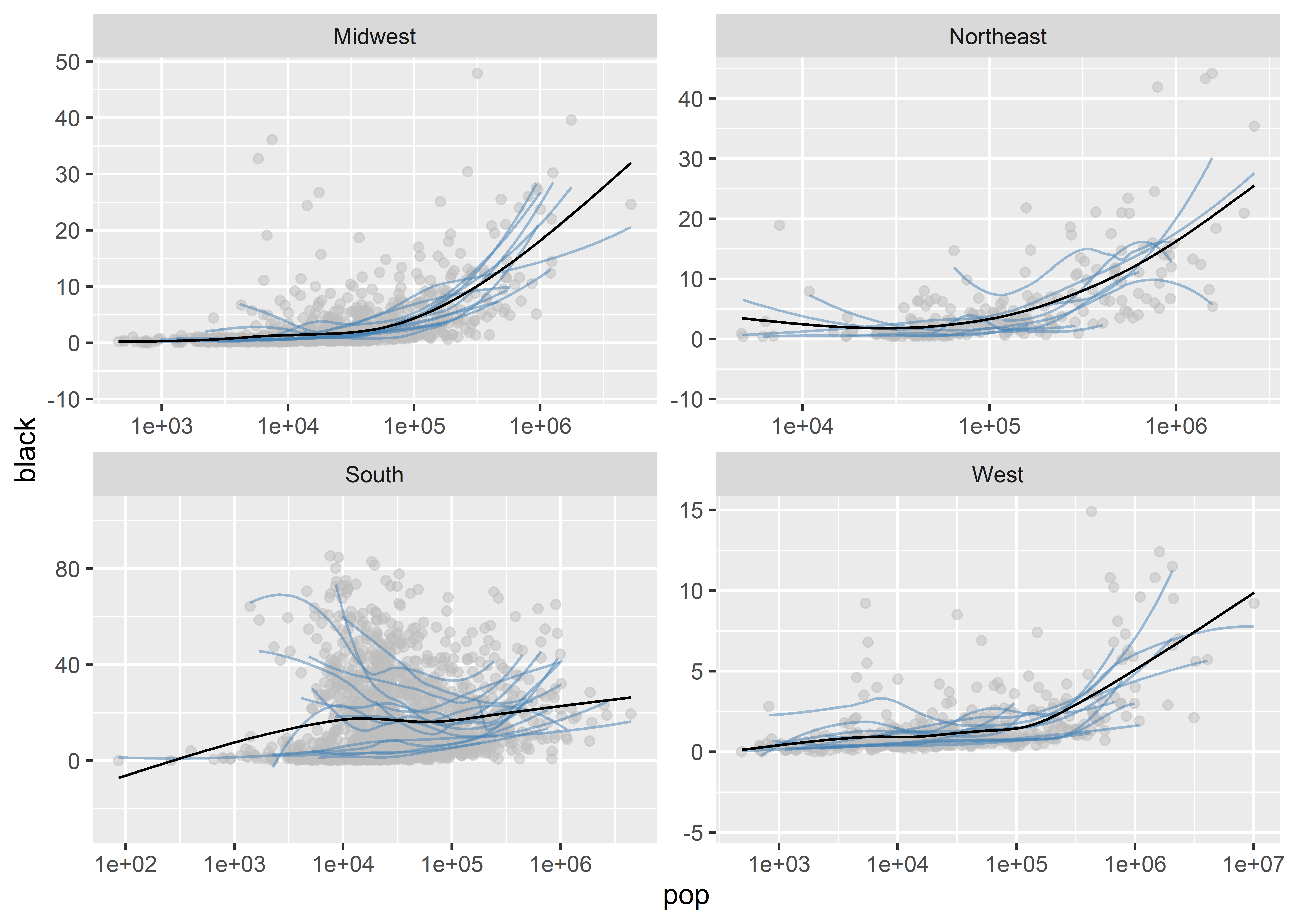
We can add a few different customizations to our faceted plot. We might, for instance, want to give ggplot the freedom to fit the range of values shown in the different sub-plots to the data in a given region. Right now, it uses a range for the x-axis and y-axis that works for the lowest and highest values for the whole data. We can tell it scales = "free" to change this:
We can also use facet_grid() similarly to facet_wrap(). This function let’s you easily facet by multiple categories at once.
There’s actually a very helpful version of facet_grid() that we can access by installing and then loading the {ggh4x} package:
install.packages("ggh4x")
The function we want to use is called facet_grid2(). What I like about this function is that it permits freeing up the axis scales, just like with facet_wrap(), which is an option that the original facet_grid() doesn’t allow.
Using this function, let’s facet both by census region and whether or not the majority of people in a county voted for Trump or Clinton in the 2016 US Presidential election. As we do so, we’ll drop the state-level smoothed regression lines to better highlight the overall trend by region and election outcome.
Breaking the data up like this, the South continues to look weird. In particular, counties in the South that voted disproportionately in favor of Clinton in 2016 are the weirdest. Why do you think this would be? It turns out that this pattern in the data is a product of the historical legacy of slavery in the South. In Southern Democratic strongholds, the black population tends to be more concentrated in rural areas where slave labor was highly concentrated in the agricultural sector. To this day, the ancestors of these slaves are still concentrated in these areas. This goes to show that even the distant past influences modern demography.
5.6 Transforming data with geoms
Beyond giving us the ability to break our data down into smaller subsets, we can use ggplot to transform data for us before it’s plotted. We’ve already done something like this when using scale_x_log10(). This transforms the x variable to the log-10 scale. Some geoms do more than just transform the scale of data; they let us generate summaries. We’ve used a function already that does just this. It’s called geom_bar(). Here’s an example of geom_bar() at work with the census_region column in our data:
ggplot(Data) +aes(x = census_region) +geom_bar()
Recall that this function returns a count of the number of observations in the data by whatever x variable we give it. It then uses this count as the y variable. In this case, geom_bar() reports the number of counties by region.
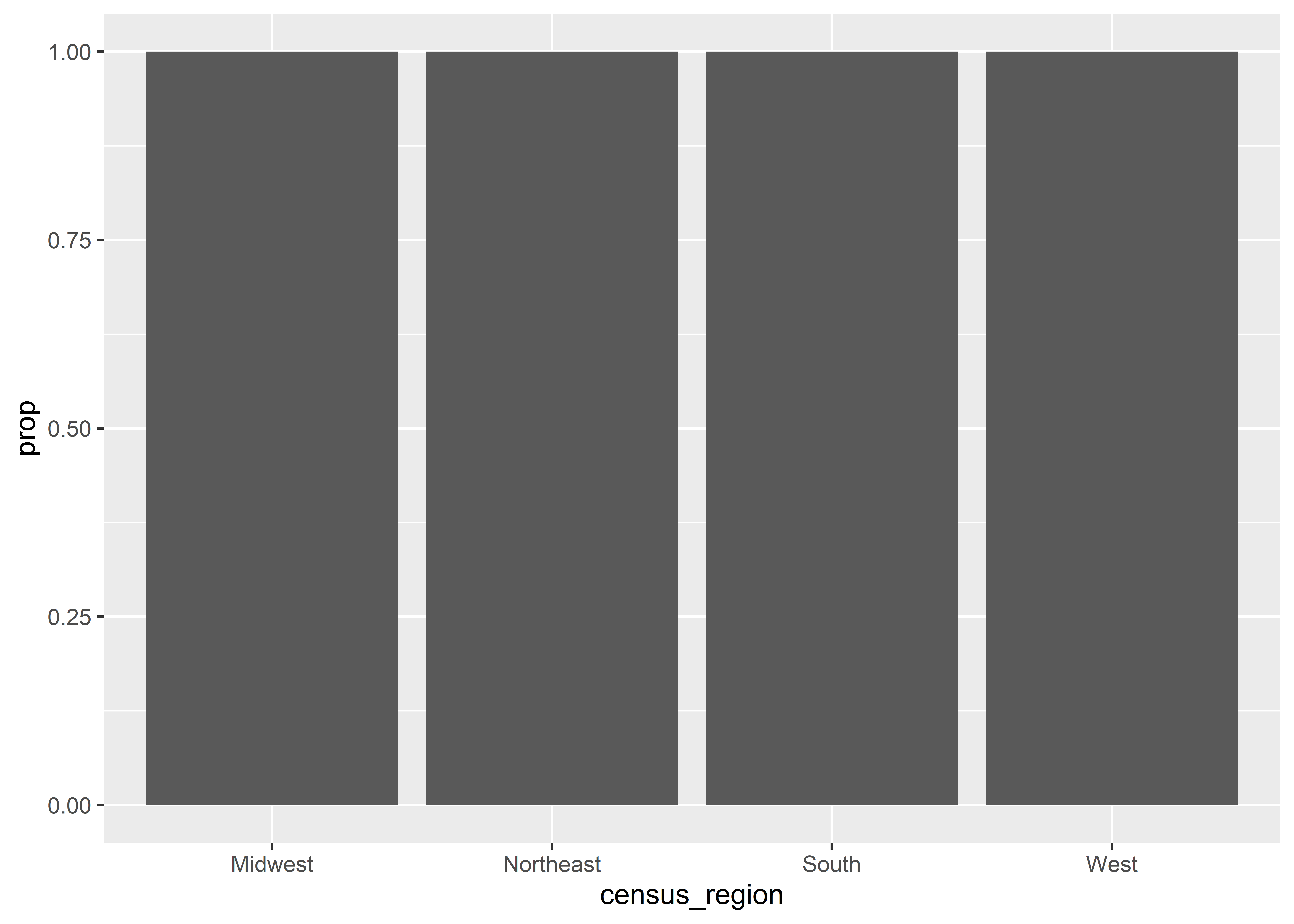
When working with geoms like geom_bar(), we can give it extra instructions for how to summarize the data. For example, say we wanted proportions rather than counts. Inside of geom_bar() we can specify aes(y = ..prop..) to tell the function to give us proportions rather than counts. Here’s what that looks like:
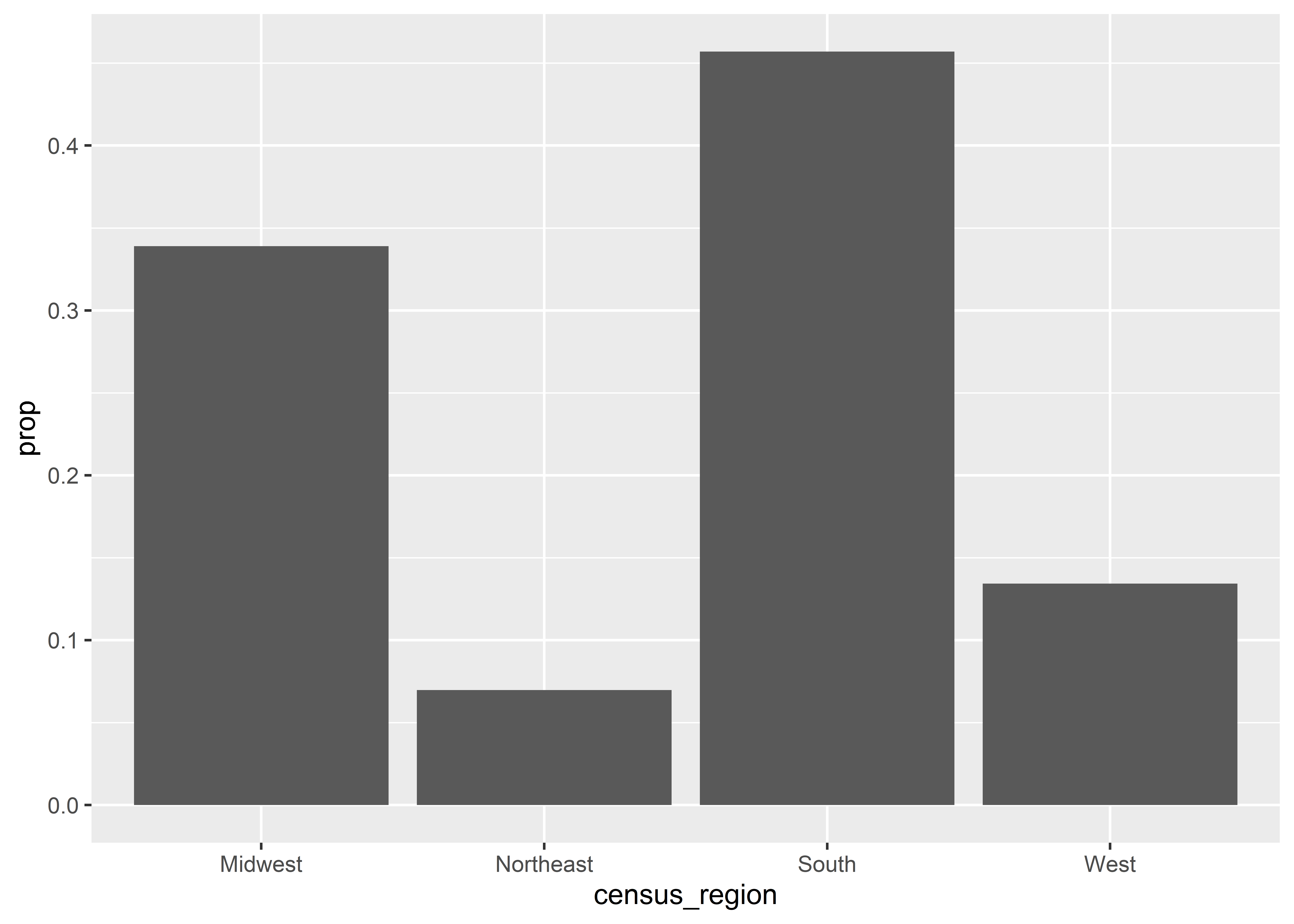
Oops! We forgot to do something. By default, geom_bar() takes a proportion by each x variable category. What happens when you take a number then divide by that number? You get 1 of course. We need to be more explicit with geom_bar() about how it should compute proportions. Specifically, we need to trick it into making the denominator for county counts the sum total of counties in the data. We can do this by mapping the group aesthetic to a single constant. In the below code, I use group = 1, but I could also use group = 1.3333334567 or group = "lemon" and get the same result.
ggplot(Data) +aes(x = census_region) +geom_bar(aes(y = ..prop.., group =1))
By adding group = 1 we’ve hacked geom_bar() into grouping the data by a variable where each value is the same (in this case, 1). This makes the function return a proportion where the count per region is divided by the total count since all regions are in our new group.
Say we also were feeling artistic and wanted to add some color to the above plot. We could map colors to regions, but remember what we talked about in the first week of class about redundancy. Ggplot is going to produce a legend for our colors. That’s just silly, since the legend labels are going to be identical to our x-axis labels.
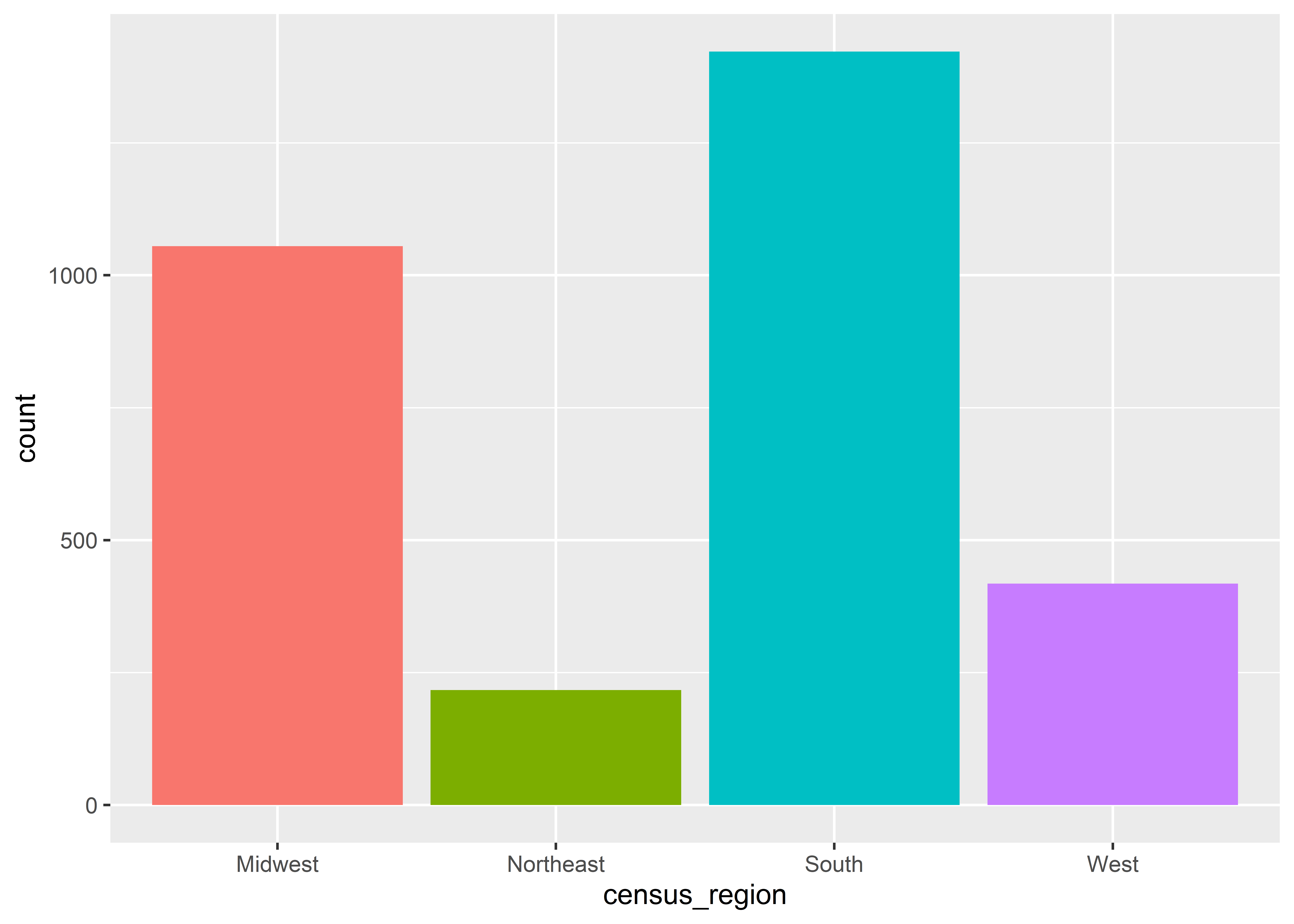
We can fix that with an option called show.legend = F inside of geom_bar(). Here’s what this looks like for counts:
ggplot(Data) +aes(x = census_region, fill = census_region) +geom_bar(show.legend = F)
We’ll introduce some new functions later on that let us do many of these transformations and more before we even give the data to ggplot. In my opinion, writing some code to prep the data before giving it to ggplot is better, but it’s worthwhile to know that you can do some transformations of your data under the hood with ggplot, too. Nonetheless, this approach can become convoluted quickly. Let me show you what I mean.
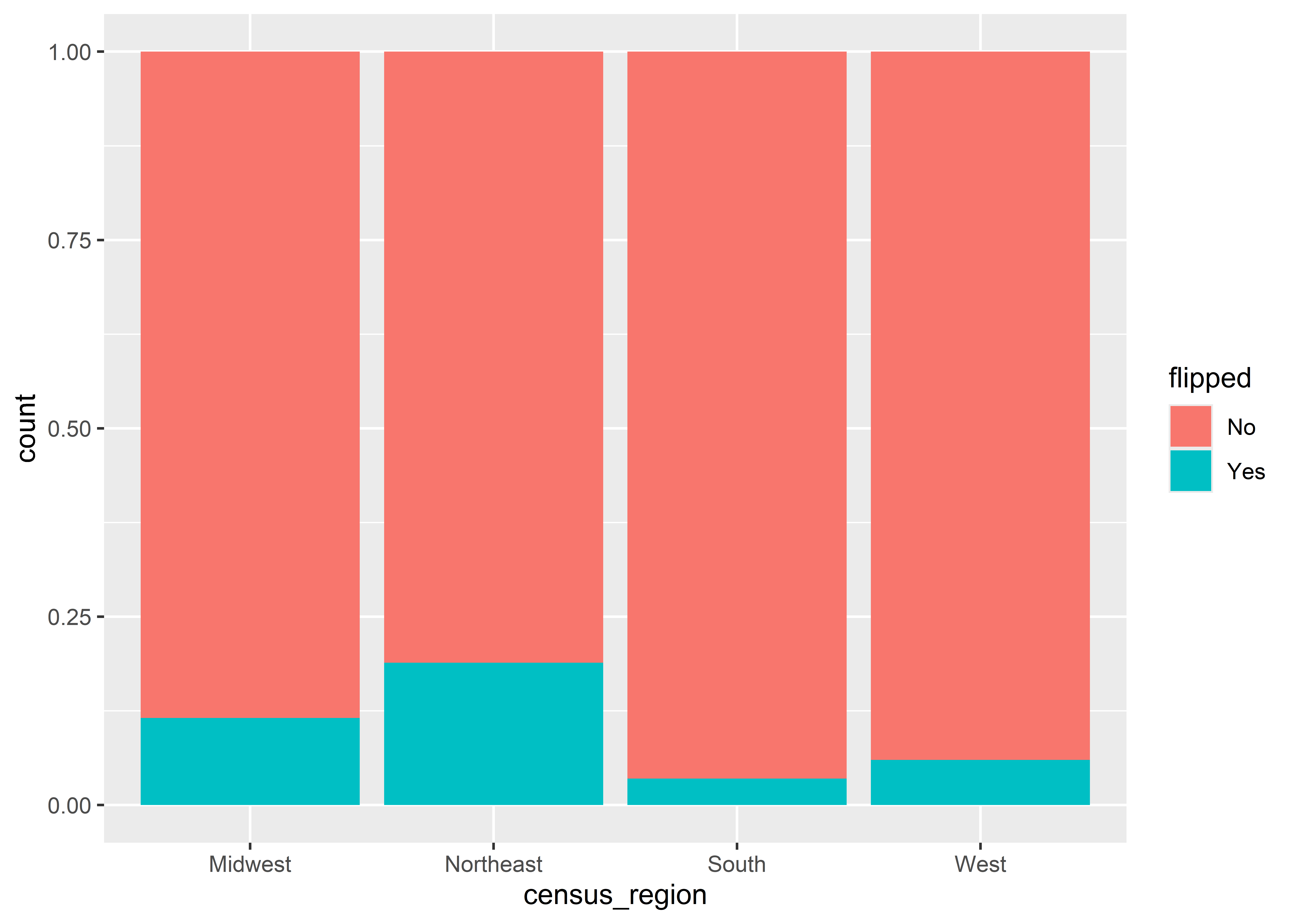
Take the below code which produces a bar chart where the y-axis is proportions and the x-axis is census regions. Recall that when we wanted to show proportions we needed to use aes(y = ..prop..) inside the geom_bar() layer and also map the group aesthetic to a constant. The below code also shows proportions, but I didn’t have to use ..prop.. anywhere in the code. Instead, I specified fill = flipped which maps the fill aesthetic to the column called fillped in the data which indicates whether a county flipped parties between the 2012 and 2016 Presidential elections. Inside geom_bar() I’ve set the option position = "fill". The output consists of four columns that all sum to 1 per each census region and where the columns are filled in by the proportion of the time counties in a region either flipped parties or remained consistent between elections. I don’t know about you, but I’m not sure how to draw a clean line between this and what we did before to get proportions.
ggplot(Data) +aes(x = census_region, fill = flipped) +geom_bar(position ="fill")
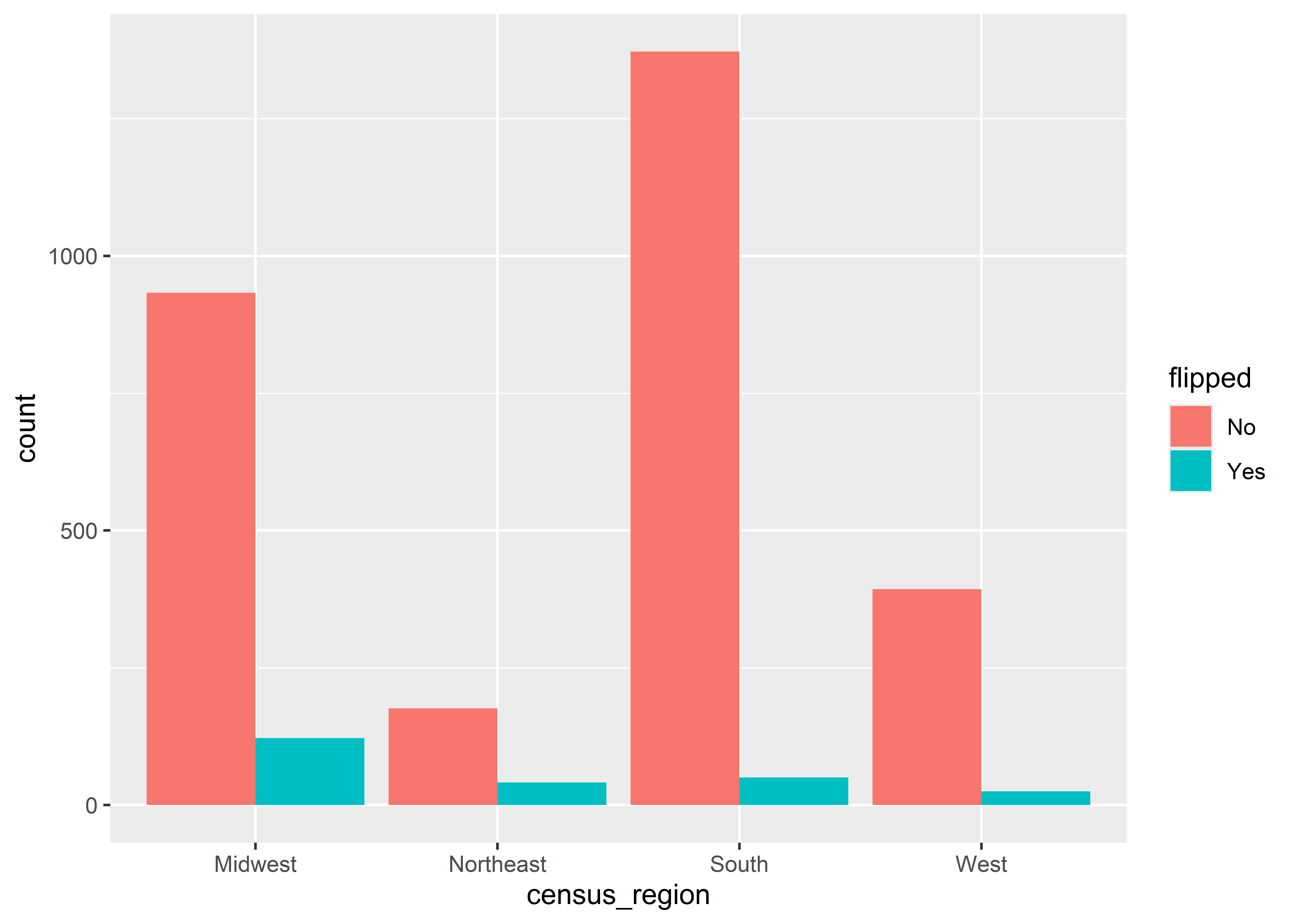
Things get even stranger if we wanted to put the proportions per census region side-by-side. The option to do this is position = "dodge", but look at what happens below. This one minor change leads ggplot to go from showing proportions to counts.
ggplot(Data) +aes(x = census_region, fill = flipped) +geom_bar(position ="dodge")
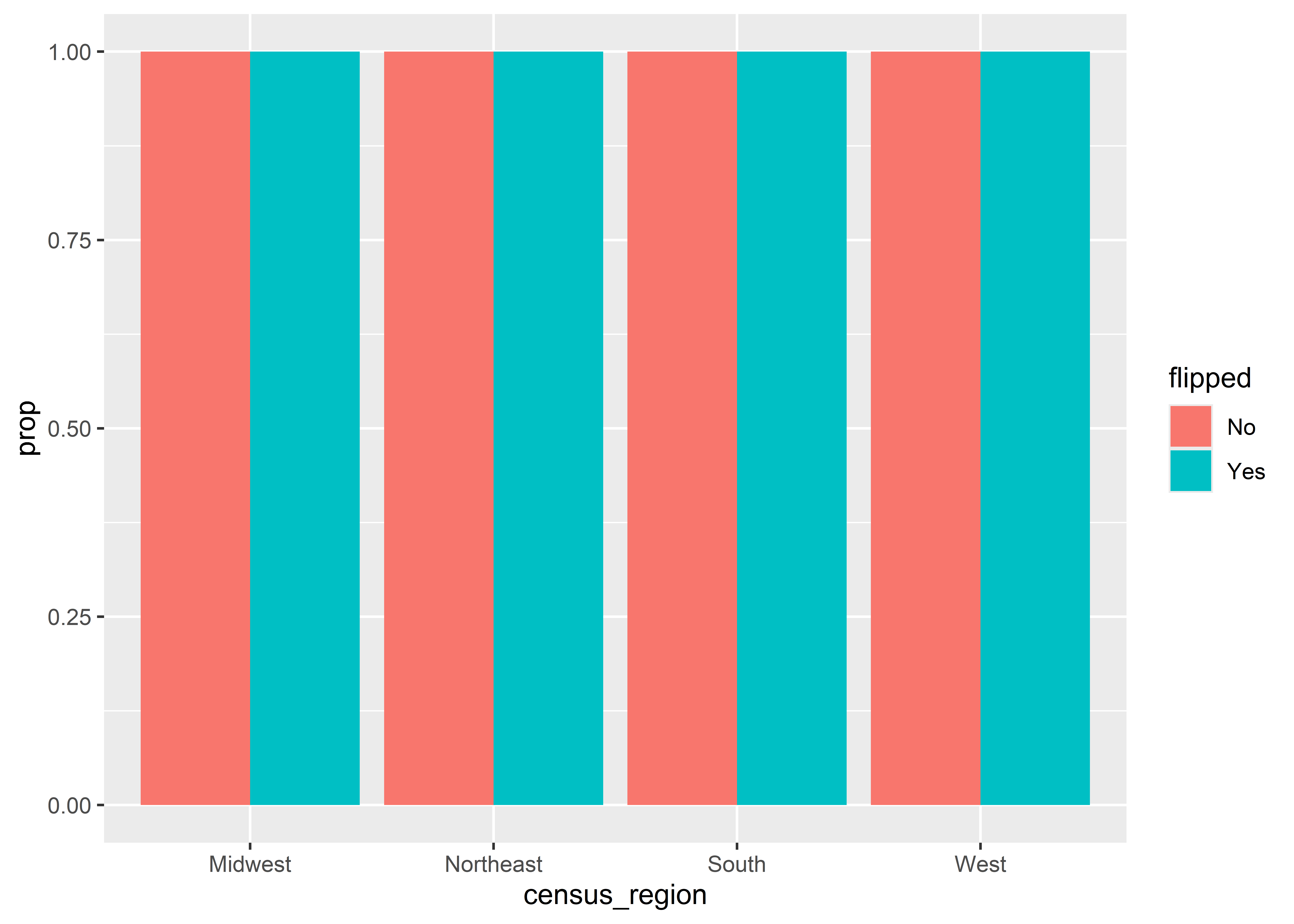
You now might be wondering if ..prop.. should come into play in this situation. The below code shows what happens, and, guess what, it doesn’t work! Now every column sums to 1!
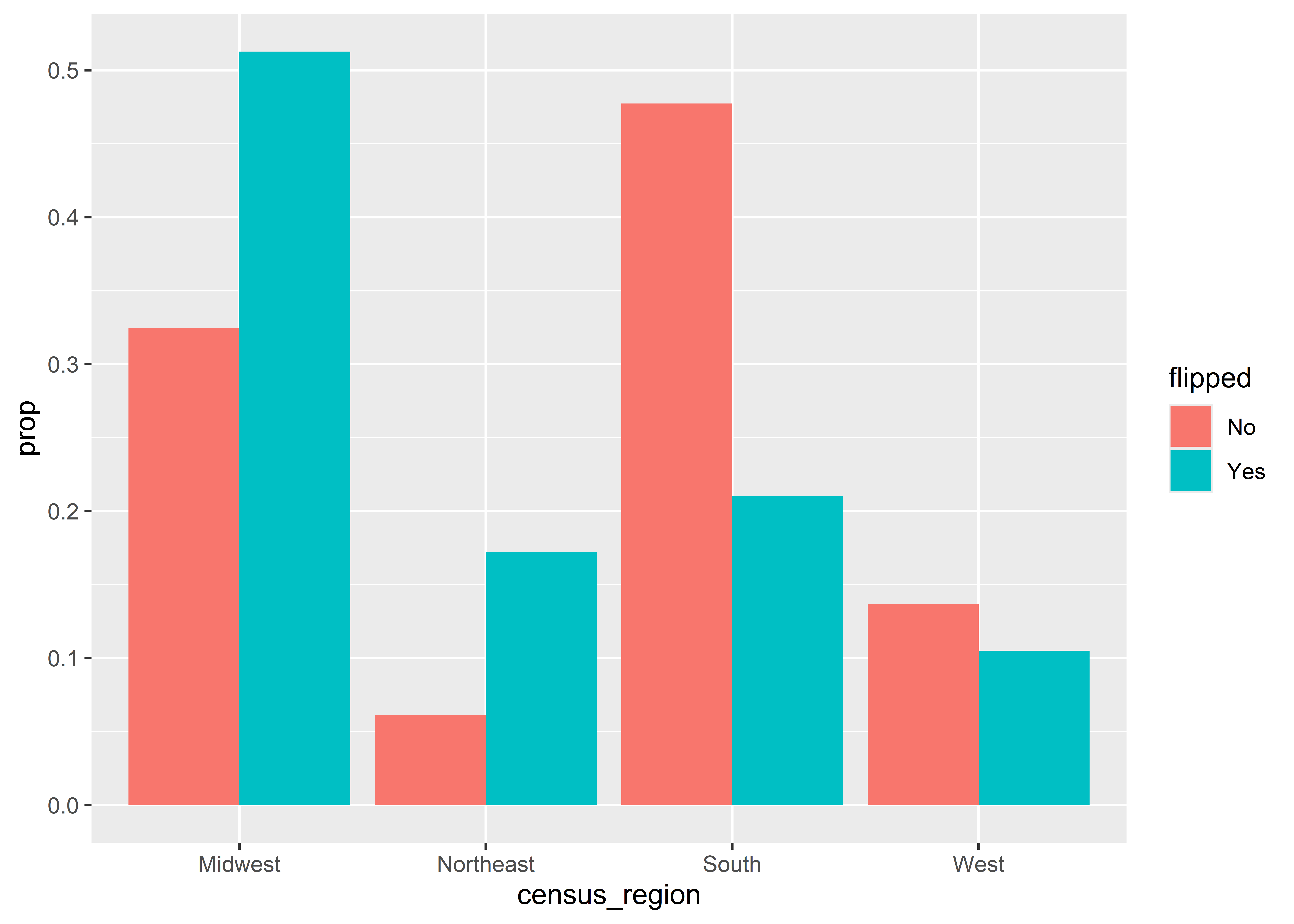
It turns out that we need to also map the group aesthetic to flipped. Here’s all the correct code:
ggplot(Data) +aes(x = census_region, fill = flipped) +geom_bar(aes(y = ..prop.., group = flipped),position ="dodge" )
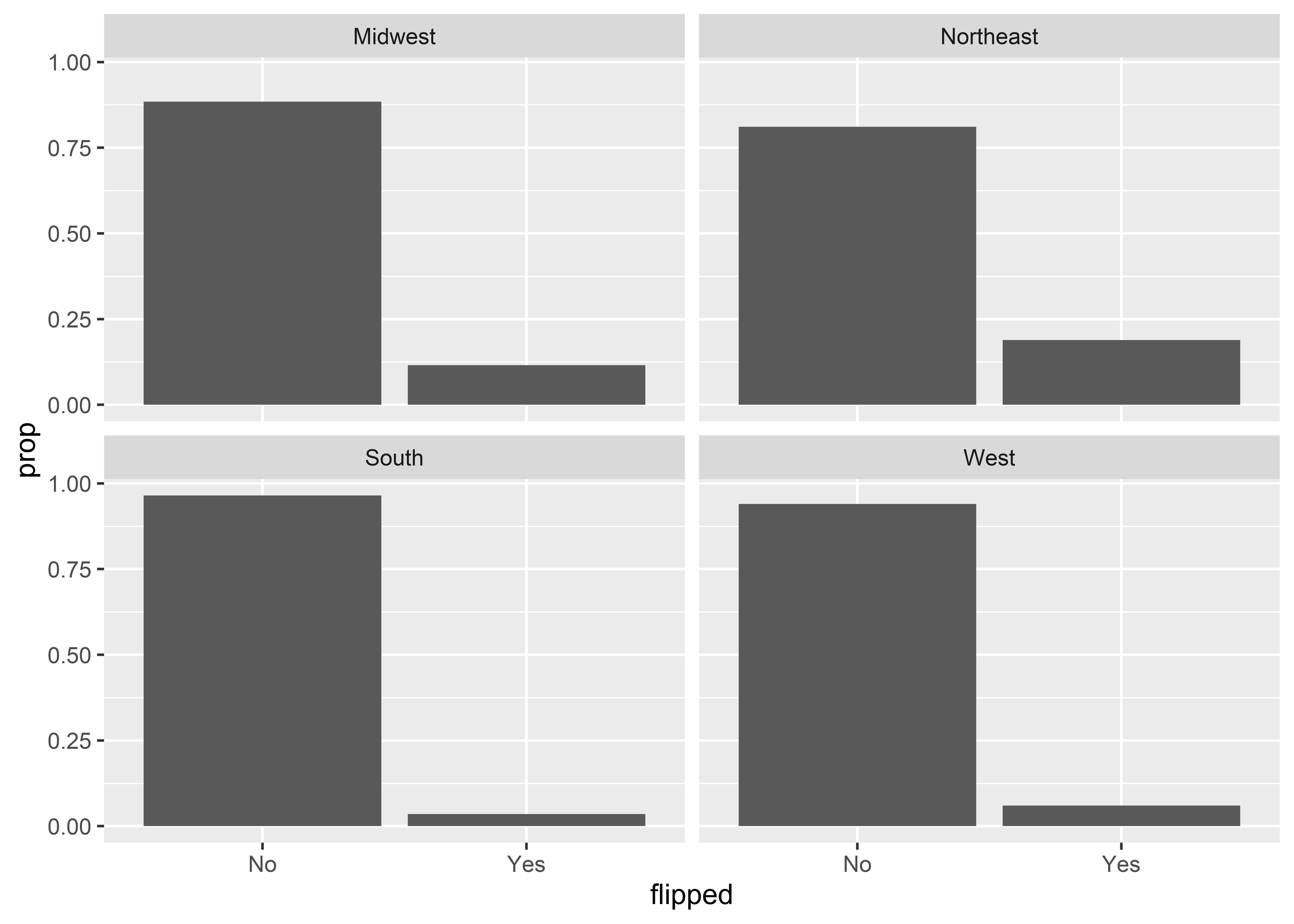
I certainly don’t like having to do two mappings for a single variable. A simpler solution is to facet by census region to avoid the need to map the fill aesthetic. Here’s what this looks like. We now have four faceted grids that have two columns each—one that shows the proportion of counties in a region that flipped and the other that shows the proportion of counties that didn’t.
The above is, in some ways, much better than using fill, and it provides a nice summary of the distribution of flipped counties across different regions in the U.S. It also makes it clear that proportions are based on region.
5.7 What you count matters
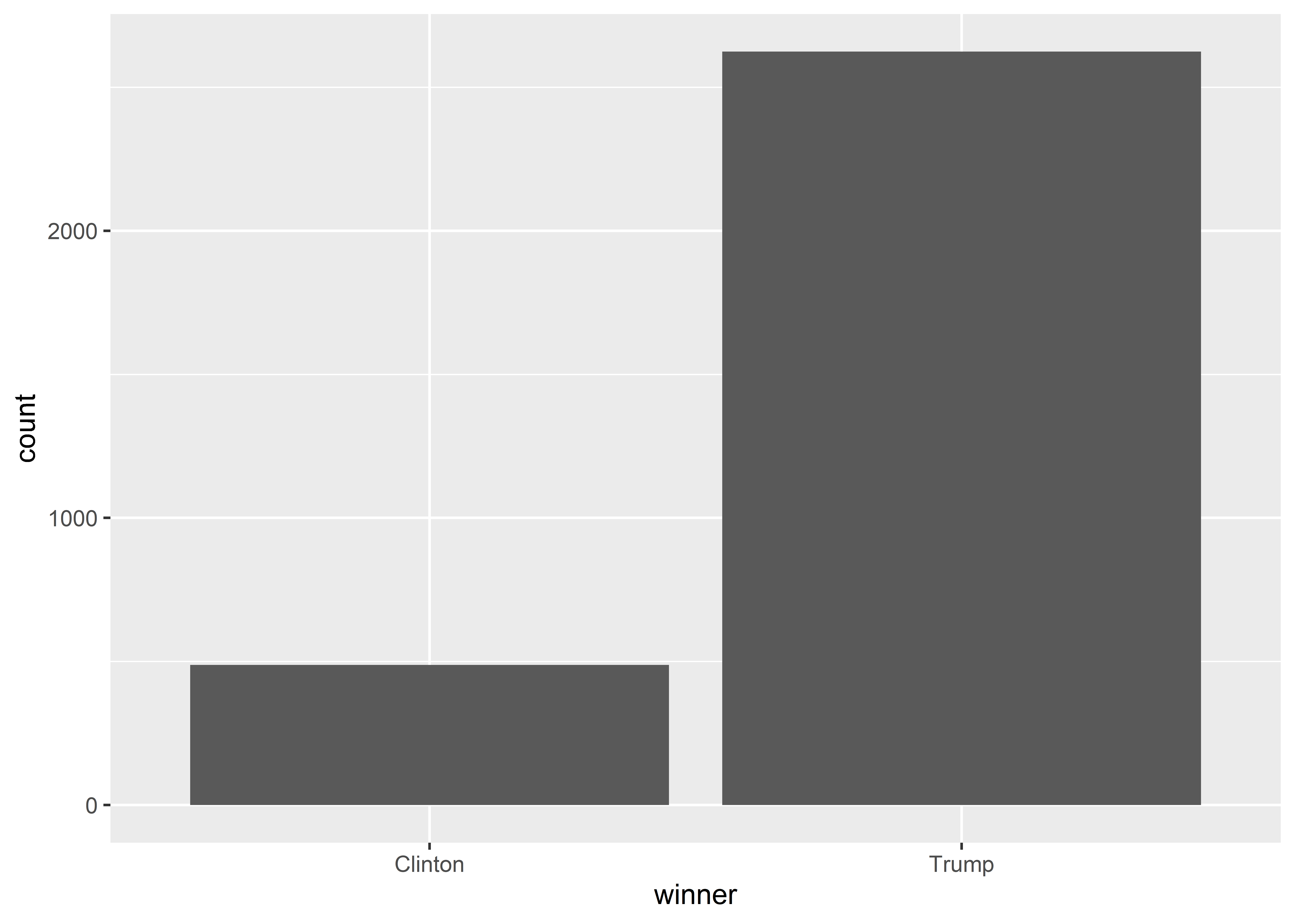
Not only do you need to be careful when using geoms to summarize data prior to plotting to ensure the reported numbers are actually the correct numbers, but also you need to be careful that even the correct numbers are not misleading. Let me explain by way of a question. Did you know that Donald Trump won counties by a landslide in 2016? You’ve been led to believe that the 2016 race was close, but as Trump always liked to boast, the reality is that he did very, very well. Just check the bar plot I produced below which counts up the number of counties where the winner of the 2016 Presidential race in that county was Trump or else Clinton. The margin isn’t even close.
ggplot(Data) +aes(x = winner) +geom_bar()
So Trump was right all along, and here’s the data to show it, right? This is about the point when you should ask “yeah, but…didn’t Clinton win the popular vote in 2016?” “Didn’t Trump win solely on a technicality with the Electoral College?” “How could this data be right?”
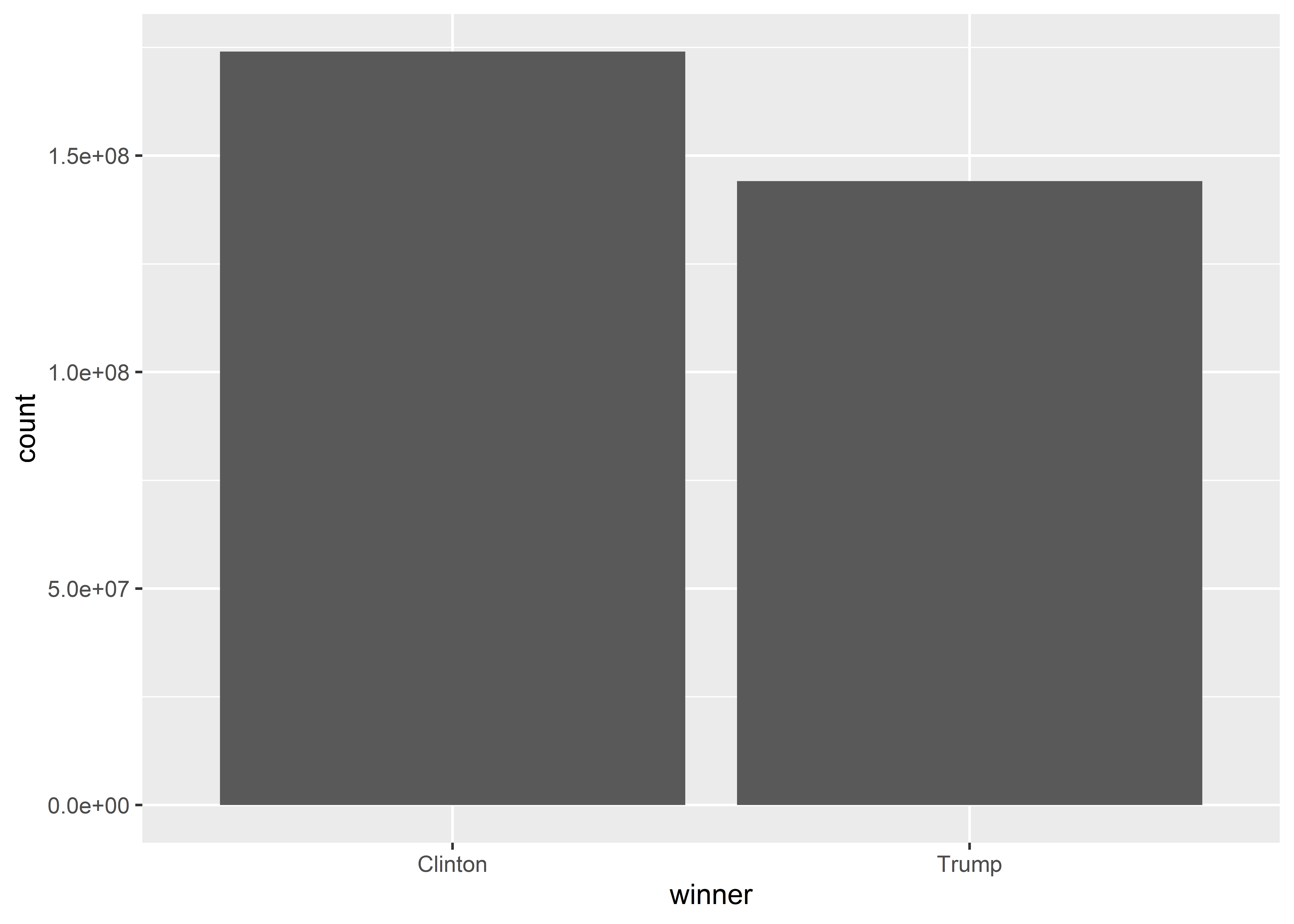
I don’t know if you know this, but counties don’t vote in elections; people do. Below is a much clearer depiction of how the election shook out in 2016. The code produces a bar plot like before, but this time I’m using an aesthetic called weight that I’ve mapped to county population (the pop column in the data). This modification forces geom_bar() to take each observation of a county that it sums up and multiply that individual county tally by its population. In short, I’m making geom_bar() sum up the populations of the counties where Trump was the winner and where Clinton was the winner rather than just the sum of the counties directly. Here, it’s much plainer to see that Trump may have won counties in 2016 by a landslide, but these counties add up to a smaller share of the population in the United States than the counties that Clinton won.
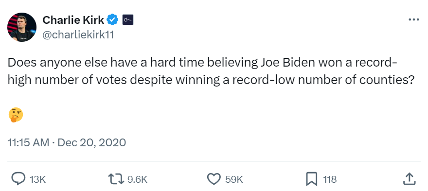
This is a cute example, and I don’t blame you if you want to accuse me of setting of a straw-man argument to easily demolish. However, it might surprise you to know that in the 2020 election, the point that Trump won a strong majority of counties was in fact lifted up by “stop the steal” advocates as evidence of foul play. Here’s a screenshot of a tweet by Charlie Kirk, a conservative radio talk show host, from December of 2020 where he implies the discrepancy between counties won and ballots cast in the 2020 election as evidence of wrong-doing:
That tweet was retweeted more than 9,000 times and liked by almost 60,000 people. Maybe this example doesn’t look so cute anymore. What you choose to count, counts.
5.8 Showing distributions
While bar plots provide a useful way to show the distribution of observations across discrete categories, we can use other geoms to summarize numerical variables, too.
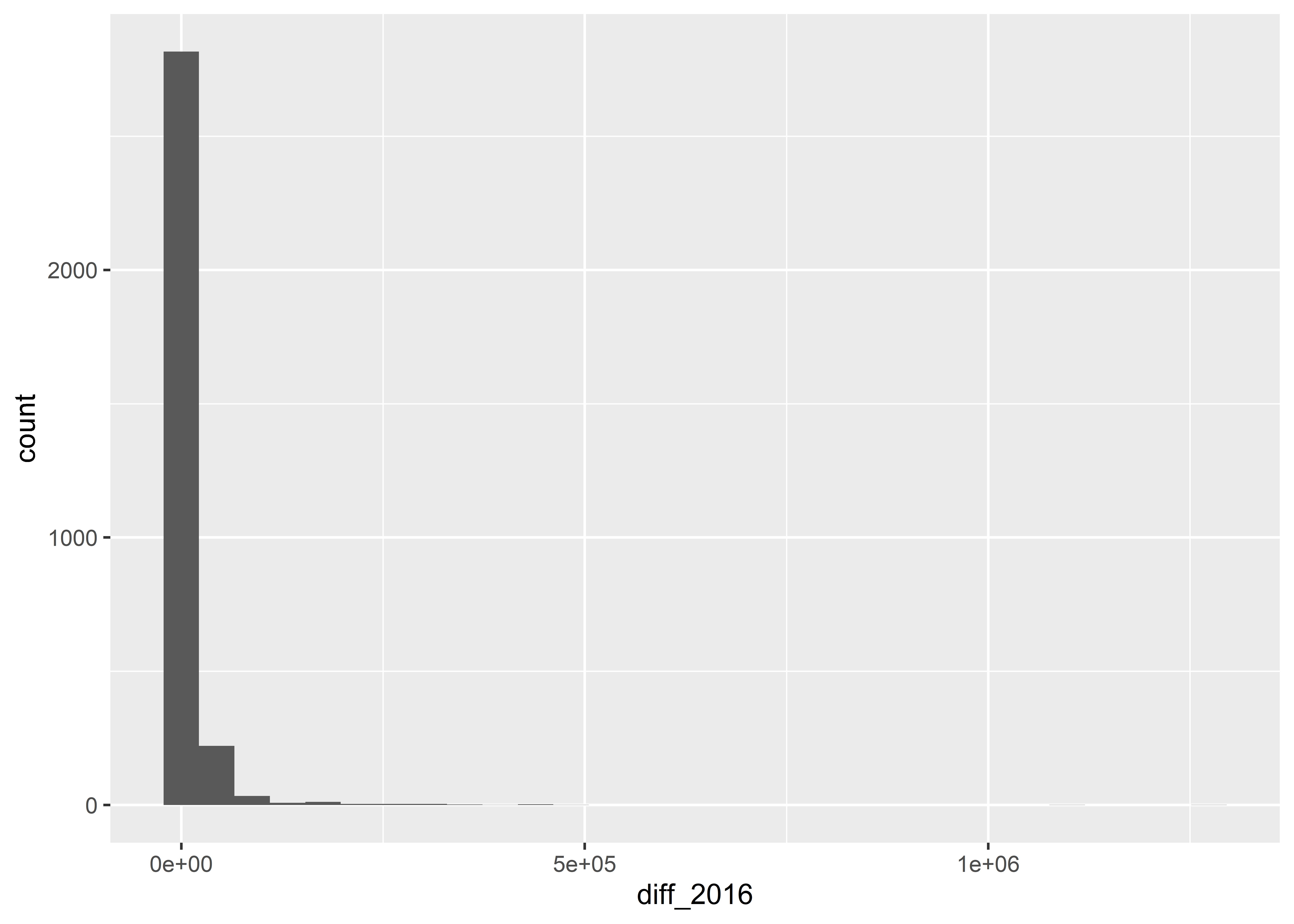
The below code produces a histogram, which is a kind of plot that lets you summarize the frequency that different values of a continuous or discrete numerical variable appear in your data. It works similarly to geom_bar() in that it minimally requires you to specify an x variable. Here, I’ve chosen to show the distribution of the variable diff_2016 which is the absolute difference in the total vote won by Clinton in 2016 versus that won by Trump.
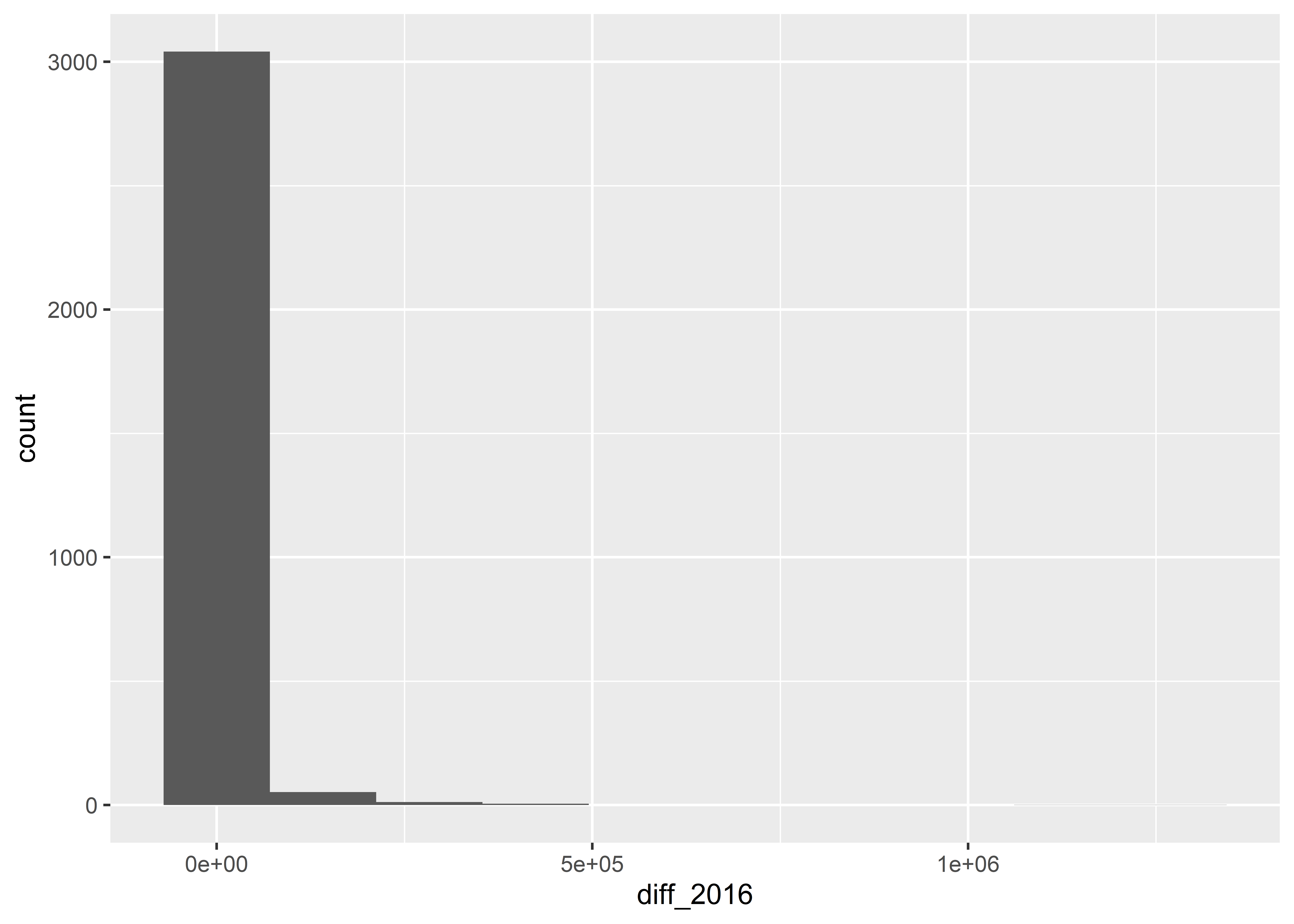
Histograms work by putting continuous variables into “bins” and then counting up the number of observations that fall into those bins. If we want, we can directly adjust the number of bins in a ggplot histogram. The below code sets bins = 10.
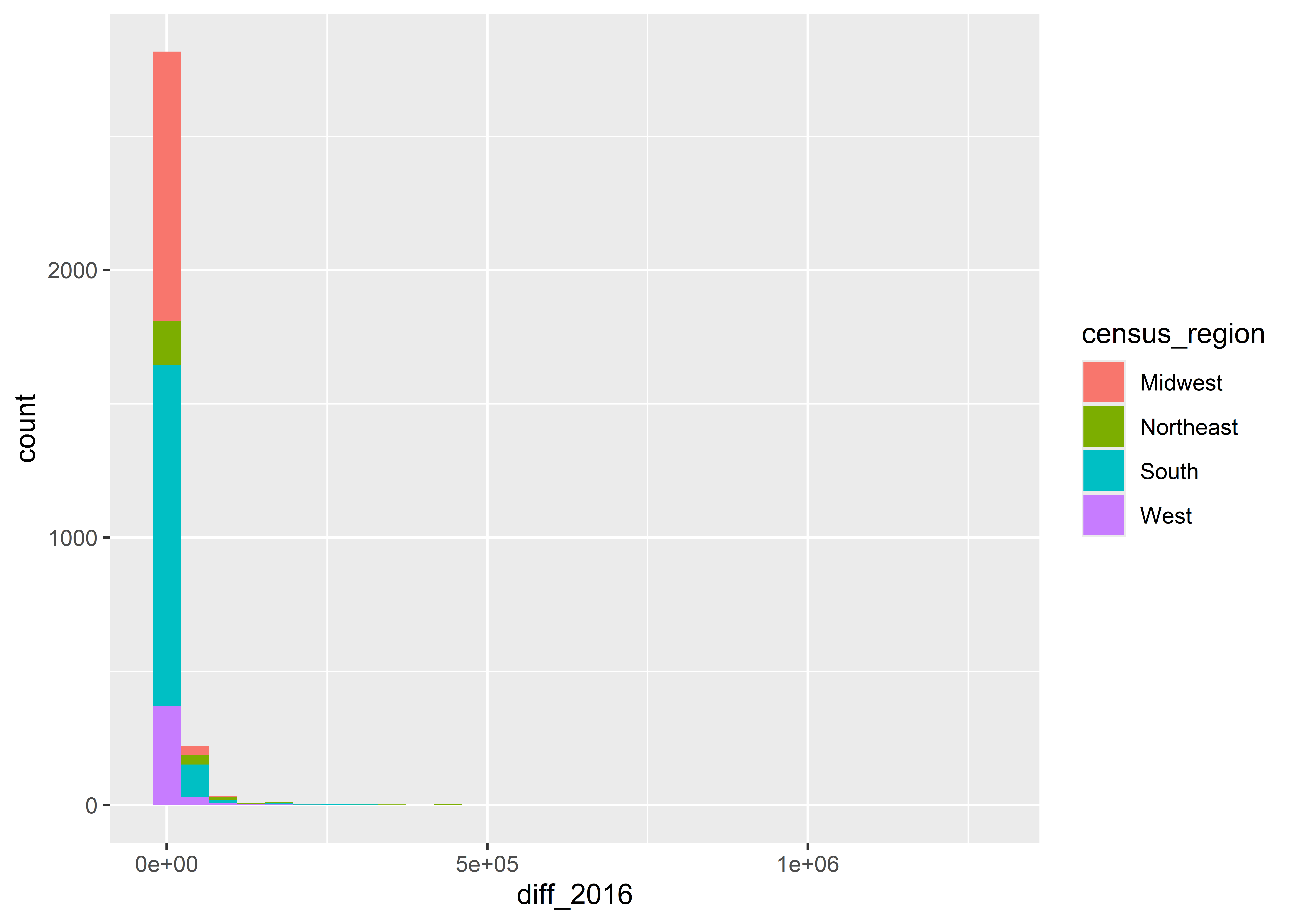
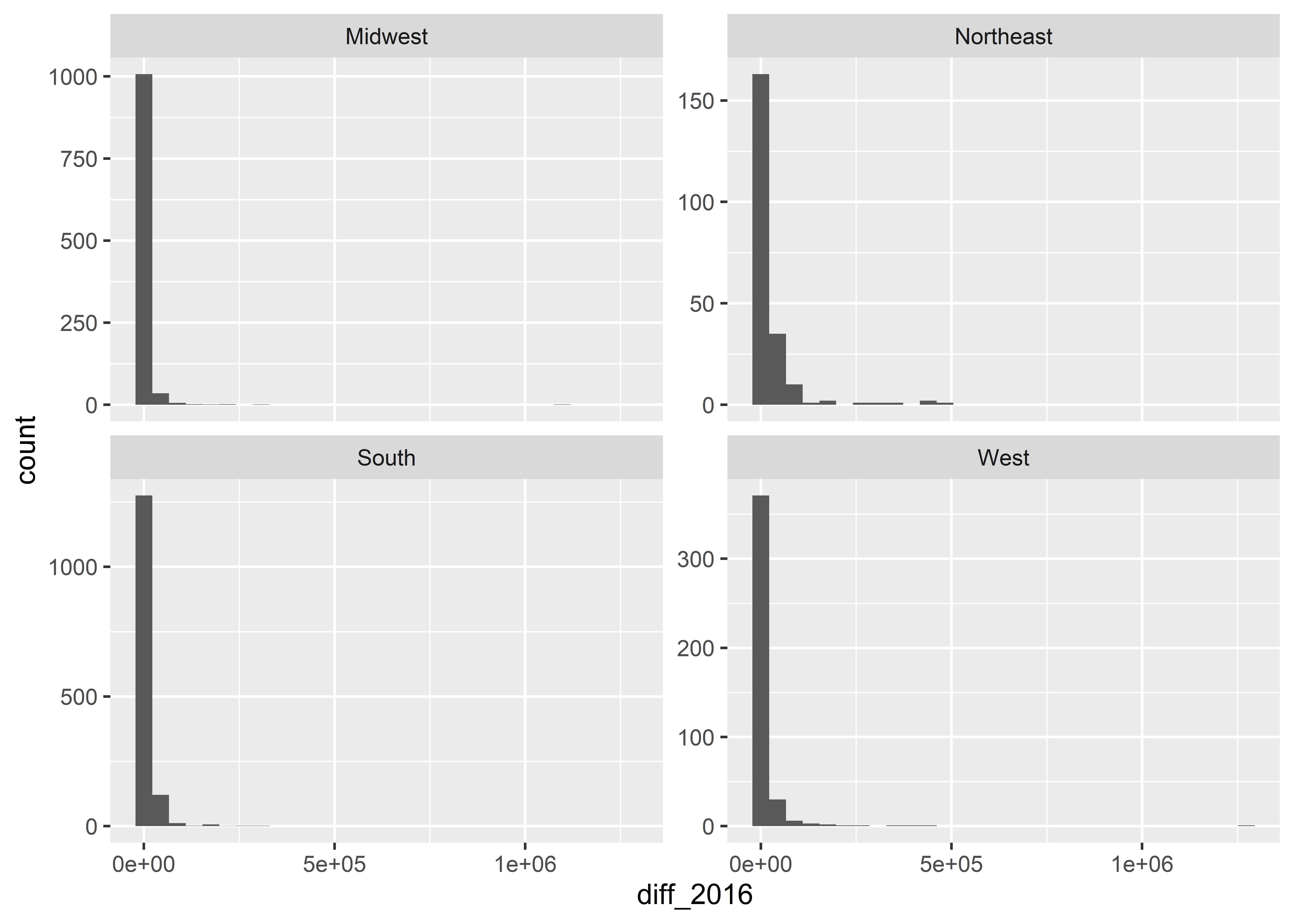
We can also group data to show its distribution by different categories. For example, we can show the vote difference by census regions, as in the below code:
ggplot(Data) +aes(x = diff_2016, fill = census_region) +geom_histogram()
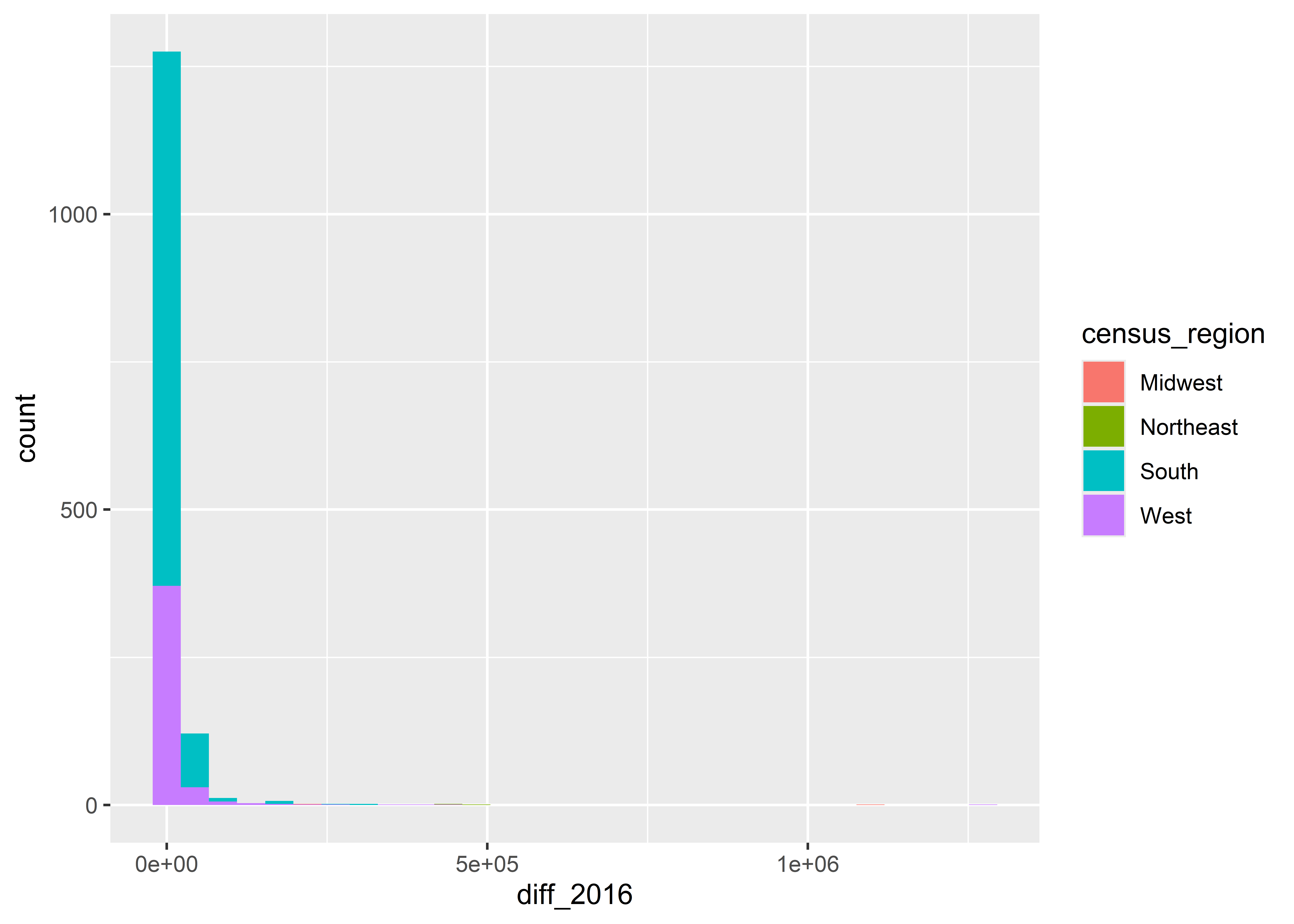
Notice that when we map fill to region that the counts are stacked on top of each other. If we don’t want them stacked we can tell ggplot to instead plot by “identity”. Of course, when we do, we have another a problem. Some of the counts overlap others, so we can’t see the distribution for all regions.
ggplot(Data) +aes(x = diff_2016, fill = census_region) +geom_histogram(position ="identity" )
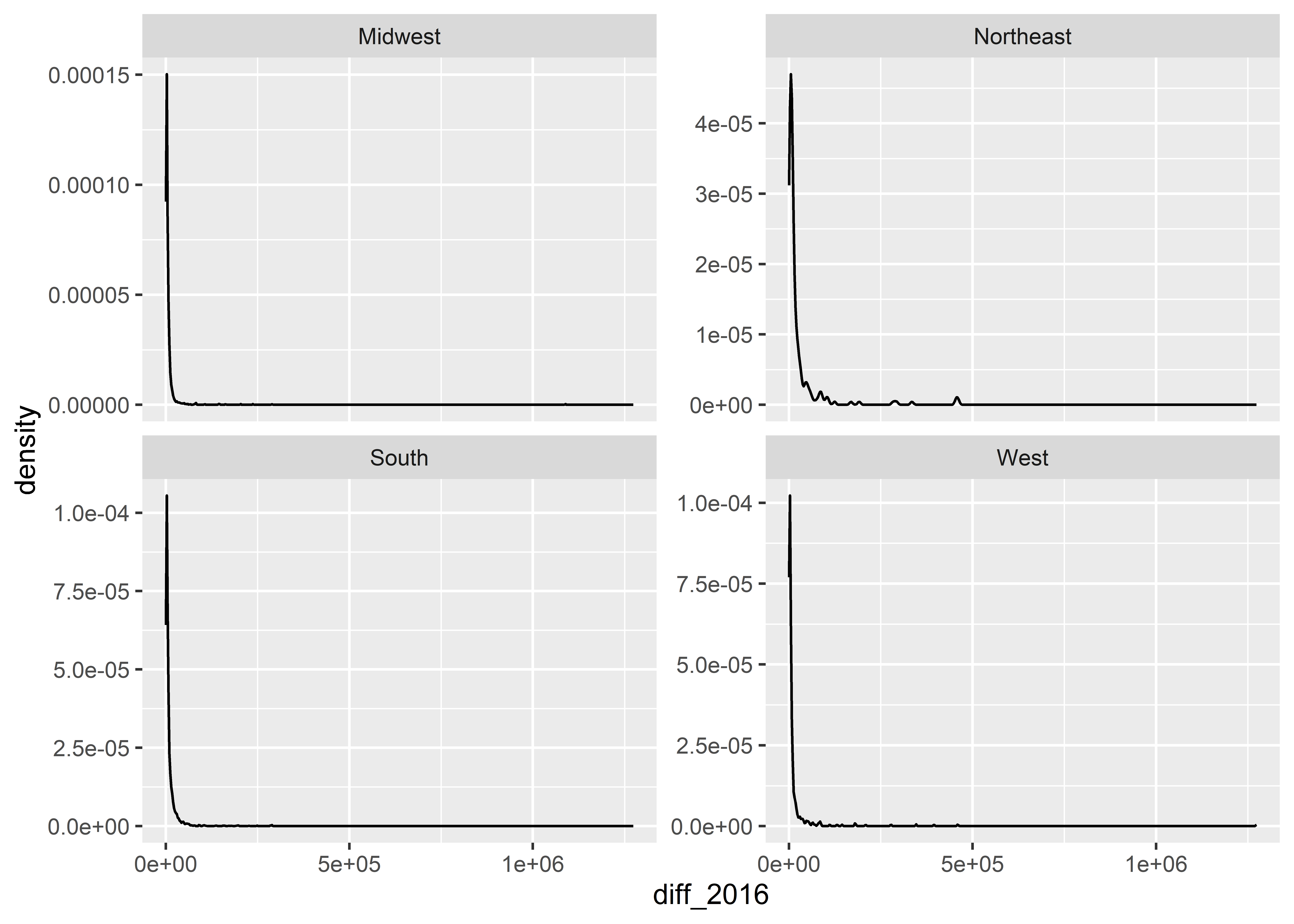
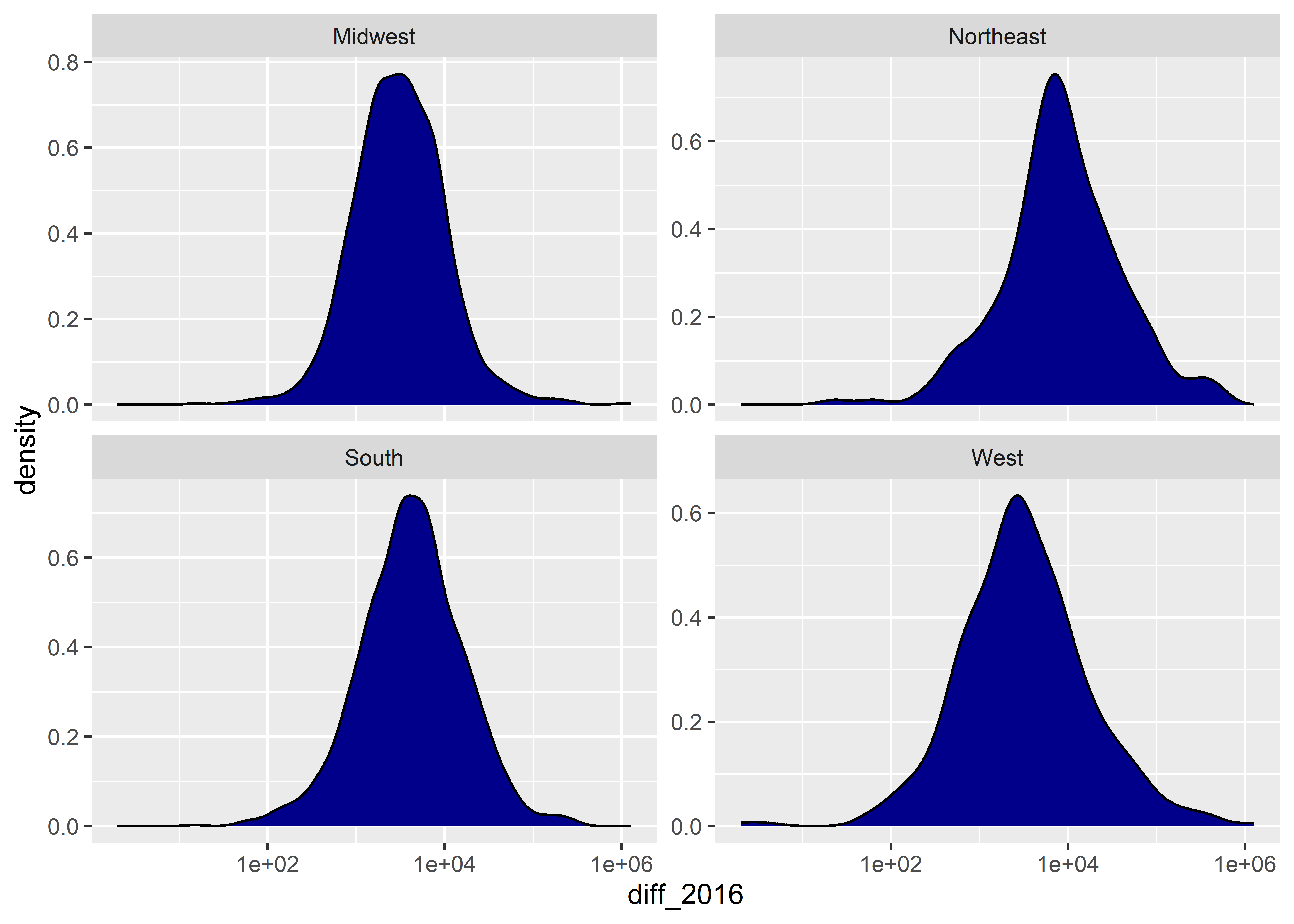
When you want to show how a distribution breaks down by groups in your data, a better option is to make a small multiple by faceting on the group of interest, like in the below code. You might also want to use free scales on the y-axis, as I do in the below code as well.
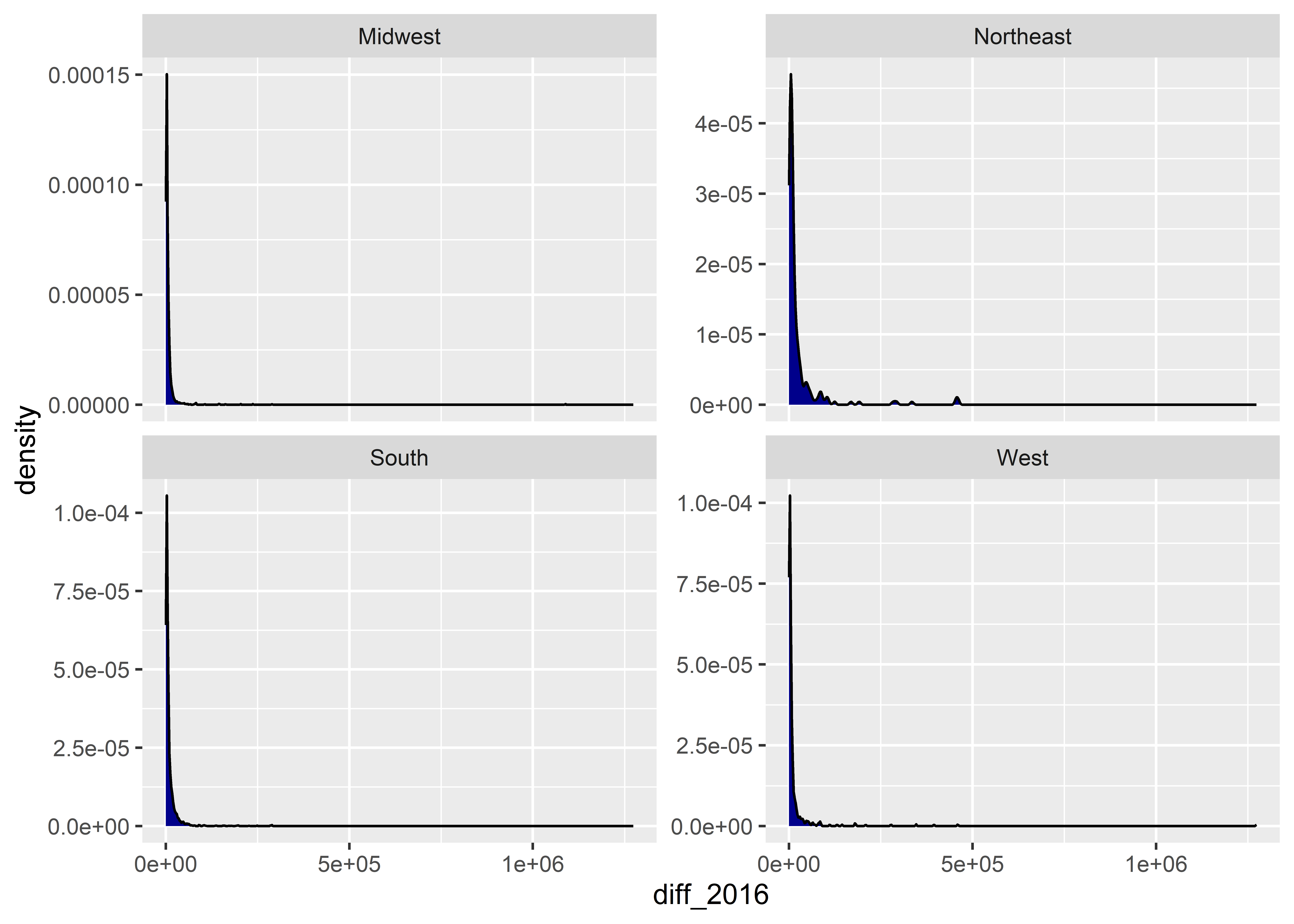
An annoying thing about density plots is that ggplot only shows us a line representing the density function. I personally prefer to have the area under the density function shaded in. Do do this, we can set the fill aesthetic inside geom_density() to a color of our choice:
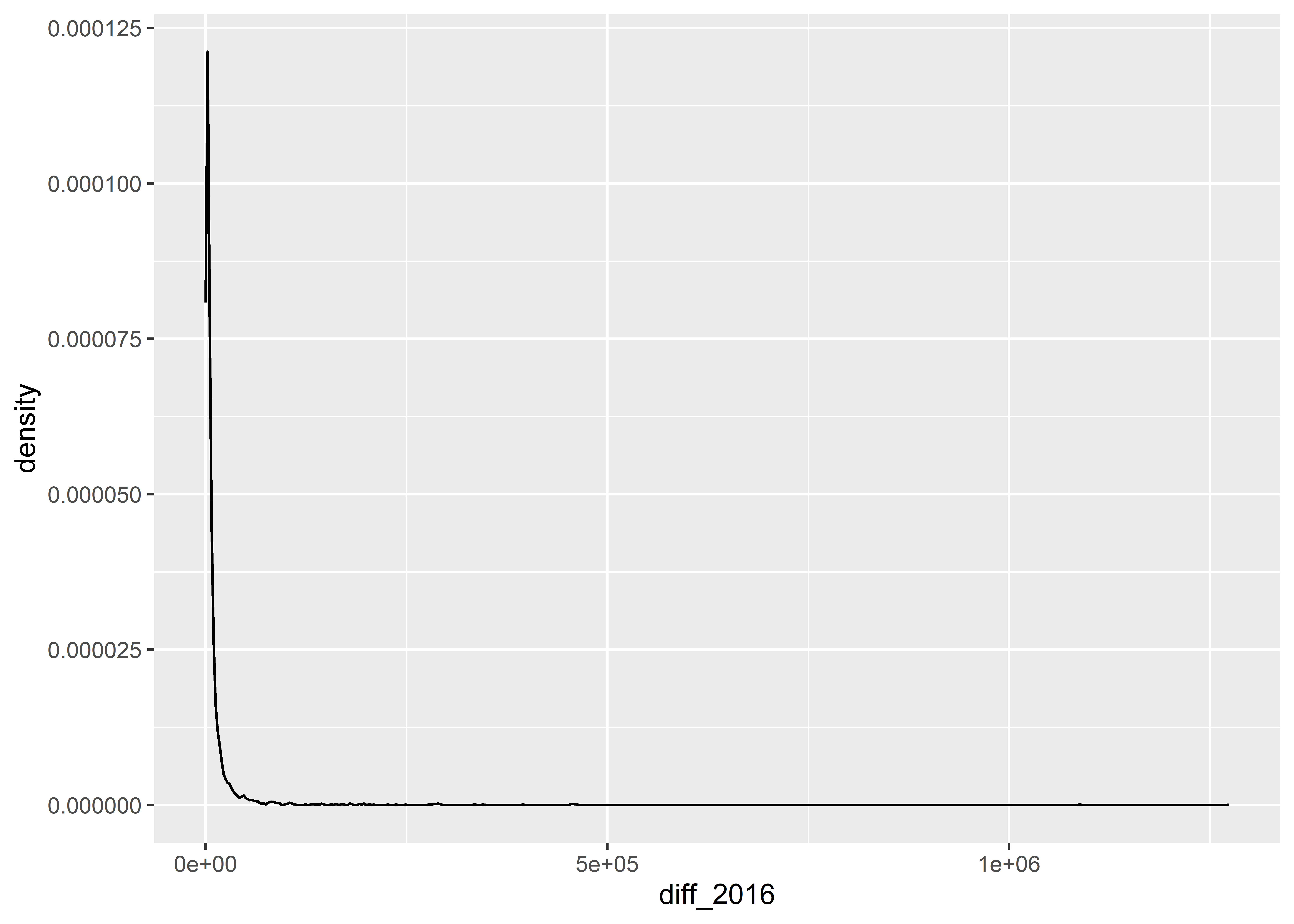
We can also modify the scales when showing continuous distributions. For example, the distribution of the difference in votes for Clinton versus Trump in 2016 is pretty skewed. This might lead us to use a log-10 transformation like we did in a previous example. Here’s what that looks like. Notice that the transformation makes the data look much more like a classical normal distribution.
There are so many more ways to transform data with geoms than what we covered in this chapter. I could spend much more time talking about your options, but down the road I’d rather show you some simple tools to transform your data before you give it to ggplot. These tools are much more intuitive, and when it comes to coding, intuitive is good. As you saw with geom_bar(), the code can become convoluted quickly when we want to do more complex things. You need to be careful, otherwise you may report the wrong numbers.
You also need to be careful that the right numbers aren’t also misleading. Depending on what you choose to count in your data, you can provide a distorted picture of what’s going on, as we saw in the example with the number of counties won by Trump in 2016. Though a seemingly trite example, “stop the steal” advocates pointed to the discrepancy between counties won by Trump in 2020 and his share of the popular vote as evidence of fraud. By providing only minimal context the strength of this argument melts away, but to the flat-footed observer it can seem convincing. You should be sensitive to showing the right numbers and the numbers that are selected to be shown. That’s an essential skill for any data analyst who seeks to wield data in defense of the truth.