10Customizing your Work Space and Refining Your Plots
10.1 Goals
Cover some ways to customize your plots using examples.
Talk about setting themes globally.
How to update settings.
10.2 Advanced Options for Your Quarto File
One way I like to work in Quarto files is by starting with a setup code block before I do anything else. I find it helps me to have a more productive session in R when I start by gathering all my tools, updating my .qmd settings, and reading in and wrangling the data I plan to use.
Here’s what my first code block might look like if I were writing a report using some conflict data.
#| include: false

## 1. Set things up the way I like:
knitr::opts_chunk$set(echo = F,
                        # I don't want to see my code chunks
                      message = F,
                        # I don't want messages appearing
                      warning = F,
                        # I don't wart warnings appearing
                      dpi = 500,
                        # When I knit, I want my figures crisp
                      out.width = "75%")
                        # I want my figures to be a reasonable size

## 2. Here are the packages I need in my session:
library(tidyverse)    # I want to use tools in the tidyverse
library(coolorrr)     # I want to update my colors
library(socsci)       # For some additional summarizing functions
library(geomtextpath) # For plotting text on lines
library(peacesciencer)# For my data

# 3. Set my color palette and ggplot theme:
set_palette(
  qualitative = c("navy", "gold", "gray", "red", "steelblue"),
  sequential = c("white", "navy"),
  diverging = c("steelblue", "white", "red3"),
  binary = c("steelblue", "red3")
)
set_theme()

## 4. Get the data I need for analysis:
create_stateyears(subset_years = 1945:2007) |>
  add_cow_wars(type = "intra") |>
  add_sdp_gdp() |>
  add_democracy() -> Data
The code block begins with #| include: false so that none of the output of the code appears when I render my report to a final document. It then proceeds in steps. For step 1, I use knitr::opts_chunk$set() to set a few custom features for code blocks. Since in this example I’m writing a report, presumably for some audience that probably doesn’t care about the underlying code I used, I have option echo = F. This ensures that my code will remain hidden in my rendered report. I also have message = F and warning = F to ensure that any function messages or warnings don’t appear in my rendered document. Finally, so that I have crisp looking data visualizations I have set dpi = 500. I also want to ensure that my data visualizations are reasonably sized, so I have set out.width = "80%".
In step 2, I open up the R packages that I need for my analysis. You can look at the comments next to these packages to see why I need them.
In step 3, I update my color palettes for use with {coolorrr}. I also use set_theme() to update the default ggplot() plotting theme.
Finally, in step 4 I bring in my data that I’ll use for my analysis.
I recommend this workflow. The more prep work you do up front, the more productive your overall session is going to be.
10.3 Setting Themes
You’ll notice that in the above code I used the function set_theme(). This comes from the {coolorrr} package, which we talked about in the previous chapter. This is my own personal ggplot theme that I like to use in my R sessions, and it’s available for you to use (if you like it) once you open the {coolorrr} package. It’s based on FiveThirtyEight’s theme but with a few of my own modifications. By running set_theme(), it sets my personal theme globally. That means that all ggplot figures I make will now use this theme rather than the default “gray” theme.
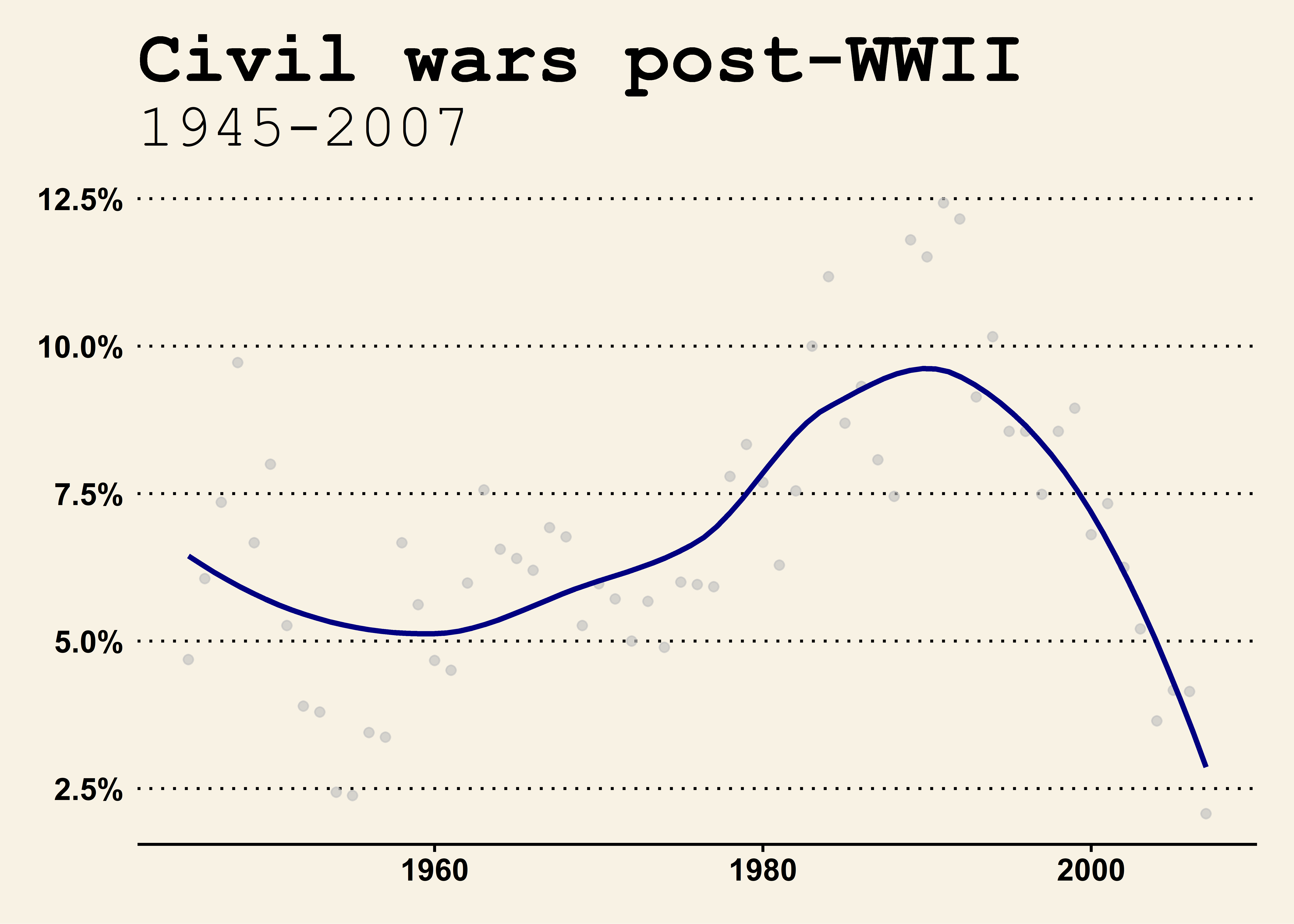
There are many different themes you can use. Let’s save the original figure as an object called my_plot and then check out a few of the available theme options.
You can access even more specialized themes using the {ggthemes} package. You can install it by writing and running install.packages("ggthemes") in the R console.
Here’s the FiveThirtyEight theme:
library(ggthemes)my_plot +theme_fivethirtyeight()
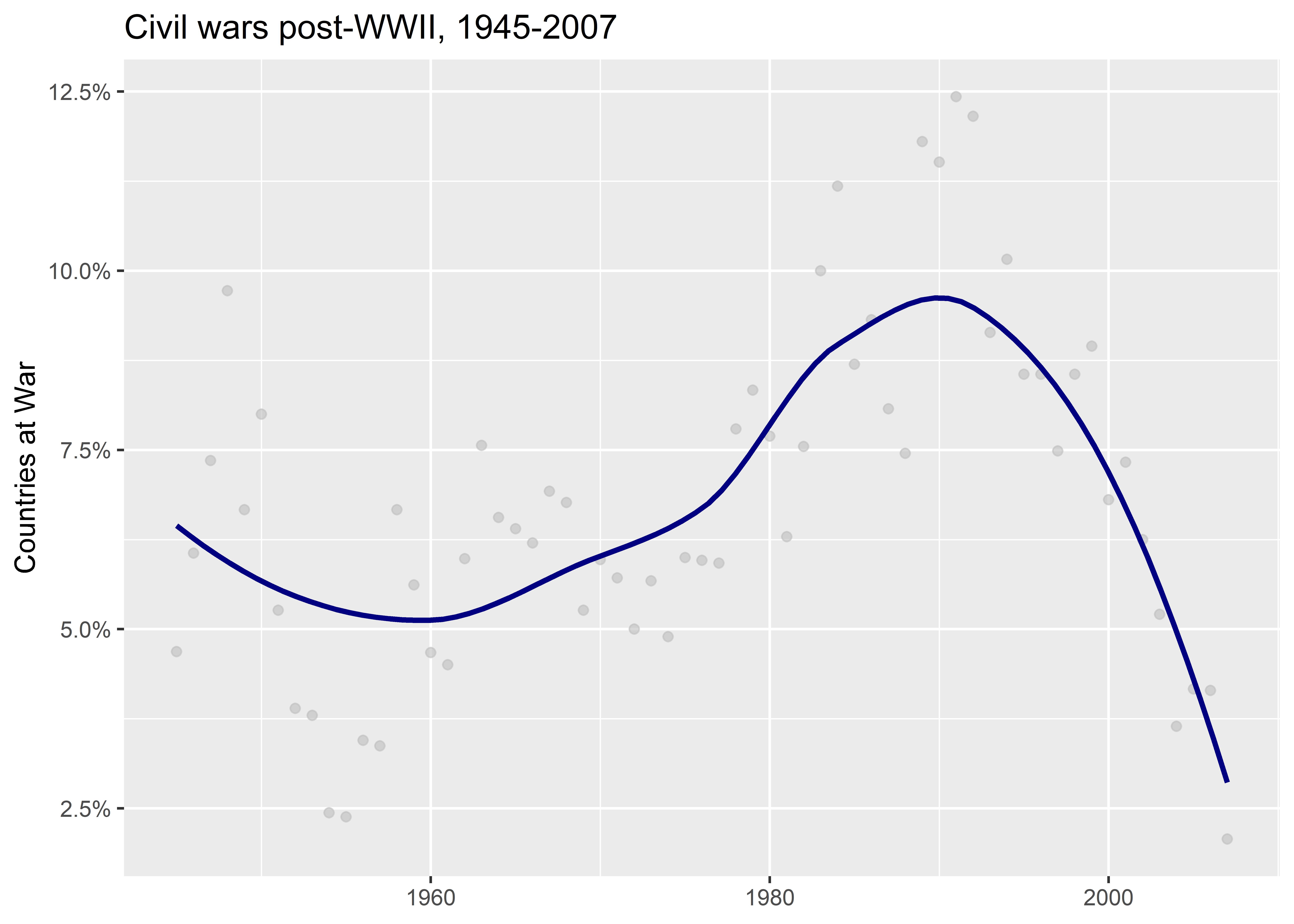
The Wallstreet Journal theme:
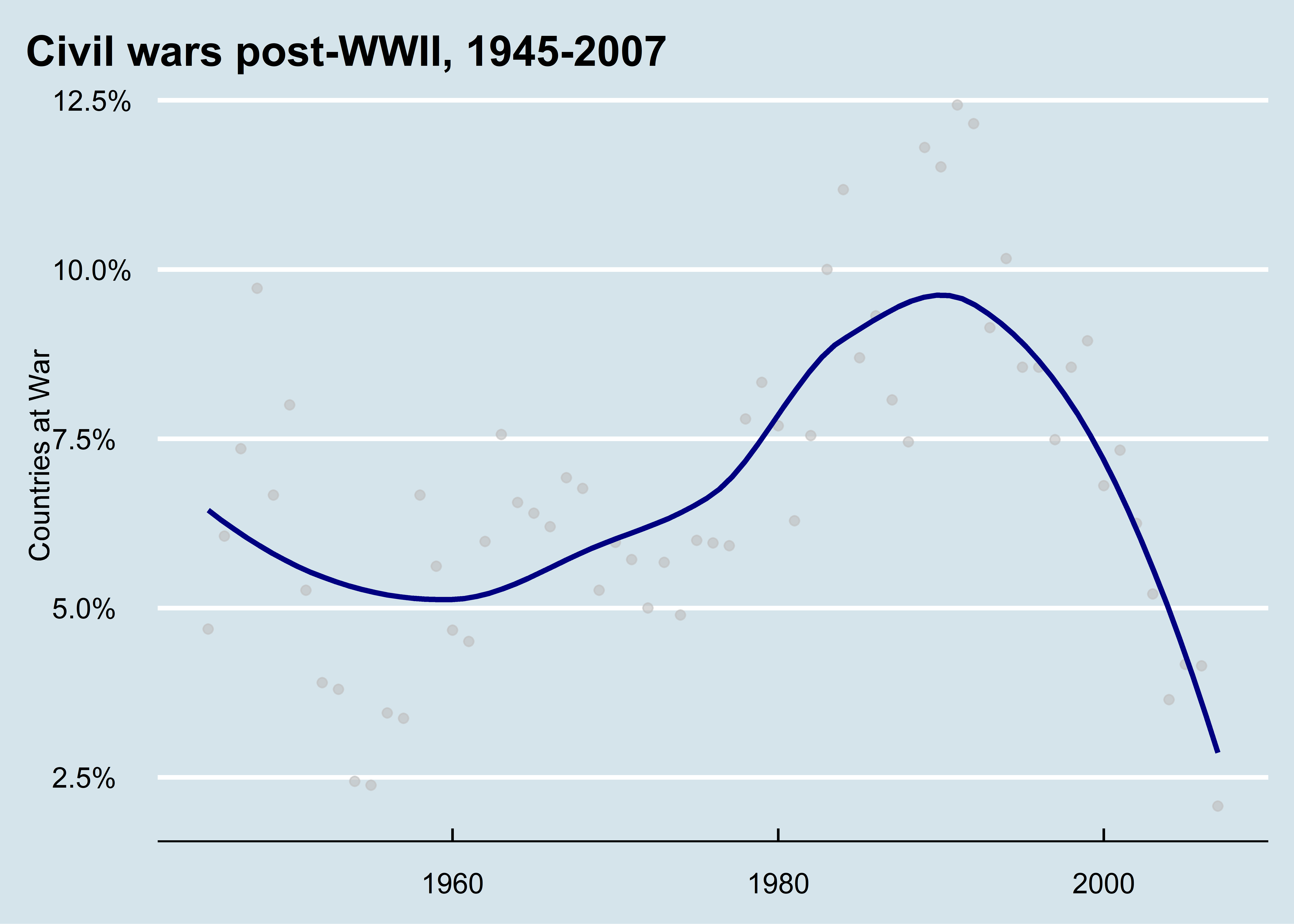
my_plot +theme_wsj() +## I need to adjust the titlelabs(title ="Civil wars post-WWII",subtitle ="1945-2007" )
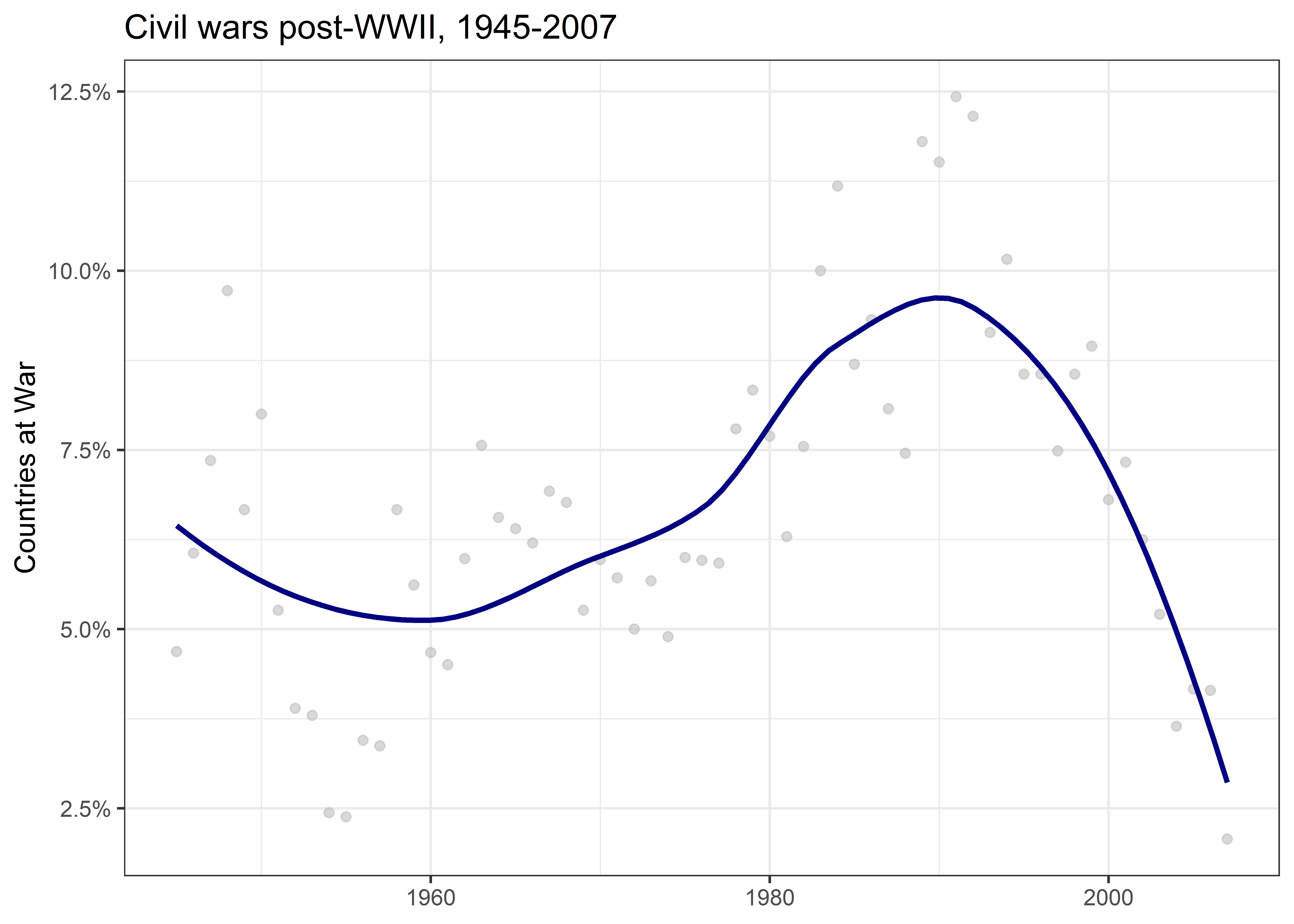
The Economist theme:
my_plot +theme_economist()
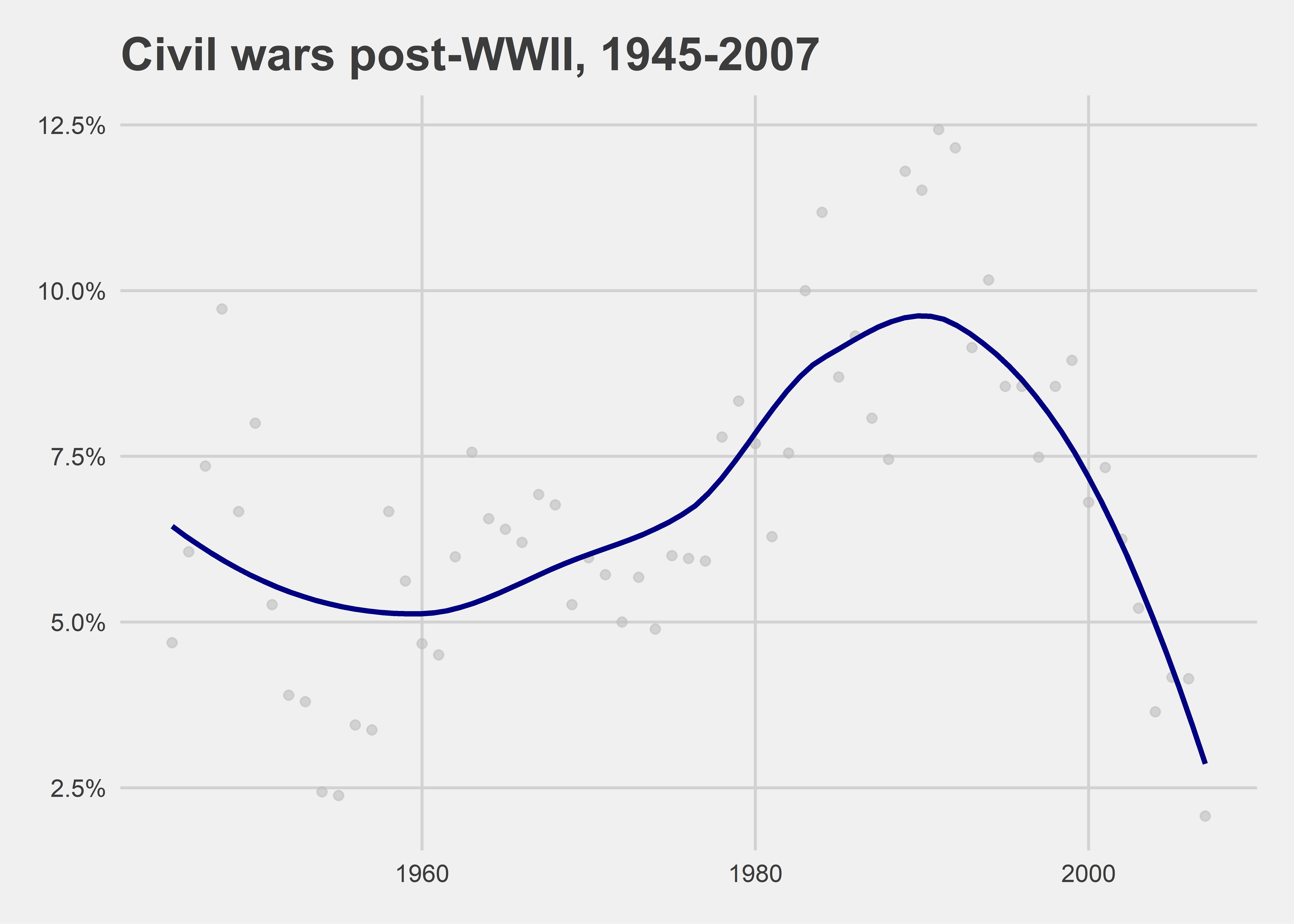
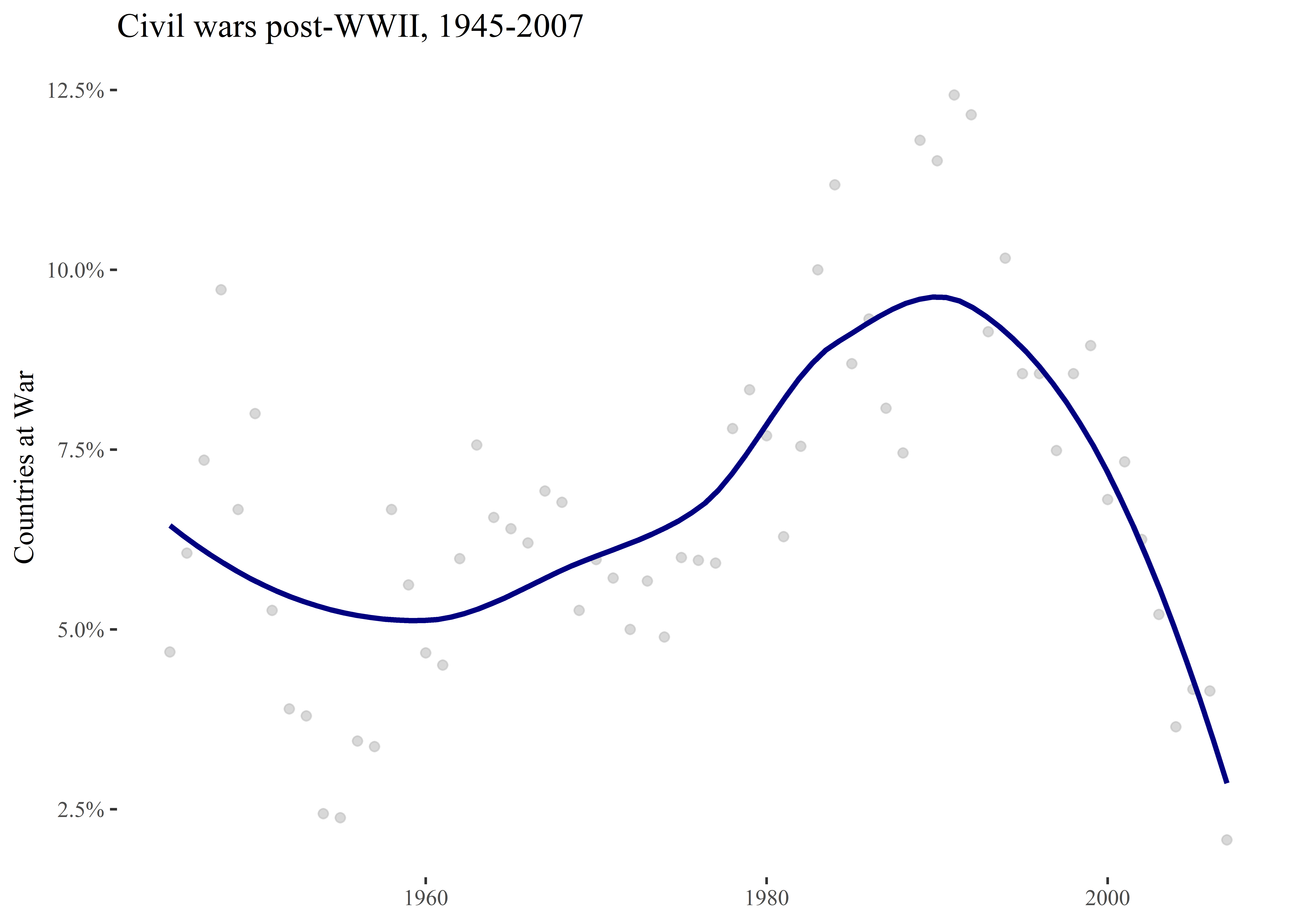
There’s even a Tufte theme:
my_plot +theme_tufte()
Remember that Tufte was the guy who said we should minimize our ink to data ratio. His theme certainly does.
10.4 Setting Your Own Theme Globally
The set_theme() function I used in the first code chunk set my own person theme globally. You can set your own theme globally, too.
Say you like the clean theme from {ggthemes}. Just run:
theme_set(theme_clean())
Notice that this function is theme_set() rather than set_theme(). How confusing! But that’s how it goes with R sometimes.
After you run the above, any new plots you make will follow the theme you set without having to add an extra line of code to your plot:
my_plot
I’m partial to my own, so I’m going to set it back with set_theme() from {coolorrr}:
set_theme()
10.5 Going In-Depth with Labels and Colors
Once you master settings like themes and colors, it’s time to start thinking about how to build up to more complicated visuals.
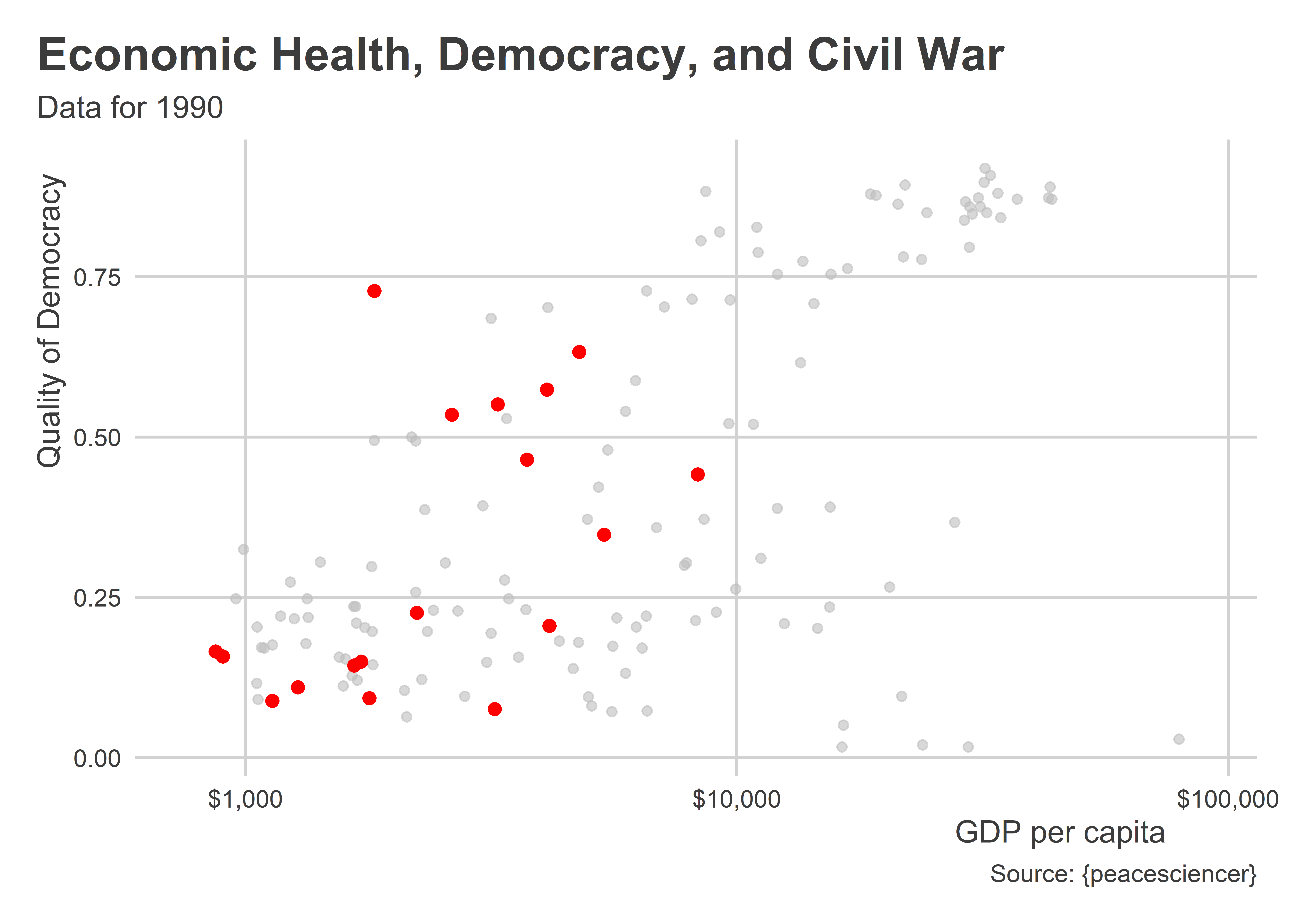
Here’s an example. Let’s start by filtering our data down to the year 1990:
Data |>filter(year ==1990) -> data_90
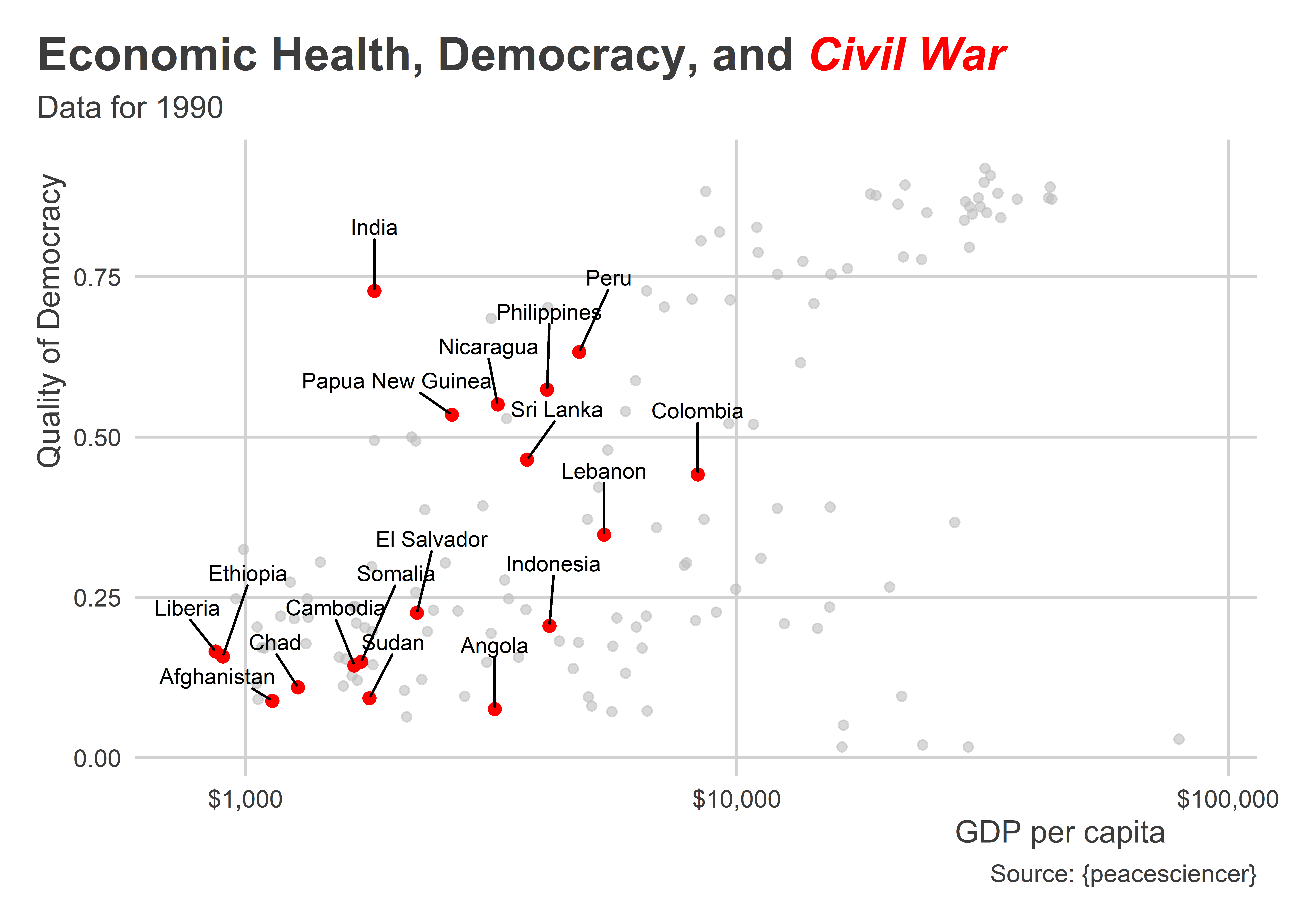
Next, let’s build a base plot—a scatter plot showing GDP per capita on the x-axis and quality of democracy on the y-axis:
p <-ggplot(data_90) +aes(x =exp(wbgdppc2011est), y = v2x_polyarchy ) +geom_point(alpha =0.6,color ="gray" ) +scale_x_log10(labels = scales::dollar) +labs(x ="GDP per capita",y ="Quality of Democracy",title ="Economic Health, Democracy, and Civil War",subtitle ="Data for 1990",caption ="Source: {peacesciencer}" )p # print
Note that I saved the plot as an object called p.
Next, let’s use color to highlight countries experiencing civil war. Up to now we’ve focused on international conflicts, but civil conflicts have become more prevalent over the past few decades. Their onset often is thought to be associated with institutional and economic factors in countries. In particular, non-democracies and poor countries seem especially prone to civil wars. Using this base plot that shows quality of democracy by GDP per capita, let’s see if we can add information about which countries in 1990 experienced civil wars. If these institutional and economic arguments are true, then we should see civil war countries cluster at the lower left quadrant of the scatter plot. The below code adds a new point layer only for observations in the data with an ongoing civil war. It colors these points red and uses a slightly larger point size than the default. As you can see, civil war countries tend to have lower GDP per capita and worse quality of democracy.
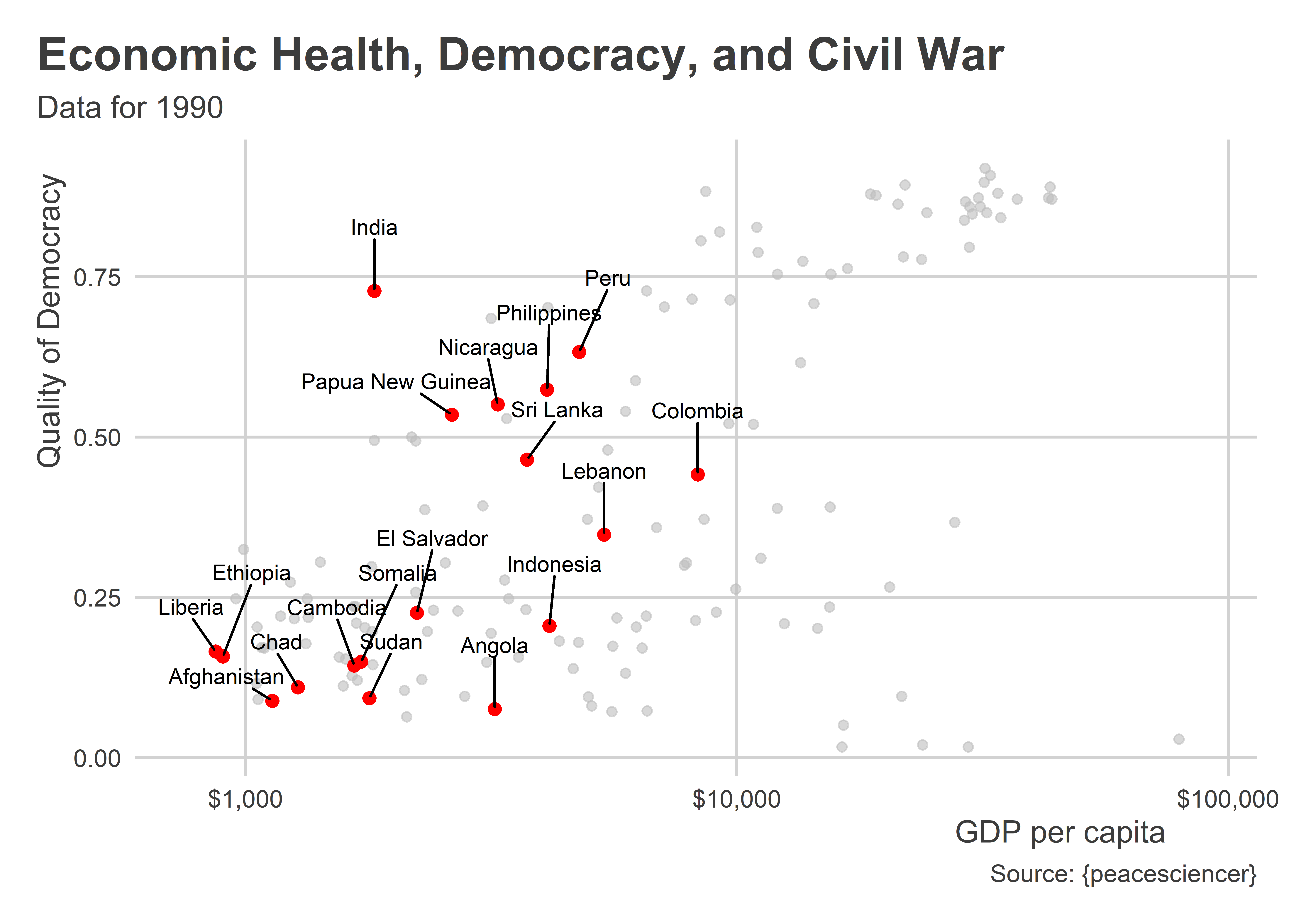
In the next layer, we’ll add some text to tell us which countries are the ones experiencing civil war. We can use the geom_text_repel() function from {ggrepel} to do this. This function is similar to geom_text() but it has more bells and whistles that, ultimately, make it easy to produce well formatted text and labels for data points in a graph.
That’s not too bad, but let’s add one more element to the plot. Countries experiencing conflict are highlighted using their names and the color red. I’d be nice to have an efficient way to tell people what red means in the plot. There’s a great package called {ggtext} that makes it really easy to edit and customize text in labels using HTML code. To install it, just write install.packages("ggtext") in the R console.
Check out how we can use it to really spice up our data viz below. By incorporating some HTML code, I’ve given R instructions to make “Civil War” in the title red, bold, and italic. This way viewers can use context clues (the color of Civil War matches the color of certain highlighted data points) to understand that the countries being singled out are countries experiencing an ongoing civil war.
## open the packagelibrary(ggtext)## create a title object to keep things tidy## and use paste0() to separate the normal text## from the HTML part of the textnew_title <-paste0("Economic Health, Democracy, and ","<span style = 'color:red'>***Civil War***</span>")## update the plot with the new title and then## tell ggplot how to read the HTML codep3 +labs(title = new_title ) +theme(plot.title =element_markdown() )
10.6 Wrapping up
My goal with the above examples isn’t to cover everything you can possibly do to refine your plots. That would be impossible because your options are practically limitless. Instead, my intention is to leave you with an impression of just how many elements can be updated as you design your data visualizations. We haven’t even talked about the theme() function which gives you even more control over the look of your data viz.
You won’t master this in a single class, or a single semester for that matter. The key with all of this is to practice.