ggplot(Data) +
  aes(x = var1, y = var2) +
  geom_point() +
  labs(
    title = "Variables 1 and 2 have a positive relationship",
    x = "Variable 1",
    y = "Variable 2"
  )
ggplot() BasicsIn this chapter, the goal is to help you understand:
The title for Part 1 of this book is “Election Fraud.” This entire section of the book is both dedicated to helping you gain a foundation in the basics of data visualization with {ggplot2}, and it’s dedicated to introducing this foundation while forcing you to wrestle with a particular real-world problem—one that sadly is becoming a part of our regular political discourse in the United States. I’m speaking, of course, of election fraud.
I believe election fraud is a great motivating example for you to sharpen your teeth with in data visualization for two reasons. First, I hope that you find it interesting! Using R for data analysis and visualization is rewarding but also tedious. However, the tedious bits are much easier to endure if pushing through them helps you to solve problems, such as the question of election fraud, that have a big impact on society and politics.
Second, as I noted above, election fraud is becoming a regular part of public discourse in the United States. Regardless of your partisan persuasion, I hope that we can all agree that this is normatively bad, because the survival of political institutions depends, in part, on whether society trusts those institutions. As we’ve witnessed over the past few years, the accusation of fraud has done a lot to shake trust in the electoral process. Belief in claims of fraud runs so deep for some individuals that it motivated a small contingent of them to violently storm the United States Capital Building on January 6, 2021. I want to equip you with tools that let you cut through the noise and evaluate accusations of fraud in a rigorous way. The ability to do this is becoming increasingly important as those who make fraud claims have taken to using sophisticated and (to the untrained observer) convincing data-based arguments that fraud really did take place. To inoculate yourself against this, you need to be armed with more than a few news editorials or opinion pieces—you need to be armed with data and the skills to wield that data in defense of the truth.
At its heart, fraud detection is all about identifying anomalies. Usually, when something has gone wrong in an election, its effects stick out like a sore thumb. Anomalies also happen with other kinds of mishaps as well. Though it’s a rare occurrence, voting machines have generated errors, and sometimes the decision to field a new ballot design can have fateful consequences.
Fortunately, regardless of the cause of some anomaly, it is often easy to catch. It’s also the case that such mishaps are rare, and even rarer is it the case that they have a material impact on election outcomes. However, we’ll talk about a prominent example where the impact was just big enough in just the right place to change the outcome of a United States Presidential Election—and it’s probably not the election you think it is.
But we’ll get to all of this in due time. First things first, let’s go over the basics of data visualization. We can’t start talking about anomalies before we learn to look at data with an eye toward identifying trends or consistent patterns. To do this, we need to make sure we have a basic understanding of our software and how it connects our dataset to a visual representation of what it contains. Let’s get to it.
ggplot() worksAt its core, the ggplot workflow in R consists of a simple four-step process:
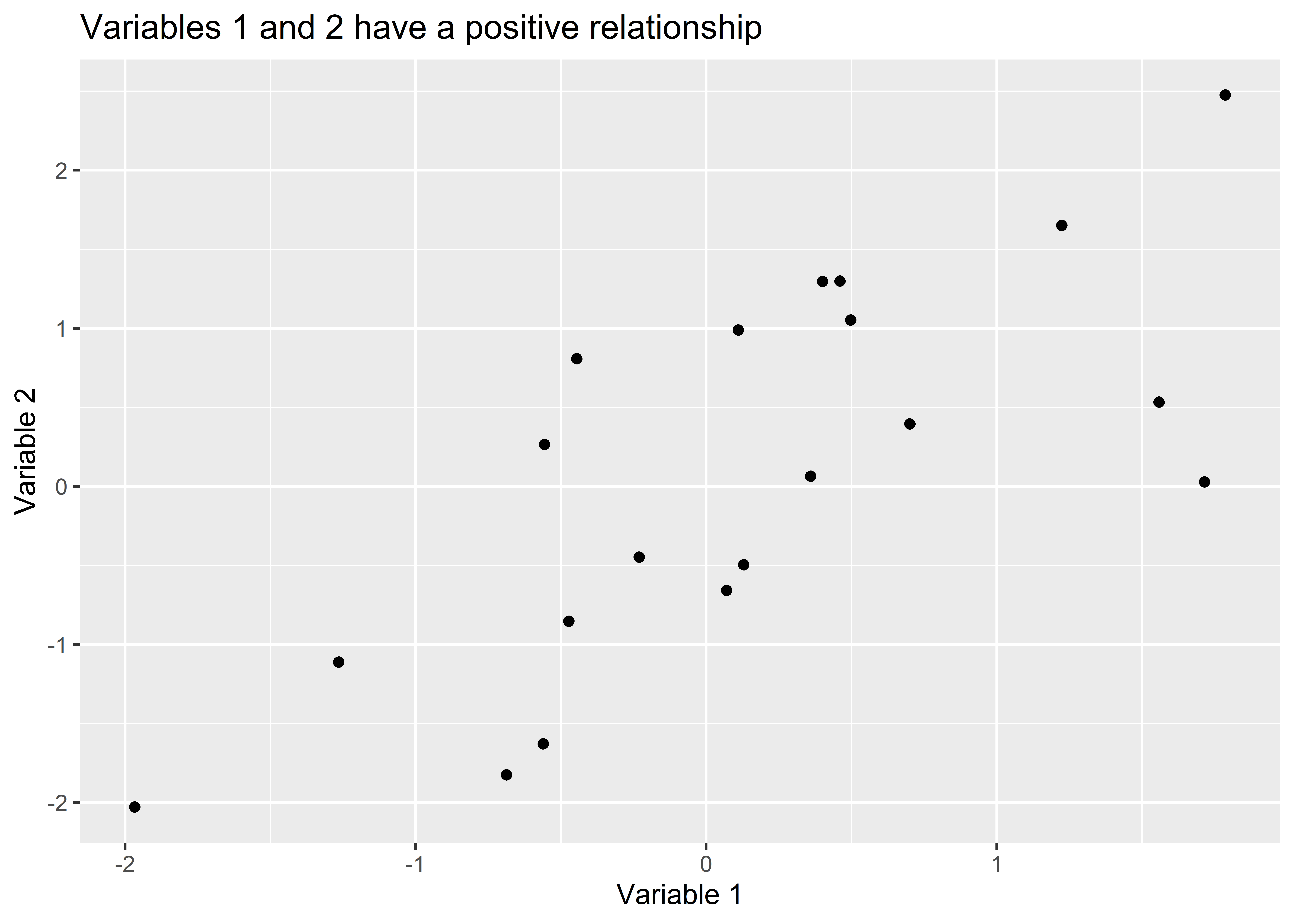
ggplot() function.ggplot() what variables you want to show relationships for using the aes() function.ggplot() about the geometry (shapes, colors, points, etc.) that you want it to use to show the relationship(s) you’re interested in using a geom_*() function.As you move from one step to the next, you’ll use the + symbol to connect your instructions in one step to those in the next. In practice, this process might look something like the code shown below. It starts by feeding a data object called Data to the ggplot() function. After the + operator, it then uses the aes() function to give ggplot instructions about which variables to show. In this case, aes(x = var1, y = var2) specifies that I want values of var1 to be shown along the x-axis of the figure and values of var2 to be shown along the y-axis. Finally, after another call to the + operator the geom_point() function is used. This function tells ggplot that I want to show the relationship between var1 and var2 using points (e.g, I want a scatter plot). I then customize the plot using the labs() function by giving it a title and some more informative names for the variables I’m plotting. The output is shown below the code.
ggplot(Data) +
aes(x = var1, y = var2) +
geom_point() +
labs(
title = "Variables 1 and 2 have a positive relationship",
x = "Variable 1",
y = "Variable 2"
)
You’ll notice that this figure is quite spartan, but you can see right off the bat that ggplot does quite a lot for you. As we’ll later learn, ggplot can do so much more. There’s a reason why it’s the state-of-the-art for data visualization. Right now, we’re crawling, but soon we’ll be sprinting.
Using ggplot itself is quite simple, but before we can use it, we need data. If we’re lucky, our data will already be fully processed and ready to go. If we’re not lucky (and usually we’re not), we’ll need to do some data wrangling. Data wrangling just refers to the process of cleaning and reshaping data to make it ready for visualization and perhaps more sophisticated analysis down the road. Thankfully, the {tidyverse} family of packages provides some helpful tools for doing this. We’ll learn the specifics in coming chapters, but before we do this, I think it will be helpful for you to see the shape we ultimately want our data to take before visualizing and analyzing it.
For most data viz or analysis purposes (no matter what tools or software you use), the goal is usually to have tidy data. “Tidy” in this context does not just mean “clean.” Tidy data refers to a specific set of characteristics about a dataset.1 In particular, tidy data have three key characteristics. It may help you to imagine something like an Excel spreadsheet as you think about them. They are as follows:
Tidy data are always rectangular in shape. Specifically, they are long-format data as opposed to wide-format.
Here’s an example of data in wide-format. The dataset shows for a selection of counties in Alabama the vote totals for Republican Party candidates in all US Presidential elections from 1960 to 2012.
| county | 1960 | 1964 | 1968 | 1972 | 1976 | 1980 | 1984 | 1988 | 1992 | 1996 | 2000 | 2004 | 2008 | 2012 |
|---|---|---|---|---|---|---|---|---|---|---|---|---|---|---|
| autauga | 1149 | 2969 | 606 | 5367 | 4512 | 6292 | 8350 | 7828 | 8715 | 9509 | 11993 | 15196 | 17398 | 17366 |
| baldwin | 4812 | 10870 | 2154 | 15104 | 13256 | 18652 | 24964 | 25933 | 26270 | 29487 | 40872 | 52971 | 61192 | 65772 |
| barbour | 1166 | 3853 | 386 | 4985 | 3758 | 4171 | 5459 | 4958 | 4475 | 3627 | 5096 | 5899 | 5862 | 5539 |
| bibb | 1052 | 2623 | 263 | 3332 | 1591 | 2491 | 3487 | 2885 | 3124 | 3037 | 4273 | 5472 | 6247 | 6131 |
| blount | 2557 | 4442 | 2013 | 6486 | 4233 | 6819 | 8508 | 8754 | 8882 | 9056 | 12667 | 17386 | 20362 | 20741 |
This format isn’t ideal for making a data visualization with ggplot. Alternatively, long-format, tidy data is much better. Here’s that same data, but tidy:
| county | year | rep |
|---|---|---|
| autauga | 1960 | 1149 |
| baldwin | 1960 | 4812 |
| barbour | 1960 | 1166 |
| bibb | 1960 | 1052 |
| blount | 1960 | 2557 |
Do you see the difference? Each row is a single observation (a county in a single year). For each observation, we have three variables, each with its own column, and each cell in each column has just one value.
Eventually, I’ll show you some cases where it makes sense to deviate from the tidy data format. But, most of the time, tidy data will get you where you need to go.
Once we have some tidy data, we then can start thinking about data visualization. As already summarized, there are four basic steps we need to follow when using ggplot(). Let’s take a closer look at each of these steps to get a better sense for the logic behind the ggplot workflow.
When we use ggplot, we first feed the core ggplot() function some data. This is how we tell ggplot what our data is. However, just giving ggplot our data isn’t enough. The code below shows what happens when we run ggplot() with some data and do nothing more. The dataset is called election and you can read it into R from your “_data” folder as shown below. It contains county level details for the lower 48 US states on election outcomes for the 2008 and 2012 Presidential elections along with the some population totals at the county level based on 2010 aggregated estimates from the American Community Survey.
## read in the dataset
read_csv(
  here::here(
    "_data", "election.csv"
  )
) -> election
## give the data to ggplot()
ggplot(election)
As you can see, simply giving data to ggplot() produced a blank canvas. The ggplot workflow is a process of adding layers of complexity upon a very simple foundation. This is the secret sauce that makes ggplot so flexible. Rather than build a super complex plot all at once, you can take it one step at a time to slowly craft your data visualization.
Now that we have a blank canvas, the next step is to select the variables in our data that we want to show. We do this with the aes() function. The below code builds on the previous code by telling R that we want to show the relationship between two variables in the election data: pop or county population and dem_margin08 or the difference in the share of the vote received by Barack Obama relative to John McCain in 2008.
ggplot(election) +
  aes(x = pop, y = dem_margin08)
The aes() function accepts a lot of different commands. In the above, I told it x = pop to say I want the pop column in the data to appear along the x-axis, and I told it y = dem_margin08 to tell it I want the Democratic Party Presidential candidate’s vote margin to appear along the y-axis. I could also tell it to give some things different colors based on categories of the data (e.g., color = state). Note that when I specify columns in the data that I want to show, I can just write out the name of the column. I don’t need to clarify the dataset these variables come from, nor do I need to put variable names in “quotation marks.” This is because all columns in the data I give to the base ggplot() function become known objects in subsequent layers.
Next, with data and variables specified, we can add some geometry to our canvas. To do this, we use “geom” functions. There are a number of geoms, like geom_point(), geom_col(), geom_boxplot(), and so on. Most of the geoms you need are available in the {ggplot2} package, but many R users have developed their own specialized geoms as well that are available in additional R packages. Some geoms will make more sense than others depending on your data, and it’s up to you to make good judgments about which to use. Each geom provides a specific set of default instructions for how to connect aesthetics to different shapes, colors, and sizes in your data viz.
In the case of looking at the Democratic Party margin in 2008 by county population, geom_point() might be a sensible option. The below code adds this geom layer to what we’ve produced so far. The point geom produces a scatter plot, so named because it looks like we have a bunch of data points scattered across our canvas.
ggplot(election) +
  aes(x = pop, y = dem_margin08) +
  geom_point()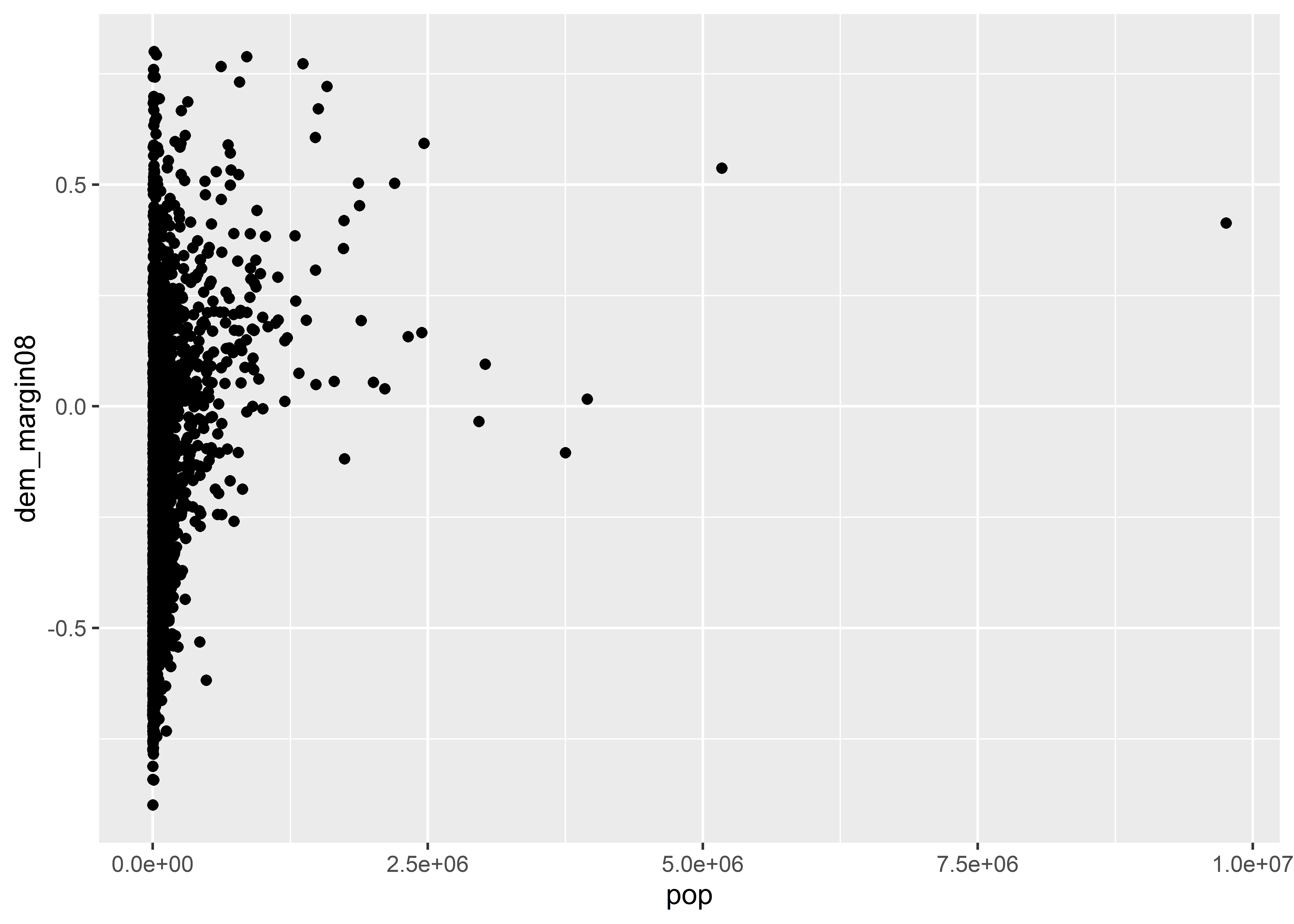
After we’ve specified a geometry, it’s good practice to touch up our data viz with some informative labels. We do this using the labs() function. This is important to use because, by default, ggplot() will use the raw names of variables as they appear in your dataset for the axis labels and it won’t even bother coming up with a plot title. If you’re just exploring some data, none of this matters, but if you’re writing a report for an audience, you’d be doing them a disservice by just doing steps 1-3 of the ggplot workflow. Help your audience out with some labels. Here are some we might use to round out our data viz:
ggplot(election) +
  aes(x = pop, y = dem_margin08) +
  geom_point() +
  labs(
    title = "More populous counties tended to favor Obama in 2008",
    x = "County Population",
    y = "Obama's Vote Margin"
  )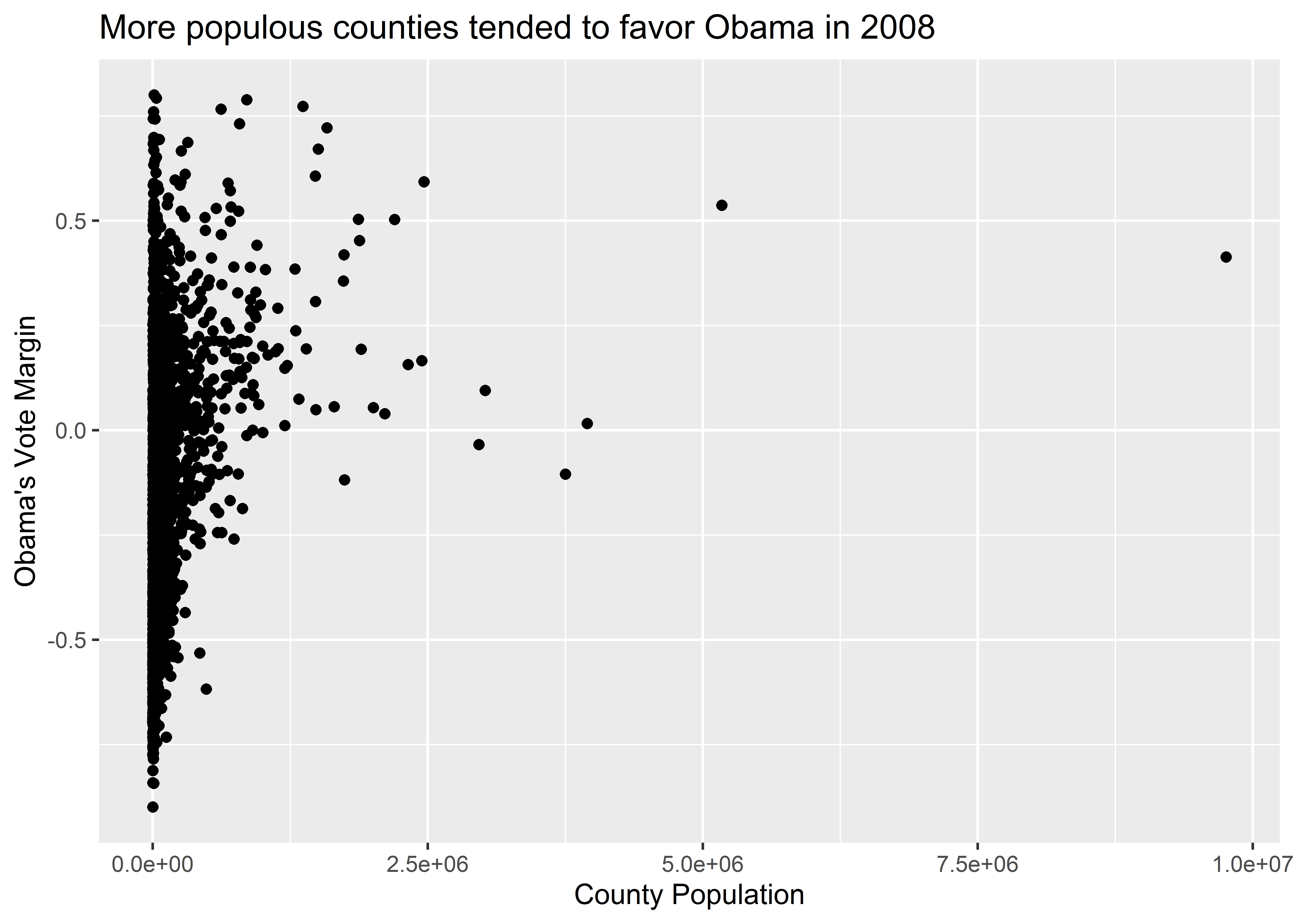
When it comes to your labels, you should follow a few rules of thumb:
Essentially, your labels should allow you to hold your audience’s hands, metaphorically of course, as you guide them through what the data is saying.
A nice thing about working with ggplot is that we can add to our data visualizations ad infinitum, layer upon layer. You aren’t restricted to only one geom, for example. Let’s build on what we’ve made so far by adding a trend line to our data using geom_smooth():
ggplot(election) +
  aes(x = pop, y = dem_margin08) +
  geom_point() +
  geom_smooth() + ## NEW GEOMETRY LAYER
  labs(
    title = "More populous counties tended to favor Obama in 2008",
    x = "County Population",
    y = "Obama's Vote Margin"
  )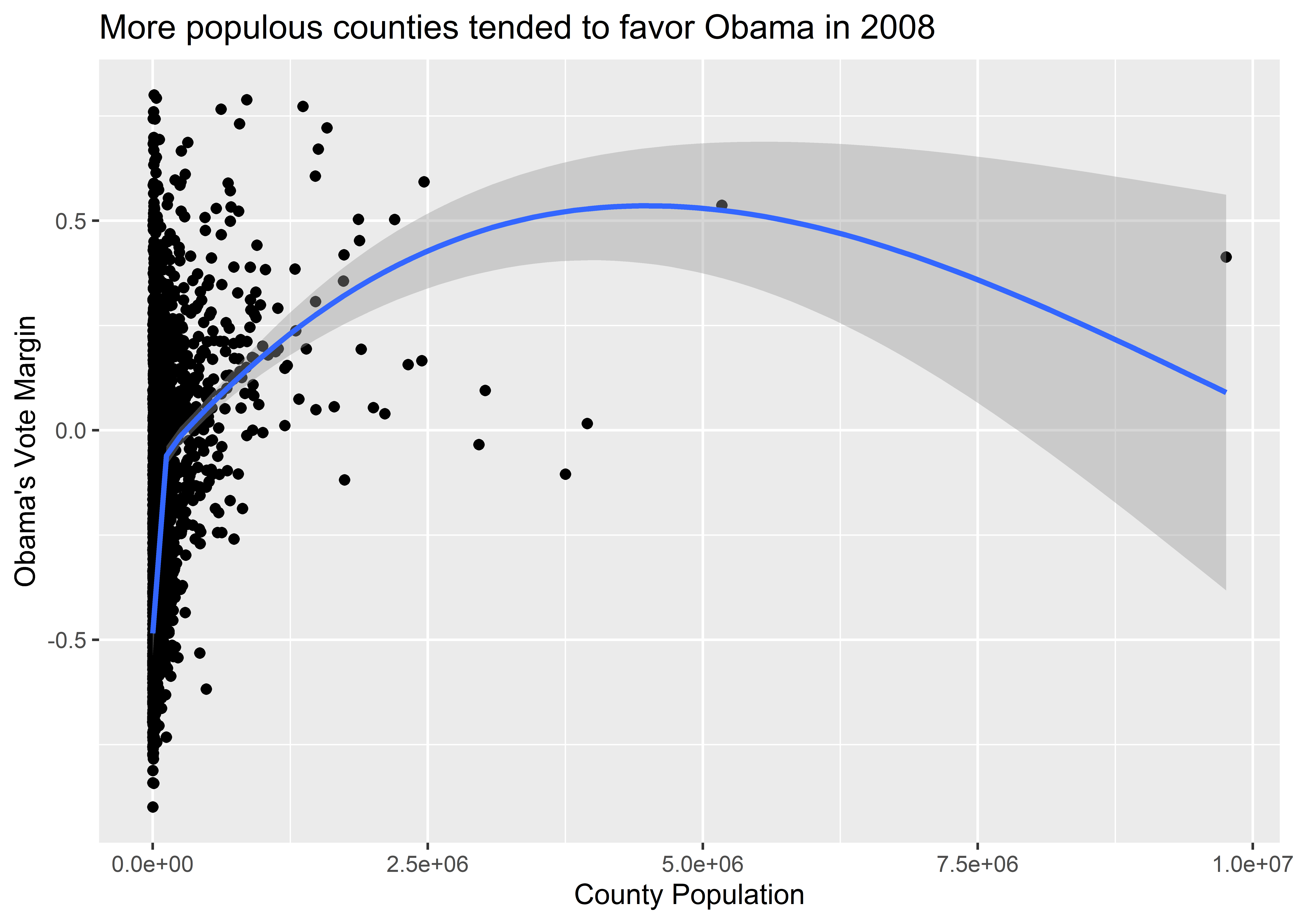
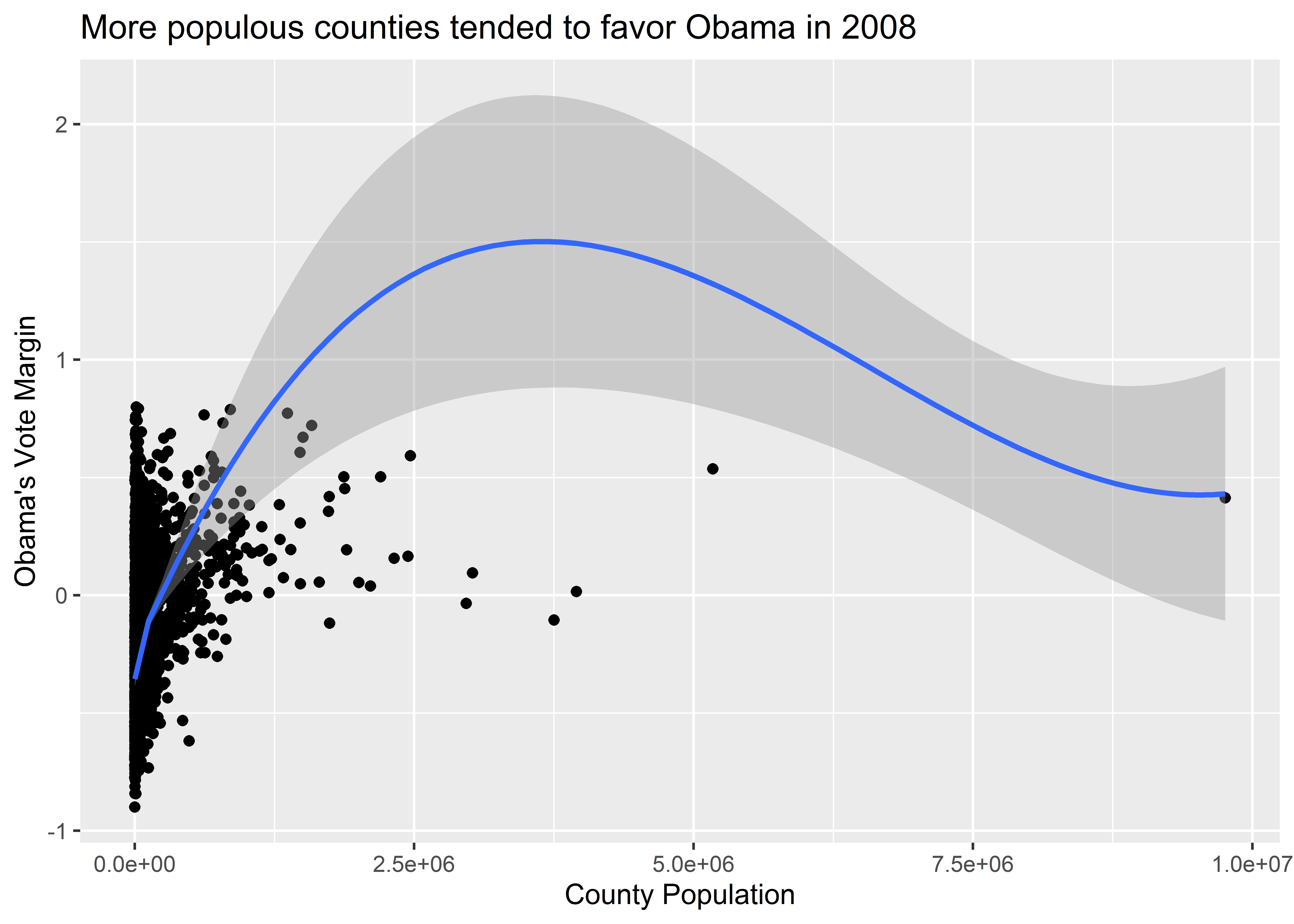
The geom_smooth() function adds a smoothed regression line to our plot. If you don’t have a background in data modeling or statistics, just think of the smooth line as a summary of the mean of the variable on the y-axis depending on the value of the variable on the x-axis. In the above figure, we can see that the average vote margin for Obama tends to increase with county population. By default, geom_smooth() is basing this conditional average on a particular kind of statistical model called a generalized additive model (GAM). This is a very flexible kind of regression model. There are other kinds of models you can have geom_smooth() use as well, any of which you can specify using the method option inside the function. For example, the below code specifies that we want geom_smooth() to estimate the conditional mean of the y-axis variable using another kind of flexible model called LOESS (locally estimated scatterplot smoothing). Notice that it gives us different results. Actually, the LOESS line seems to go way out of bounds, predicting a conditional mean for Obama’s vote margin where no data points are present.
ggplot(election) +
  aes(x = pop, y = dem_margin08) +
  geom_point() +
  geom_smooth(method = "loess") +
  labs(
    title = "More populous counties tended to favor Obama in 2008",
    x = "County Population",
    y = "Obama's Vote Margin"
  )
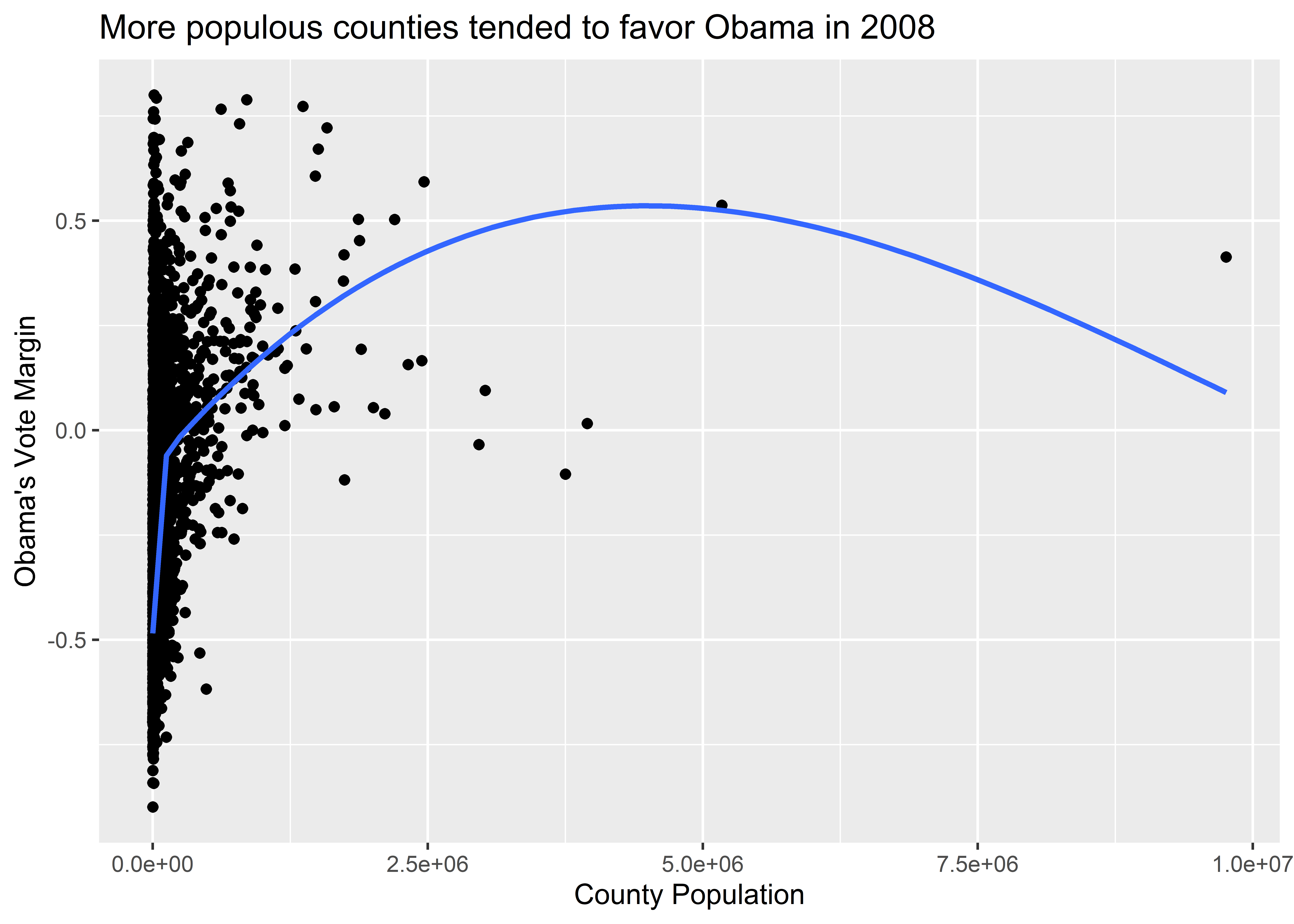
You’ll notice, too, that geom_smooth() provides 95% confidence intervals (CIs) around the estimated conditional mean. This is that transparent band round the blue regression line. Think of these as a summary of how precisely the mean of the y-variable is estimated. Wider 95% CIs mean there’s more “noise” than “signal” in the data. Narrower 95% CIs mean there’s more “signal” than “noise.” Sometimes, it’s nice to turn these off, which we can do by setting the se option to FALSE (which we can shorten to just F), like so:
ggplot(election) +
  aes(x = pop, y = dem_margin08) +
  geom_point() +
  geom_smooth(se = F) + # turn off the CIs
  labs(
    title = "More populous counties tended to favor Obama in 2008",
    x = "County Population",
    y = "Obama's Vote Margin"
  )
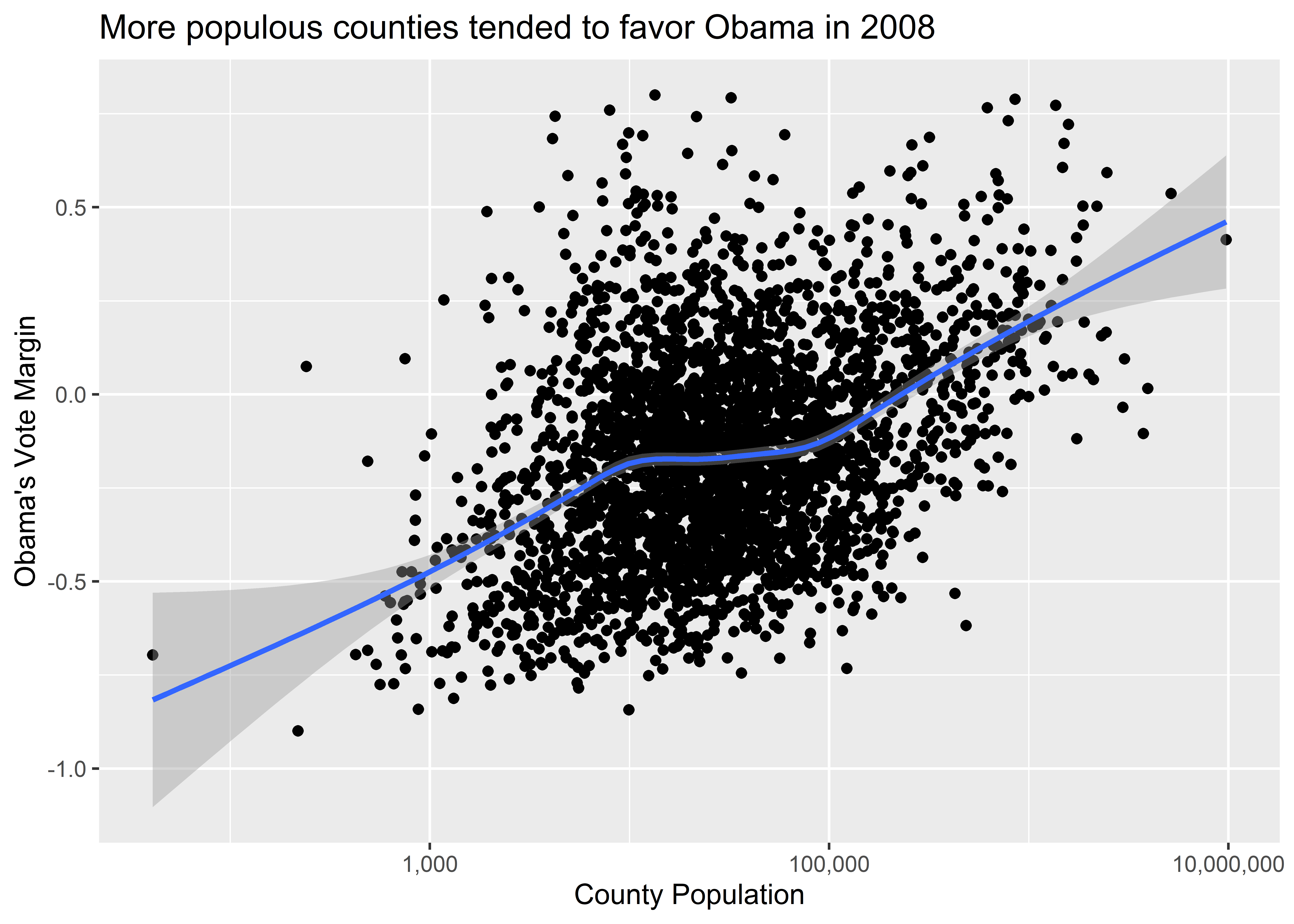
Beyond adding additional geometries to our data visualization, we can also play around with the scales. We might, for example, want to see what happens if we show population on the log-10 scale rather than as raw totals. The reason is that county population has a fairly skewed distribution—that is, there are many small counties and only a few very large ones. A log-10 scale adjusts for this in a way that also remains faithful to our data. It’s something called a monotonic transformation, or a way to change one set of numbers into another set of numbers while preserving the ordering. To adjust the values on the axes, we can use a variety of scale_*() functions. One of these is called scale_x_log10().
Here’s what our data viz looks like when we add this layer to the plot. The relationship between population and Obama’s vote margin is much clearer.
ggplot(election) +
  aes(x = pop, y = dem_margin08) +
  geom_point() +
  geom_smooth() +
  labs(
    title = "More populous counties tended to favor Obama in 2008",
    x = "County Population",
    y = "Obama's Vote Margin"
  ) +
  scale_x_log10()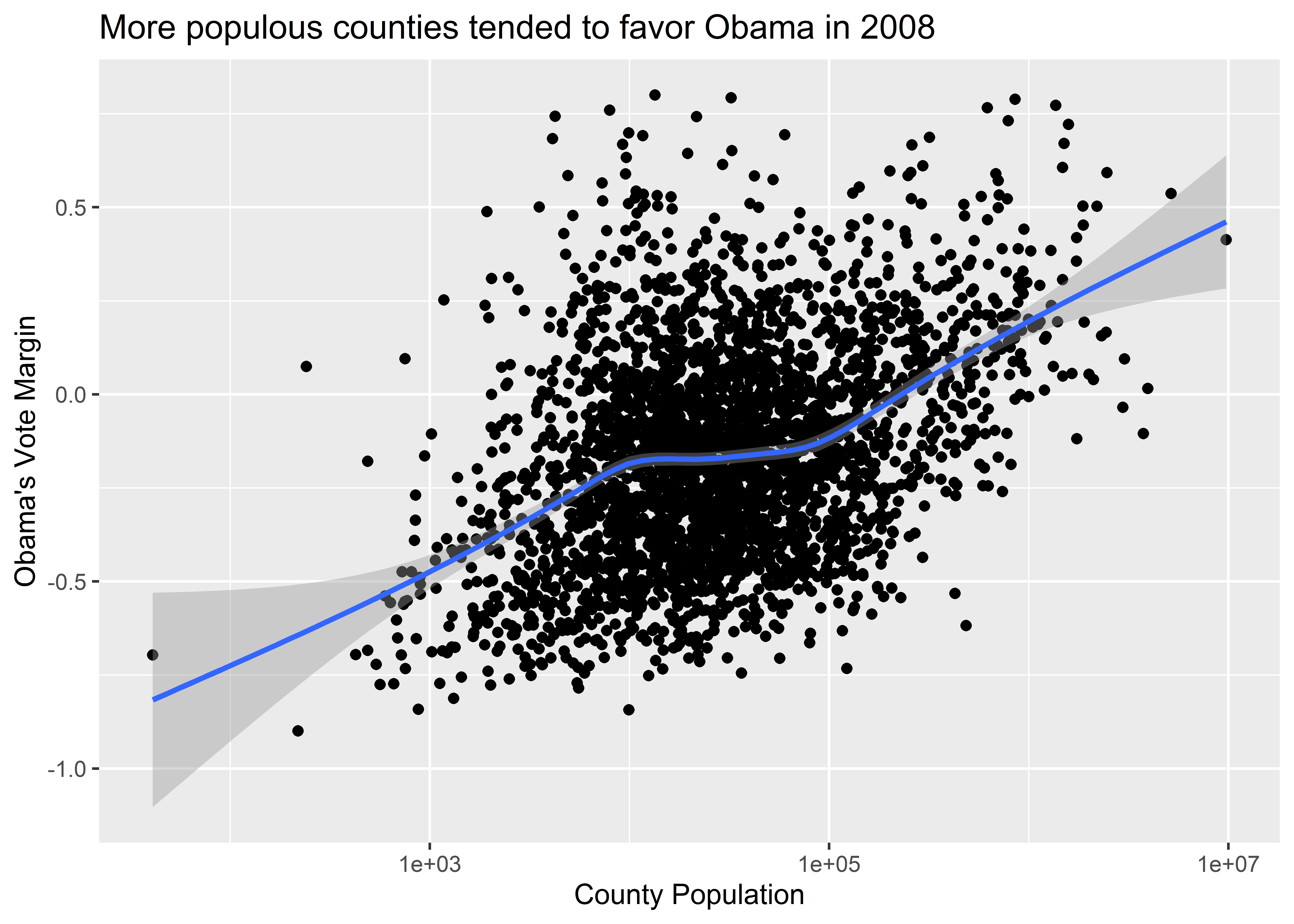
As we update axis scales, we can also update the axis labels that appear along the different tick marks. If you haven’t already noticed, the population values reported along the x-axis in our figure appear in scientific notation (1e+03 = 1,000). That’s a little ugly to read. Thankfully, we can update this, too. Observe what happens when I specify labels = scales::comma inside of scale_x_log10(). It looks better, right?
ggplot(election) +
  aes(x = pop, y = dem_margin08) +
  geom_point() +
  geom_smooth() +
  labs(
    title = "More populous counties tended to favor Obama in 2008",
    x = "County Population",
    y = "Obama's Vote Margin"
  ) +
  scale_x_log10(
    labels = scales::comma
  )
There are many other ways that we can adjust our axis scales—too many to cover here. However, we’ll consider many additional adjustments to scales and axis labels as we work through all kinds of examples later on.
An interesting trick about working with ggplot is that we can specify our data and our aesthetics at different points in our code while still giving us the same output. Each of the below ways of writing our code will give us identical figures. Try them out to see for yourself.
## Way 1:
ggplot(election, aes(x = pop, y = dem_margin08)) +
  geom_point() +
  geom_smooth()

## Way 2:
ggplot(election) +
  geom_point(aes(x = pop, y = dem_margin08)) +
  geom_smooth(aes(x = pop, y = dem_margin08))

## Way 3:
ggplot() +
  geom_point(
    data = election,
    aes(x = pop, y = dem_margin08)
  ) +
  geom_smooth(
    data = election,
    aes(x = pop, y = dem_margin08)
  )
While any of the above approaches makes no difference for your output, there are cases where the location that we specify something does make a difference. This is a feature, rather than a bug, of ggplot that lets us customize our data visualizations in even greater detail. In coming chapters, we’ll explore some different options.
Let’s quickly revisit the ggplot workflow:
ggplot() data.aes().geom_*() functions.There are some important things to keep in mind when doing steps 2, 3, and 4. In particular, it’s really easy to confuse when you want to map an aesthetic for when you want to set an aesthetic.
What’s the difference?
aes() function.geom_*() functions.Aesthetics are features of the plot’s geometry that we want to control, like what variables appear on the different axes, and what colors or shapes we want to use. When we map an aesthetic, that means we’re connecting a particular aesthetic to some variable in our data. When we set an aesthetic, we’re giving ggplot direct instructions for what it should show.
To help illustrate, here’s an example of the scatter plot we’ve been working on with the color aesthetic mapped to whether Obama or McCain won a majority of the popular vote in a particular county.
ggplot(election) +
  aes(x = pop, y = dem_margin08, color = winner08) +
  geom_point() +
  geom_smooth() +
  labs(
    title = "More populous counties tended to favor Obama in 2008",
    x = "County Population",
    y = "Obama's Vote Margin"
  ) +
  scale_x_log10(labels = scales::comma)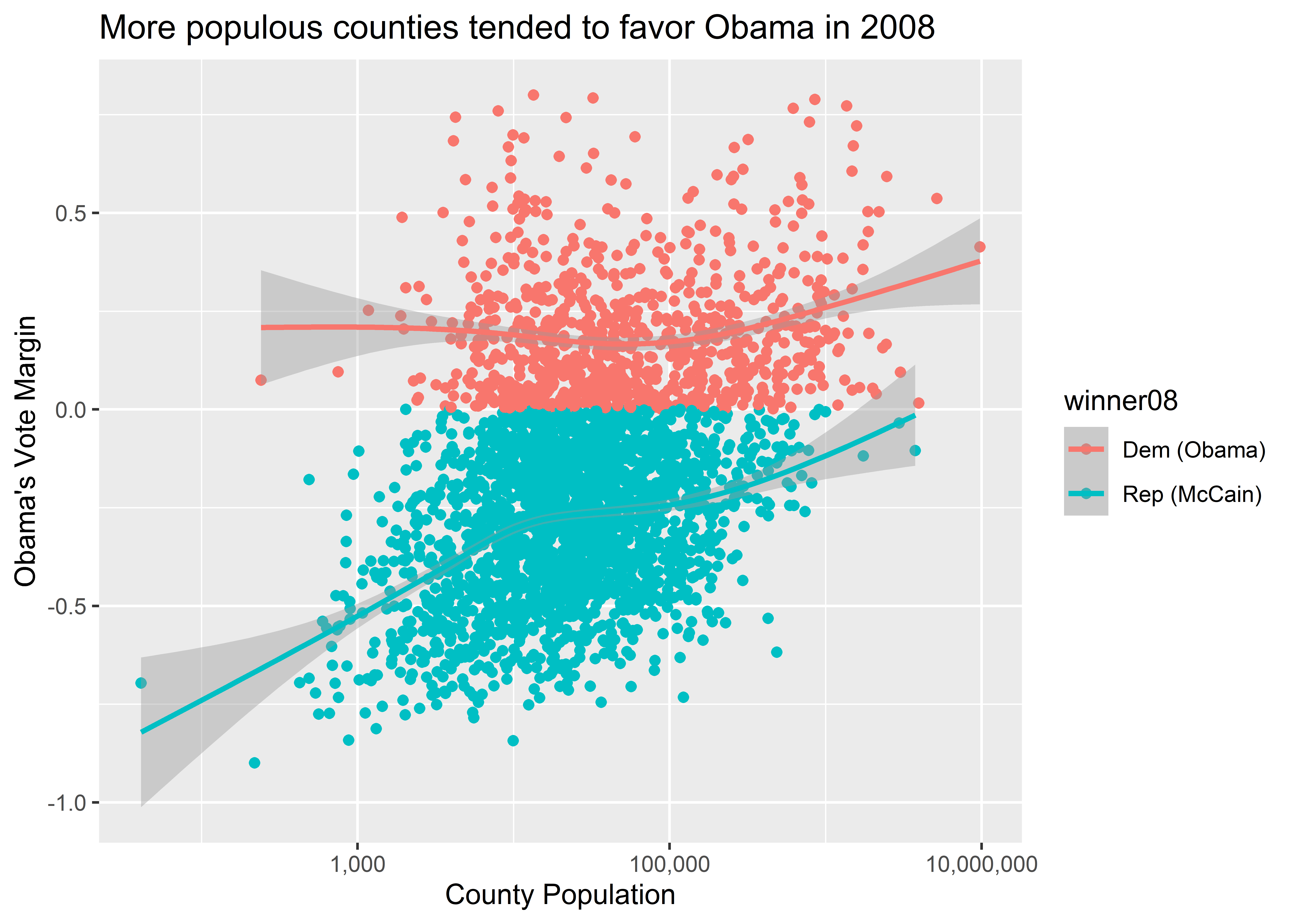
The above code contains a command in the aes() function that specifies color = winner08. This option tells ggplot that it should map different colors to the values that exist in this column in the data. There are two values, and so ggplot maps two and exactly two colors to these different values. It also did the work of producing a legend at the right-hand side of our figure that tells us which color is mapped to which value in the variable winner08. Down the road, we’ll talk about how we can customize the colors ggplot uses, and how we can customize details about the legend.
That’s what it means to map an aesthetic, but what would happen if we wanted to just specify a custom color using? Look at what happens if you try setting color = "gold" inside aes():
ggplot(election) +
  aes(x = pop, y = dem_margin08, color = "gold") +
  geom_point() +
  geom_smooth() +
  labs(
    title = "More populous counties tended to favor Obama in 2008",
    x = "County Population",
    y = "Obama's Vote Margin"
  ) +
  scale_x_log10(labels = scales::comma)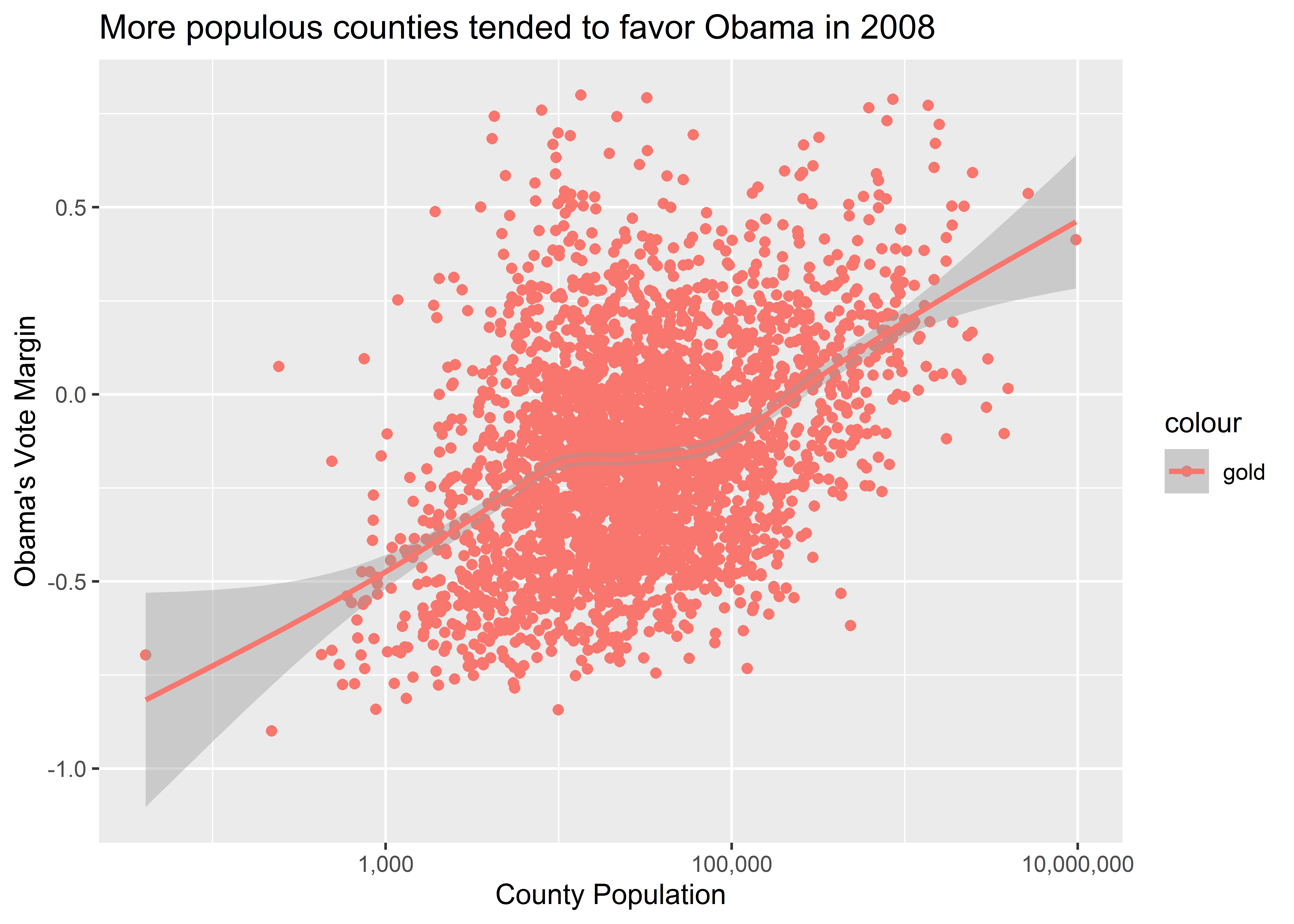
Does the output look “gold” to you? It sure doesn’t. Instead, it’s red.
This is a classic example of mapping an aesthetic when we actually need to set an aesthetic. To set the color of points and lines, we don’t specify them inside aes(). Doing so leads ggplot to mistakenly conclude that we are adding a new column to our data where each cell entry of that column is a category called “gold.” It then picks a default color to map to that category. Since there’s only one category, it only maps one color, and the default is red.
To avoid this, we instead should set aesthetics inside geom_*() functions. In the below code, I tell ggplot to make the color of the points in our scatter plot gold and to make the color of the smoothed regression line red.
ggplot(election) +
  aes(x = pop, y = dem_margin08) +
  geom_point(color = "gold") +
  geom_smooth(color = "red") +
  labs(
    title = "More populous counties tended to favor Obama in 2008",
    x = "County Population",
    y = "Obama's Vote Margin"
  ) +
  scale_x_log10(labels = scales::comma)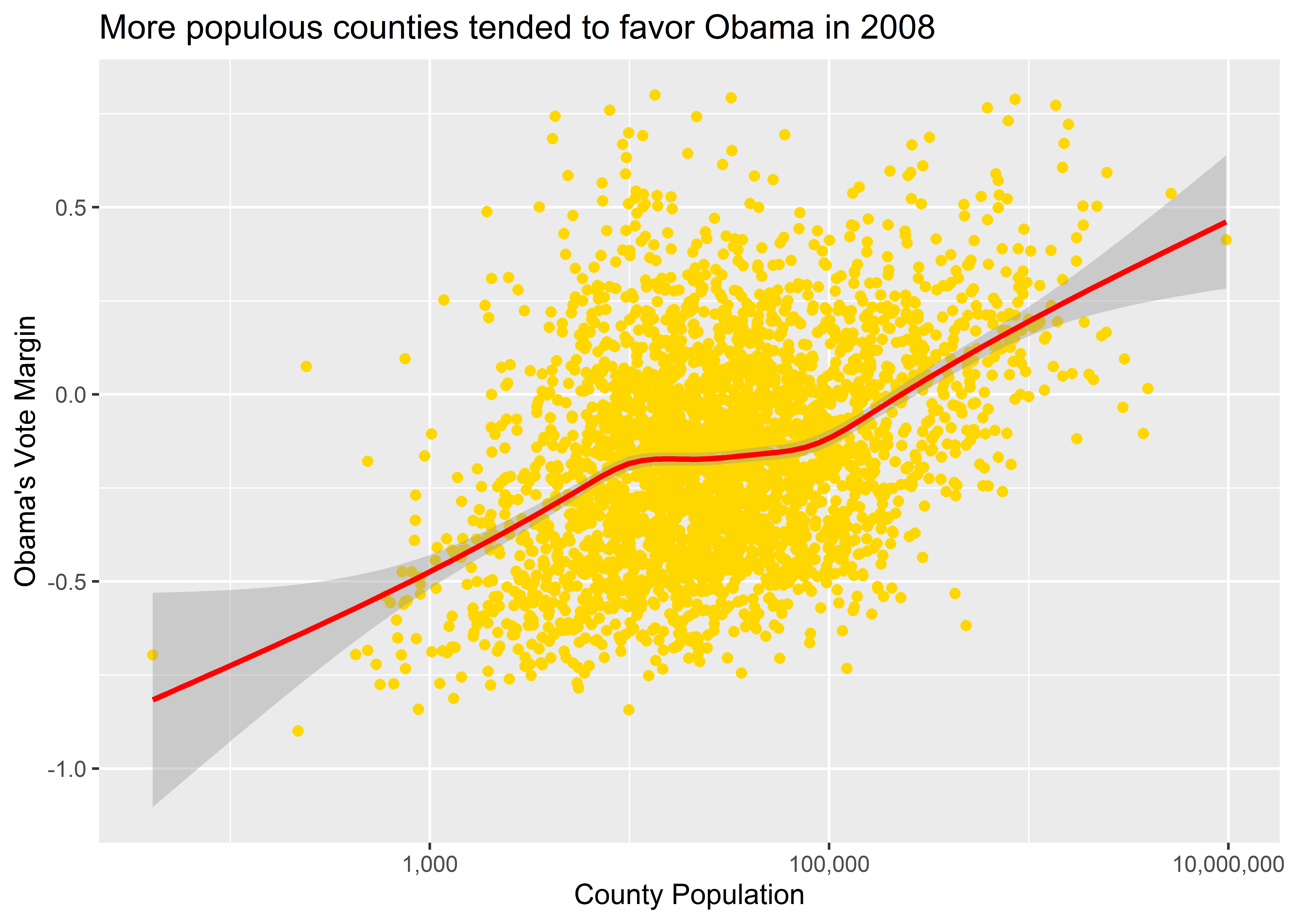
This terrible looking, McDonald’s colored data viz looks just like it should. Are you lovin’ it?
There are lots of different aesthetics that you can either map or set with ggplot, such as size, color, alpha (which indicates transparency), fill, and on and on. For example, say we wanted to map point size to population in a scatter plot and set the transparency of points using alpha. In the below code I include the command size = pop in the aes() function and then inside geom_point() I write alpha = 0.5. To change things up, I’ve made the x variable Obama’s 2008 vote share (total ballots cast in 2008 divided by turnout in 2008) and the y variable Obama’s 2012 vote share (total ballots cast in 2012 divided by turnout in 2012).
ggplot(election) +
  aes(
    x = dem2008 / turnout2008,
    y = dem2012 / turnout2012,
    size = pop
  ) +
  geom_point(alpha = 0.25) +
  labs(
    title = "Counties where Obama did well in 2008 he did well in 2012",
    x = "2008 Vote Share",
    y = "2012 Vote Share"
) 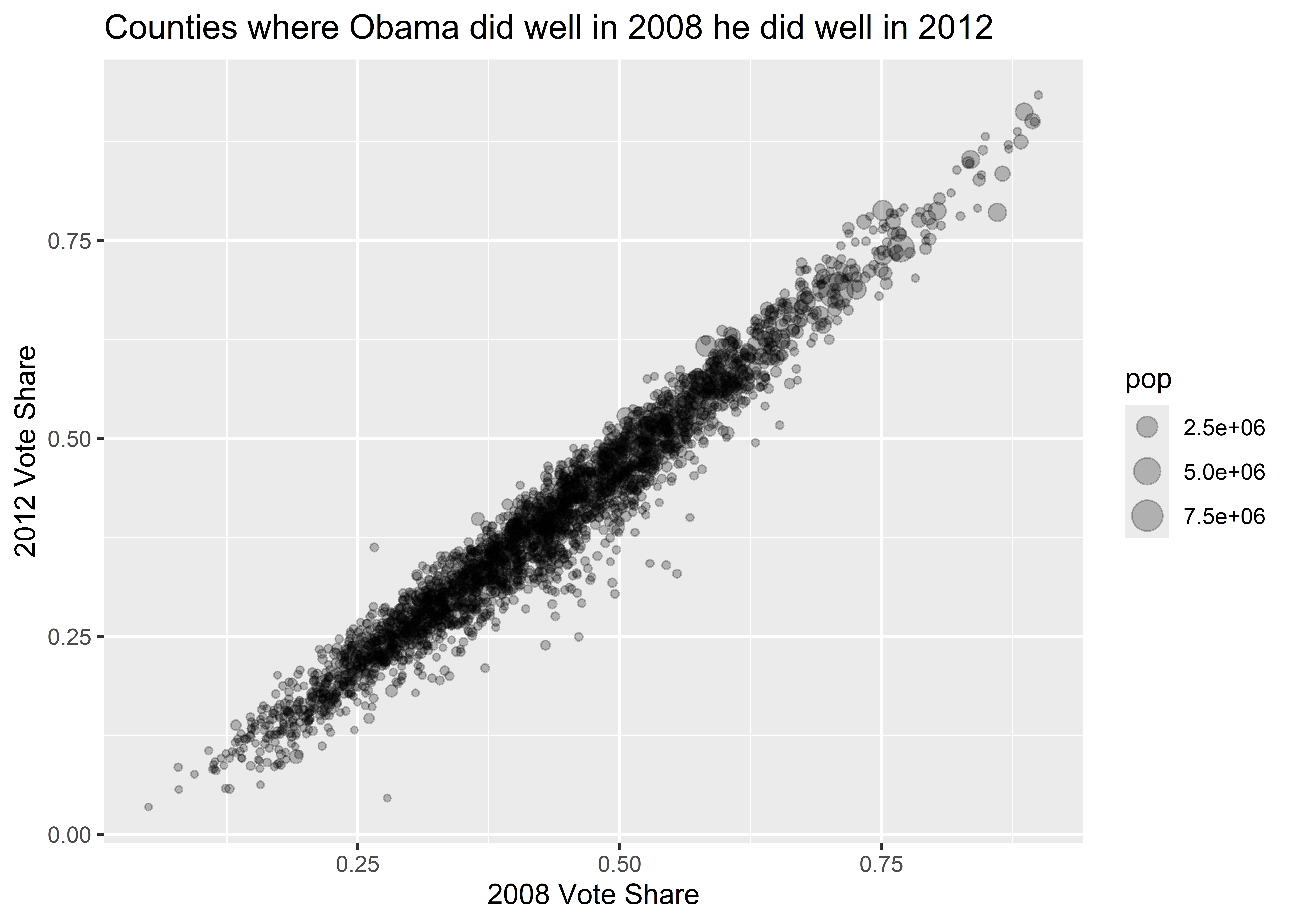
The above code maps point size to the pop variable in the election data so that geom_point() draws larger points for observations that have a larger population. The command alpha = 0.5 in geom_point() sets the transparency of points to 50%. I could have given it any numerical value between 0 and 1, where 1 (the default) means the object being plotted is completely solid and 0 means it is invisible.
Not only can we map and set different aesthetics at the same time, we can also tell ggplot just to map an aesthetic for one geom layer rather than all of them. Look at the difference between the plot this code produces:
ggplot(election) +
  aes(x = pop, y = dem_margin08, color = winner08) +
  geom_point() +
  geom_smooth() +
  labs(
    title = "More populous counties tended to favor Obama in 2008",
    x = "County Population",
    y = "Obama's Vote Margin"
  ) +
  scale_x_log10(labels = scales::comma)
And compare it to what this code produces:
ggplot(election) +
  aes(x = pop, y = dem_margin08) +
  geom_point(aes(color = winner08)) +
  geom_smooth() +
  labs(
    title = "More populous counties tended to favor Obama in 2008",
    x = "County Population",
    y = "Obama's Vote Margin"
  ) +
  scale_x_log10(labels = scales::comma)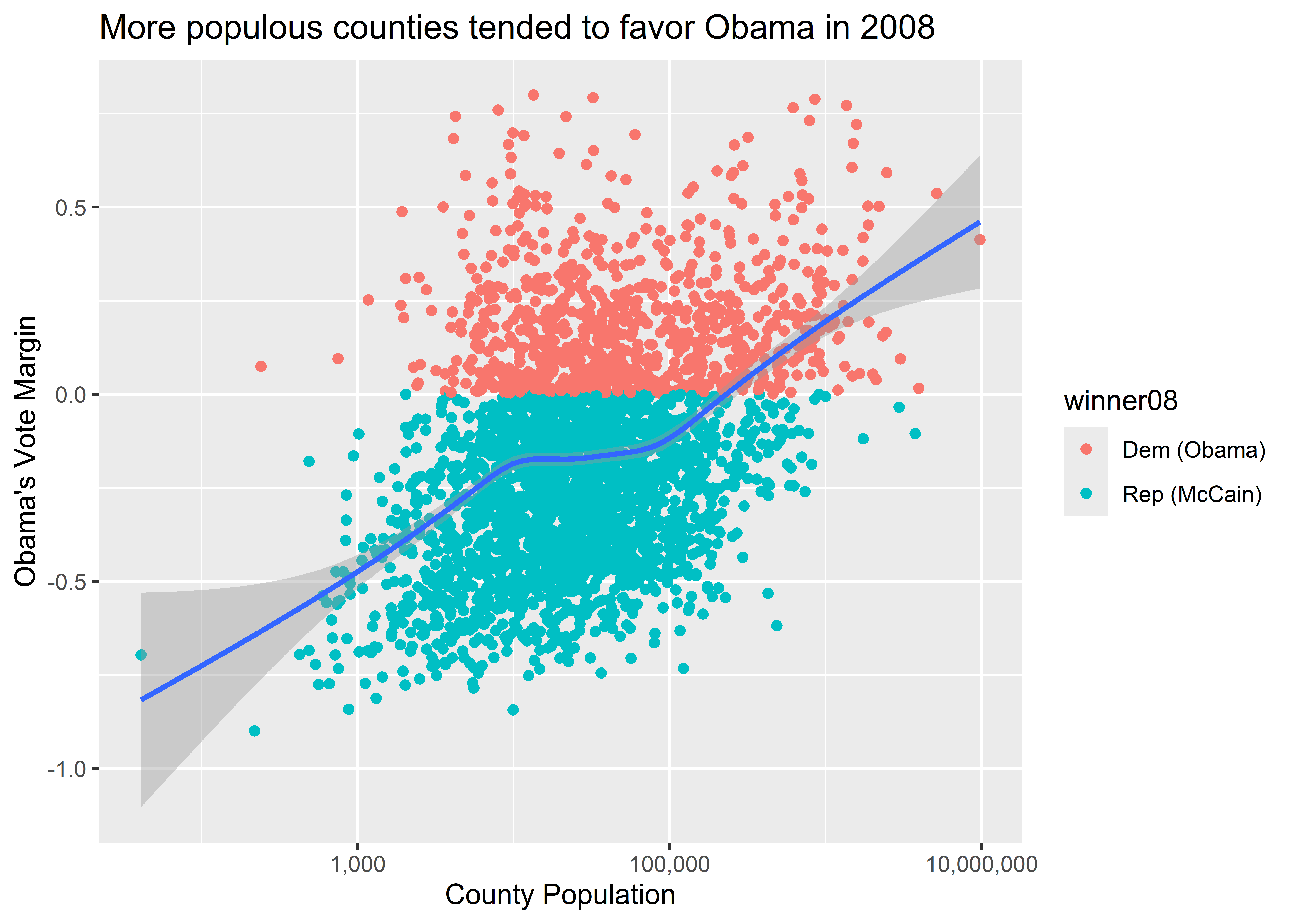
The first code maps color to winner08 globally. That means that for each geom layer that we add, color will be mapped to the values of this column. Conversely, the second code chunk maps color to winner08 only for the geom_point() layer. That is, we’ve done an aesthetic mapping locally. This is done by adding a new call to aes() inside a particular geom function. Remember when I mentioned you could map variables using aes() in a few different places in your code? This is why you can do that, and this in particular is a case where the location in your code that you include variables using aes() matters for your output.
Notice, too, the difference in the legends ggplot produces for these figures. Ggplot legends will always faithfully reflect the aesthetic mappings you add to your plots.
Ggplot will dutifully map all kinds of aesthetics that you tell it to map. That doesn’t mean that every possible mapping is a good idea.
Take the example from above where we mapped point size to population. This was a sensible choice because people have an easy time intuiting that point size corresponds with the size of the observation. We could have used color instead. Would this choice have been as effective?
ggplot(election) +
  aes(
    x = dem2008 / turnout2008,
    y = dem2012 / turnout2012,
    color = pop
  ) +
  geom_point() +
  labs(
    title = "Counties where Obama did well in 2008 he did well in 2012",
    x = "2008 Vote Share",
    y = "2012 Vote Share"
  )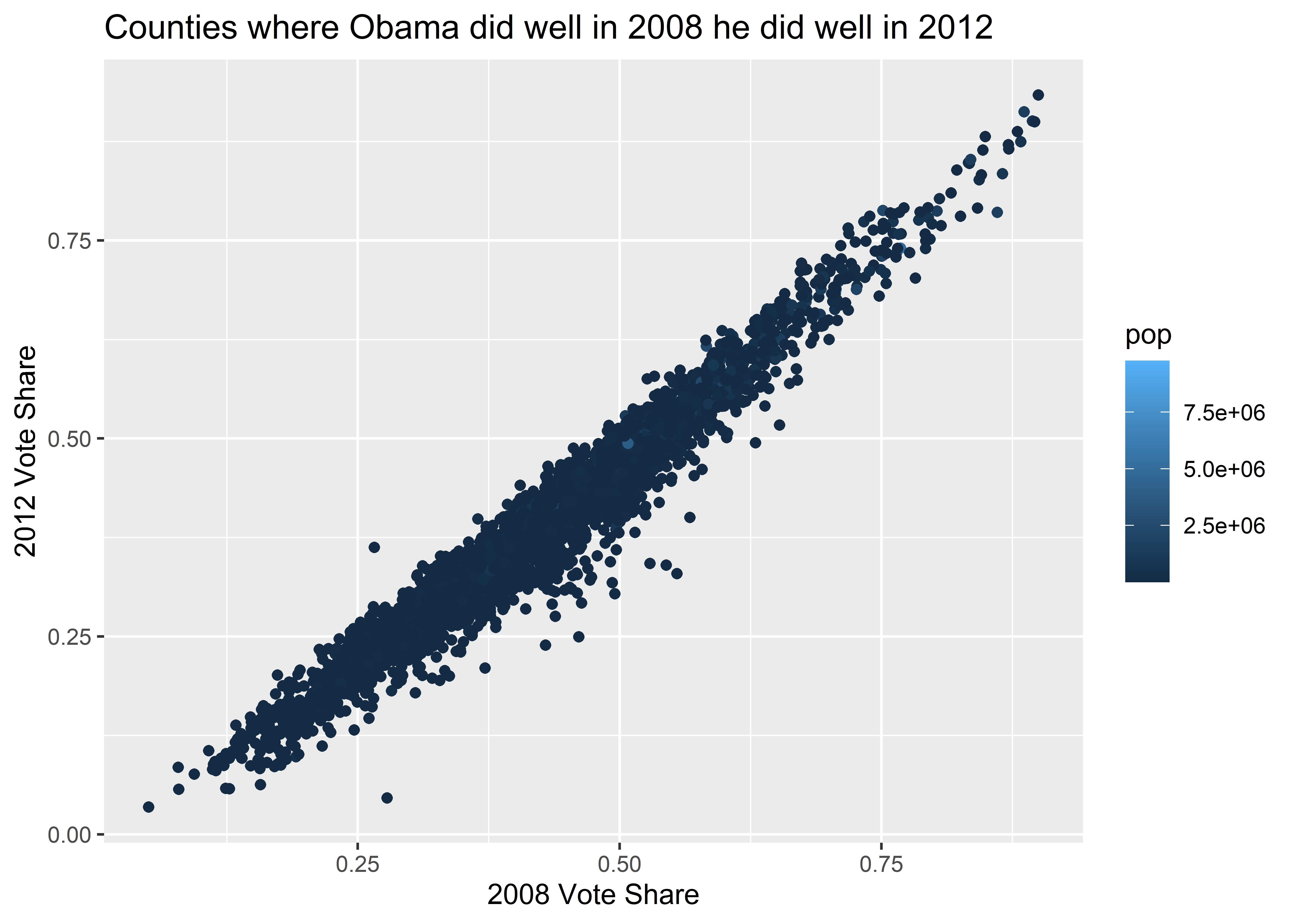
The answer is no. Here’s another example, this time for a bar plot where we’ve mapped the color of columns to winner08. To change things up, instead of making the x variable pop I’ve used pop_decile which consists of the integers 1-10. These indicate which decile in the distribution of county populations a particular county falls. Also notice that there is no y variable. This is because the geom that we’re going to use (geom_bar()) will create a y variable for us by counting up the number of counties in the data associated with the different population deciles.
ggplot(election) +
  aes(x = pop_decile, color = winner08) +
  geom_bar()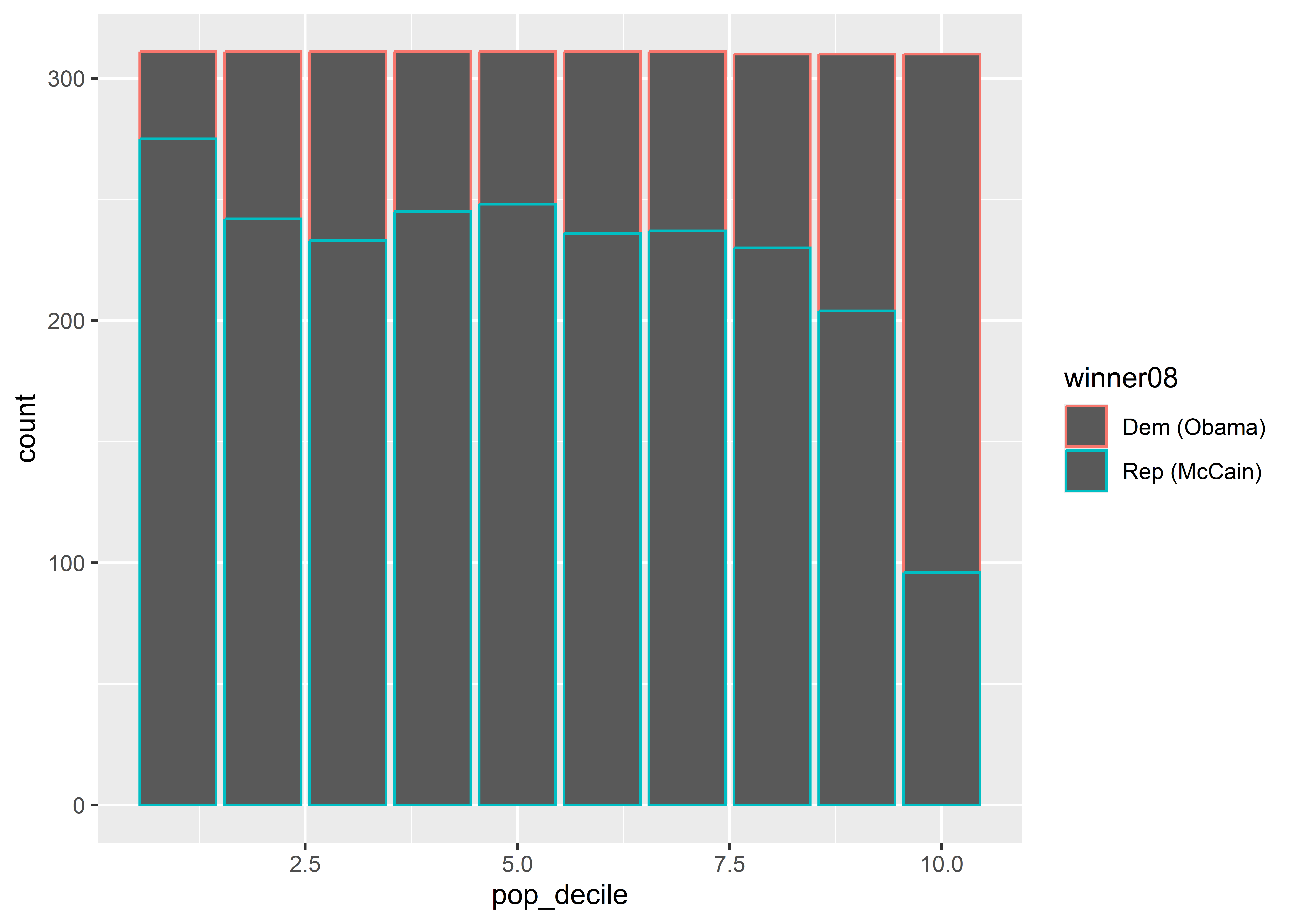
Do you notice all the grey spaces in the figure? That’s because when you produce a bar plot, the color aesthetic colors the borders of the bars; not inside them. When we want to fill spaces with color, we need to use the fill aesthetic rather than color:
ggplot(election) +
  aes(x = pop_decile, fill = winner08) +
  geom_bar()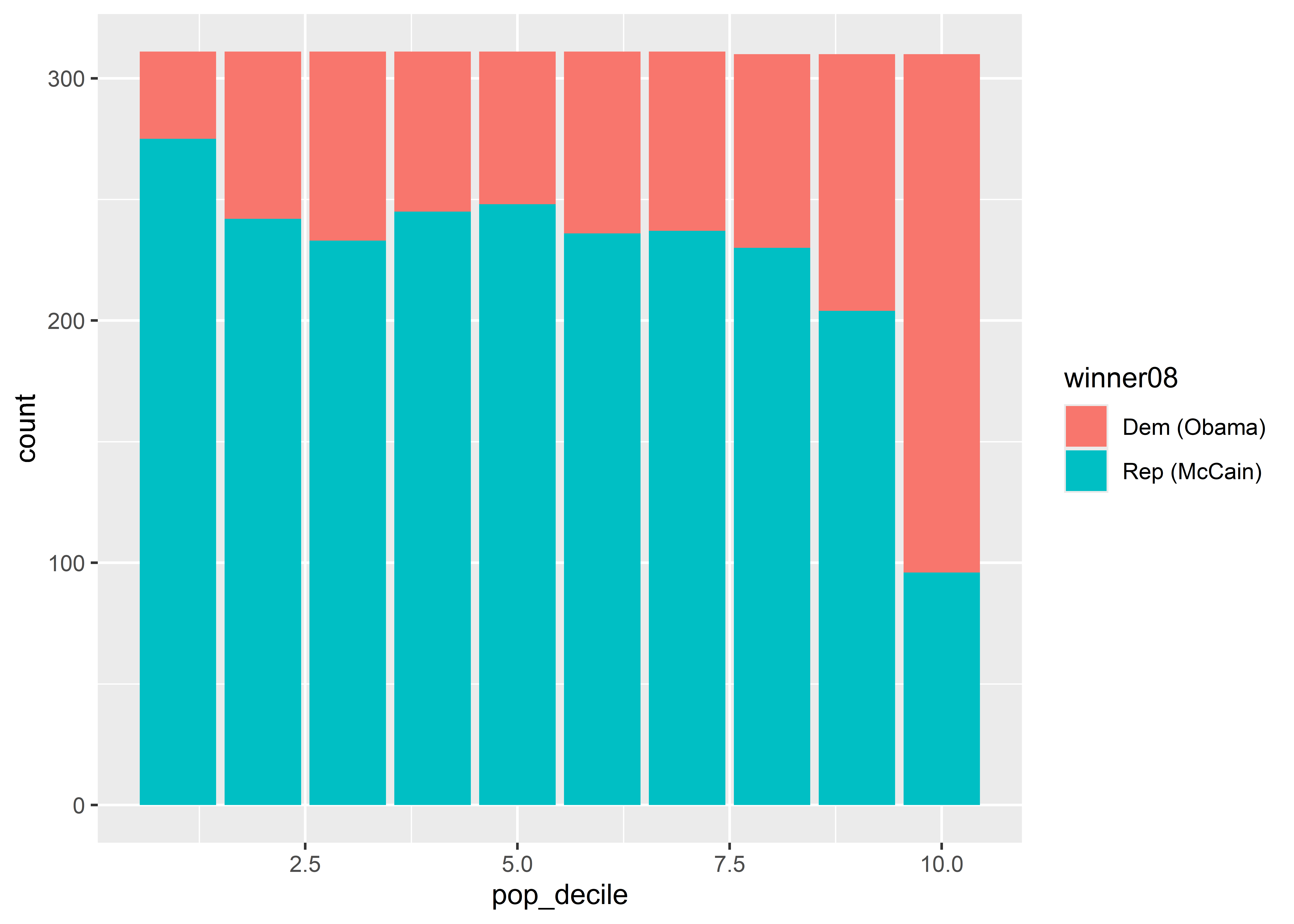
If you get confused about color versus fill, try to remember that you “fill” empty spaces.
Finally, you should make sure that your mapped aesthetics communicate something unique rather than redundant. Say, for example, someone decided to map size to population in a scatter plot where population is also on the x-axis, as shown below. This is a bad plotting choice. It only adds chart junk to your data visualization. We already have a sense for how population size corresponds to different data points because of their location along the x-axis. We don’t need to map size (or any other aesthetic) to population as well.
ggplot(election) +
  aes(x = pop, y = dem_margin08, size = pop) +
  geom_point() +
  labs(
    title = "More populous counties tended to favor Obama in 2008",
    x = "County Population",
    y = "Obama's Vote Margin"
  ) +
  scale_x_log10(labels = scales::comma)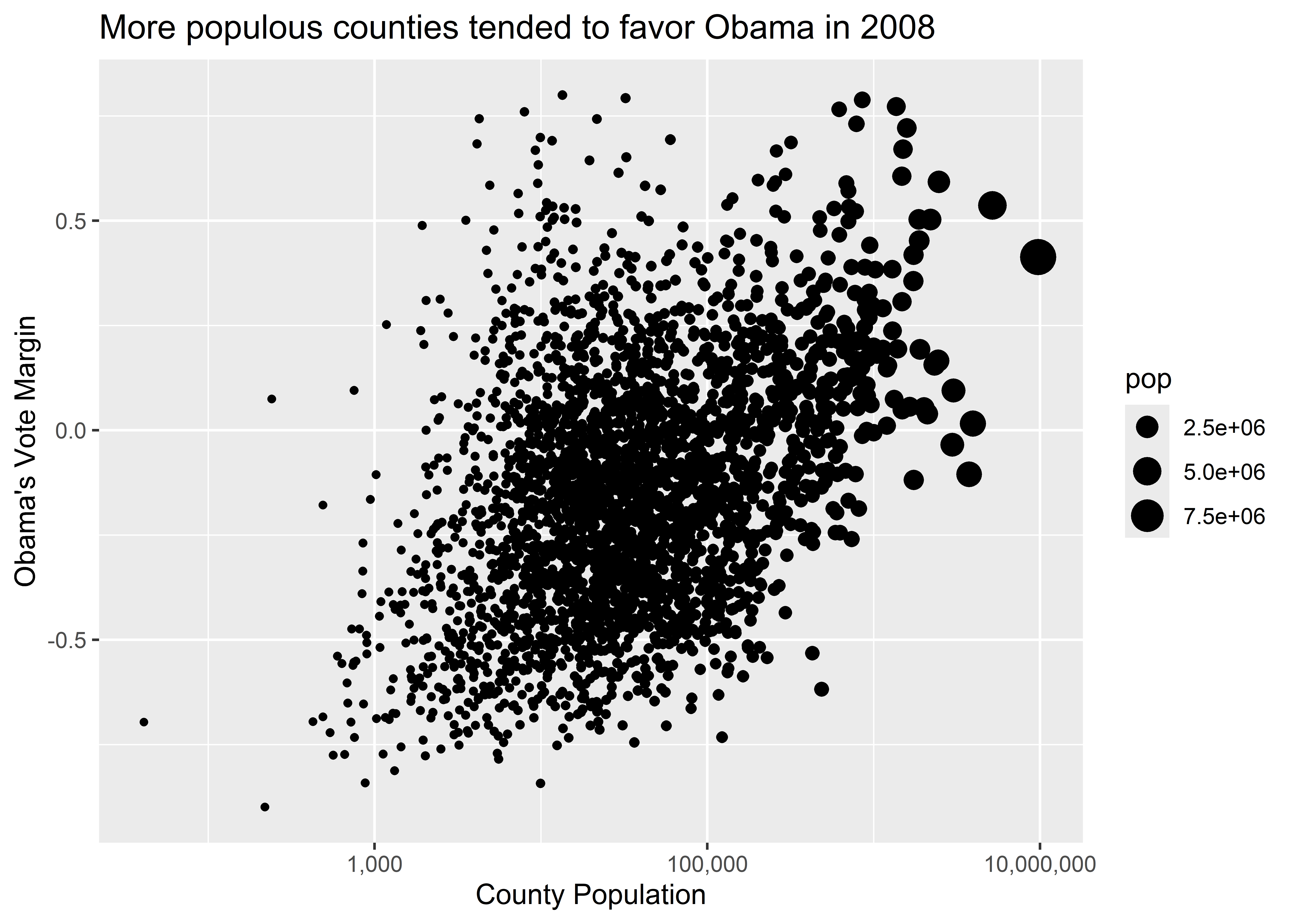
After you’ve produced your data viz, you may want to save it for later use for writing a report or to share on social media or some other outlet.
You have a lot of different options for saving your figures, and I want us to wrap up by walking through a couple of these.
This is the easiest one. You can copy and paste the data viz you produce directly from your Quarto file. Just right click on the figure that your code block produced and select copy and/or save to save it somewhere in your files.
ggsave()You can save your plots using the ggsave() function to save a plot directly to somewhere in your project files.
Say you created a folder in your project called Figures. Here’s how you would use a combo of here() and ggsave() to save your work:
my_plot <- ggplot(election) +
  aes(x = pop_decile, color = winner08) +
  geom_bar()
# save your ggplot as an object

library(here)
# open the here package

ggsave(here("Figures", "my_first_figure.png"),
       plot = my_plot)
# save it to the Figures folder and name it
# "my_first_figure.png" to save it as a .png file
This is my favorite and preferred way of saving a figure. The biggest pros of using this approach are:
You can check out more options by writing ?ggsave() in the console.
The ggplot workflow follows a simple logic. Using this logic, you can produce a near infinite variety of data visualizations. We haven’t even covered the myriad ways you can customize the theme and overall look of your figures.
We’ve also discussed why you need to be careful with mapping and setting aesthetics. Among the list of common mistakes new R users make when producing a data visualization, I’d say confusing these two things is near the top. Every time you run your code, make sure you take the time to actually look at what you’ve produced and determine whether it looks right or if something is off. This simple practice of slowing down will go a long way in making you a more effective and efficient data analyst.
Speaking of taking a look at our data and the visualizations we’re producing, in the next chapter, we’re going to talk about making sure our data visualizations are showing what we think they should be showing.
Oh, and by the way, you’re probably wondering to yourself about what all this has to do with election fraud and election anomalies in general. Don’t worry, we’ll get to that soon.
Tidy data are a special case of “normal form” data, which is an important concept in data-base management.↩︎