## packages
library(tidyverse)
library(socsci)
library(coolorrr)

## my own data viz settings
set_theme()
set_palette(
  qualitative = c("steelblue", "gray", "red3", "purple4", "gold2"),
  sequential = c("white", "steelblue"),
  diverging = c("red3", "white", "steelblue"),
  binary = c("steelblue", "red3")
)

## data
url <- "http://filesforprogress.org/datasets/wthh/DFP_WTHH_release.csv"
Data <- read_csv(url)

## recodes
Data <- Data |>
  mutate(
    ## education
    educ_cat = frcode(
      educ4 == 1 ~ "High School or Less",
      educ4 == 2 ~ "Some College",
      educ4 == 3 ~ "College Grad",
      educ4 == 4 ~ "Postgrad"
    ),
    ## race
    race_new = frcode(
      race4 == 1 ~ "White",
      race4 == 2 ~ "Black",
      race4 == 3 ~ "Latino",
      race4 == 4 ~ "Other"
    ),
    ## party id
    pid3_new = frcode(
      pid3 == 1 ~ "Democrat",
      !(pid3 %in% 1:2) ~ "Independent/Other",
      pid3 == 2 ~ "Republican"
    ),
    ## gender
    gender_id = ifelse(
      gender == 1, "Male", "Female"
    ),
    ## age
    age = 2018 - birthyr,
    ## issues
    across(
      c(ICE, BAIL_item, WELTEST, PUBLICINT, GREENJOB, POLFEE),
      ~ frcode(
        .x == 5 ~ "Strongly oppose",
        .x == 4 ~ "Oppose",
        .x == 3 ~ "Neither",
        .x == 2 ~ "Support",
        .x == 1 ~ "Strongly support"
      )
    )
)14 Showing More with Less
14.1 Goals
- Provide examples for how to do demographic summaries of survey samples
- Provide examples for how to summarize attitudes in a survey
- Learn ways to show more with less by putting multiple related summaries in a single data visualization.
In this last chapter on working with survey data, I want to walk through some ways to show more with less using survey data. Often we’re interested in many different related variables when we make summaries of survey responses, and the process of making a data visualization for each one can be tedious. It’s much better to be efficient by showing more data in fewer data visualizations. Using a combination of data pivots or a special R package called {patchwork} we do this easily.
Here’s some starting packages and data (along with recodes) that you’ll need to walk through the below examples:
14.2 Demographic Summaries
There are many ways you could summarize the demographic profile of a sample. How complex these summaries are depends on how many demographic factors you want to consider at once. If you want to just look at one at a time, a simple bar chart or histogram will do. For example, here’s a bar chart of how the sample breaks down by race:
Data |>
  ct(race_new, wt = weight_DFP, show_na = F) |>
  ggplot() +
  aes(
    x = reorder(race_new, -pct),
    y = pct
  ) +
  geom_col(
    fill = "gray"
  ) +
  labs(
    x = NULL,
    y = NULL,
    title = "Breakdown of the survey sample by race",
    caption = "Source: What the Hell Happened? (Data for Progress)"
  ) +
  scale_y_continuous(
    labels = scales::percent
  ) +
  theme(
    axis.text.x = element_text(angle = 45, hjust = 1)
  )
Here’s another example looking at the breakdown by respondent age:
ggplot(Data) +
  aes(x = age) +
  geom_histogram(
    fill = "gray",
    color = "black"
  ) +
  scale_x_continuous(
    n.breaks = 10
  ) +
  labs(
    x = NULL,
    y = NULL,
    title = "Distribution of survey respondents by age",
    caption = "Source: What the Hell Happened? (Data for Progress)"
  )
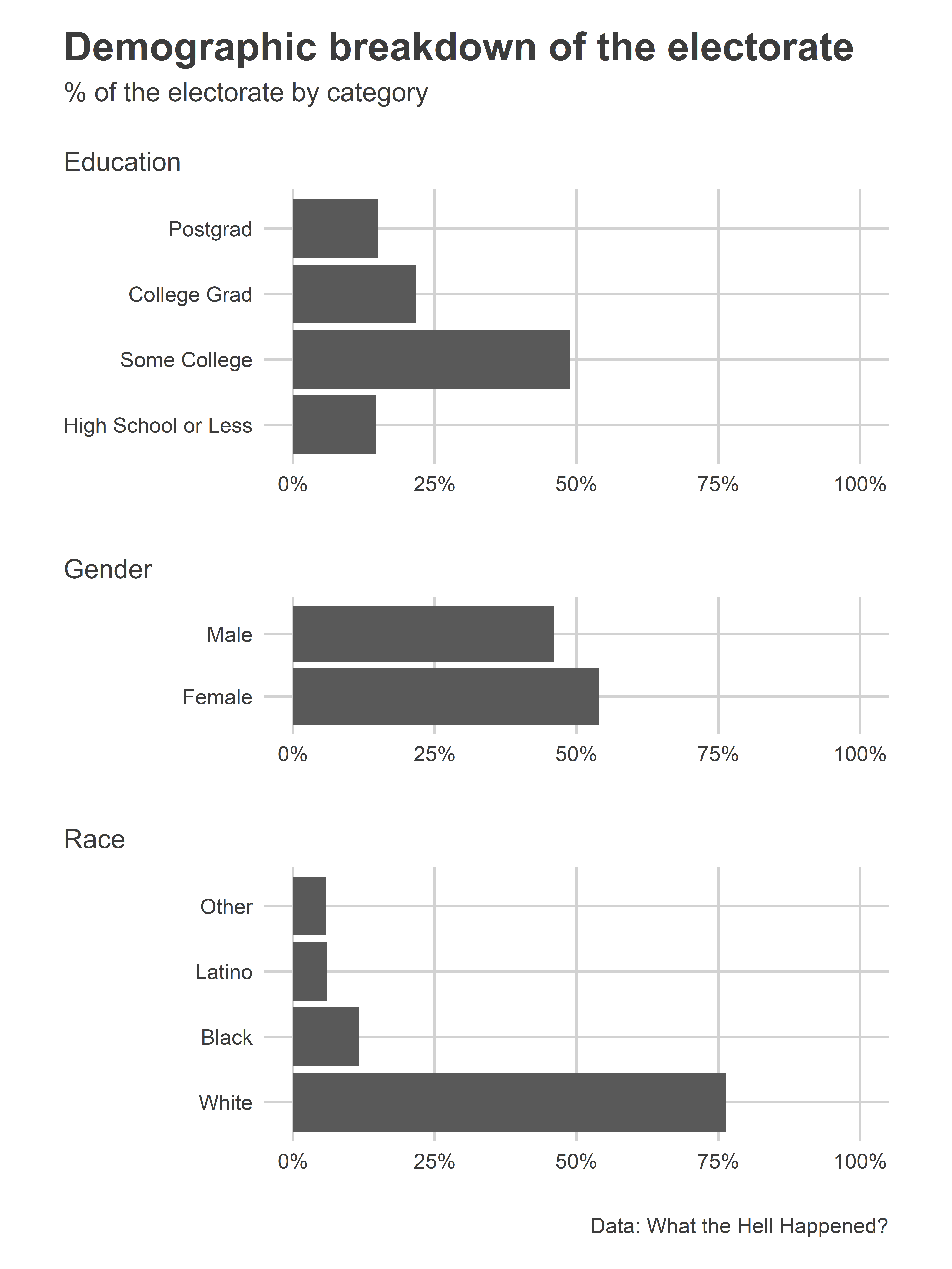
If we want to summarize many different demographic factors at once, it helps to make a small multiple. This is more concise than splitting summaries up across many different graphs. Say we wanted to look at the demographic breakdown of the data by gender, race, and education. In the below example, I’m able to show all three at once. In previous examples I’ve shown you how to pivot the data and use a small multiple by facet wrapping. This approach unfortunately messes with the ordering of factors like education level for plotting. To get around this, I instead make a small multiple by making individual plots for each demographic factor I’d like to summarize. I then combine them together using the {patchwork} package. You can read more about it here: https://patchwork.data-imaginist.com/. It lets me use simple syntax to combine plots into a single data visualization and customize the appearance.
## use patchwork
library(patchwork)

## make summary objects for each variable
edu_sum <- Data |>
  ct(educ_cat, wt = weight_DFP, show_na = F)
gen_sum <- Data |>
  ct(gender_id, wt = weight_DFP, show_na = F)
rac_sum <- Data |>
  ct(race_new, wt = weight_DFP, show_na = F)

## make individual plots for each
p1 <- ggplot(edu_sum) +
  aes(x = pct, y = educ_cat) +
  geom_col() +
  labs(
    subtitle = "Education"
  )
p2 <- ggplot(gen_sum) +
  aes(x = pct, y = gender_id) +
  geom_col() +
  labs(
    subtitle = "Gender"
  )
p3 <- ggplot(rac_sum) +
  aes(x = pct, y = race_new) +
  geom_col() +
  labs(
    subtitle = "Race"
  )

## combine them together
p1 / p2 / p3 +
  plot_layout(
    heights = c(2, 1, 2)
  ) +
  plot_annotation(
    title = "Demographic breakdown of the electorate",
    subtitle = "% of the electorate by category",
    caption = "Data: What the Hell Happened?"
  ) &
  scale_x_continuous(
    labels = scales::percent,
    limits = 0:1
  ) &
  labs(
    x = NULL,
    y = NULL
  )
14.3 Summarizing Attitudes
We have similar data visualization choices when we want to show how an attitude either breakdowns by different demographic factors in the data or else is correlated with other attitudes. Just like with demographic factors, your data visualizations can range from simple to complex.
Here’s an example showing how attitudes with respect to six different policies breakdown. While it doesn’t show how attitudes vary by different factors in the data, it manages to summarize attitudes for all six at once:
Data |>
  pivot_longer(
    cols = c(ICE, BAIL_item, WELTEST, PUBLICINT, GREENJOB, POLFEE)
  ) |>
  mutate(
    name = frcode(
      name == "ICE" ~ "De-fund ICE",
      name == "BAIL_item" ~ "End Cash Bail",
      name == "WELTEST" ~ "Drug-testing for Welfare",
      name == "PUBLICINT" ~ "Public Internet Company",
      name == "GREENJOB" ~ "Green Jobs for Unemployed",
      name == "POLFEE" ~ "Polution Fees for Companies"
    )
  ) |>
  group_by(name) |>
  ct(value, wt = weight_DFP, show_na = F) |>
  ggplot() +
  aes(x = value, y = pct, fill = name) +
  geom_col(show.legend = F) +
  facet_wrap(~ name) +
  scale_y_continuous(
    labels = scales::percent
  ) +
  labs(
    x = NULL,
    y = NULL,
    title = "Support for different policy proposals",
    caption = "Data: What the Hell Happened?"
  ) +
  theme(
    axis.text.x = element_text(angle = 45, hjust = 1)
  )
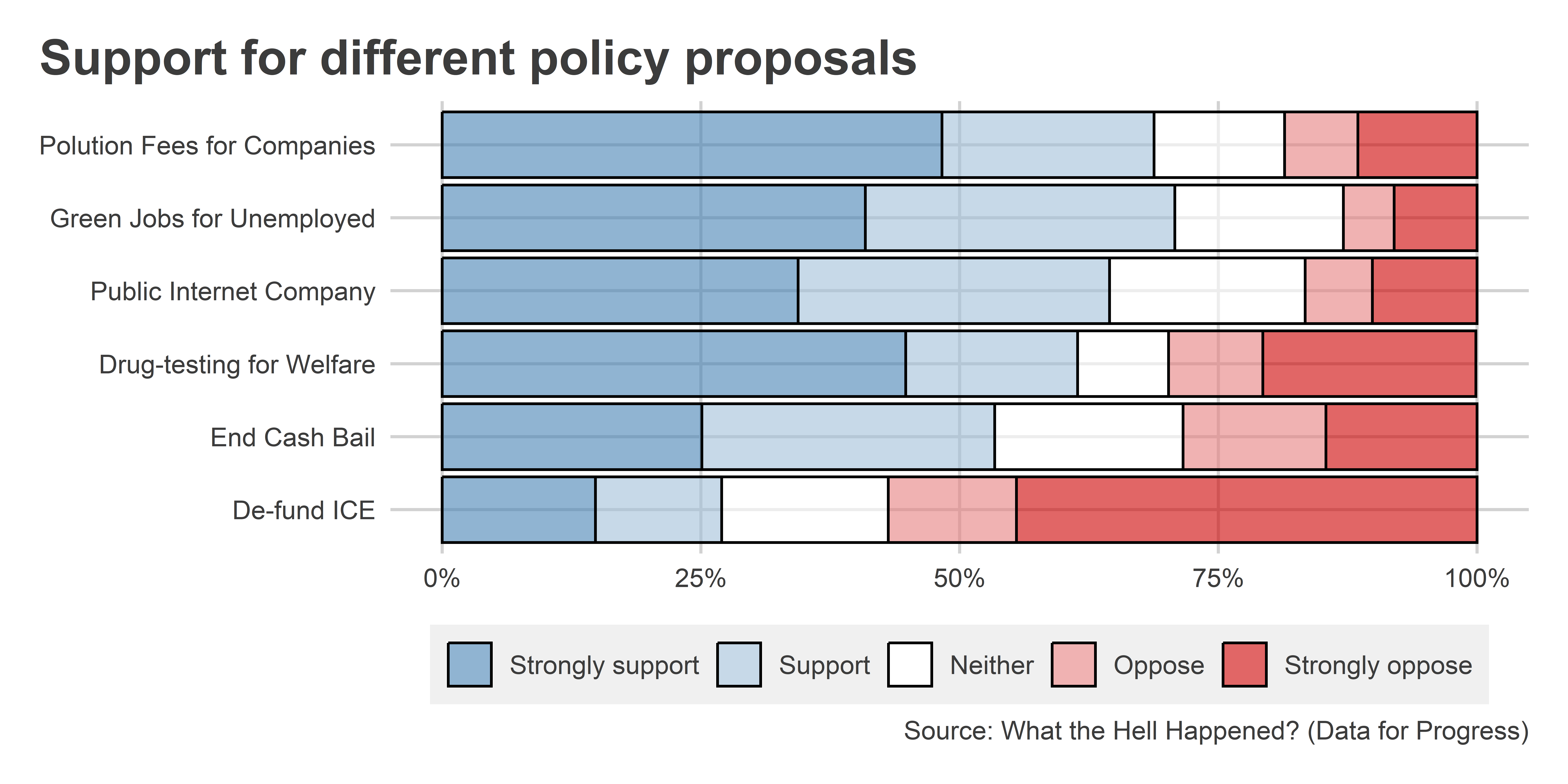
We can also convert this into a stacked version to make comparisons easier:
Data |>
  pivot_longer(
    cols = c(ICE, BAIL_item, WELTEST, PUBLICINT, GREENJOB, POLFEE)
  ) |>
  mutate(
    name = frcode(
      name == "ICE" ~ "De-fund ICE",
      name == "BAIL_item" ~ "End Cash Bail",
      name == "WELTEST" ~ "Drug-testing for Welfare",
      name == "PUBLICINT" ~ "Public Internet Company",
      name == "GREENJOB" ~ "Green Jobs for Unemployed",
      name == "POLFEE" ~ "Polution Fees for Companies"
    )
  ) |>
  group_by(name) |>
  ct(value, wt = weight_DFP, show_na = F, cum = T) |>
  ggplot() +
  aes(x = pct, y = name, fill = value) +
  geom_col(color = "black") +
  scale_x_continuous(
    labels = scales::percent
  ) +
  labs(
    x = NULL,
    y = NULL,
    title = "Support for different policy proposals",
    caption = "Source: What the Hell Happened? (Data for Progress)",
    fill = NULL
  ) +
  ggpal(
    type = "diverging",
    aes = "fill",
    ordinal = T,
    levels = 5,
    guide = guide_legend(reverse = T)
  )
Summarizing attitudes that are measured using continuous scales can be done similarly, for example, with a histogram, like I’ve done below using racial resentment, hostile sexism, and fear of demographic change. Notice that I can map the weight aesthetic to the weight_DFP column in the dataset to infer what the distribution for these variables looks like in the general electorate.
Data |>
  pivot_longer(
    cols = c(racial_resentment_scaled, hostile_sexism_scaled, fear_of_demographic_change_scaled)
  ) |>
  mutate(
    name = str_replace_all(name, "_", " ") |>
      str_remove(" scaled")
  ) |>
  ggplot() +
  aes(x = value, weight = weight_DFP) +
  geom_histogram(
    color = "black",
    fill = "gray"
  ) +
  facet_wrap(~ name) +
  scale_x_continuous(
    breaks = 0:1,
    labels = c("low", "high")
  ) +
  labs(
    x = NULL,
    y = NULL,
    title = "Distribution of attitudes toward different marginalized\ngroups",
    caption = "Data: What the Hell Happened?"
  ) +
  theme(
    axis.text.x = element_text(hjust = 0:1)
  )
You can also use a “ridge” plot, for continuous data. A ridge plot is similar to a density plot, but it lets you show multiple distributions at once without the need to use facet_wrap() or facet_grid().
## open {ggridges}
library(ggridges)

## make the plot
Data |>
  pivot_longer(
    cols = c(racial_resentment_scaled, hostile_sexism_scaled, fear_of_demographic_change_scaled)
  ) |>
  mutate(
    name = str_replace_all(name, "_", " ") |>
      str_remove(" scaled")
  ) |>
  ggplot() +
  aes(x = value, y = name, weight = weight_DFP) +
  geom_density_ridges(
    aes(height = ..density..),
    stat = "density",
    trim = T
  ) +
  labs(
    x = NULL,
    y = NULL,
    title = "Distribution of attitudes toward different marginalized\ngroups",
    caption = "Source: What the Hell Happened? (Data for Progress)"
  )
We can also use a “raincloud” plot. It’s very similar to the above, but it adds more elements. Specifically, it blends together a density plot, a boxplot, and a dotplot/histogram, giving the appearance of rain clouds. Check it out below. Make sure to install {ggrain}.
## install.packages("ggrain")
library(ggrain)

Data |>
  pivot_longer(
    cols = c(racial_resentment_scaled, hostile_sexism_scaled, fear_of_demographic_change_scaled)
  ) |>
  mutate(
    name = str_replace_all(name, "_", " ") |>
      str_remove(" scaled")
  ) |>
  ggplot() +
  aes(x = name, y = value, fill = name, color = name, weight = weight_DFP) +
  geom_rain(alpha = 0.6) +
  coord_flip() +
  labs(
    x = NULL,
    y = NULL,
    title = "Distribution of attitudes toward different marginalized\ngroups",
    caption = "Source: What the Hell Happened? (Data for Progress)"
  ) +
  ggpal(aes = "fill") +
  ggpal(aes = "color") +
  theme(
    legend.position = ""
  )
14.4 Final tips
Doing more with less is a great time saver. By showing multiple summaries in a single data visualization you avoid needless repetition. I also think it’s much easier for your audience to quickly digest your findings. But before we go, I want to caution you against putting too much in a single data visualization.
In each of the examples above, the variable summaries I combined together are all related in some way. Demographic factors were grouped together. Attitudes on specific issues were grouped together. The same was done with indexes capturing sentiments toward disadvantaged groups. You should always make sure there’s some logic connecting your many summaries. The goal is to produce a beautiful patchwork of data visualizations; not an incarnation of Frankenstein’s Monster.
Also, even when your summaries have a logical connection, you can still run the risk of showing too much. A summary of 5 or so demographic factors will look okay, but one of 20? That’s probably not going to work. The key is to identify a happy medium between avoiding the tedium of many graphs that show only very little and a few graphs that lead to information overload.