Rows: 51
Columns: 26
$ fips.x <chr> "02", "01", "05", "04", "06", "08", "09", "11", "10", "12…
$ abbr <chr> "AK", "AL", "AR", "AZ", "CA", "CO", "CT", "DC", "DE", "FL…
$ full <chr> "Alaska", "Alabama", "Arkansas", "Arizona", "California",…
$ geom <MULTIPOLYGON [m]> MULTIPOLYGON (((-2396847 -2..., MULTIPOLYGON…
$ state <chr> "Alaska", "Alabama", "Arkansas", "Arizona", "California",…
$ st <chr> "AK", "AL", "AR", "AZ", "CA", "CO", "CT", "DC", "DE", "FL…
$ fips.y <dbl> 2, 1, 5, 4, 6, 8, 9, 11, 10, 12, 13, 15, 19, 16, 17, 18, …
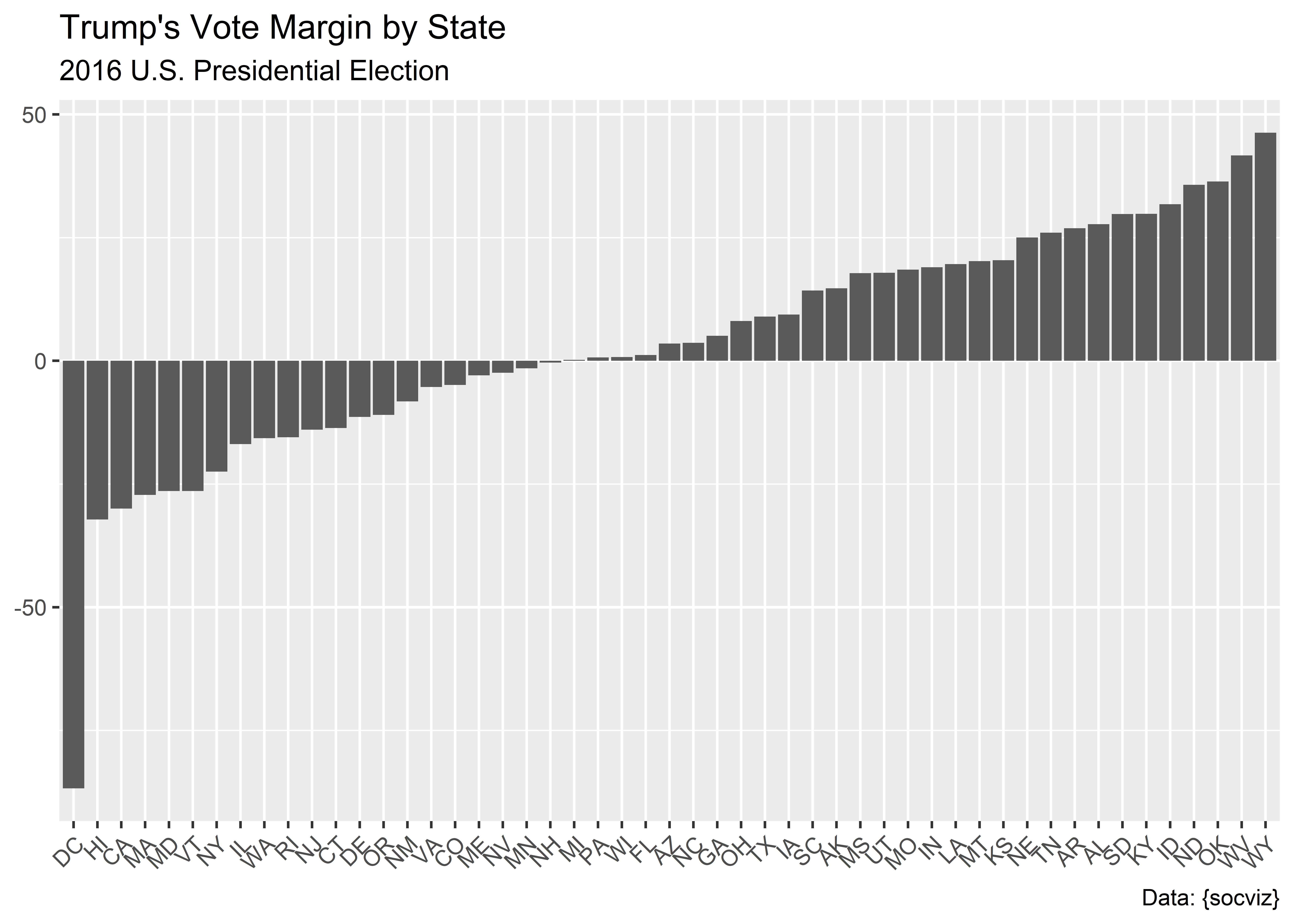
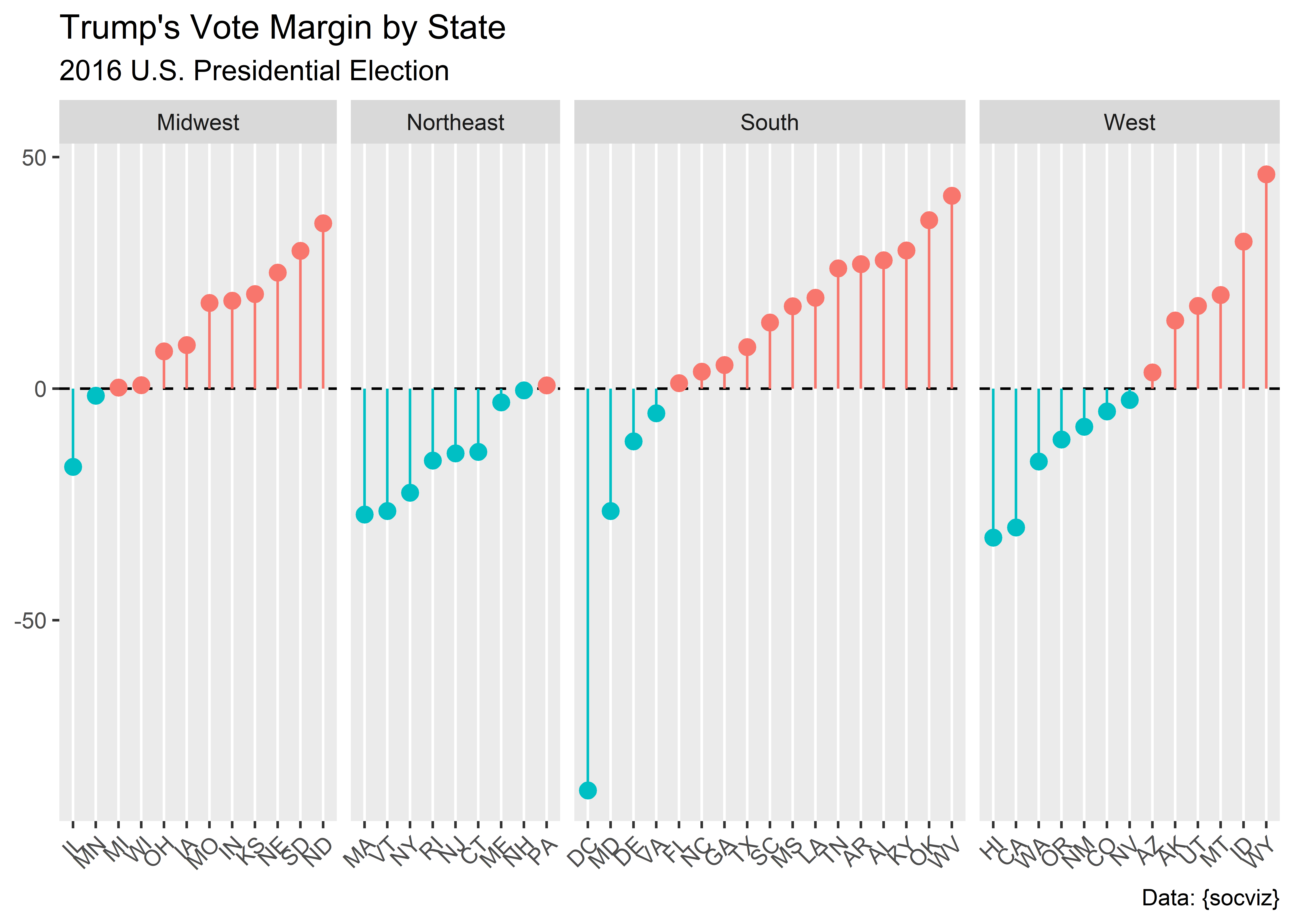
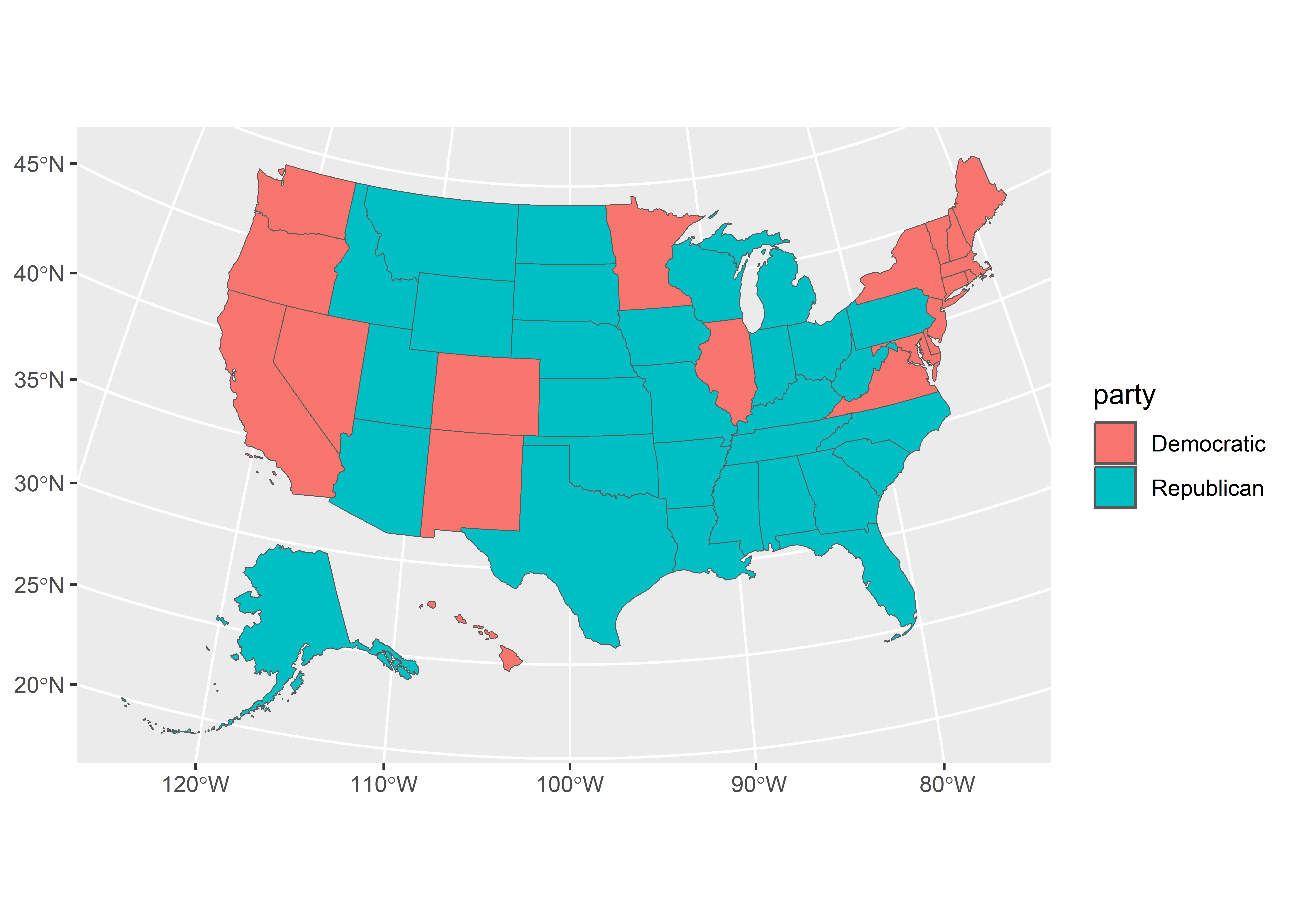
$ total_vote <dbl> 318608, 2123372, 1130635, 2604657, 14237893, 2780247, 164…
$ vote_margin <dbl> 46933, 588708, 304378, 91234, 4269978, 136386, 224357, 27…
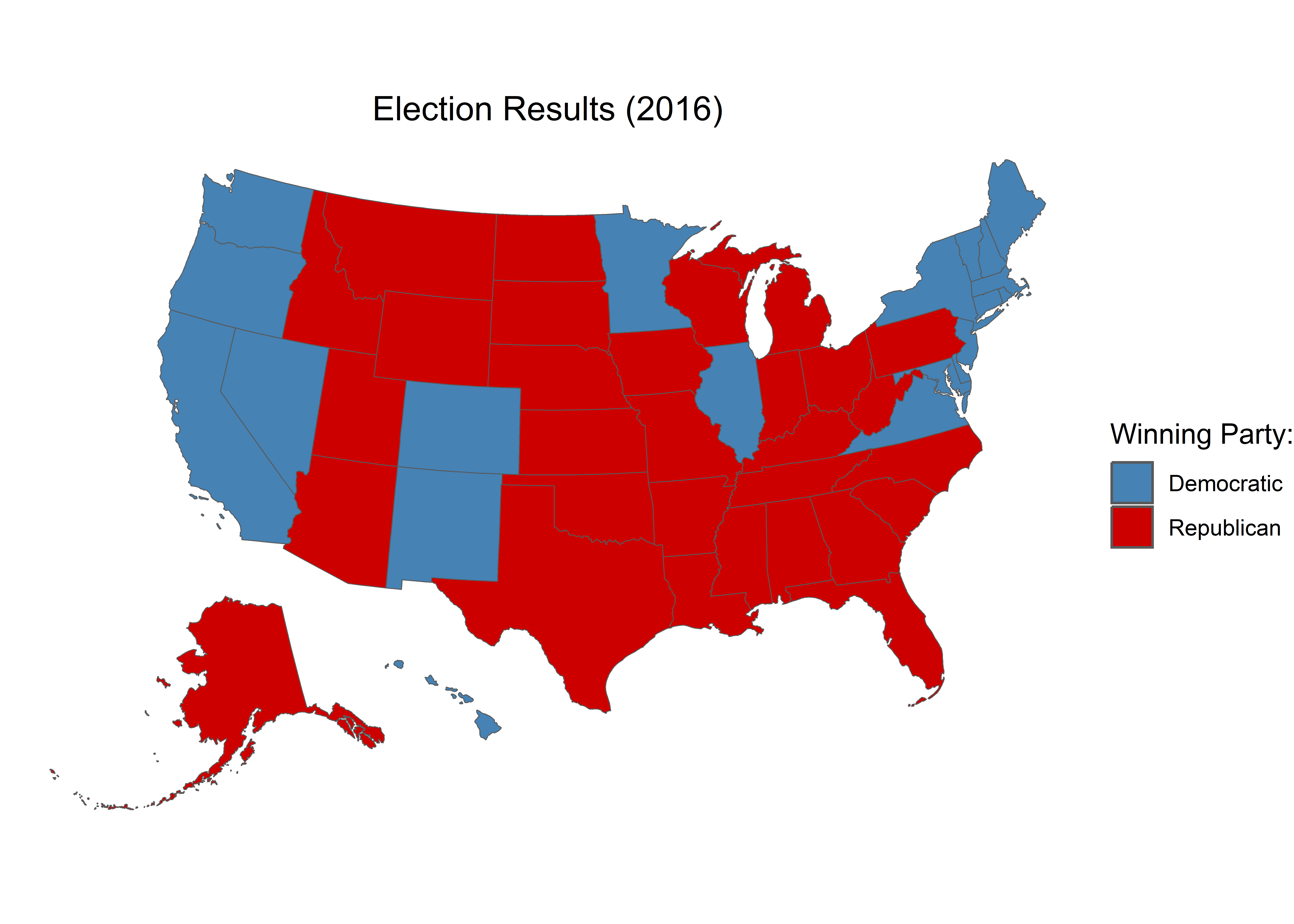
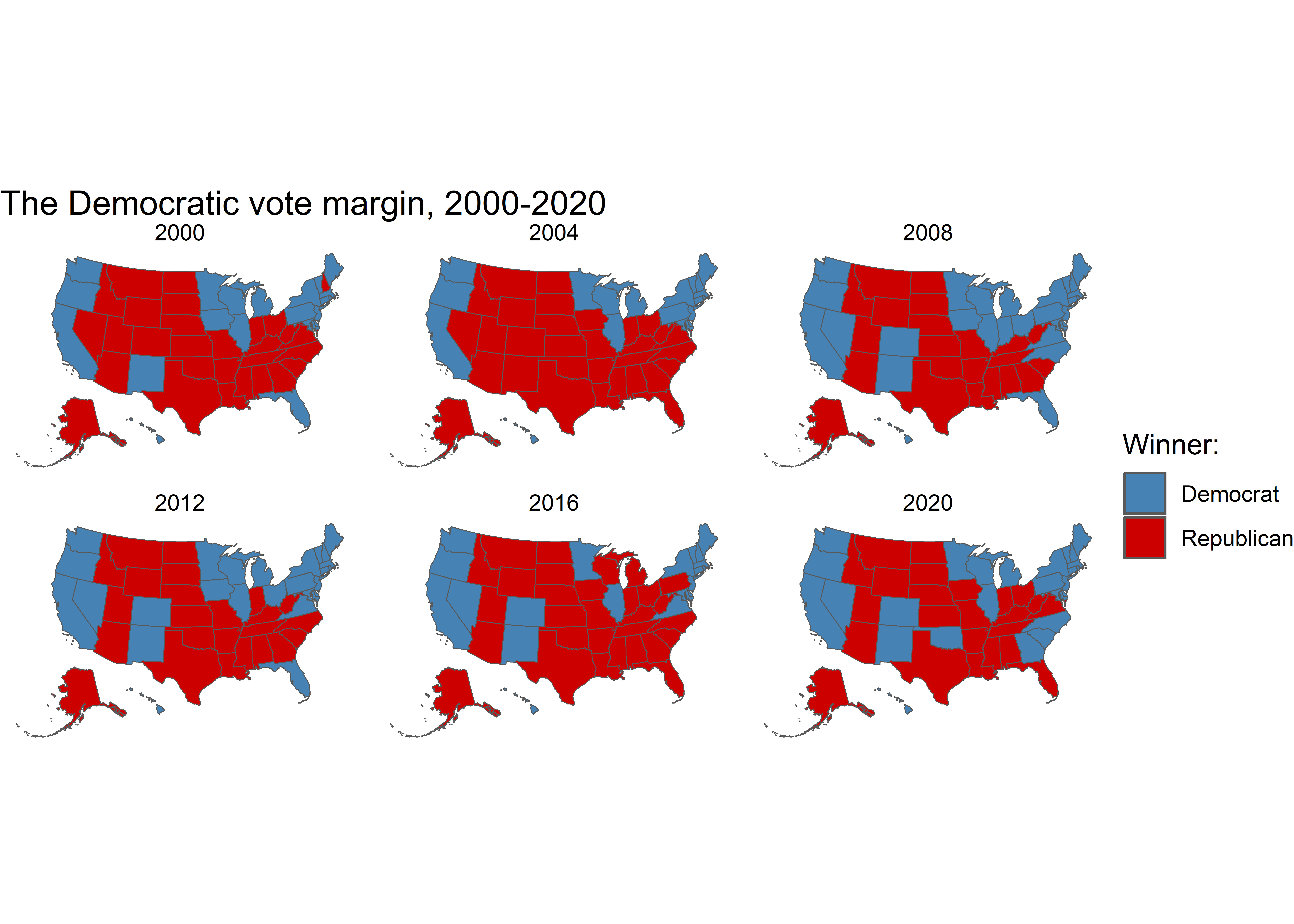
$ winner <chr> "Trump", "Trump", "Trump", "Trump", "Clinton", "Clinton",…
$ party <chr> "Republican", "Republican", "Republican", "Republican", "…
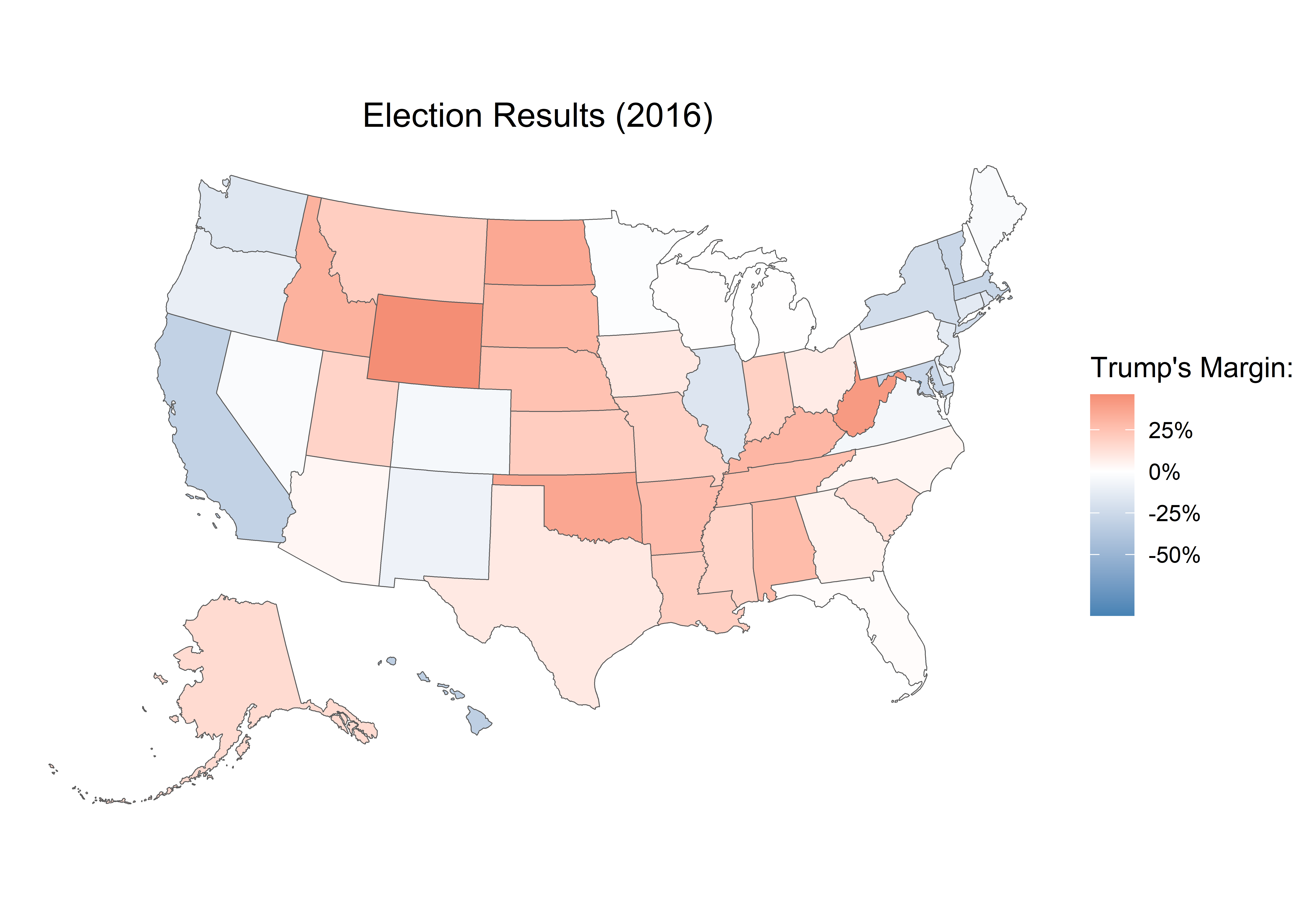
$ pct_margin <dbl> 0.1473, 0.2773, 0.2692, 0.0350, 0.2999, 0.0491, 0.1364, 0…
$ r_points <dbl> 14.73, 27.72, 26.92, 3.50, -29.99, -4.91, -13.64, -86.77,…
$ d_points <dbl> -14.73, -27.72, -26.92, -3.50, 29.99, 4.91, 13.64, 86.77,…
$ pct_clinton <dbl> 36.55, 34.36, 33.65, 44.58, 61.48, 48.16, 54.57, 90.86, 5…
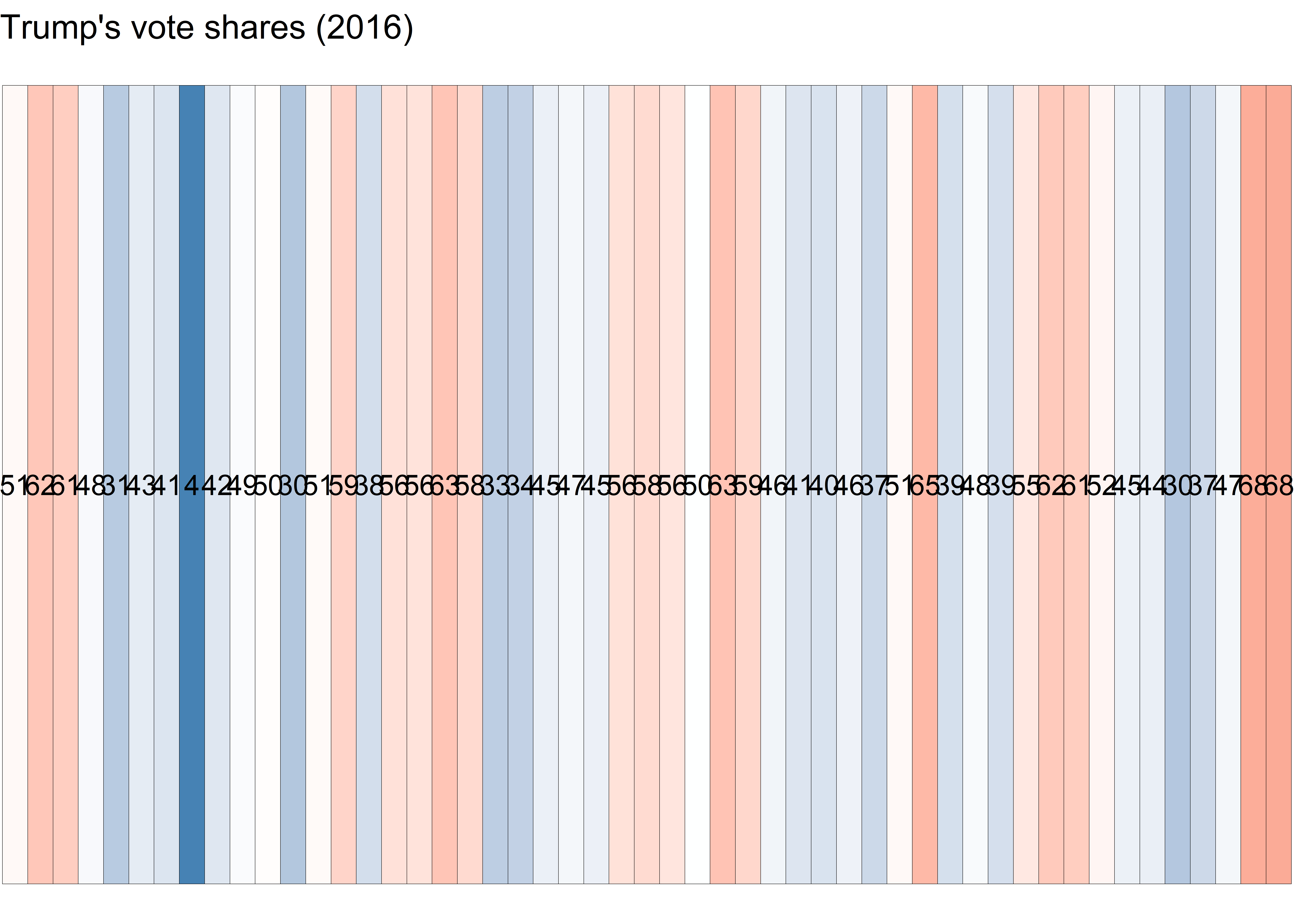
$ pct_trump <dbl> 51.28, 62.08, 60.57, 48.08, 31.49, 43.25, 40.93, 4.09, 41…
$ pct_johnson <dbl> 5.88, 2.09, 2.64, 4.08, 3.36, 5.18, 2.96, 1.58, 3.33, 2.1…
$ pct_other <dbl> 6.29, 1.46, 3.13, 3.25, 3.66, 3.41, 1.55, 3.47, 1.88, 1.8…
$ clinton_vote <dbl> 116454, 729547, 380494, 1161167, 8753792, 1338870, 897572…
$ trump_vote <dbl> 163387, 1318255, 684872, 1252401, 4483814, 1202484, 67321…
$ johnson_vote <dbl> 18725, 44467, 29829, 106327, 478500, 144121, 48676, 4906,…
$ other_vote <dbl> 20042, 31103, 35440, 84762, 521787, 94772, 25457, 10809, …
$ ev_dem <dbl> 0, 0, 0, 0, 55, 9, 7, 3, 3, 0, 0, 3, 0, 0, 20, 0, 0, 0, 0…
$ ev_rep <dbl> 3, 9, 6, 11, 0, 0, 0, 0, 0, 29, 16, 0, 6, 4, 0, 11, 6, 8,…
$ ev_oth <dbl> 0, 0, 0, 0, 0, 0, 0, 0, 0, 0, 0, 1, 0, 0, 0, 0, 0, 0, 0, …
$ census <chr> "West", "South", "South", "West", "West", "West", "Northe…