library(tidyverse)
library(coolorrr)9 Introducing {coolorrr} for Color Palettes
9.1 Goals
- Use tools in
{coolorrr}to update color palettes. - Understand the different kinds of palettes you can choose from.
- Select your own palettes.
9.2 Cooler colors with {coolorrr}
Up to now we’ve mapped color or fill aesthetics to variables in our data, while relying on ggplot defaults (mostly). These can be updated using a variety of built-in {ggplot2} functions. However, I generally dislike most of these—mainly because there are so many functions to choose from. So I decided to create an R package that would simplify the process of updating palettes, and I call it {coolorrr}. In these notes, we’ll walk through how to use it.
First things first, you need to install it. Instead of using install.packages(), you need to use the install_github() function from the {devtools} package. The reason is that the package I made is hosted in a repository on my personal GitHub rather than the CRAN (which is where many other R packages are hosted). To install it, simply write and run the following code in your console:
devtools::install_github("milesdwilliams15/coolorrr")If you don’t have {devtools}, you’ll need to install it first by writing and running install.packages("devtools") in your R console.
This package was inspired by a free and easy to use palette-generating site called coolors.co. If you go to the site, it lets you easily pick out all kinds of different palettes, and it gives you the hex-codes associated with individual colors. R knows how to read hex-codes, which means we can use them for setting or updating colors for our data visualizations.
This is where {coolorrr} comes in. The package is designed so that you can take the palettes you make at coolors.co and use them with ggplot. Here’s how it works.
9.2.1 Setting your palettes
First, open the {tidyverse} along with {coolorrr}:
{coolorrr} works by setting a series of different palettes globally in R’s environment and then calling them in the ggplot workflow. That means that before you can use your palettes, you need to set them. You do that with the set_palette() function. To get started, you can actually just run the function in a line of code without any inputs. It’s pre-programmed with default palettes, but my own choices which are probably of questionable taste.
set_palette()To use a palette of your own choosing from coolors.co, you can update any one of four palette options in set_palette(). These are qualitative, sequential, diverging, and binary, respectively. You can provide a vector of color names to any of these options, or, as shown in the below code, you can update palettes by providing the url to a particular custom palette made at coolor.co. In the below example, I am updating the “qualitative” palette.
set_palette(
  qualitative = "https://coolors.co/palette/264653-2a9d8f-e9c46a-f4a261-e76f51-ec8c74-f0a390"
)
Notice that this works similarly to how read_csv() reads in a .csv file hosted on my GitHub. You provide a url (in “quotation marks”) and then the function does the rest.
As noted above, set_palette() supports four different color palettes. These are:
qualitative: useful for showing unordered categorical data (e.g., world regions, different categories of democracy measures, or different demographic categories such as race).diverging: useful for continuous/numerical data that has a reference point (e.g., showing a vote margin where 0 = no difference with positive values to one side and negative to the other).sequential: useful for continuous/numerical data where you only care about highlighting differences between lower and higher values (e.g., population density).binary: this is a special qualitative palette for those cases where you just want to compare two categories (e.g., Democracies or Non-Democracies).
Any palettes you don’t specify when running set_palette() will automatically be set using defaults. You can update any of the four palettes at any time, but just be aware that if you only set one palette when you run the function, all the others will revert to the defaults if you don’t keep your own choices in the code, too (I’ll probably fix this issue at some point in the future).
As I also noted above, you don’t have to go to coolor.co. You can make your color selections directly rather than having to go to coolors.co. All you have to do is provide a vector of color names. In the below example, I give a two-element vector to the binary option that contains the colors “red” and “blue.”
set_palette(
  binary = c("red", "blue")
)
Be careful about the number of colors you provide for each kind of palette. The qualitative palette should probably have at least 5 colors, but you may need more depending on your data. The other palettes require you to specify a certain number of colors. The sequential palette expects two, one for the low-end color and one for the high-end color. The diverging palette expects three—in addition to low- and high-end values, you should select a color for values in the middle. Finally, the binary palette expects (as the name suggests) two colors.
9.2.2 Using your palettes
Once you set your palettes, you can use the ggpal() function to update ggplot’s defaults when you map colors or fill to data. The function has a few different options you can set. The main one’s are:
type: equals one of"qualitative","diverging","sequential", or"binary". This is how you tellggpal()what palette to use.aes: equals one of"color"or"fill". This is how you tellggpal()whether it needs to update the palette for the color aesthetic or the fill aesthetic.
By default, the options are type = "qualitative" and aes = "color".
In addition to these options, you can update a few other things, too:
midpoint: If you usetype = "diverging", this option lets you pick what the midpoint (point of reference) should be for the diverging palette. By default, this is 0.ordinal: By default this isFALSE. You would want to set this toTRUEin cases where you have either a sequential or diverging palette that is ordinal rather than continuous/numerical.levels: Ifordinal = TRUE, you should update this option to tellggpal()how many levels there are in your ordinal sequential or diverging color palette....: Theggpal()function is set up in such a way that you can give other instructions that are passed off to operations “under the hood.” These include things like updated labels or custom values to show in legends.
The ggpal() function is designed to plug into the overall ggplot workflow. To use it, you just create your plot like usual and then use + ggpal() as an additional line of code. The next section shows you some examples.
9.3 Seeing it in action
Let’s walk through how {coolorrr} works using some {peacesciencer} data. Let’s make a country-year dataset with indicators for whether a country was part of or started a militarized interstate dispute (MID), but let’s only look at conflicts after World War II. To do this we’ll subset to years from 1946 to 2010 in the create_stateyears() function.
## open packages
library(tidyverse)
library(peacesciencer)
library(socsci)
create_stateyears(
subset_years = 1946:2010
) |>
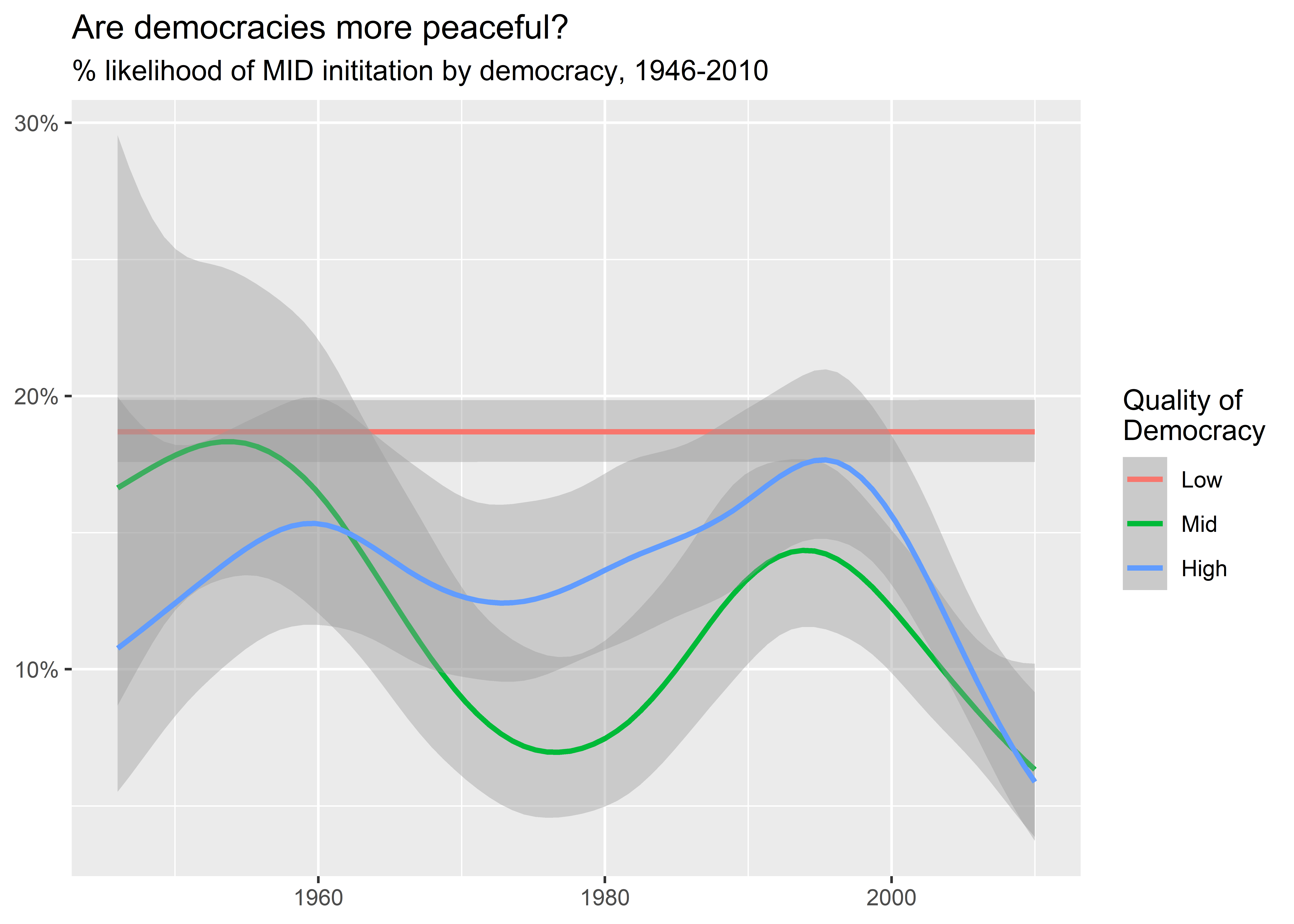
add_gml_mids() -> dtNow, since we’re going to show off some color palettes, let’s add some information to our data about quality of democracy. Adherents to the long peace theory argue that one of the factors that drives the long peace is the spread of democracy. Is it the case that more democratic countries are less apt to start fights? The below code populates the data with democracy measures. It then creates a new column called dem which is a three category ordered factor that indicates whether a country has a low, medium, or high democracy score based on the v2x_polyarchy measure for democracy. This measure is different from the Polity 2 measure we used in a previous chapter. It is produced by the Varieties of Democracy (V-Dem) project, and it’s on a scale from 0 to 1. The below code labels a democracy score as low if the score is less than 1/3, medium if it’s between 1/3 and 2/3, and high if it’s above 2/3.
I then give the data to ggplot(). Notice that unlike in previous examples I don’t group the data by year to calculate a yearly MID rate. Instead, I keep the data at the country-year level and use a variant of geom_smooth() called stat_smooth(). Inside this function I set method = "gam" and method.args = list(family = binomial). These commands instruct stat_smooth() to fit a kind of regression line to the data based on a generalized additive logit model. Logit is useful when your outcome variable (y-axis variable) is binary, taking values of either 0 or 1. It ensures that computed values don’t go above or below these bounds. The output then tells us, among the different groupings of countries based on democracy scores, the predicted probability of countries starting MIDs over time. Clearly countries in the lowest category show a steady read of MID initiation over time while the middle and high categories show more variation over time and, in later years, a clear decline in their likelihood of initiating MIDs.
## add democracy
dt |>
  add_democracy() -> dt

## make a democracy indicator
dt |>
  mutate(
    dem = frcode(
      v2x_polyarchy < 1/3 ~ "Low",
      between(v2x_polyarchy, 1/3, 2/3) ~ "Mid",
      v2x_polyarchy > 2/3 ~ "High"
    )
  ) -> dt

dt |>
  drop_na(dem) |>
  ggplot() +
  aes(
    x = year,
    y = gmlmidonset_init,
    color = dem
  ) +
  stat_smooth(
    method = "gam",
    method.args = list(family = binomial)
  ) +
  labs(
    x = NULL,
    y = NULL,
    color = "Quality of\nDemocracy",
    title = "Are democracies more peaceful?",
    subtitle = "% likelihood of MID inititation by democracy, 1946-2010"
  ) +
  scale_y_continuous(
    labels = scales::percent
  )
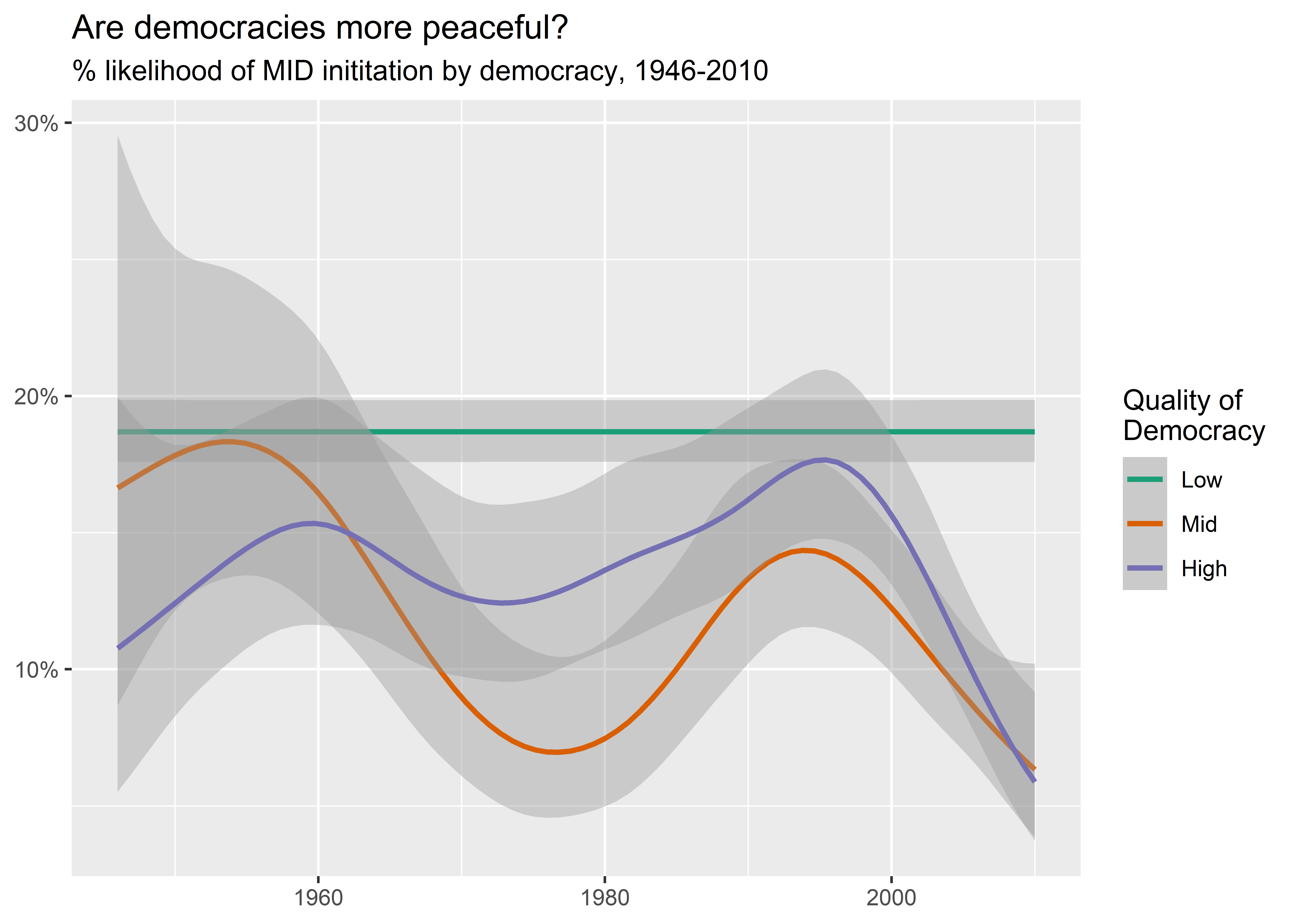
The default color palette used by ggplot() gives me three colors, one for each category of democracy quality. These defaults are just fine, but we can change them if we want to. The standard approach to doing this with {ggplot2} is to specify some kind of scale_*_*() function where the first * represents one of either color or fill, and where the second * represents one of a number of palette types such as manual or gradient. To update the palette in the above graph, we could use scale_color_brewer. In this example our palette is a qualitative palette, so we’ll specify type = "qual" and then we can use a number to select one of a number of different qualitative palettes. In this case I used palette = 2.
dt |>
  drop_na(dem) |>
  ggplot() +
  aes(
    x = year,
    y = gmlmidonset_init,
    color = dem
  ) +
  stat_smooth(
    method = "gam",
    method.args = list(family = binomial)
  ) +
  labs(
    x = NULL,
    y = NULL,
    color = "Quality of\nDemocracy",
    title = "Are democracies more peaceful?",
    subtitle = "% likelihood of MID inititation by democracy, 1946-2010"
  ) +
  scale_y_continuous(
    labels = scales::percent
  ) +
  scale_color_brewer(
    type = "qual",
    palette = 2
  )
There’s nothing wrong with this approach, but there are many different functions for updating our color palettes. The point of {coolorrr} is to remove the need to remember the right function for the job and instead give you one function to rule them all.
First, let’s set a new qualitative palette. The one I specify below is Thanksgiving Day themed:
set_palette(
  qualitative = "https://coolors.co/palette/264653-2a9d8f-e9c46a-f4a261-e76f51-ec8c74-f0a390"
)
Next, let’s make our plot. Notice that all I have to write to update the palette is + ggpal(). By default it assumes I want to update the color mapping and that I want to use a qualitative palette.
dt |>
  drop_na(dem) |>
  ggplot() +
  aes(
    x = year,
    y = gmlmidonset_init,
    color = dem
  ) +
  stat_smooth(
    method = "gam",
    method.args = list(family = binomial)
  ) +
  labs(
    x = NULL,
    y = NULL,
    color = "Quality of\nDemocracy",
    title = "Are democracies more peaceful?",
    subtitle = "% likelihood of MID inititation by democracy, 1946-2010"
  ) +
  scale_y_continuous(
    labels = scales::percent
  ) +
  ggpal()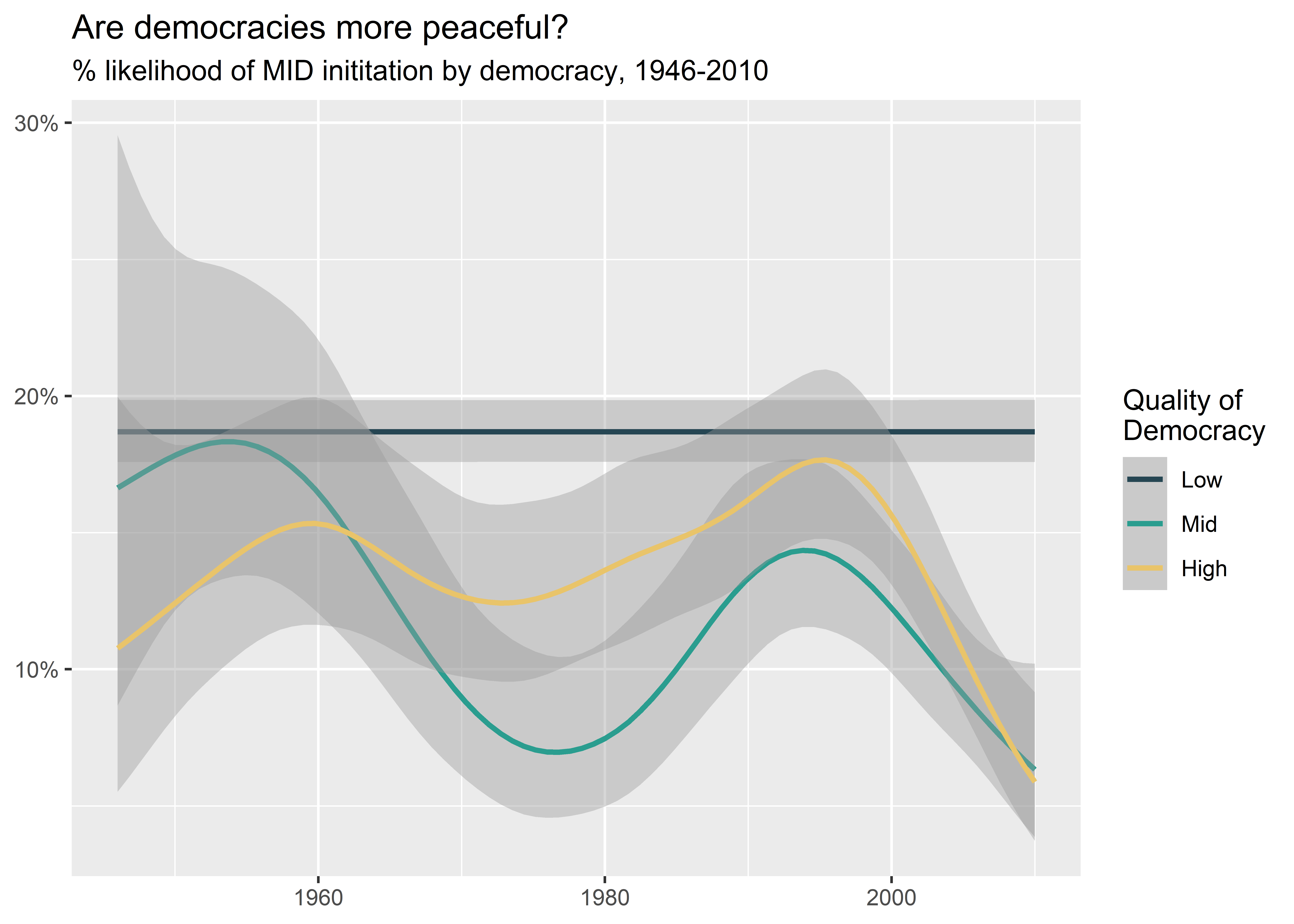
As you can see, the workflow is really simple. After you set a palette that you like, you can then use ggpal() in the normal ggplot workflow.
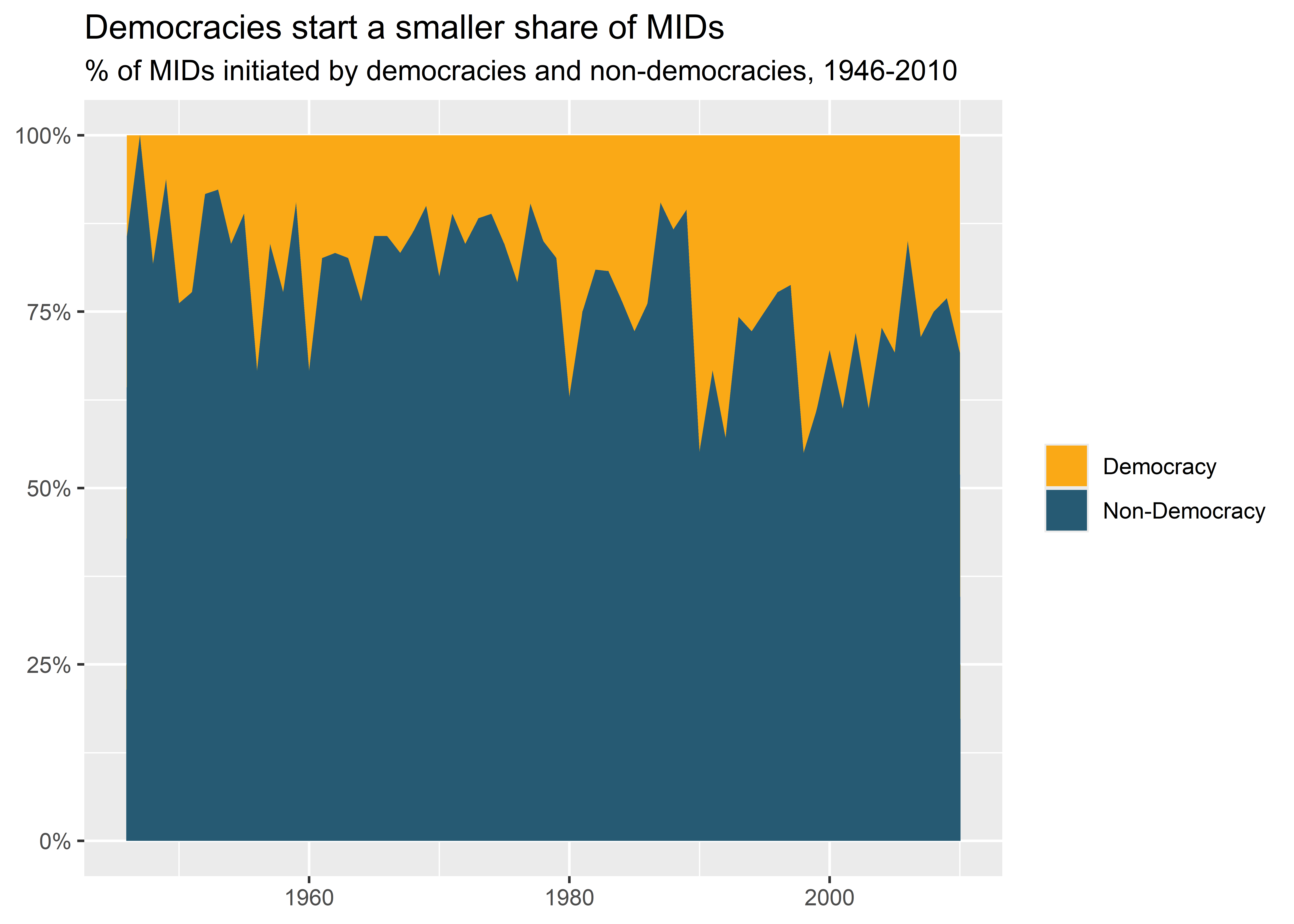
Here’s an example using a binary palette and the fill aesthetic. Even though I didn’t explicitly specify a binary palette when I ran set_palette() before, it took the liberty of specifying defaults for any palettes I didn’t personally customize. In the below code I make a binary democracy category and then summarize the share of MIDs started over time that democracies and non-democracies are responsible for. I then produce an area plot with fill mapped to the democracy category. I also use ggpal() and tell it to update the filled colors with a binary palette.
dt |>
  mutate(
    dem2 = ifelse(dem == "High", "Democracy", "Non-Democracy")
  ) -> dt

dt |>
  drop_na(dem) |>
  group_by(year, dem2) |>
  summarize(
    n = sum(gmlmidonset_init)
  ) |>
  group_by(year) |>
  mutate(
    pct = n / sum(n)
  ) |>
  ggplot() +
  aes(
    x = year,
    y = pct,
    fill = dem2
  ) +
  geom_area() +
  ggpal(
    type = "binary",
    aes = "fill"
  ) +
  labs(
    x = NULL,
    y = NULL,
    title = "Democracies start a smaller share of MIDs",
    subtitle = "% of MIDs initiated by democracies and non-democracies, 1946-2010",
    fill = NULL
  ) +
  scale_y_continuous(
    labels = scales::percent
  )
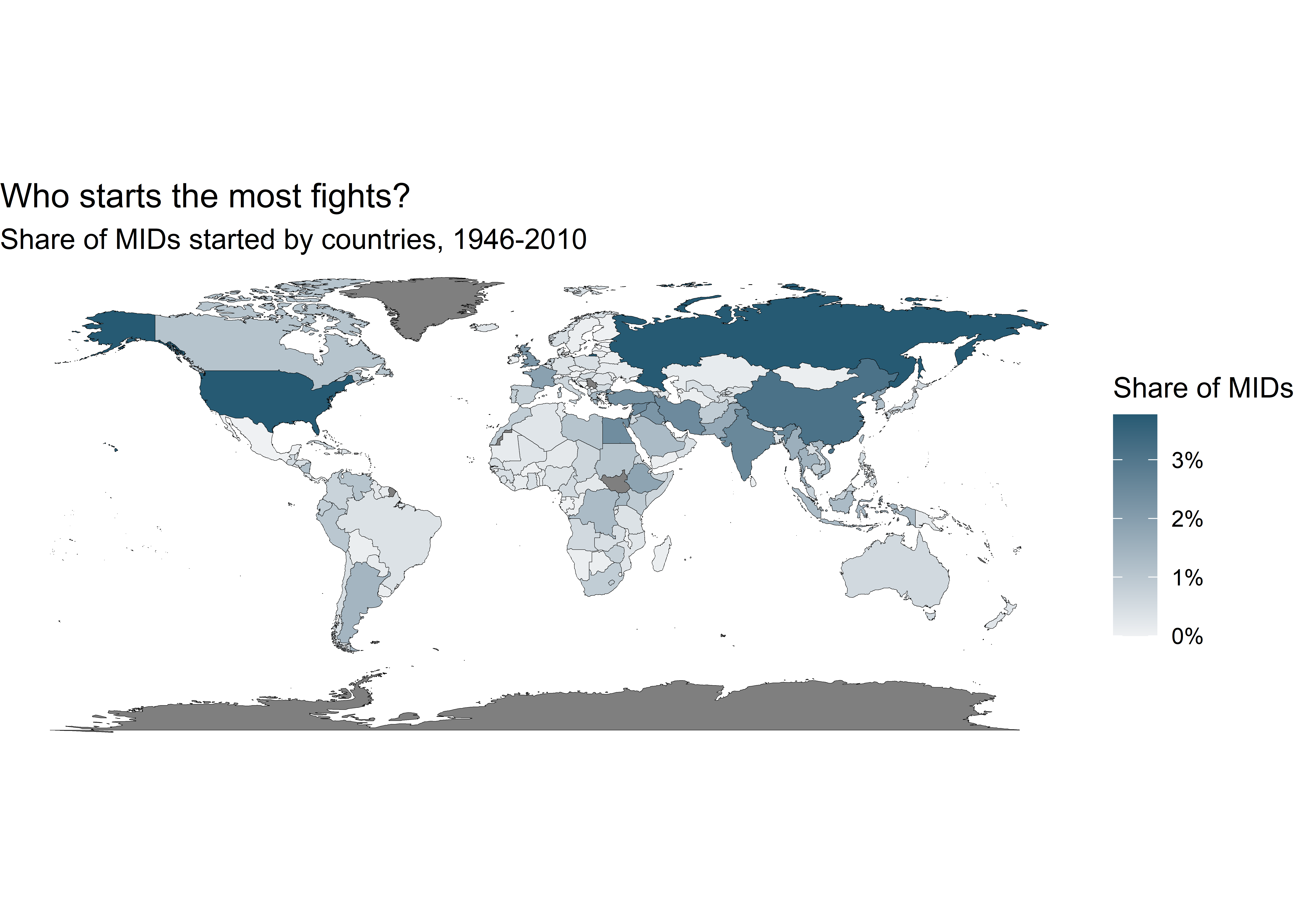
Here’s another example using a sequential palette to show the rate at which different countries are responsible for the global MID rate since World War II. To draw a world map, I use map_data("world") to get coordinates to draw the countries of the world and then I cross-walk it with a summarized data object that reports, for each country in the world, the share of MID initiations it is responsible for from 1946 to 2010.
First, here’s the code to get the data we need for the map:
## summarize the data
dt |>
  group_by(ccode) |>
  summarize(
    n = sum(gmlmidonset_init),
    .groups = "drop"
  ) |>
  mutate(
    pct = n / sum(n)
  ) -> sum_dt

## get info to draw a world map
world_map <- map_data("world")

## cross-walk and merge with summarized data
world_map |>
  mutate(
    ccode = countrycode::countrycode(
      region,
      "country.name",
      "cown"
    )
  ) |>
  left_join(
    sum_dt,
    by = "ccode"
  ) -> map_dt
Next, here’s the code to draw the map. It’s clear from the results who starts the most fights: the U.S. and Russia.
ggplot(map_dt) +
  aes(
    x = long,
    y = lat,
    group = group
  ) +
  ## first layer since there are NAs
  geom_polygon(
    color = "black",
    size = 0.1,
    fill = "gray"
  ) +
  ## the filled layer
  geom_polygon(
    aes(fill = pct),
    color = "black",
    size = 0.1
  ) +
  ggpal(
    type = "sequential",
    aes = "fill",
    labels = scales::percent
  ) +
  coord_fixed() +
  theme_void() +
  labs(
    fill = "Share of MIDs",
    title = "Who starts the most fights?",
    subtitle = "Share of MIDs started by countries, 1946-2010"
  )
9.4 Make Your Own Palette
Now it’s your turn to make your own palette. As you do, make sure you think clearly about your goals and choose a palette accordingly.
Pick out four:
- Qualitative: Used for categorical data (like regions).
- Sequential: Used for ordered categories or numerical variables.
- Diverging: Used for ordered categories or numerical variables where there is a mid-point.
- Binary: Used in cases where you have only two categories to compare.
You can go to coolors.co and pick out four palettes that you like:
- A 7+ color qualitative palette
- A sequential palette — select two colors for the upper and lower bounds of the color scheme
- A diverging palette — select three colors, each for the upper, middle, and lower bounds respectively
- A binary palette — select two colors
Once you’ve done that you can set them like so. Here are my own picks:
set_palette(
  qualitative = "https://coolors.co/palette/4d86a5-cf0bf1-12e2f1-3e517a-98da1f-fc9f5b-d60b2d-c3c4e9-9cc76d-2dffdf",
  sequential = "https://coolors.co/palette/e7ecef-274c77",
  diverging = "https://coolors.co/011638-f5f5f5-c20114",
  binary = "https://coolors.co/022864-f40119"
)
Then, try out some examples from above or make some new figures and test out your choices.