It’s important to know who is and isn’t in your survey.
Become familiar with some of the challenges of working with survey data.
Introduce tools from {socsci} to make working with survey data easier.
Exercise judgment in how you clean up survey data with respect to later data visualization choices.
11.2 Introduction to surveys
How do we come up with an estimate for who will win the U.S. Presidential election? How do we gauge public opinion on the use of military force or foreign aid? How do we figure out the relationship between socioeconomic background and political attitudes and behaviors?
The most straightforward way to answer these questions is to conduct a survey. The idea is that by asking a bunch of people what they think, feel, or do, we can draw more informed conclusions about the social and political landscape.
However, (1) we have to be careful about whom we survey, and (2) we have to be careful to ensure we ask people questions in the right way. If we aren’t careful about 1, we may not be able to generalize from the group of people we surveyed to the broader population. And if we aren’t careful about 2, we may not be able to trust the responses of the people we surveyed.
Both of these considerations deal with two different kinds of bias, respectively:
sampling bias
social desirability bias
To understand why the first kind of bias is problematic, we need to think in terms of probability and statistics. Let’s imagine that we have a population of 1,000 individuals and we want to gauge their level of support or opposition to mandatory vaccinations against COVID-19. However, suppose that due to budgetary or logistical barriers, we can only ask 100 people about their attitudes. How can we be sure that the 100 people we survey will give us a good representation of what all 1,000 people in the population think?
The solution is to pick the 100 that we survey at random. This ensures that the attitudes of the sample we survey are, in expectation, equal to the attitudes of the population. The key thing to remember here is the “in expectation” part of the previous sentence. While we cannot guarantee that any one random sample’s attitudes match those of the general population, if we were to repeatedly draw random samples of individuals to survey from the population, the average of the sample estimates will converge toward the true population mean.
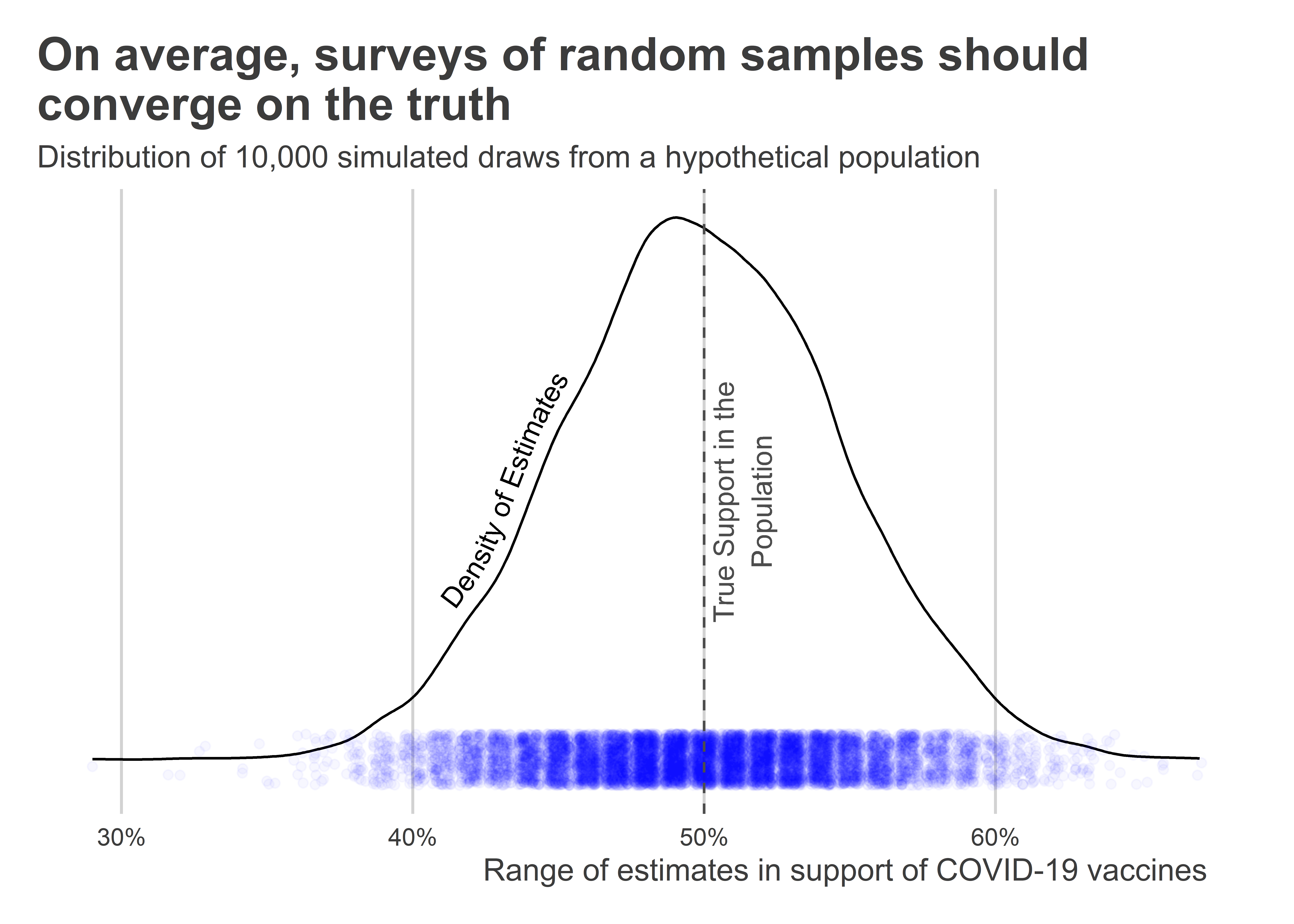
Say out of the 1,000 people in the population, 500 support mandatory vaccinations. That means the true population level of support is 50%. If we draw a random sample from this population and ask them their attitudes, on average we’d expect that a similar 50% in the sample support mandatory vaccinations as well. However, this is not guaranteed to be true for each and every possible random sample from the population. But if we could repeatedly draw random samples, on average attitudes would clock in at 50%.
The below figure shows the results from a simple simulation to show this is the case. I programmed R to give me a population of 1,000 individuals where 500 support mandatory vaccinations and the rest don’t. Then, I had it repeatedly draw samples of 100 individuals from the population and tally up the share of individuals in the samples that support mandatory vaccinations. The figure shows the distribution of estimates I got from repeating this procedure 10,000 times. As you can see, the range of support indicated by individual surveys varies substantially. While many provide estimates close to the true population’s actual level of support, some fall below 40% and some above 60%. This is the kind of random noise we’d expect to see from this kind of sampling procedure.
## open packages and set new plot defaultslibrary(tidyverse)library(socsci)library(geomtextpath)library(coolorrr)set_palette()set_theme()## create a "population" with 50/50 attitudes on COVID vax:p <-rep(0:1, each =500)## sample 100 individuals from the pop. 1,000 x and compute support:tibble(its =1:10000,phat =map(its, ~sample(p, 100) |>mean()) |>unlist()) |>## give the output to ggplot()ggplot() +aes(x = phat ) +geom_textdensity(label ="Density of Estimates",hjust =0.3,vjust =-0.5 ) +geom_jitter(aes(y =0),color ="blue",alpha =0.03 ) +scale_x_continuous(labels = scales::percent ) +scale_y_continuous(breaks =NULL ) +geom_textvline(xintercept =0.5,label ="True Support in the\nPopulation",color ="gray30",linetype =2,vjust =1.1 ) +labs(x ="Range of estimates in support of COVID-19 vaccines",y =NULL,title ="On average, surveys of random samples should\nconverge on the truth",subtitle ="Distribution of 10,000 simulated draws from a hypothetical population" )
The main point to remember is that surveys of random samples from a population, while still subject to error, are one of the best social science tools we have for making population inferences. However, many surveys we see “in the wild” often are not based on random samples. A good example is a Fox survey of their viewership asking them about their evaluation of the current sitting President’s performance on issue X. The results from these surveys often wildly diverge from attitudes in the broader American electorate because the average Fox viewer is not representative of the average American. Polls on social media are another common example. Consider the following Twitter poll by Lou Dobbs when he was an anchor on Fox News Business. Based on the wording of this poll and hashtags included, can you guess what demographic is most apt to see and respond to this question? (Hint: It’s probably mostly a right-leaning, Republican audience.)
These surveys can still be useful, because they tell us something about how a certain demographic thinks. But we should be aware of the limitations of these kinds of surveys, too. While the above example tells us something useful about viewers of Lou Dobbs, it doesn’t give us a good sense of the attitudes of the broader public.
In addition to considering who is surveyed, we also have to think carefully about the specific questions that people are asked. If a question is poorly worded, it can cause confusion. There are also some questions that, even if they are clear and easy to understand, may yield responses that we can’t trust. When the latter problem is the case, the usual culprit is social desirability bias.
People make errors when they take surveys. Maybe they’re in a hurry or misunderstand a question or two, so they provide an answer that doesn’t actually align with what they think. We have a term for this: “noise.” But sometimes when someone’s answer doesn’t align with their actual attitudes it’s no accident; the respondent lied. This happens if people try to give you the answer that they think is the “right” answer rather than their honest opinion. There is a lot of research out there on this problem. Everything from the identity of the person giving a survey, to whether it’s done online or over the phone can lead people to give different answers to otherwise similar questions.
To avoid this problem, it’s important to think about how you ask people questions. This is especially true when asking people about polarizing issues where they may feel pressure to answer in a certain way. This can pose a serious challenge to inference. Say we wanted to measure something like a person’s level of racism. You can’t just ask in a survey, “how racist would you say you are on a scale from 0 to 10?” People won’t answer that question honestly. In cases like this, social scientists have come up with a number of indirect ways to measure racism without asking people directly.
Two approaches we can use when we think people might lie or give unreliable answers on surveys are (1) survey experiments and (2) creating indexes. In survey experiments, social scientists randomize how a question is worded. If they find systematically different kinds of responses depending on the question wording, then this can both serve as evidence of social desirability bias and be leveraged as a means to identifying a more authentic estimate of how individuals really feel in the population. A good example of this approach in the context of racism would be to present survey respondents with the bio of a hypothetical congressional candidate. In this bio, everything from party ID to education would be kept the same, but some respondents would be randomly assigned to see a version where the candidate is white and others would be randomly assigned to see a version where the candidate is black. If, on average, respondents support the black candidate at lower rates than the white one, this might be be due to some level of racial bias in the sample.
Alternatively, creating an index involves asking individuals a battery of questions that, individually, are only indirectly related to the attitude you want to measure. However, when averaged together, these questions can help you triangulate attitudes (such as racism) that are otherwise impossible to measure with one straightforward question. For example, to measure racism you might ask someone how angry they are about racism, whether they think minorities should get special favors to overcome structural barriers to education or employment, and whether they think white people get special advantages because of their skin color. In none of these questions is a respondent asked to indicate their level of racial bias. Instead, the idea is to infer racial bias based on the way they responded to all of these questions.
Neither survey experiments nor indexes are perfect. In fact, they can often be controversial if there is no consensus on what a particular response really should imply. In the above example, if someone doesn’t believe a white person gets advantages because of their skin color, this would increase their level of racism in a racism index. But someone might point out that a person could answer this way out of ignorance rather than racism. They might also answer this way because of highly individual circumstances. A poor rural white respondent is probably unlikely to think their skin color gives them advantages, and they might base their response on this experience. All this is to say, experiments and indexes aren’t perfect. However, they often are preferable to the alternative of either not investigating an issue or foolishly asking direct questions that will lead people to lie in their responses.
In the next section, I walk through some survey data and provide examples for how we can use it to talk about public attitudes and behaviors.
11.3 Looking at the What the Hell Happened Survey
As we learn about how to use survey data, we’re going to use a survey fielded in 2018 for a project called “What the Hell Happened?” (WTHH) done by an organization called Data for Progress (DP). DP is a left-leaning organization, and its goal in 2018 was to figure out what factors contributed to Hillary Clinton’s loss to Donald Trump in the 2016 US Presidential election.
The WTHH survey is worth looking at for a few reasons. The first is that it’s a good, scientifically valid survey. While DP has a leftward political bias, the WTHH survey was fielded using industry best-practices. The survey would certainly pass muster in an academic journal.
The second reason WTHH is worth using is that it asked respondents a range of questions that helped DP measure a mix of straightforward and hard to quantify characteristics and attitudes. It covers issues ranging from how people voted in 2016 and their partisan ID, to group consciousness and racism. This gives us plenty of material to work with as we learn the ins and outs of using survey data.
The final reason WTHH is worth looking at is that it provides insight into the connections between inter-group attitudes and political behavior. Like voter fraud and the long peace, which we discussed in previous chapters, linking attitudes and political behaviors is intrinsically interesting because it is normatively weighty. The technical details of working with survey data are not easy to master. Don’t be surprised if you get discouraged and lose motivation. However, I believe that having an important problem to solve is a bulwark against the tendency to give up when things get tough.
With all that throat-clearing out of the way, let’s take a look at the WTHH survey data. Data for Progress made the data for the WTHH project publicly available on their website, and we can directly access their data using a URL. The below code reads the WTHH data into R. Since the data is stored as a .csv file, we can use read_csv() to read it in.
The below code lets us take a look at the first 10 rows and 5 columns of the data. If you notice, all the data seem to be integers. Take the gender column for example. It contains the values 1 and 2. Presumably these correspond with either “male” or “female,” but this isn’t immediately obvious.
Why would the data look like this? Generally all survey data is stored in this format. Rather than include actual survey response categories in the data, numerical codes are used instead. This is done to save storage space. An integer like 1 eats up much less memory than a character string like “male.”
Of course, this begs the question of how we decode the integer values in survey data. All surveys come with a codebook, which provides the information we need to convert numerical codes to the true survey response values. The WTHH has its own codebook, which I’ve linked to below:
In the next section I walk through some examples using the WTHH data.
11.4 Recoding variables and visualizing summaries with {socsci}
Recoding is the process of converting numerical codes in survey data to their correct values. There are many ways to go about recoding in R, but my favorite approach is to use the {socsci} R package, which has already made some appearances in previous chapters. {socsci} provides helpful tools for cleaning and summarizing survey data prior to data visualization.
The workhorse function in {socsci}, and my main favorite reason for using it, is the frcode() function. It lets us easily create new ordered categorical variables, and while its syntax takes some getting used to, once you understand the logic, it gives you a lot of power to make customized ordered factors for use in your data visualizations. It works similarly to case_when(), but it’s designed specifically to return a vector of data that is an ordered category.
Consider the following code. It uses frcode() to convert the numerical codes for the race column in the dataset to meaningful values. If you look on page 1 of the WTHH codebook, you can check that this is the correct mapping between the integers in the race column and their true values from the survey. There are some integers that we’ve missed. Most racial categories beyond the main four highlighted below (White, Black, Hispanic, and Asian) are too small to yield reliable statistics, so researchers often combine the rest into an “other” category. The syntax TRUE ~ "Other" in the last line of frcode() is short-hand for telling the function to make all integers (and NAs) not already specified “Other.”
The syntax with frcode() goes like so: logical condition ~ what to do. In the first line in frcode() above, the syntax race == 1 ~ "White" literally means that when values in the race column equal 1, the category that should be returned is “White”.
By default, frcode() returns a categorical variable that is ordered based on the order in which the categories were specified. For a variable like race, ordering isn’t really necessary. However, for a variable like partisan leaning, ordering is extremely important. Consider the following example which converts integers for a variable that records partisan lean into the appropriate categories. The below code creates a new column called pid7_cat, which is an ordered categorical variable that runs from strong Democrat to strong Republican.
To summarize distributions of different categories we can use the ct() function, which is also in {socsci}. We can quickly use it check the counts and the proportions of observations across these newly coded categories for party ID:
Notice the order in which the counts appear matches the order in which we made the recodes in frcode(). Because pid7_cat is an ordered category, when we have ct() make a summary by these categories, it obeys the ordering of our data.
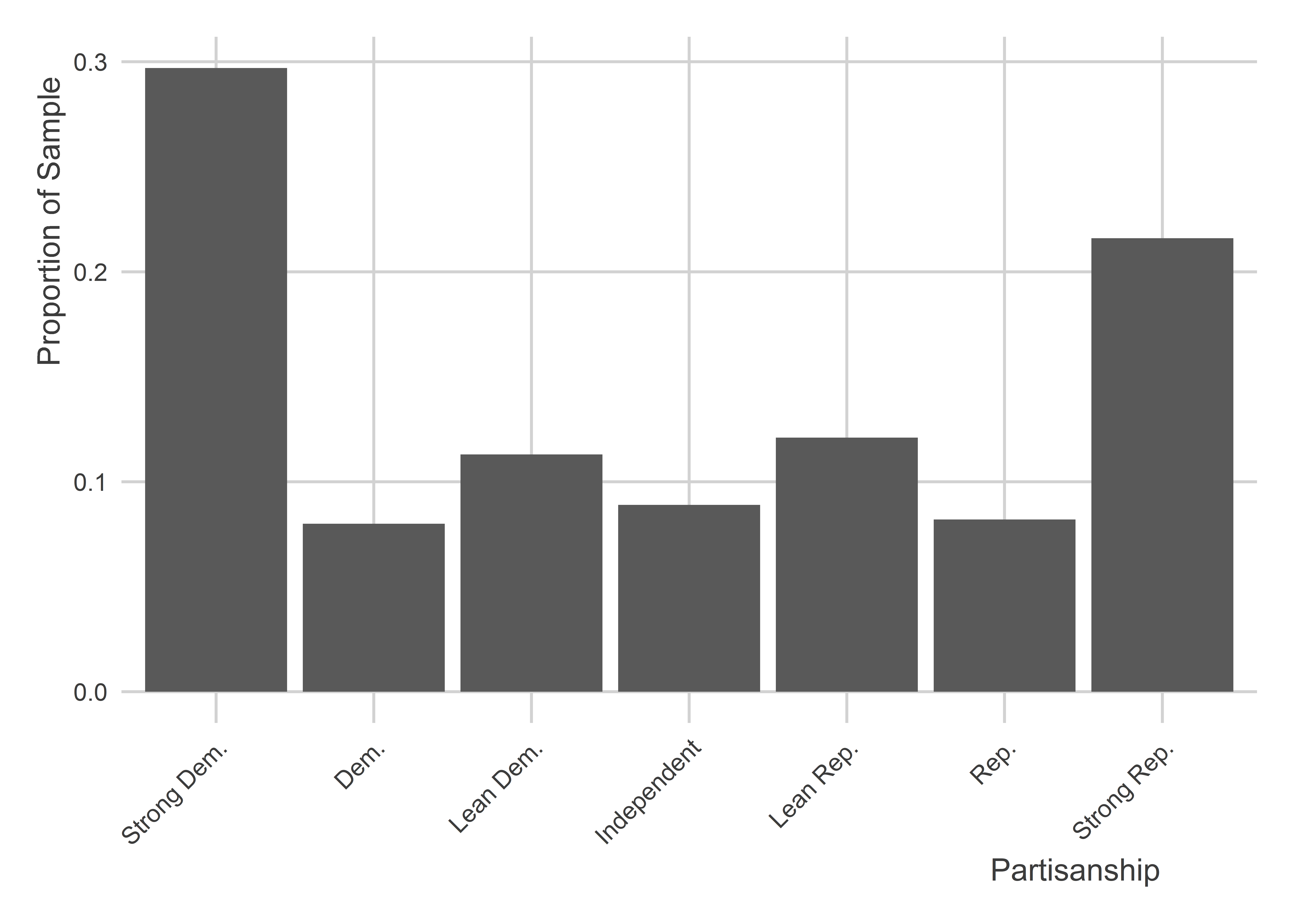
This fact comes in handy for data visualization. Say we wanted to show the distribution of partisan lean in the WTHH survey. Using pid7_cat we can create a data visualization like the following, using ct() along the way. Notice that the categories run from strong Democrat on the left to strong Republican on the right.
You’ll see in the the above graph that there’s an NA value shown on the far right. If there are any remaining rows in the data that don’t have a relevant category, frcode() automatically returns an NA for those rows. If we want to drop those values from the summary we can specify the option show_na = F in ct(). Notice that the proportions are now different. It’s because the NA category is now being dropped before proportions are computed.
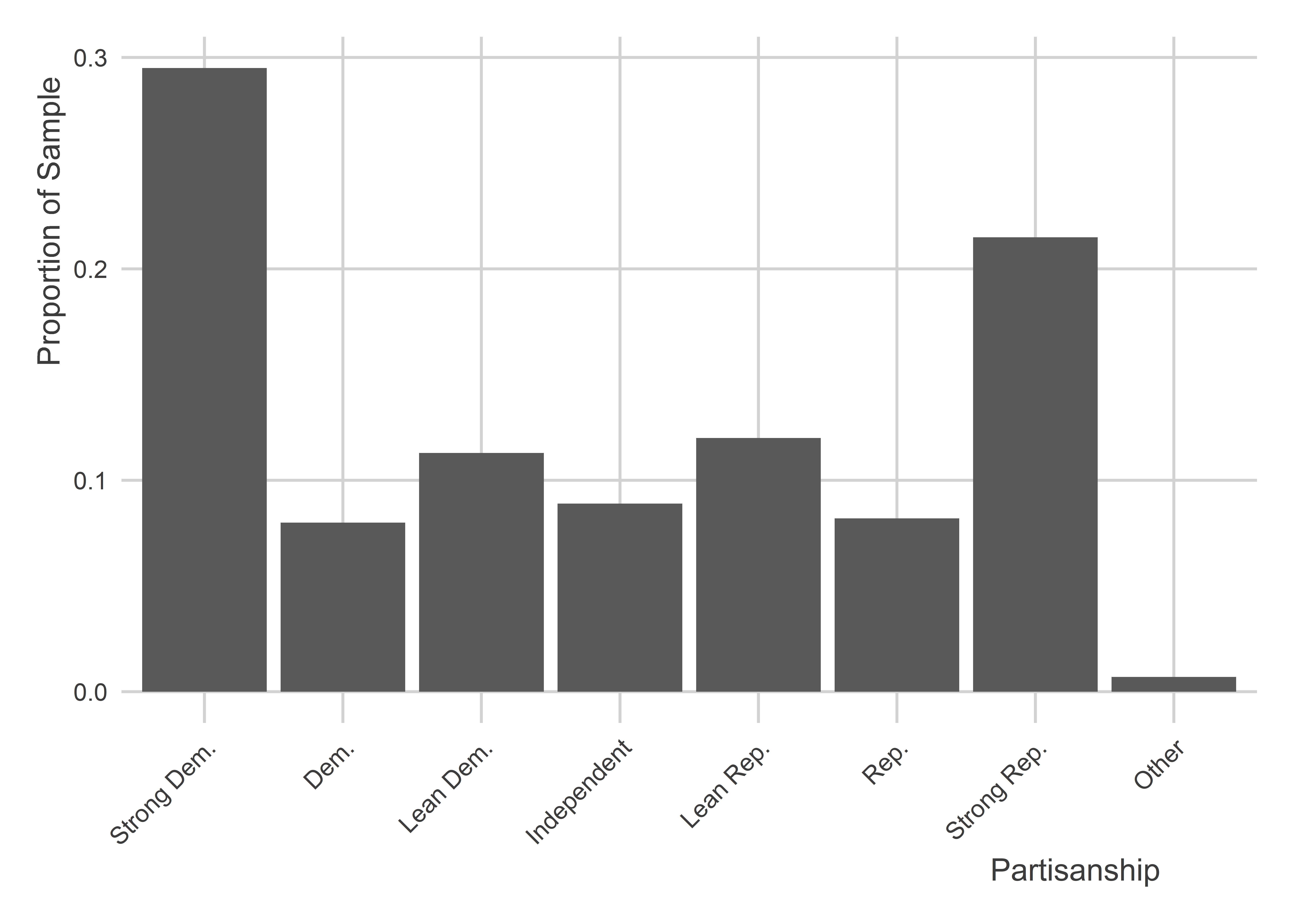
The final line that reads TRUE ~ "Other" literally means, for anything else not specified, make the category “Other”. Now when we plot the data, it looks like this:
For some binary outcomes, we may not need to use frcode(). Gender for example is a binary category in the WTHH data. We can recode it simply by using ifelse(). ifelse() is a simple function that you’ve seen used in previous chapters. It returns one outcome if a logical condition is met, otherwise it returns an alternative outcome. In the below code, the syntax ifelse(gender == 1, "Male", "Female") means if the gender numerical code is 1, return the category “Male”, otherwise return the category “Female”.
Another scenario you may run into is that some numerical values in the data actually represent true survey values. Birth year is a common example, and the WTHH survey data is no exception. Check out the first five rows of the data in the birthyr column. It looks like years, and that’s because that is, in fact, what the column values are.
Even though we don’t need to recode a variable like birth year, we may still want to. For example, we could convert it to the age of the respondents when they took the survey by subtracting birth year from 2018. We can do this by writing:
wthh <- wthh |>mutate(age =2016- birthyr)
Sometimes we might want to go further and create a set of discrete age categories that lump certain age ranges together. This is a common approach in analyzing survey data because we often don’t care so much about the difference between a 29 and 30 year old. We do, however, care about the difference between people in their 20s versus those in their 30s.
We can lump the data into larger buckets in a couple of different ways. First, we could create an ordered category like so:
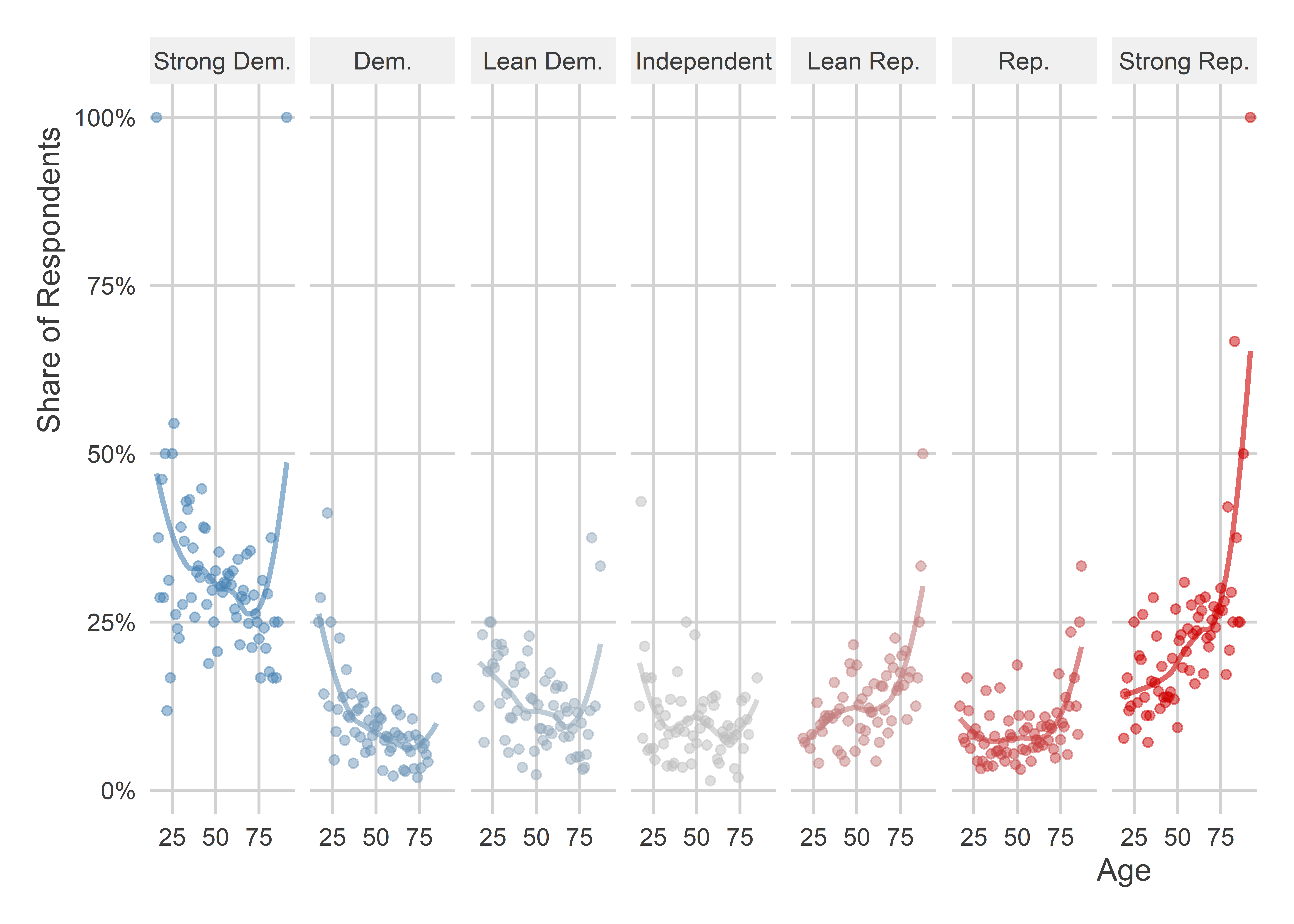
With any one of these age variables, we can summarize trends in other variables, like partisanship. For example, let’s consider how age relates to how partisan lean. Using the numerical version age, we can do something like the below. The code creates a small multiple that counts up the number of individuals by age that have a certain partisan lean.
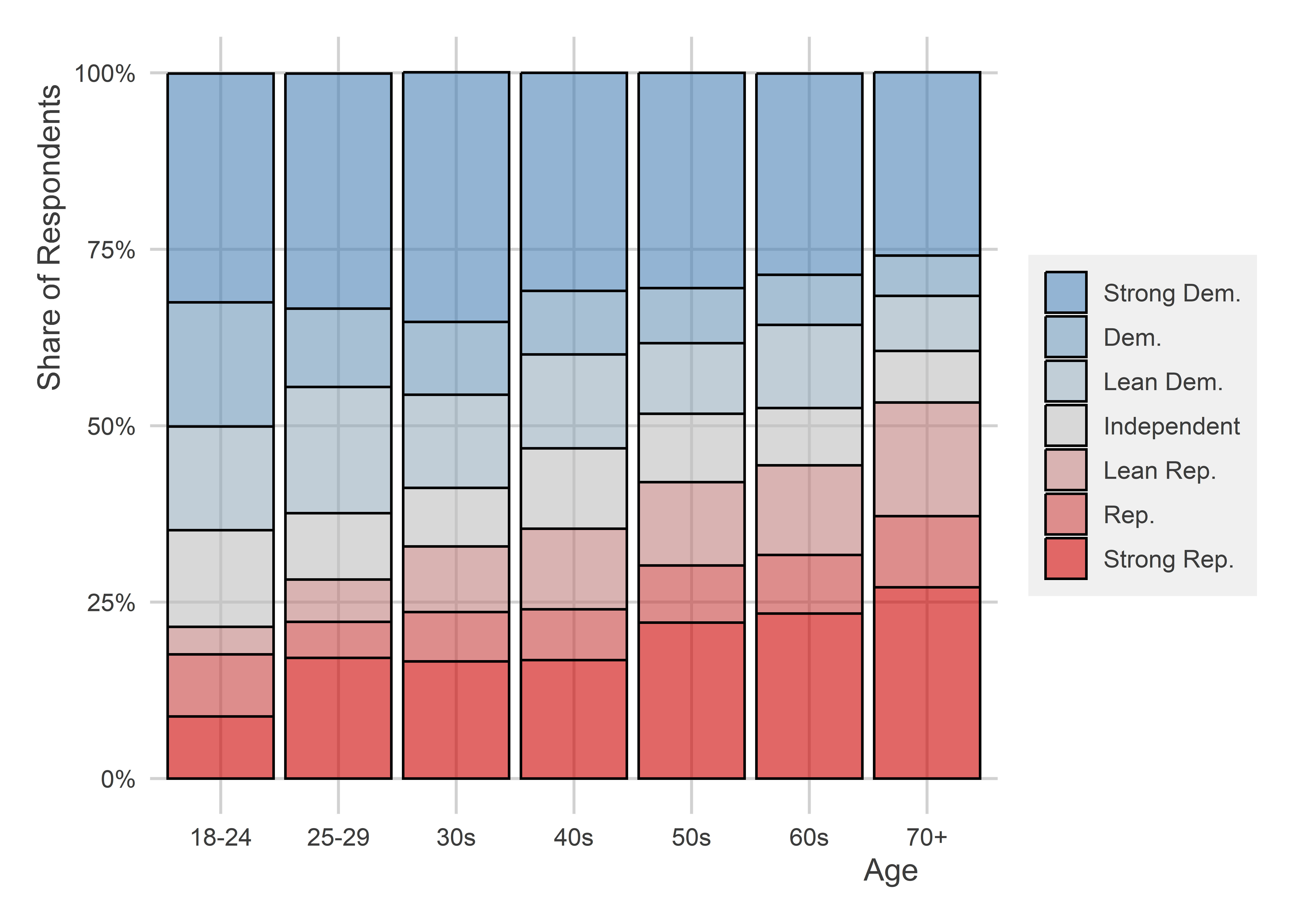
Using the categorical version of the age variable, we could make a graph like the next one shown below instead. It’s a stacked bar chart that shows the share of survey respondents in different age categories that fall into one of the seven partisan buckets. This one makes it really clear that older individuals tend to lean more Republican.
The WTHH survey was done in such a way to ensure that it is scientifically valid, however few surveys in practice are truly done with a random sample of the population. It’s really hard to ensure that every person in the population has an equal chance of appearing in your survey. Not everyone can be reached with the same ease and not everyone that you do contact will be willing to participate. Even worse, these factors usually are not random themselves, meaning that the people who don’t appear in your survey might be on average different than the people that do appear in your survey.
On a related note, a survey could be skewed on purpose. When this happens the goal isn’t to deceive but to illuminate. For example, certain minority groups, like Muslims, make up a very small share of the American population. If you took a random sample, of 3,000 people, you might only end up with a handful of individuals who identify as Muslim in your data. That isn’t enough people to draw good inferences about the attitudes of this group. If the goal of your study is specifically to compare Muslims to other groups in society, you would purposely want to over-sample Muslim individuals compared to other groups. This ensures that you have enough of them in your data to actually draw good inferences about the broader Muslim population.
In either scenario, either accidental or purposeful nonrandom sampling, most survey firms include sample weights in their data to adjust their summaries to better reflect population values. The survey weight is a real number applied to each observation in the data that is used to compute weighted summaries of statistics. There’s more art than science involved in setting these weights and different groups that field surveys have their own proprietary approach. Usually the process involves looking at census data to identify the break down in the population along educational, income, racial, and gender lines (among others). Any groups in the data that are under-represented relative to the population will get a higher weight to compensate, while those that are over-represented in the survey will get a lower weight.
We can adjust for sample weights in the WTHH survey using the weight_DFP column. The below code shows the first five rows of survey weights included in the data:
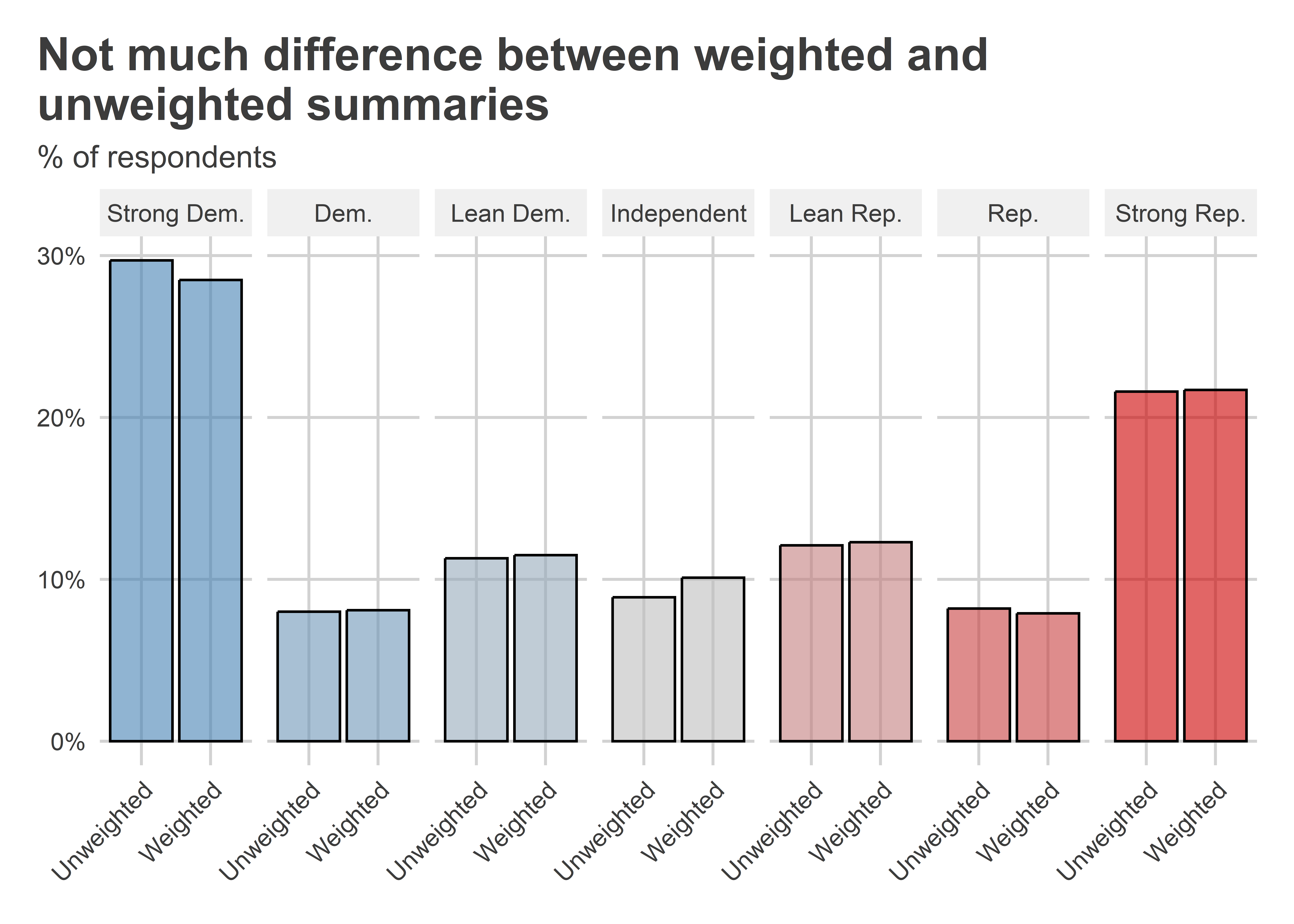
Let’s compare what the sample distribution of party ID looks like compared to the weighted sample distribution. In the below code, I use a new function called bind_rows() to stack two data summaries on top of each other. One is an unweighted summary and the other is a weighted summary.
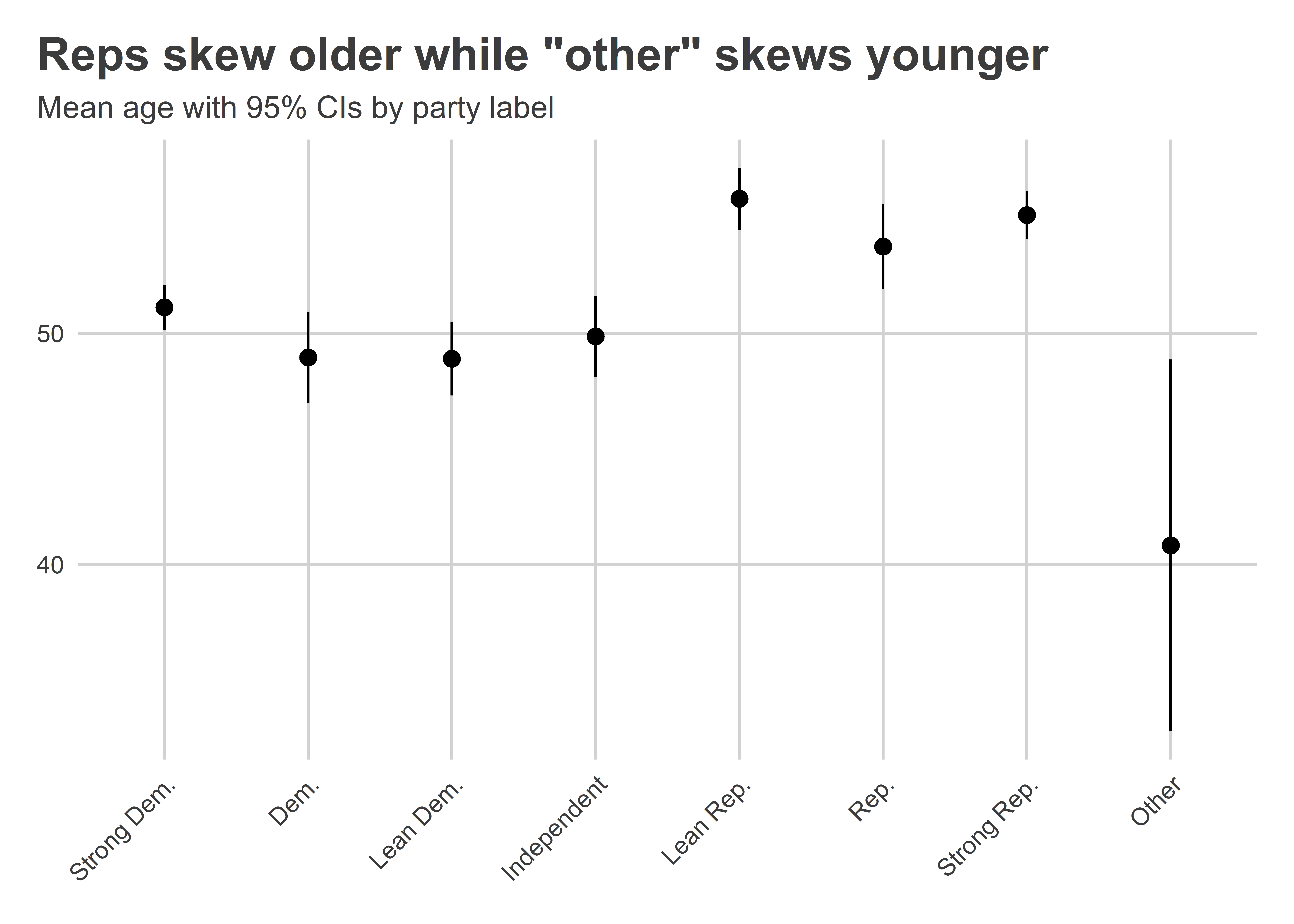
There’s another function that we can use in {socsci} to summarize data as well, and it also accommodates survey weights. It’s called mean_ci() and it reports a sample mean along with 95% confidence intervals (or CIs of other levels as well). Let’s use this function to summarize average age by party lean.
You can see in the output that mean_ci() does a lot under the hood. For a given numerical variable it returns a mean, a count, a standard deviation, and standard error, and the lower and upper 95% confidence intervals. This summary is convenient for plotting a point estimate of a mean and bars to represent confidence intervals. A good geometry layer to use is geom_pointrange(). Here’s what this approach gives us:
wthh |>group_by(pid7_cat) |>mean_ci(age) |>ggplot() +aes(x = pid7_cat,y = mean,ymin = lower,ymax = upper ) +geom_pointrange() +labs(x =NULL,y =NULL,title ='Reps skew older while "other" skews younger',subtitle ="Mean age with 95% CIs by party label" ) +theme(axis.text.x =element_text(angle =45,hjust =1 ) )
The mean_ci() function also lets us computed weighted means. Here’s the same code as above with the exception that the mean and 95% CIs are adjusted using sample weights:
wthh |>group_by(pid7_cat) |>mean_ci(age, wt = weight_DFP) |>ggplot() +aes(x = pid7_cat,y = mean,ymin = lower,ymax = upper ) +geom_pointrange() +labs(x =NULL,y =NULL,title ='Reps skew older while "other" skews younger',subtitle ="Mean age with 95% CIs by party label" ) +theme(axis.text.x =element_text(angle =45,hjust =1 ) )
11.6 Conclusion
Surveys are great for uncovering attitudes and having informed discussions about political behavior. However, to ensure we are on solid footing, we need to think carefully about who was and wasn’t included in our survey and why. We also need to think about how people were asked questions and whether we feel we can trust their responses to actually reflect survey respondent attitudes, beliefs, or behaviors.
When it comes to analyzing survey data, we have a lot of tools available to us in R, and we talked about some of these tools above. There are many more tools out there as well, and in coming chapters we’ll consider some more complex examples.
We’ll also think a bit more about index construction in the next chapter. As noted above, we might need to construct an index when the attitude we want to measure isn’t amenable to a straightforward question. The WTHH data include a few indexes which we can explore. We can also try out different ways of constructing them and consider whether an index is sensitive to which factors we include and exclude.