## open packages
library(tidyverse)
library(peacesciencer)

## create state-year data
create_stateyears(
  subset_years = 1816:2010
) |> ## populate with conflict indicators
add_gml_mids() -> dt8 Adding Labels and Text
8.1 Goals
- Learn about adding text and labels to figures.
- Introduce the
{geomtextpath}package.
8.2 The value of labels when showing trends
When showing trends in conflict onset or severity, we might want to highlight some important points in time for our audience. A good way to do this is to add labels or text to our graphs. Proponents of the long peace theory (the idea that conflicts are becoming less common and less deadly over time) point to World War II as an important turning point in the history of international conflict. So, when making a graph, it might make sense to include a vertical line at the point World War II started (or perhaps ended). It might also help to label this line so that it’s clear that its purpose is to highlight World War II.
Someone might also want to compare trends in two or more metrics over time. In the last chapter we discussed the value of measuring conflict prevalence as a rate rather than as a count to adjust for the fact that, over time, more countries have come into existence. Any upward trend in the frequency of conflict might suggest that international politics is becoming more conflictual, or it could just be driven by an increase in the total number of countries. As we’ll discuss in this chapter, there are multiple ways to compute the rate of international conflict to adjust for the number of countries in the world, and we might want to show our audience whether these methods lead to different conclusions about trends in conflict onset. To compare these trends in the same graph, we could make a small multiple or map color to different metrics. Using the {geomtextpath} package, we have another option. We can add labels directly to trends lines. This is a nice option to have in your toolbox, and it isn’t too hard to do.
Alright, let’s get started.
8.3 Highlighting moments in time
As noted above, proponents of the long peace theory claim that World War II (or whereabouts) was a key turning point in the history of international conflict. They say that conflicts after World War II were less prevalent (with major power conflict non-existent) and that the conflicts that erupted were less deadly. Let’s focus on the first of these claims using some {peacesciencer} data. In the below code I open up the {tidyverse} and {peacesciencer}. I then create a country-year dataset that is populated with indicators for whether countries were involved in, or started, militarized interstate disputes (MIDs) with other countries in a given year.
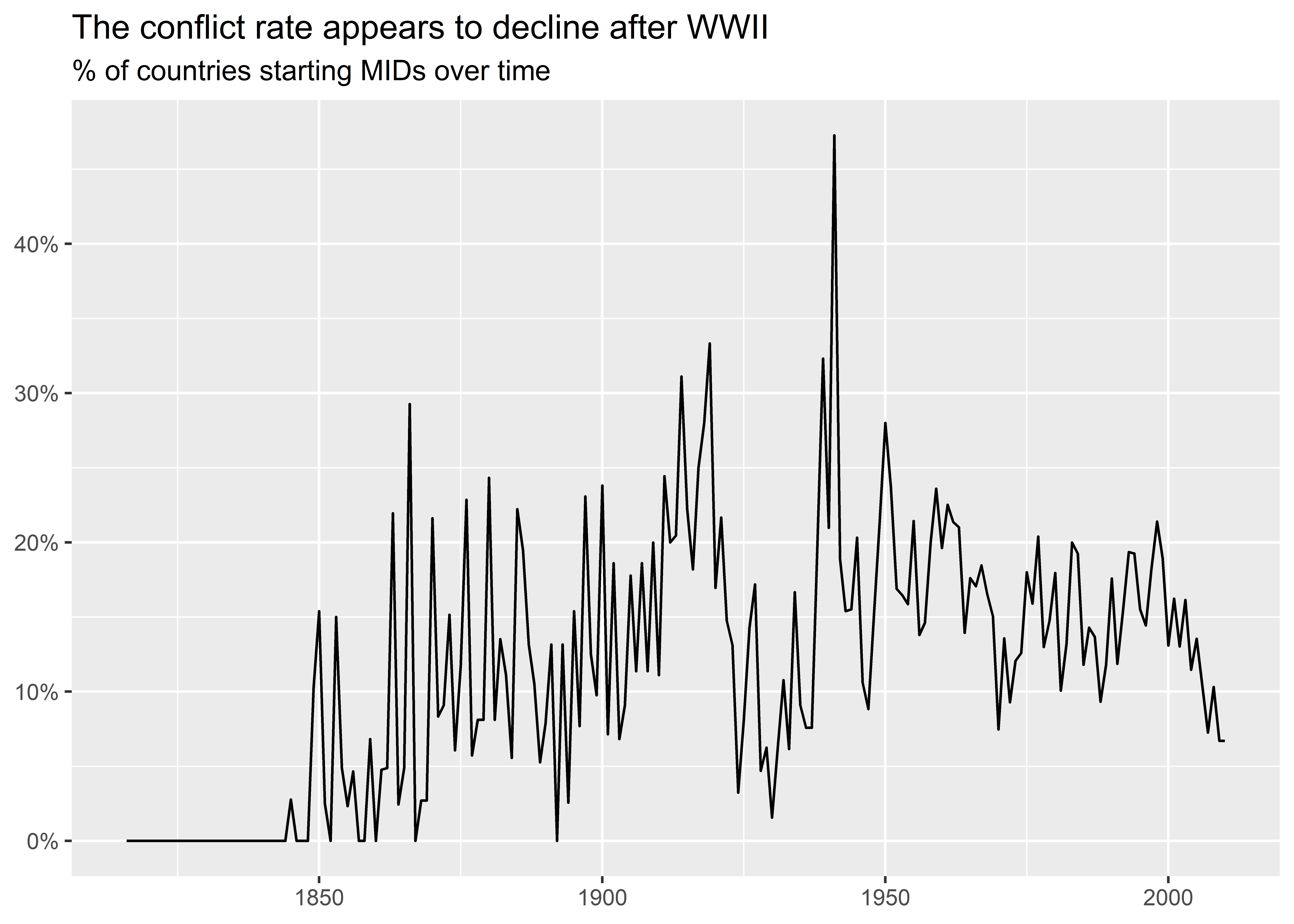
I’ll start by making a graph that shows conflict initiation over time. To do this, I group the data by year and then I calculate the mean on MID onset initiation. This gives me a collapsed dataset where each row is a year and where there are two columns, one the year and the other the MID initiation rate. Rather than save this summarized data as an object, I give it directly to ggplot() using the pipe operator. I then make a line plot that shows the MID initiation rate by year. I add a few additional touches, like making the the y-axis show percentages, adding a title and subtitle, and turning off the axis titles. Notice that the title tells the audience my interpretation of the data—it looks like MID initiations experience a decline (albeit modest) after World War II.
dt |>
  group_by(year) |>
  summarize(
    mid_init_rate = mean(gmlmidonset_init)
  ) |>
  ggplot() +
  aes(x = year, y = mid_init_rate) +
  geom_line() +
  labs(
    x = NULL,
    y = NULL,
    title = "The conflict rate appears to decline after WWII",
    subtitle = "% of countries starting MIDs over time"
  ) +
  scale_y_continuous(
    labels = scales::percent
  )
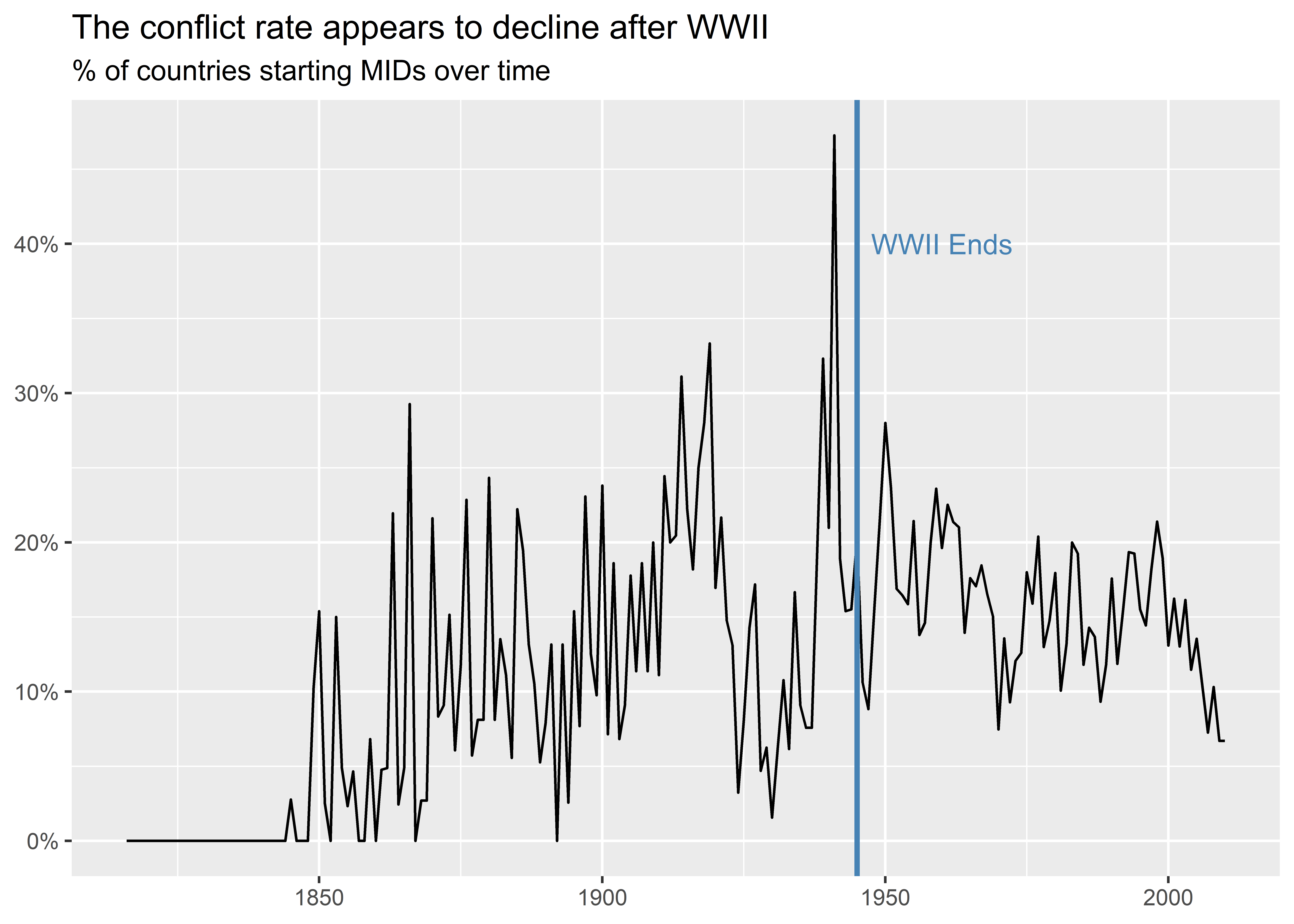
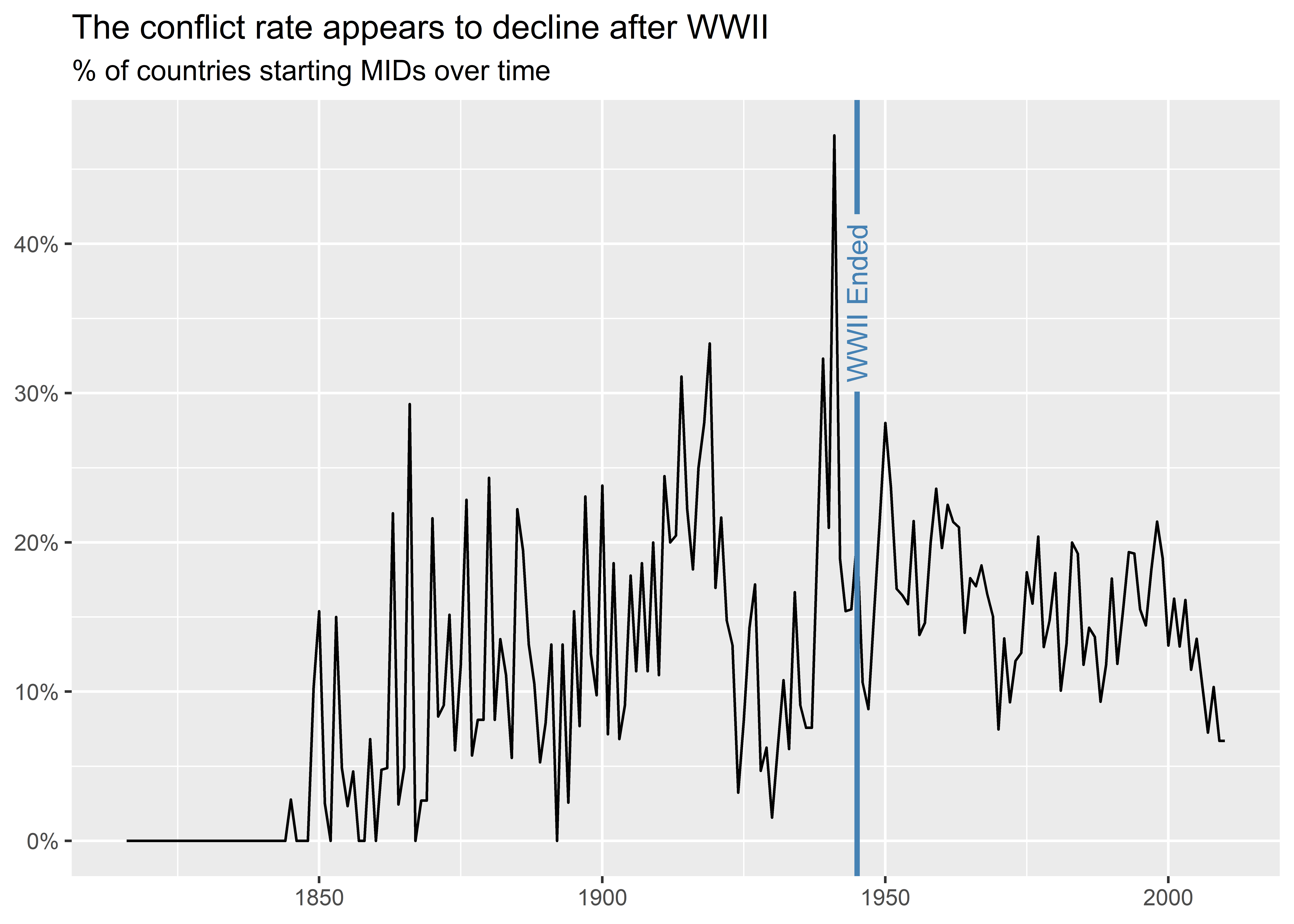
The above graph is fine, but it would be better if it explicitly highlighted World War II in time. As long as my audience knows that World War II started in 1939 and ended in 1945, they can just look at the x-axis, find those years, and determine whether they agree with my interpretation of the data. But this will annoy some people in my audience—that’s never good. Thankfully, I have some ready to use tools in the {ggplot2} package to help my audience out.
In the below code I produce a graph just like the one above, but I add two additional layers. First, I use geom_vline() to draw a vertical line at 1945. Second, I use annotate() to include a “WWII Ends” label close to the vertical line to make it clear that I want to highlight when WWII ends.
dt |>
  group_by(year) |>
  summarize(
    mid_init_rate = mean(gmlmidonset_init)
  ) |>
  ggplot() +
  aes(x = year, y = mid_init_rate) +
  geom_line() +
  geom_vline(
    xintercept = 1945,
    color = "steelblue",
    size = 1
  ) +
  annotate(
    geom = "text",
    x = 1945,
    y = 0.4,
    label = "WWII Ends",
    color = "steelblue",
    hjust = -0.1
  ) +
  labs(
    x = NULL,
    y = NULL,
    title = "The conflict rate appears to decline after WWII",
    subtitle = "% of countries starting MIDs over time"
  ) +
  scale_y_continuous(
    labels = scales::percent
  )
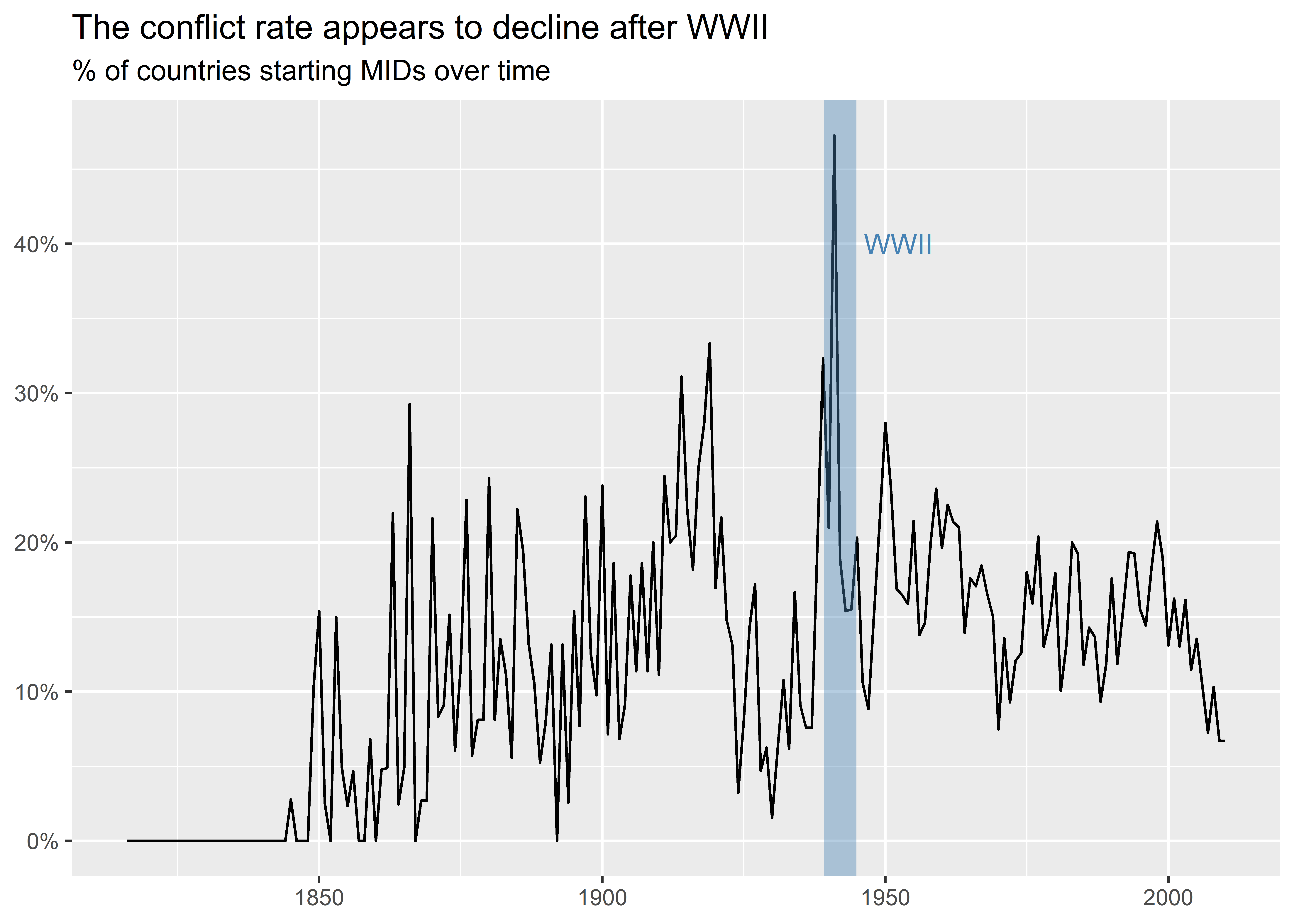
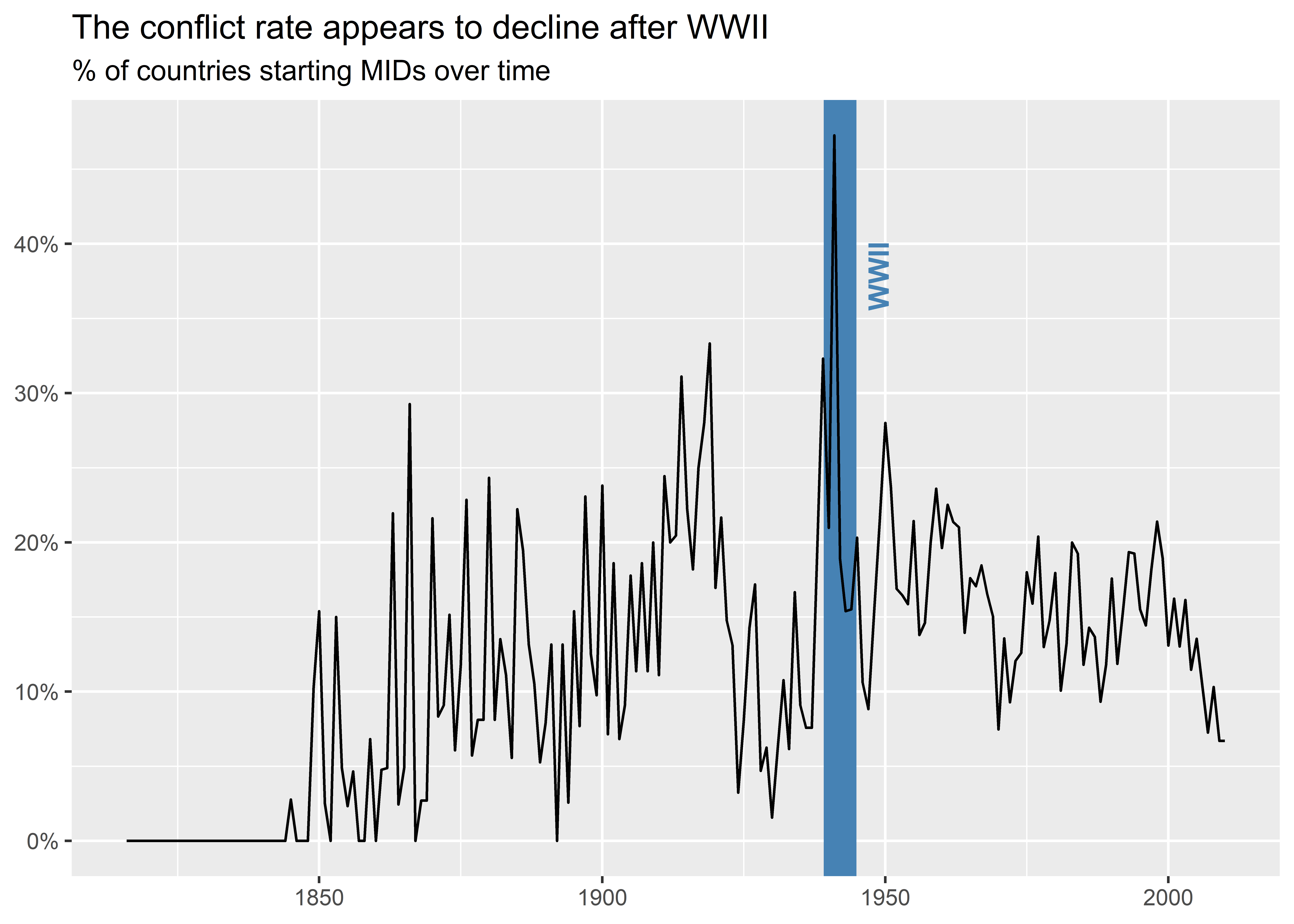
I can customize the vertical line to have it cover the whole World War II period, too. In the below code I make the line wider using the size option and make it transparent. I also change the label to just say “WWII” since I’m not just highlighting when World War II ended but the years it was ongoing.
dt |>
  group_by(year) |>
  summarize(
    mid_init_rate = mean(gmlmidonset_init)
  ) |>
  ggplot() +
  aes(x = year, y = mid_init_rate) +
  geom_line() +
  geom_vline(
    xintercept = (1939 + 1945) / 2,
    color = "steelblue",
    size = 6,
    alpha = 0.4
  ) +
  annotate(
    geom = "text",
    x = 1945,
    y = 0.4,
    label = "WWII",
    color = "steelblue",
    hjust = -0.1
  ) +
  labs(
    x = NULL,
    y = NULL,
    title = "The conflict rate appears to decline after WWII",
    subtitle = "% of countries starting MIDs over time"
  ) +
  scale_y_continuous(
    labels = scales::percent
  )
Using a combination of geom_vline() and annotate() works just fine in this example, but I can accomplish something very similar using less code with the help of the {geomtextpath} package. To install it, just run install.packages("geomtextpath") in the R console. To use it, just use library(geomtextpath) to access a range of new geom functions that provide text or label versions of some basic {ggplot2} geoms. In the below code, I use geom_textvline() and specify that I want a vertical line at 1945 and that I want to layer on top of the line the text “WWII Ended.”
library(geomtextpath)
dt |>
  group_by(year) |>
  summarize(
    mid_init_rate = mean(gmlmidonset_init)
  ) |>
  ggplot() +
  aes(x = year, y = mid_init_rate) +
  geom_line() +
  geom_textvline(
    xintercept = 1945,
    label = "WWII Ended",
    color = "steelblue",
    hjust = 0.8,
    linewidth = 1
  ) +
  labs(
    x = NULL,
    y = NULL,
    title = "The conflict rate appears to decline after WWII",
    subtitle = "% of countries starting MIDs over time"
  ) +
  scale_y_continuous(
    labels = scales::percent
  )
I can also make the line wider to highlight the range of years that WWII was ongoing, as I do in the below code. I update a few different things additional things in the graph as well. First, I put the vertical line behind the line showing the rate of MID initiation. Second, I make the label bold and I adjust it to the right.
dt |>
  group_by(year) |>
  summarize(
    mid_init_rate = mean(gmlmidonset_init)
  ) |>
  ggplot() +
  aes(x = year, y = mid_init_rate) +
  geom_textvline(
    xintercept = (1939 + 1945) / 2,
    label = "WWII",
    color = "steelblue",
    hjust = 0.8,
    linewidth = 6,
    fontface = "bold",
    vjust = 2
  ) +
  geom_line() +
  labs(
    x = NULL,
    y = NULL,
    title = "The conflict rate appears to decline after WWII",
    subtitle = "% of countries starting MIDs over time"
  ) +
  scale_y_continuous(
    labels = scales::percent
  )
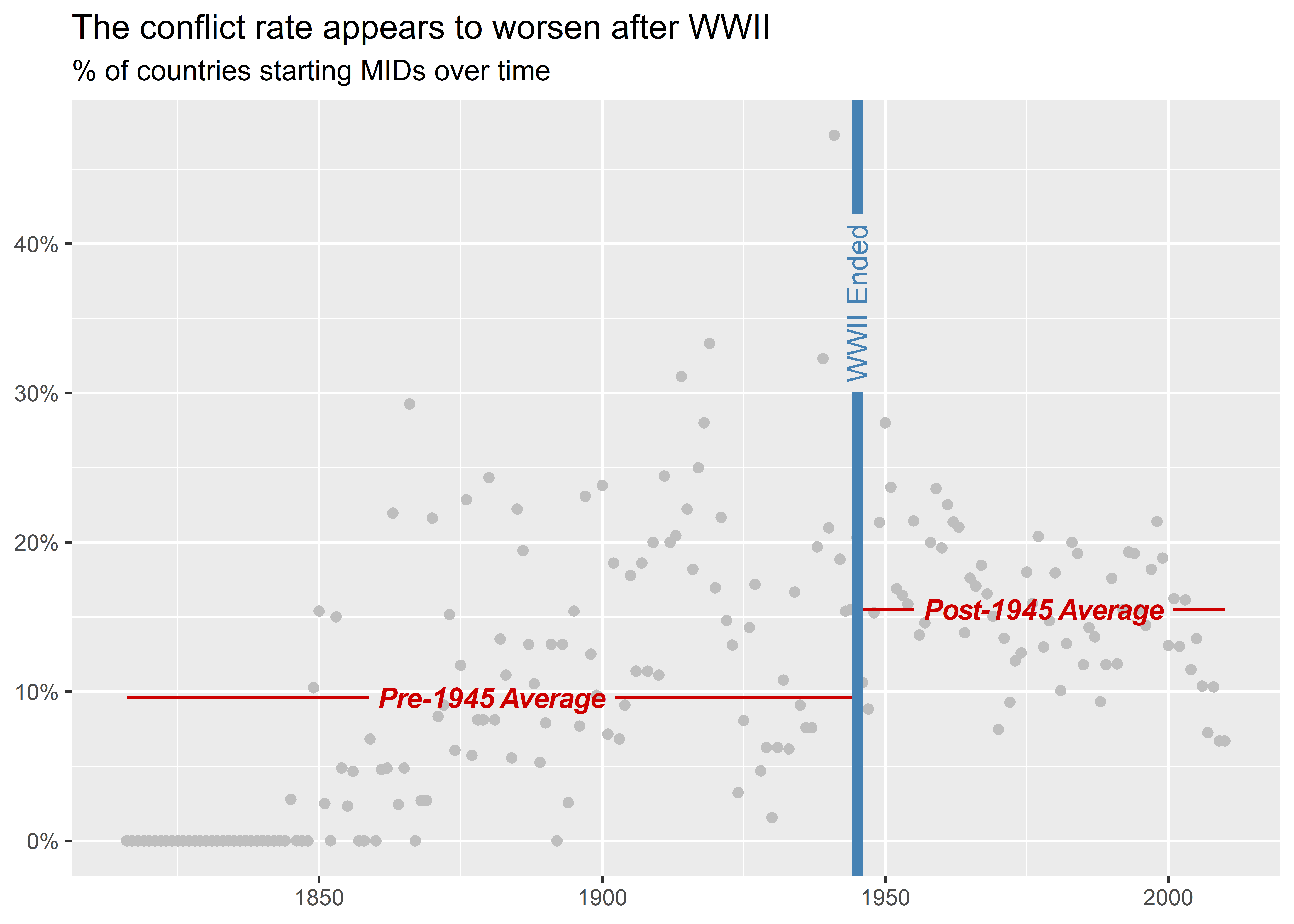
We could distinguish between pre- and post-World War II trends in other ways. In the below example, I combine a scatter plot with a smooth plot, but I throw a few parlor tricks into the mix. First, I use geom_textsmooth() instead of the usual geom_smooth() so that I can add labels to the fitted regression lines. Second, I specify method = "lm" to indicate that it should fit a linear model and I specify formula = y ~ 1 to indicate that it should fit a linear model only with an intercept. This forces the smoothed layer to effectively report an overall average. Finally, I group the smoothed layer by whether the year is before or after 1945 so that I can show a unique average for each period. I also add some labels to tell my audience what the reported lines represent. Looking at the data in this way brings into sharp relief the fact that the prevalence of countries starting conflicts is higher after World War II than before, in direct contradiction with the long peace theory.
dt |>
  group_by(year) |>
  summarize(
    mid_init_rate = mean(gmlmidonset_init)
  ) |>
  ggplot() +
  aes(x = year, y = mid_init_rate) +
  geom_point(color = "gray") +
  geom_textsmooth(
    aes(
      group = year > 1945,
      label = ifelse(
        year > 1945,
        "Post-1945 Average",
        "Pre-1945 Average"
      )
    ),
    method = "lm",
    formula = y ~ 1,
    color = "red3",
    fontface = "bold.italic"
  ) +
  geom_textvline(
    xintercept = 1945,
    label = "WWII Ended",
    color = "steelblue",
    hjust = 0.8,
    linewidth = 2
  ) +
  labs(
    x = NULL,
    y = NULL,
    title = "The conflict rate appears to worsen after WWII",
    subtitle = "% of countries starting MIDs over time"
  ) +
  scale_y_continuous(
    labels = scales::percent
  )
8.4 Comparing trends
Labels are not just helpful for highlighting points in time. They can also be used to compare trends in multiple metrics in the same graph. Let’s do an example using three different ways of computing the MID initiation rate per year.
In the below code, I use the source() function to read in a new function called add_mid_opportunity() that I personally created to populate a country-year dataset with a few new columns: mid_inits, n_pairs, n_prds and n_opps.
The first of these is an count of the number of MIDs a country initiated in a year. This is going to give different results from what we get using add_gml_mids() because it corrects for some MIDs that don’t show up in the latter and it also counts up if a country started more than one MID in a given year.
The second, third, and fourth columns count up the number of other countries a single country can start fights with in a given year based on a few different criteria. The first is just a raw sum of the number of other countries in the international system at a given point in time. The second is the sum of other countries in the world that are politically relevant for a given country. These are countries that one country could potentially engage militarily based on its contiguity with them (whether they are next to each other) and whether it is a major power. The idea is that a country could attack another country either if they are neighbors or else, if they are not neighbors, a country could attack another if it is a major power.
The final measure is based on information about major power status, contiguity, as well as distance from other countries. These values are given to an equation based on research done by the political scientists Bear Braumoeller and Austin Carson (2011) which indicates the probability that any two countries would have an opportunity to fight each other. It’s a more complicated way to compute relevance than the previous measure, but it arguably is more realistic because it accounts for the fact that geography and major power status have a probabilistic rather than deterministic impact on which countries can potentially fight each other.
In the below code, after I use source() (which runs some code in a .R file I have saved on my GitHub), I can use the add_mid_opportunity() function to populate my country-year dataset with these new measures of relevance.
source(
"https://raw.githubusercontent.com/milesdwilliams15/dpr-101-project-files/refs/heads/main/_helper_functions/add_opportunity.R"
)
## add new measures
create_stateyears(
subset_years = 1816:2010
) |>
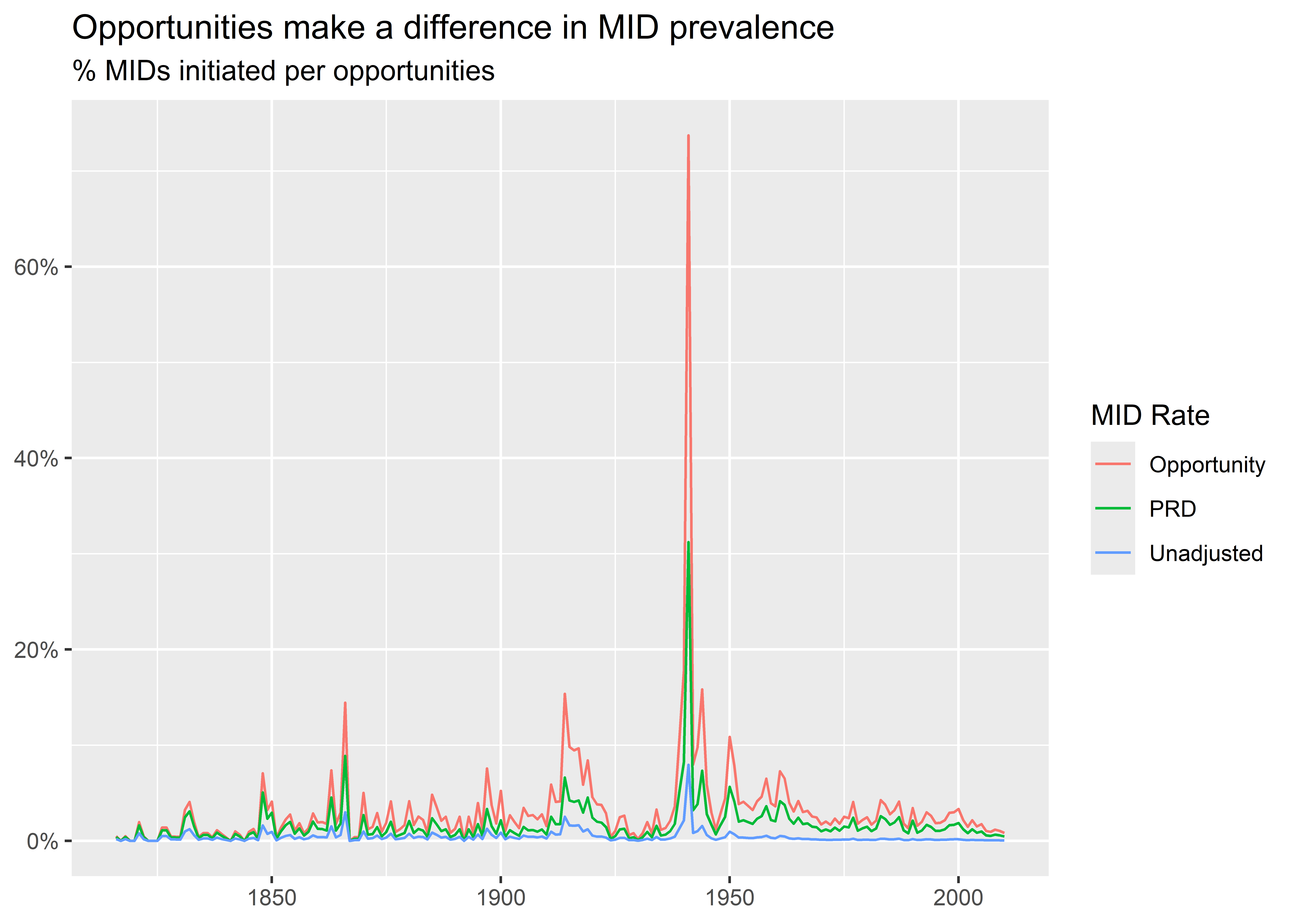
add_mid_opportunity() -> dtNext, I create a year-level dataset called sum_dt that has an unadjusted measure of the frequency of MID initiation per number of country pairs, the frequency of MID initiation per the number of politically relevant pairs, and the frequency of MID initiation per the sum of opportunities based on the Braumoeller-Carson measure.
dt |>
  group_by(year) |>
  summarize(
    Unadjusted = sum(mid_inits) / sum(n_pairs),
    PRD = sum(mid_inits) / sum(n_prds),
    Opportunity = sum(mid_inits) / sum(n_opps),
    .groups = "drop"
  ) -> sum_dt
With this data, I can make a graph that shows variation in each metric by year. To do this, I first pivot the data longer by each of my metrics. I do this by writing -year in pivot_longer(). Since my data only has four columns (the year and three metrics), I can just write -year to specify that I want the function to pivot my data by all columns other than year. Once the data is pivoted, I can then map color to metric names when I make my plot. As the graph shows, how we measure the rate of MID initiation makes a big difference in terms of the estimated prevalence of international conflict.
sum_dt |>
  pivot_longer(-year) |>
  ggplot() +
  aes(x = year, y = value, color = name) +
  geom_line() +
  labs(
    x = NULL,
    y = NULL,
    title = "Opportunities make a difference in MID prevalence",
    subtitle = "% MIDs initiated per opportunities",
    color = "MID Rate"
  ) +
  scale_y_continuous(
    labels = scales::percent
  )
Using a legend to provide labels is great, but we can also use tools from {geomtextpath} to put labels directly on lines, instead. Check out the following example:
sum_dt |>
  pivot_longer(-year) |>
  ggplot() +
  aes(x = year, y = value, color = name) +
  geom_textline(
    aes(label = name),
    show.legend = F
  ) +
  labs(
    x = NULL,
    y = NULL,
    title = "Opportunities make a difference in MID prevalence",
    subtitle = "% MIDs initiated per opportunities",
    color = "MID Rate"
  ) +
  scale_y_continuous(
    labels = scales::percent
  )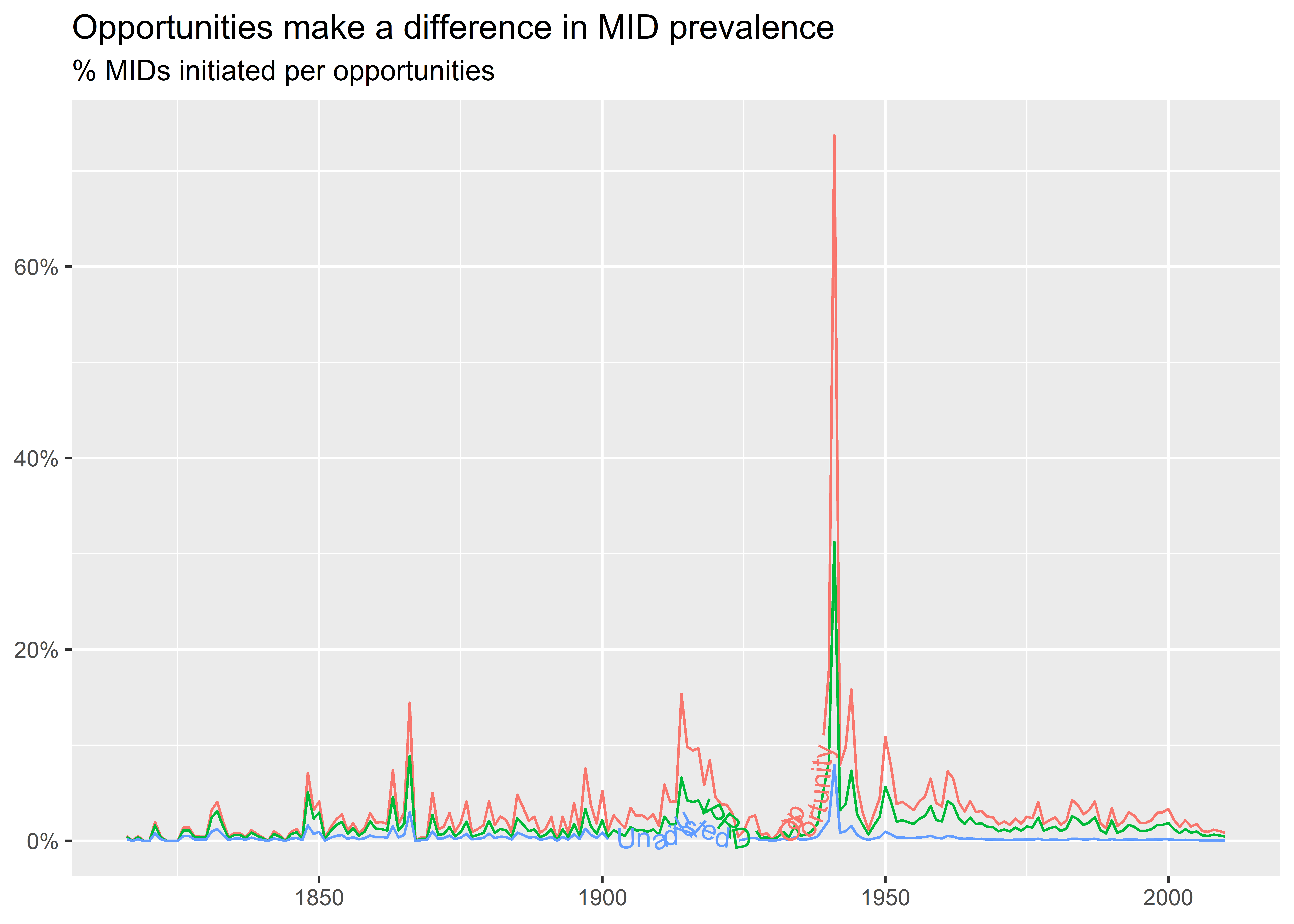
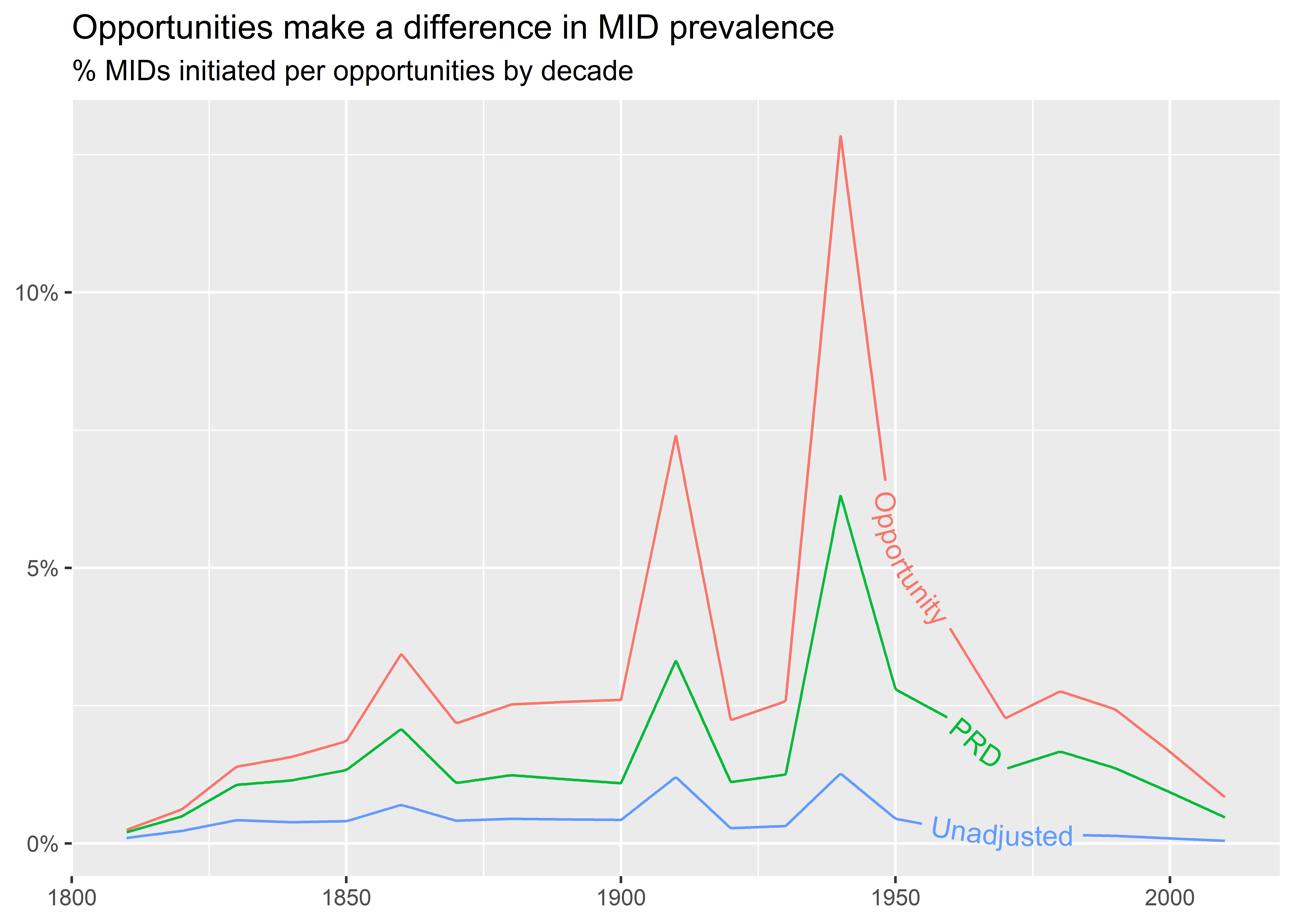
Ew! That doesn’t look so good. I tried using geom_textline() to put labels on the lines for each metric. The problem I ran into is that the lines are too bumpy and also too close together to clearly read the text. If you check out the help file for geom_textline() you’ll see that we can adjust for bumpiness, but there’s no fixing the fact that there’s little daylight between lines. For data that look like this, we might want to stick with colors and a legend. Alternatively, we can try different ways of calculating rates over time that are less bumpy. For example, we could aggregate the data to decades rather than years, like below. This makes it much easier to distinguish trends over time by metric. It also makes it clear that the estimated prevalence of conflict initiation looks higher over time when we account for how many opportunities countries realistically have to initiate disputes with one another.
dt |>
  mutate(
    decade = 10 * floor(year / 10)
  ) |>
  group_by(decade) |>
  summarize(
    Unadjusted = sum(mid_inits) / sum(n_pairs),
    PRD = sum(mid_inits) / sum(n_prds),
    Opportunity = sum(mid_inits) / sum(n_opps)
  ) |>
  pivot_longer(-decade) |>
  ggplot() +
  aes(x = decade, y = value, color = name) +
  geom_textline(
    aes(label = name),
    show.legend = F,
    text_smoothing = 50,
    hjust = 0.85
  ) +
  labs(
    x = NULL,
    y = NULL,
    title = "Opportunities make a difference in MID prevalence",
    subtitle = "% MIDs initiated per opportunities by decade",
    color = "MID Rate"
  ) +
  scale_y_continuous(
    labels = scales::percent
  )
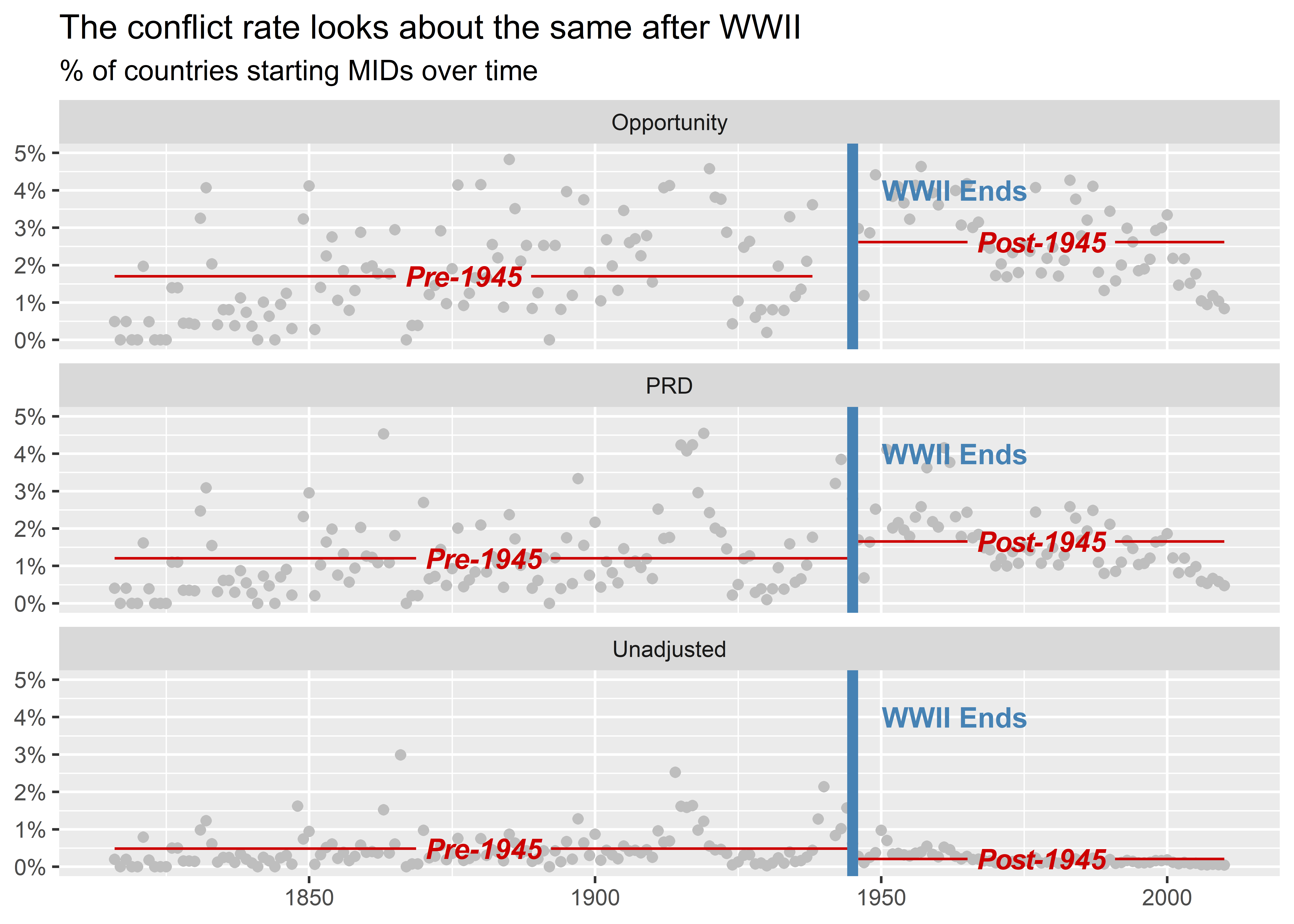
For one final example, we can produce something like the last plot in the previous section, but this time as small multiple broken down by metric. Since the data we used to calculate the MID rate here is different than in the aforementioned plot, the results look different. Our new measures suggest that the conflict rate after World War II isn’t much different relative to the rate before. Pay close attention to the below code. It looks complex, but its basic elements rely on skills that we’ve already covered.
sum_dt |>
  pivot_longer(-year) |>
  mutate(
    post1945 = ifelse(year > 1945, "Post-1945", "Pre-1945")
  ) |>
  ggplot() +
  aes(x = year, y = value) +
  geom_point(color = "gray") +
  geom_textsmooth(
    aes(
      group = post1945,
      label = post1945
    ),
    method = "lm",
    formula = y ~ 1,
    color = "red3",
    fontface = "bold.italic"
  ) +
  geom_vline(
    xintercept = 1945,
    color = "steelblue",
    linewidth = 2
  ) +
  annotate(
    "text",
    x = 1945,
    y = 0.04,
    label = "WWII Ends",
    color = "steelblue",
    hjust = -0.2,
    fontface = "bold"
  ) +
  facet_wrap(~ name, nrow = 3) +
  labs(
    x = NULL,
    y = NULL,
    title = "The conflict rate looks about the same after WWII",
    subtitle = "% of countries starting MIDs over time"
  ) +
  scale_y_continuous(
    labels = scales::percent,
    limits = c(0, 0.05)
  )