Show why transforming data before plotting is more efficient.
7.2 Frequency plots for showing summaries
Some geoms transform or summarize the data for us when we plot it. We talked about using geom_bar() to do this before. This function really shines when we want to break the data down by multiple categories at once—imagine the data viz equivalent of a cross-tab.
library(tidyverse)
Warning: package 'tidyverse' was built under R version 4.2.3
Warning: package 'ggplot2' was built under R version 4.2.3
Warning: package 'tibble' was built under R version 4.2.3
Warning: package 'tidyr' was built under R version 4.2.3
Warning: package 'readr' was built under R version 4.2.3
Warning: package 'purrr' was built under R version 4.2.3
Warning: package 'dplyr' was built under R version 4.2.3
Warning: package 'stringr' was built under R version 4.2.3
Warning: package 'forcats' was built under R version 4.2.3
Warning: package 'lubridate' was built under R version 4.2.3
── Attaching core tidyverse packages ──────────────────────── tidyverse 2.0.0 ──
✔ dplyr     1.1.2     ✔ readr     2.1.4
✔ forcats   1.0.0     ✔ stringr   1.5.0
✔ ggplot2   3.5.0     ✔ tibble    3.2.1
✔ lubridate 1.9.3     ✔ tidyr     1.3.0
✔ purrr     1.0.2
── Conflicts ────────────────────────────────────────── tidyverse_conflicts() ──
✖ dplyr::filter() masks stats::filter()
✖ dplyr::lag()    masks stats::lag()
ℹ Use the conflicted package (<http://conflicted.r-lib.org/>) to force all conflicts to become errors
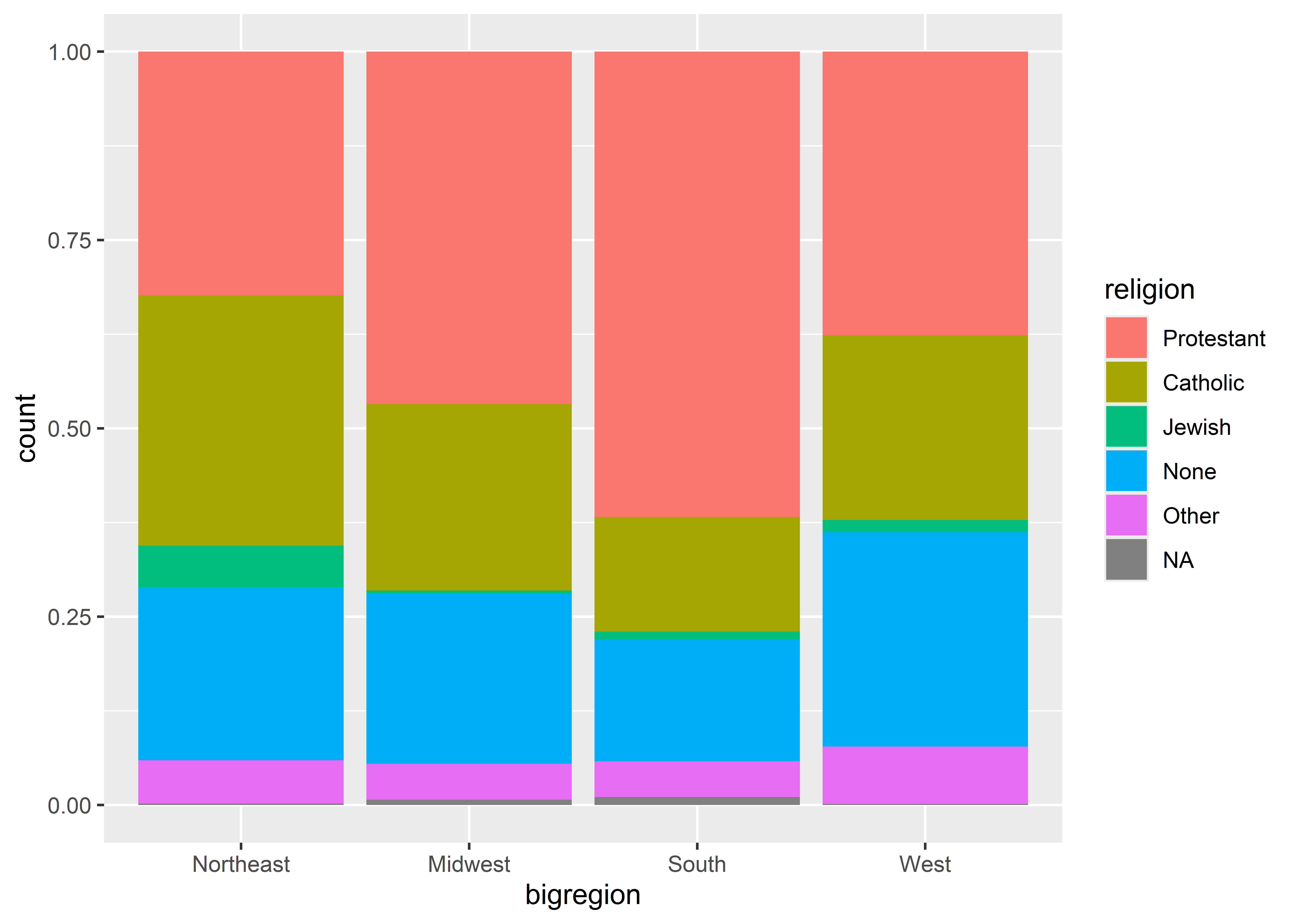
library(socviz)ggplot(gss_sm) +aes(x = bigregion, fill = religion) +geom_bar()
The above summarizes the number of observations by census region in the GSS 2016 dataset from the {socviz} package. By mapping fit to religion, it further breaks down the count by self-identified region among survey respondents.
By updating just one option we can convert this output from a raw count to a proportion.
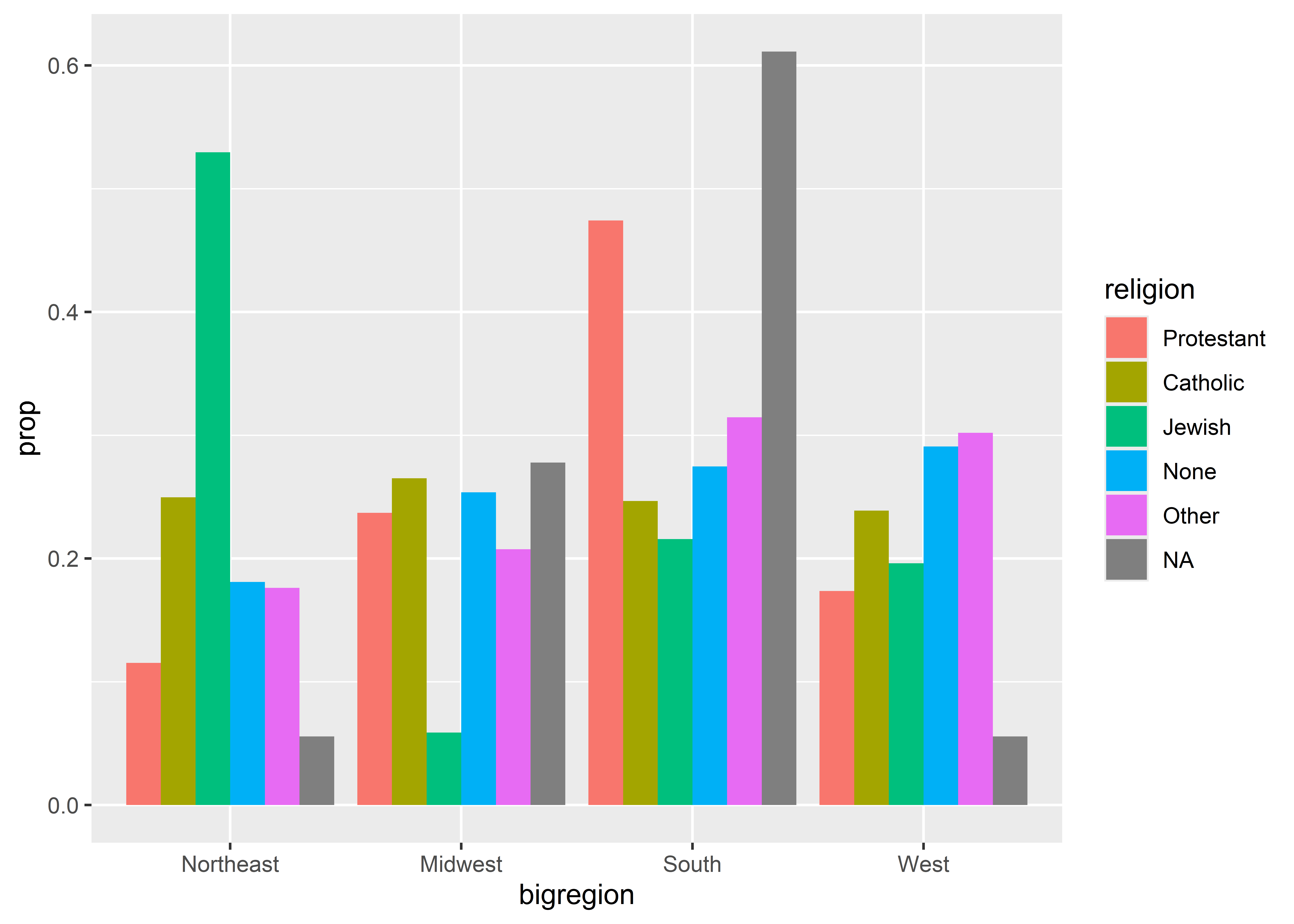
ggplot(gss_sm) +aes(x = bigregion, fill = religion) +geom_bar(position ="fill")
By setting position = "fill" the output now shows proportions by our x variable. We can now see the share of respondents by region that self-identify with a particular religion. We also could show the proportions side-by-side to make comparisons even clearer, but we have to take a few more steps than you might think. For example, say we tried using position = "dodge":
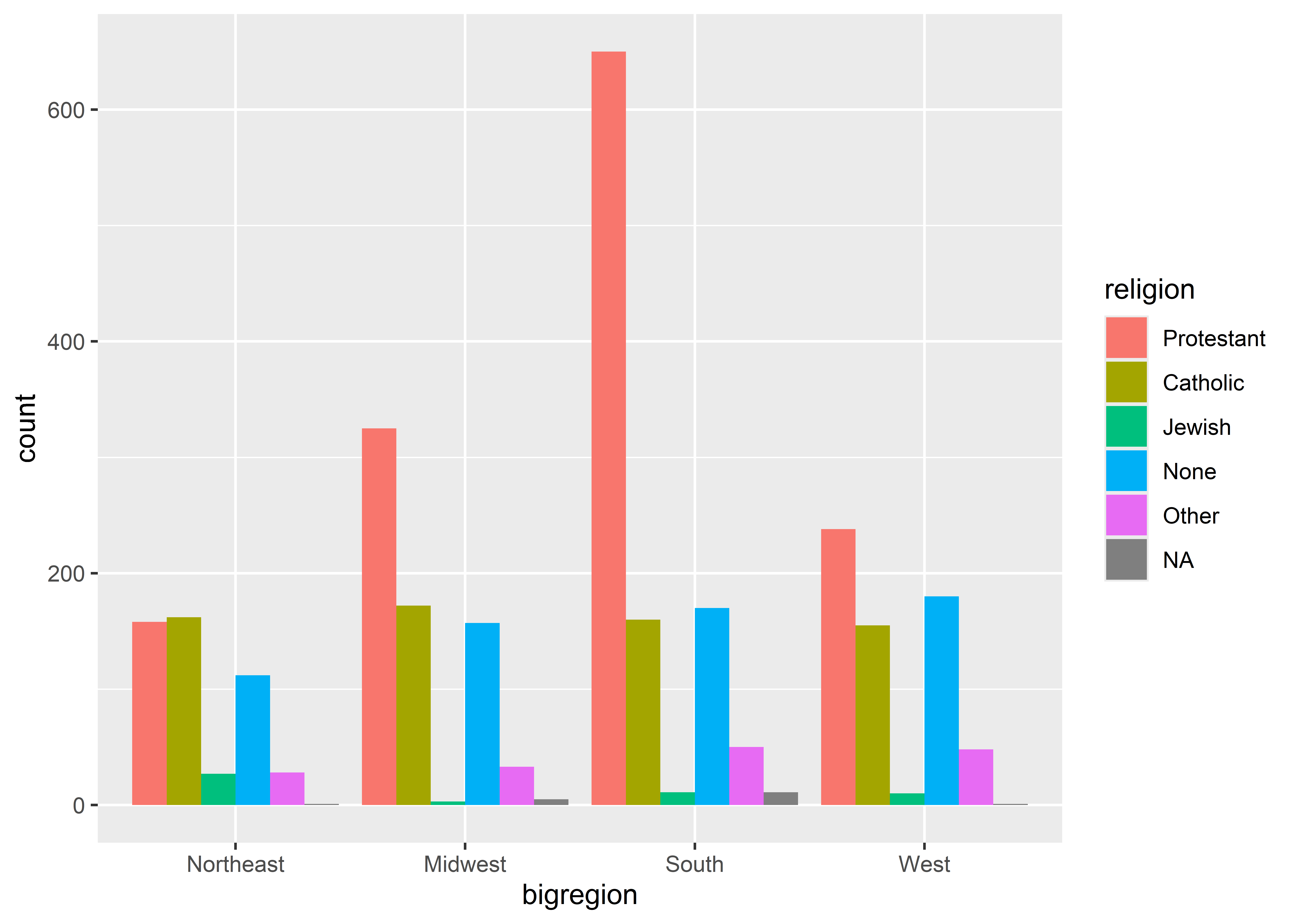
ggplot(gss_sm) +aes(x = bigregion, fill = religion) +geom_bar(position ="dodge")
The bars appear side-by-side, but we’re back to showing counts. Maybe we should try mapping y to ..prop..?
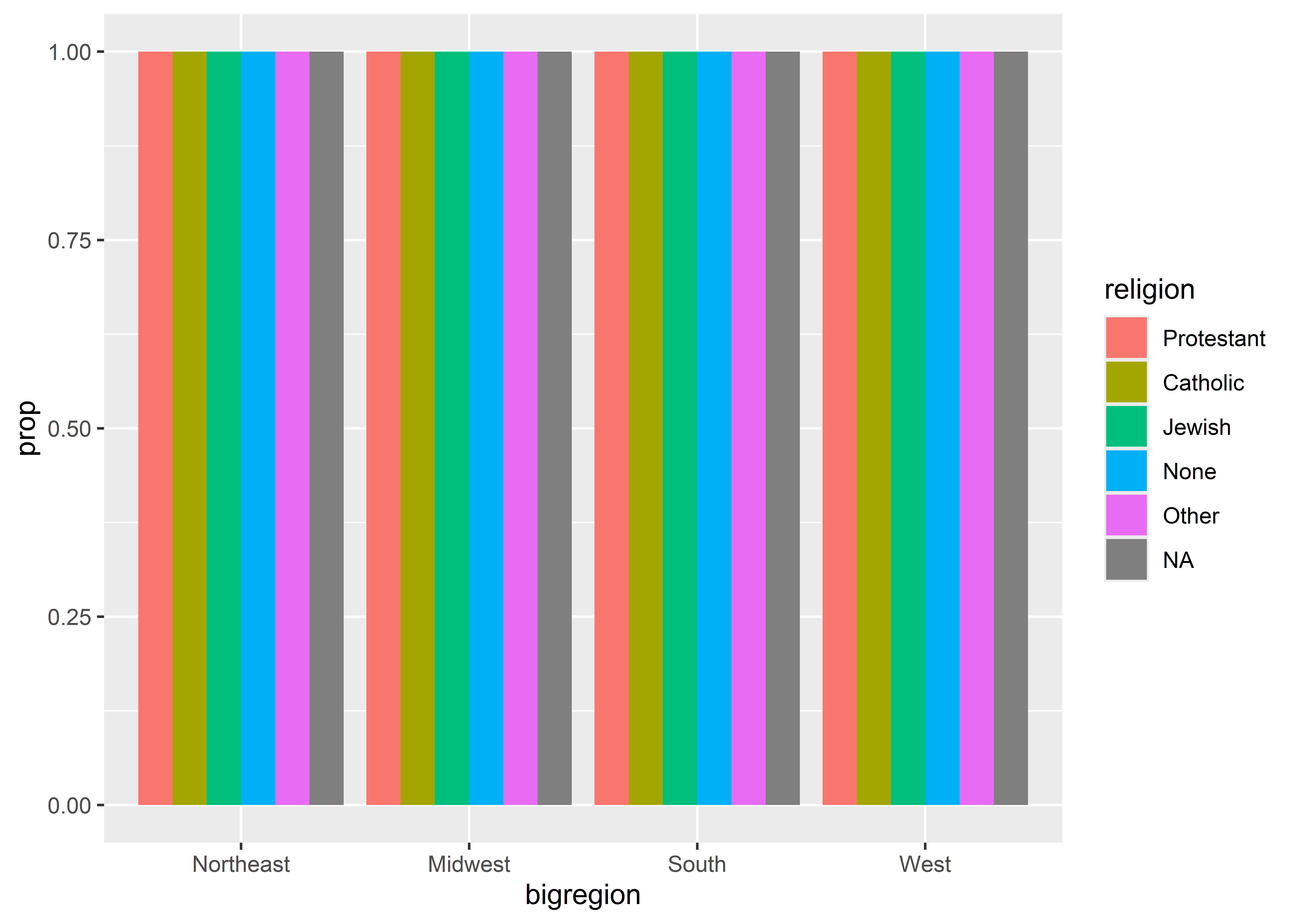
ggplot(gss_sm) +aes(x = bigregion, y = ..prop.., fill = religion) +geom_bar(position ="dodge" )
Warning: The dot-dot notation (`..prop..`) was deprecated in ggplot2 3.4.0.
ℹ Please use `after_stat(prop)` instead.
Shoot! That didn’t work either. The final step we need to take is to map groups to religion, too.
ggplot(gss_sm) +aes(x = bigregion, y = ..prop.., fill = religion,group = religion) +geom_bar(position ="dodge" )
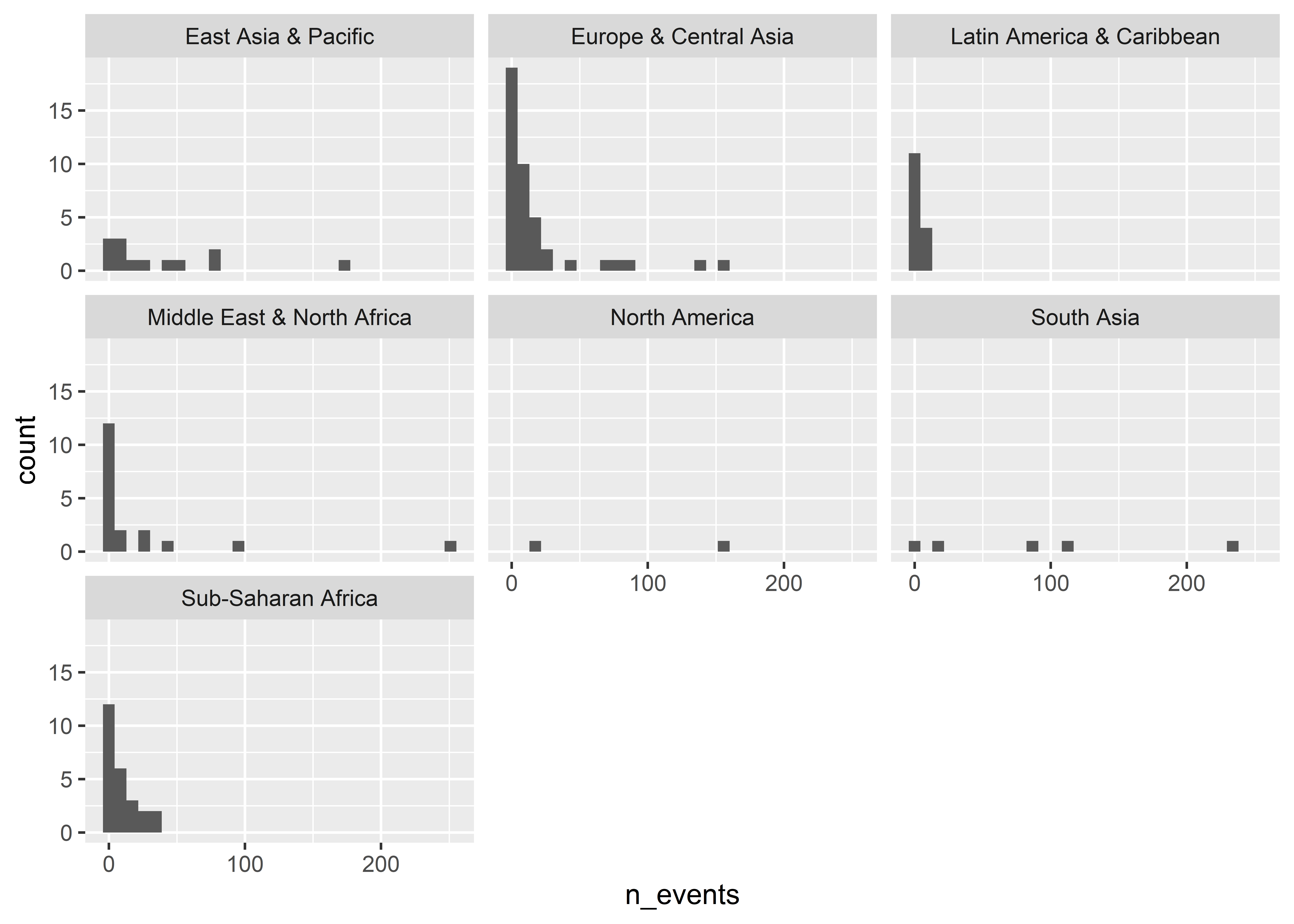
If we don’t like having to do two mappings for a single variable, we instead could facet by region to avoid the need to map the fill aesthetic.
The above is, in some ways, much better than using fill. The above provides a nice summary of the distribution of religious affiliations across different regions in the U.S. It also makes it clear that proportions are based on region.
7.3 Show distributions
Speaking of distributions, bar plots provide a useful way to show the distribution of observations across discrete categories. We can use other geoms to summarize numerical variables, too.
Here’s some data on fatalities from “militarized interstate events” from 2001 to 2014. Each row in the data is a country that was part of some kind of a militarized event involving another country. These events fall below the level of full-scale war. For each country, the data contains the number of recorded events from 2001 to 2014 and estimates of the minimum and maximum number of total fatalities associated with these events for the country involved.
Rows: 121 Columns: 5
── Column specification ────────────────────────────────────────────────────────
Delimiter: ","
chr (1): country
dbl (4): ccode1, n_events, fatalmin, fatalmax

ℹ Use `spec()` to retrieve the full column specification for this data.
ℹ Specify the column types or set `show_col_types = FALSE` to quiet this message.
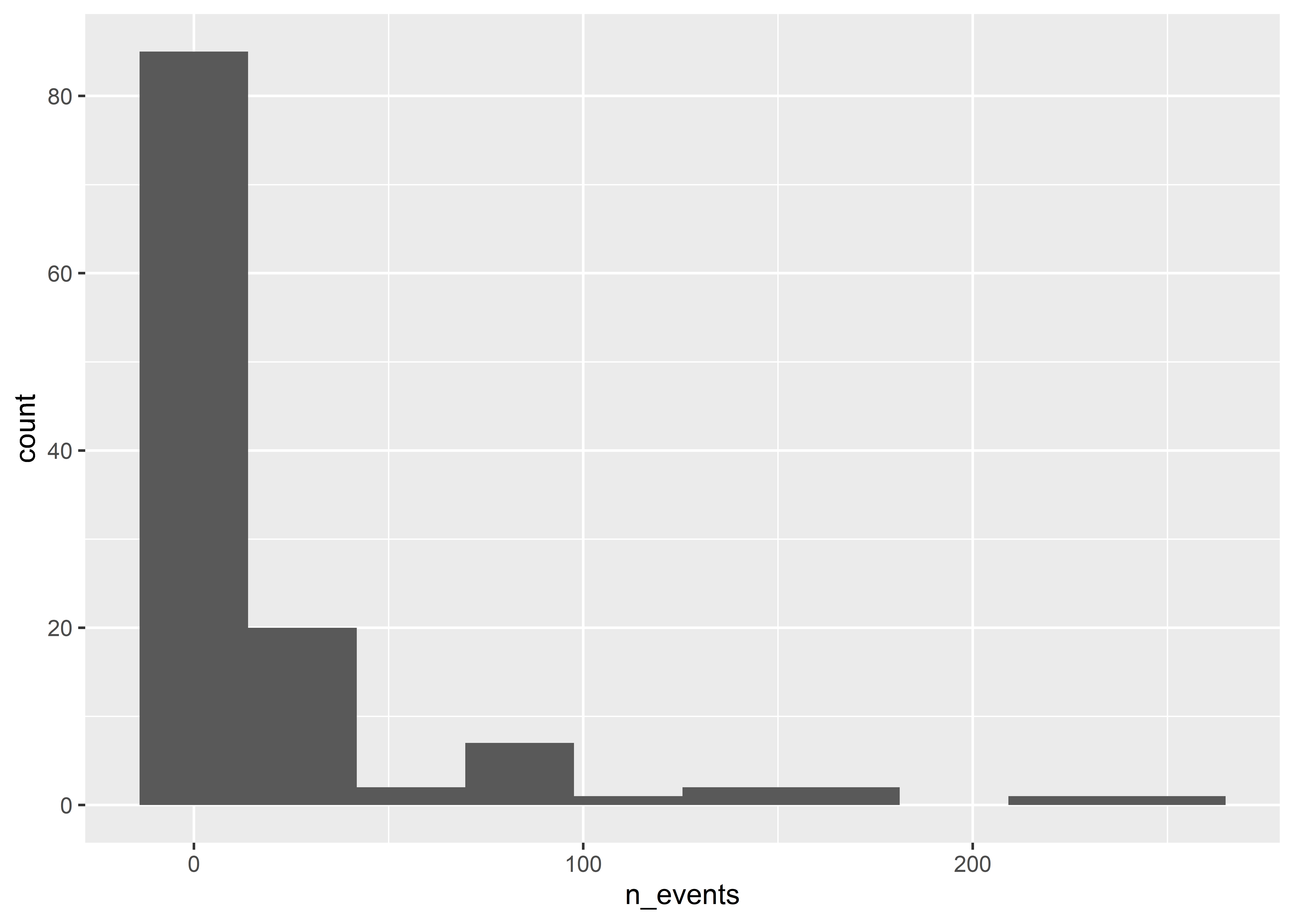
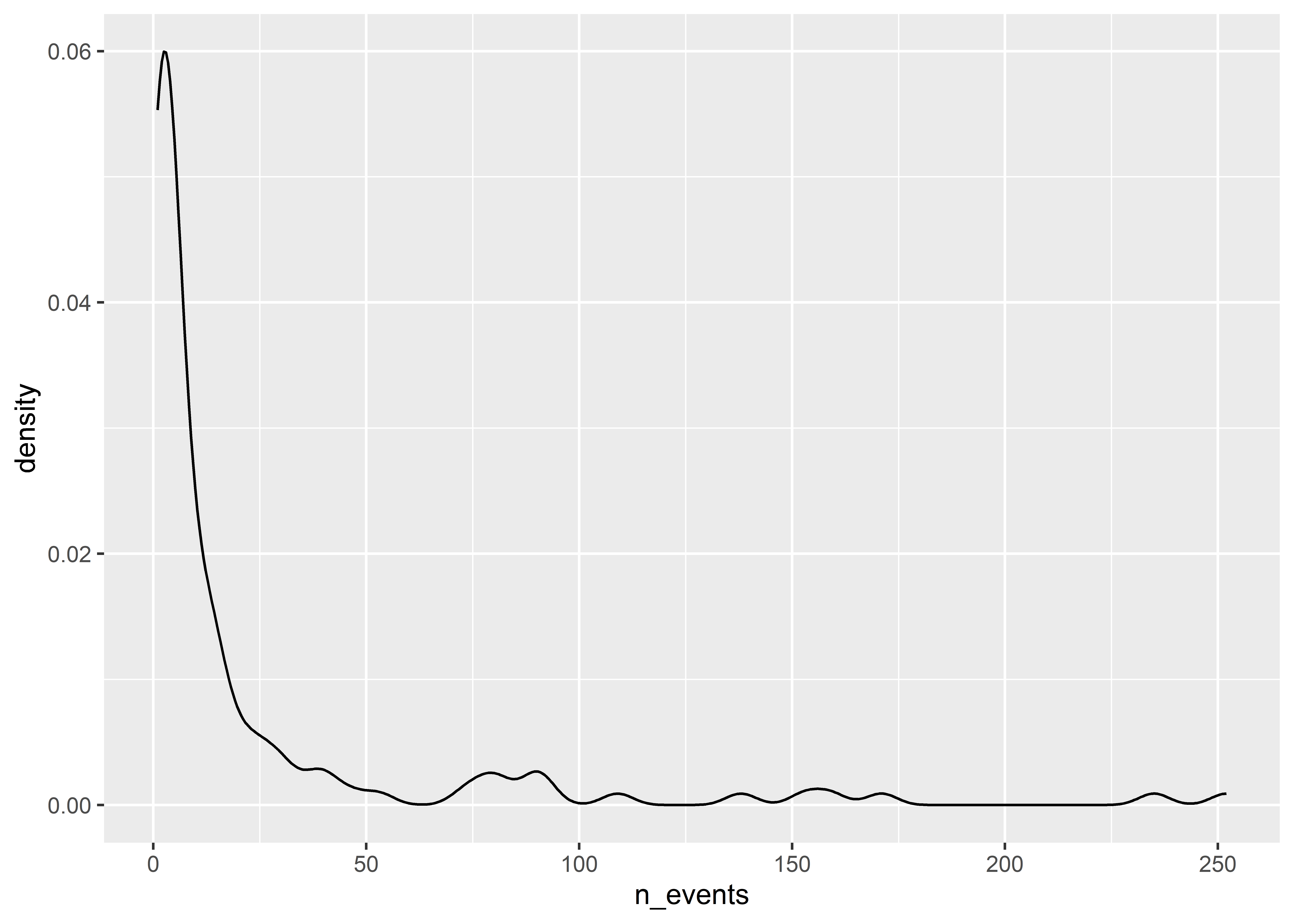
Just like geom_bar() summarizes discrete data, geom_histogram() summarizes continuous data. For example, we can use it to summarize the distribution of event counts:
`stat_bin()` using `bins = 30`. Pick better value with `binwidth`.
Histograms work by putting continuous variables into “bins” and then counting up the number of observations that fall into those bins. If we want, we can directly adjust the number of bins in a ggplot histogram. The below code sets bins = 10.
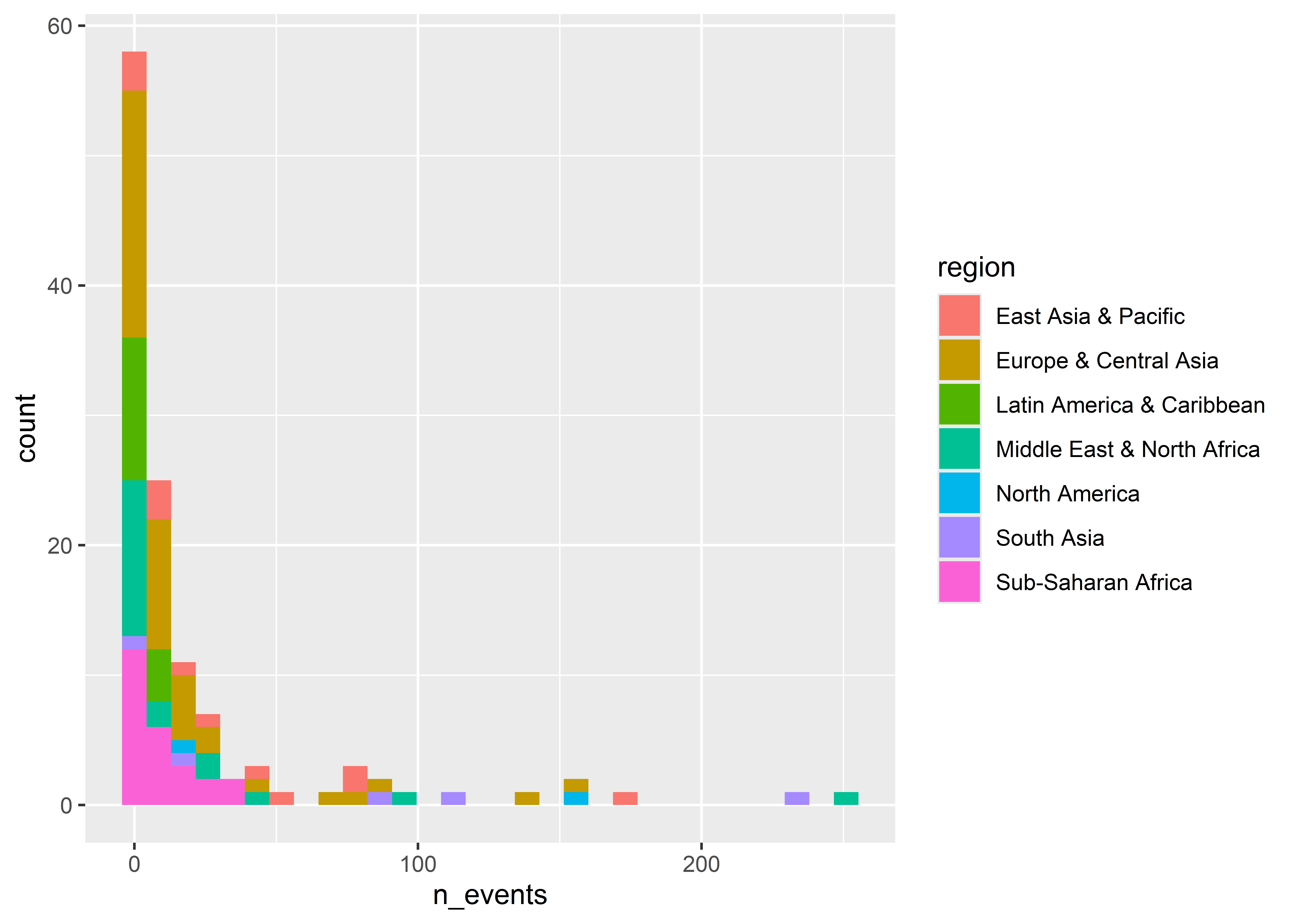
We can also group data to show its distribution by different categories. For example, we can show counts by world regions. Our data don’t have a column for regions, but we can add one with some help from the mutate() function and the countrycode() function from the {countrycode} package (write install.packages("countrycode") to install it).
## add new column called "region" to the datamie_data <-mutate( mie_data,region = countrycode::countrycode( country, "country.name", "region" ))## draw histogram with fill mapped to regionggplot(mie_data) +aes(x = n_events, fill = region) +geom_histogram()
`stat_bin()` using `bins = 30`. Pick better value with `binwidth`.
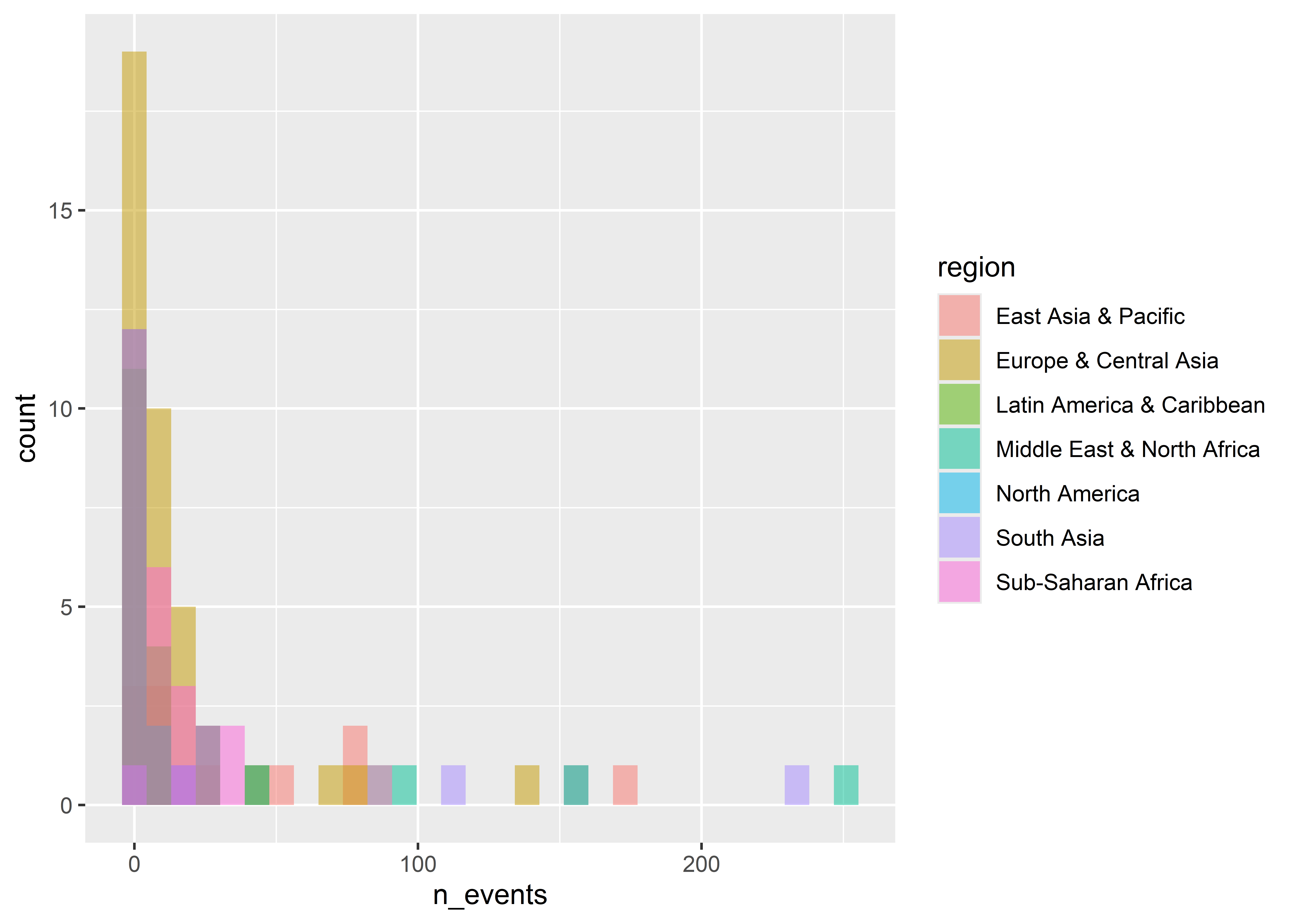
Notice that when we map fill to region that the counts are stacked on top of each other. If we don’t want them stacked we can tell ggplot to instead plot by “identity”.
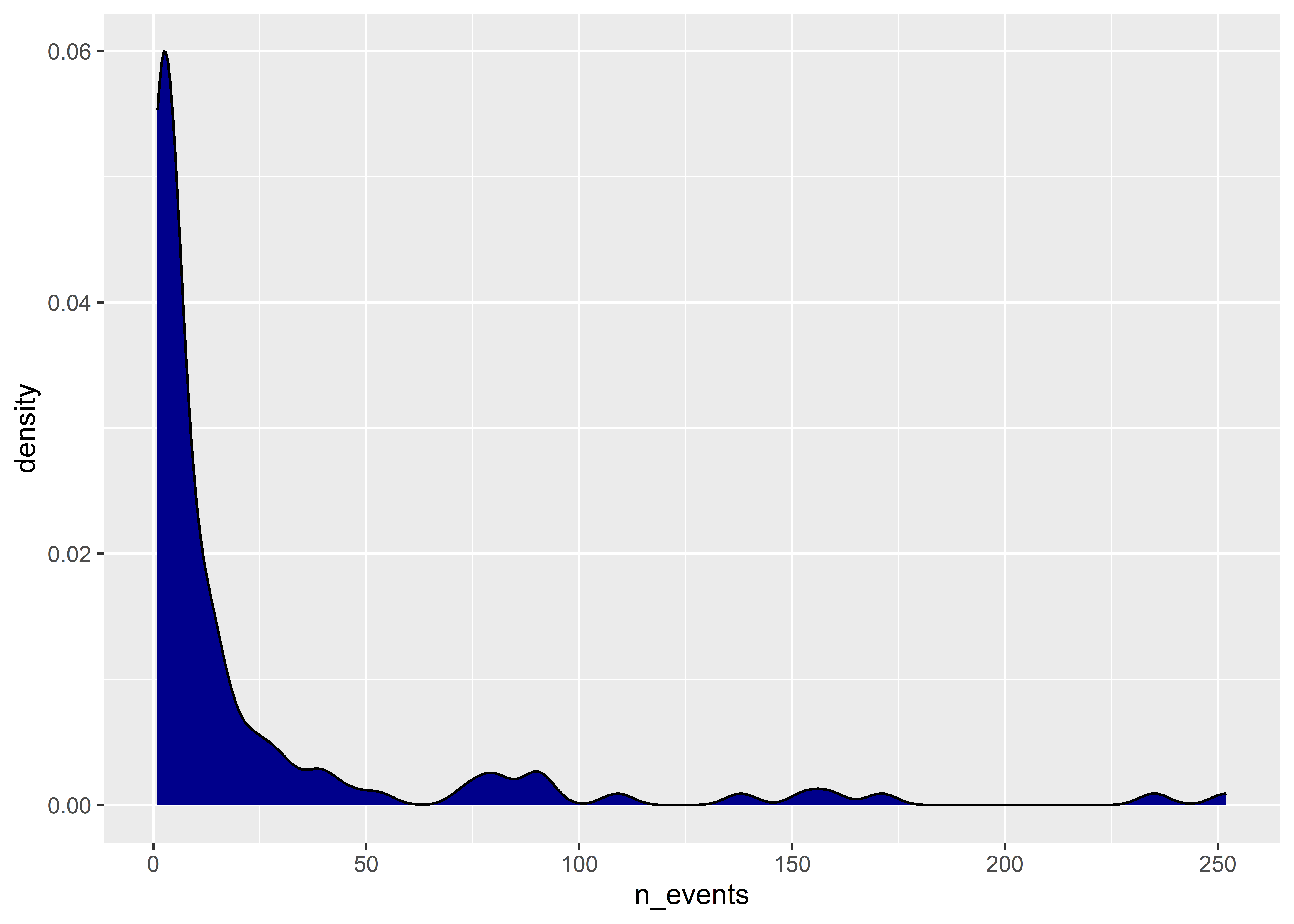
An annoying thing about density plots is that ggplot only shows us a line representing the density function. I personally prefer to have the area under the density function shaded in. Do do this, we can just set the fill aesthetic inside geom_density() to a color of our choice:
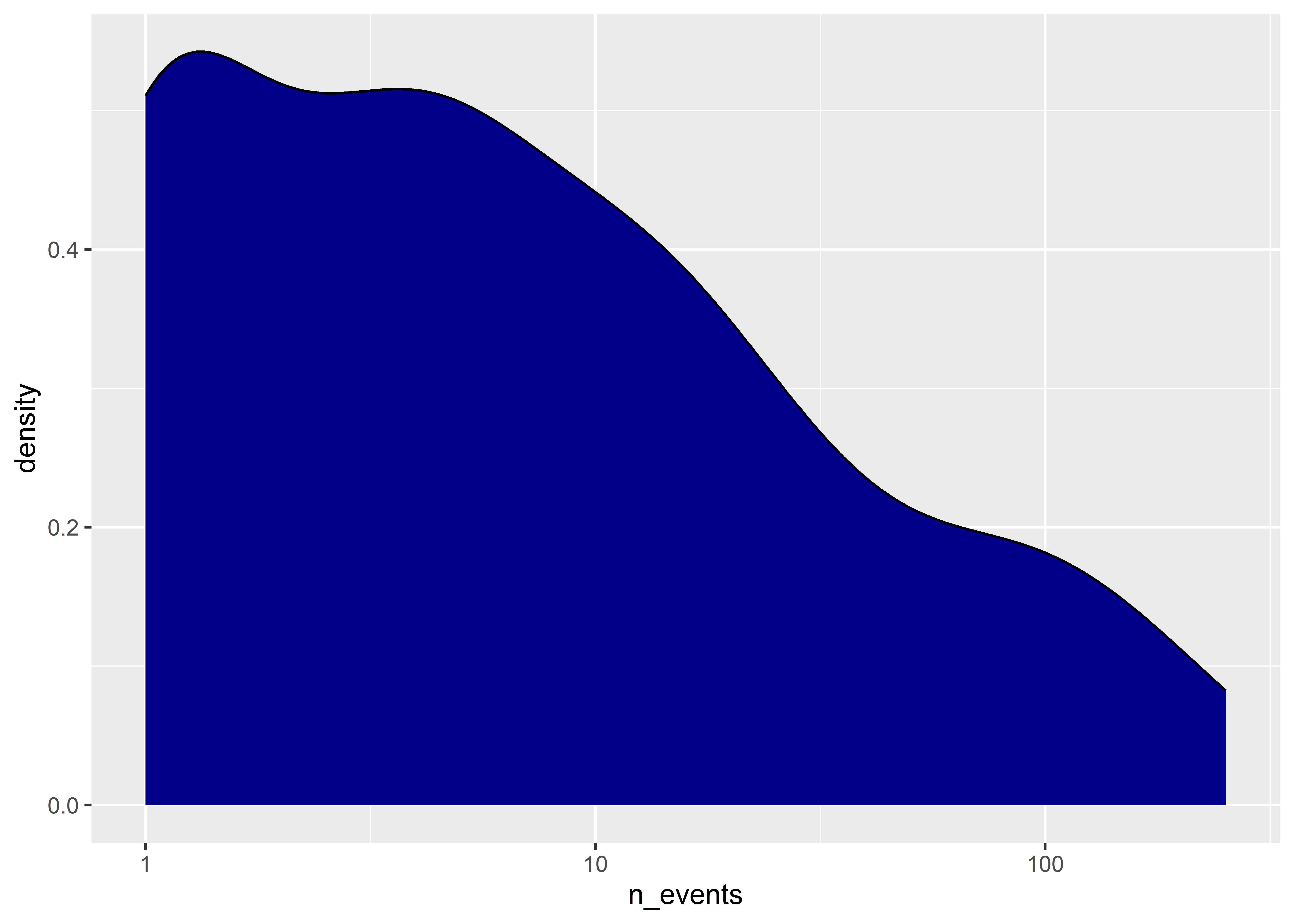
We can also modify the scales when showing continuous distributions. For example, the distribution of the number of events is pretty skewed. Log-transforming the data might make the data look a little more normal.
You often can and should transform data before you give it to ggplot. I don’t recommend this in the case of showing histograms or density plots, but I do if you want to summarize data by certain categories like we’ve done previously with geom_bar().
Say for example I wanted to show the proportion of events by world regions. I could us geom_bar() and add y = ..prop.. and group = 1 in the aes() function. Or, I could use some other functions to summarize the data before I give it to ggplot. Check it out:
## make a new summary data objectmie_props <- mie_data |>group_by(region) |>summarize(events =sum(n_events),.groups ="drop" ) |>mutate(prop = events /sum(events) )## make a column plot using itggplot(mie_props) +aes(x = prop, y =reorder(region, prop)) +geom_col()
The above code introduces some new functions and syntax. For example, I used three new functions: group_by(), summarize(), and mutate(). I also used a pipe operator: |>. We’ll talk about these things in more detail later, so keep these functions and syntax in your back pocket.
At this point you may be asking why it’s necessary to transform the data before giving it to ggplot? In the case of this simple example, the value add is less clear. This will change when we introduce more complex data transformations and summaries into the mix. You can only go so far with “under the hood” transformations using geom functions. Knowing how to transform you data before you plot it is a necessary skill, and one that will up your data visualization game many times over once you get the hang of it.