
11 Bad Examples and How to Fix Them
11.1 Goals
- For every bad figure you see in the wild, a better one is within reach.
- The difference that a few simple modifications makes can go a long way.
- Some of these modifications make use of some special functions.
11.2 Dual axes
The textbook provides a number of case studies—examples of bad data visualizations and ways to improve them. In these notes, we’ll work through some of these examples while adding some new twists.
Take a figure like the following line plot. It shows from 1945-2017 the quality of democracy trend for the United States using two measures—the Polity2 index and V-Dem. Clearly we can see that scaling is an issue.
A tempting solution might be to use dual y-axes and change the scaling of the quality of democracy measures. But we don’t really need to make dual axes at all. And, while it’s possible to do such things with ggplot, dual axes are actually quite difficult to interpret.
Instead, we’ll follow the example from our text to produce the following plot instead.
First, you’ll need to read in the data:
library(peacesciencer)
create_stateyears(subset_years = 1945:2017) |>
  add_democracy() -> Data
Then, you’ll need to add a new column that puts the polity2 index on the same 0-1 scale as V-Dem:
Data |>
  mutate(
    polity2_i = (polity2 + 10) / 20
  ) -> Data
We also want to create a value that’s the difference between these measures. We can do that, too, now that they’re on the same scale:
Data |>
  mutate(
    diff = v2x_polyarchy - polity2_i
  ) -> Data
Now, let’s make a plot for the U.S. Pay close attention here, because I’m introducing a new package called {patchwork}.
usData <- Data |> filter(ccode == 2)
  ## Filter the data down to the US

ggplot(usData) +
  ## Start making our plot
  aes(x = year) +
  geom_textline(
    aes(y = v2x_polyarchy),
    label = "V-Dem",
    vjust = 1.5,
    text_smoothing = 50,
    color = "red"
  ) +
  geom_textline(
    aes(y = polity2_i),
    label = "Polity",
    vjust = 1.5,
    text_smoothing = 100,
    color = "blue"
  ) +
  labs(
    x = NULL,
    y = NULL,
    title = "Trend in Democracy for the United States, 1945-2017",
    subtitle = "Quality of Democracy Scores"
  ) -> p1

## Now I'm going to make another plot
ggplot(usData) +
  aes(x = year,
      y = diff) +
  geom_line() +
  geom_hline(yintercept = 0, lty = 2) +
  labs(
    x = NULL,
    y = NULL,
    subtitle = "Difference in Measures"
  ) -> p2

## Use patchwork to combine the plots into a single data viz
library(patchwork)
p1 / p2 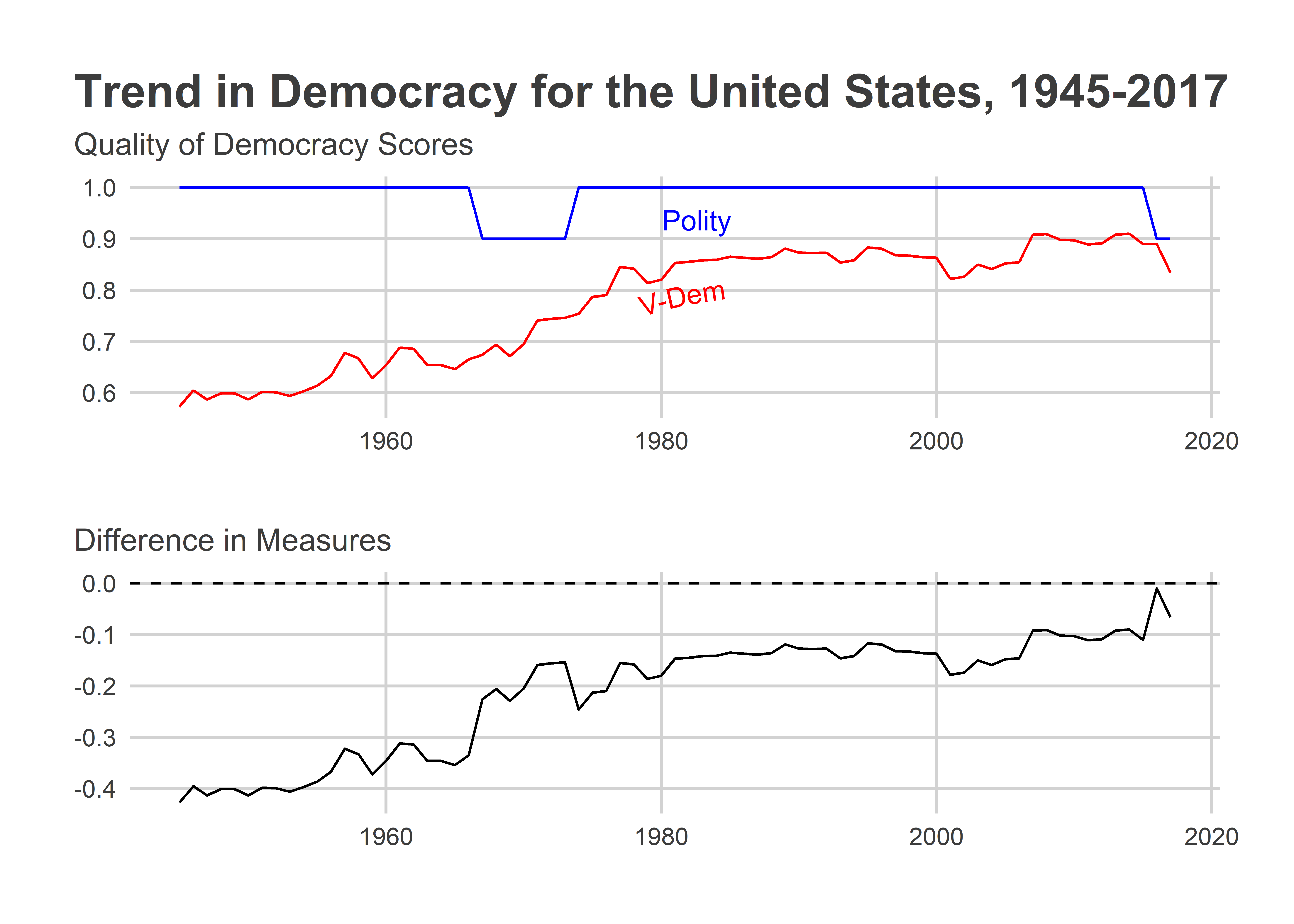
The above simultaneously shows the trends in democracy quality in the U.S. according to Polity and V-Dem and also shows the difference between the measures. We can clearly see that V-Dem has a much less positive view of democracy in the U.S. relative to Polity. This difference is especially pronounced throughout the ’50s, ’60s, and ’70s.
Also note the use of the {patchwork} package. This is a helpful package for combining multiple ggplot objects in the same frame. It uses relatively simple syntax for giving R instructions for how to place different plots in relation to each other. For example, p1 + p1 would put these plots side-by-side whereas the syntax above, p1 / p2 places the first one on top of the other. There are lots of other bells and whistles associated with the package, too. Read more about {patchwork} here: https://patchwork.data-imaginist.com/index.html
11.3 Relationships over time
Here’s another example of a bad data viz. The below figure is supposed to show the relationship between the global average of GDP per capita and quality of democracy over time. But it relies on some odd choices. First, instead of using a scatter plot (a more natural choice), it shows time on the x-axis and then plots both GDP per capita and democracy quality on the y-axis. Second, it uses different plotting geometry for each variable—geom_col() for GDP per capita and geom_point() for democracy.
The technical term for the above figure is “poopy.” We can do better. First add some economic data to our dataset:
Data |>
  add_sdp_gdp() -> Data
Then, summarize the data and give it to ggplot:
Data |>
  group_by(year) |>
  summarize(
    dem = mean(v2x_polyarchy, na.rm=T),
    wealth = exp(mean(wbgdppc2011est, na.rm=T))
  ) |>
  ggplot() +
  aes(x = wealth,
      y = dem) +
  geom_path(color = "darkgray") +
  geom_text(
    aes(label = year)
  ) +
  scale_x_continuous(
    labels = scales::dollar
  ) +
  labs(x = "GDP/capita",
       y = "Quality of Democracy",
       title = "Trend in Global Average Wealth and Democracy Quality")
There are some years that overlap, but that’s okay. It’s still much better than the previous. We could alternatively just use labels for decades. It would just require a little extra modification to the code above. We can also use geom_text_repel() from {ggrepel} to ensure no overlap in the year labels.
library(ggrepel)
Data |>
  mutate(
    decade = round(year / 10) * 10
  ) |>
  group_by(decade) |>
  summarize(
    dem = mean(v2x_polyarchy, na.rm=T),
    wealth = exp(mean(wbgdppc2011est, na.rm=T))
  ) |>
  ggplot() +
  aes(x = wealth,
      y = dem) +
  geom_path(color = "darkgray") +
  geom_point(color = "navy") +
  geom_text_repel(
    aes(label = decade),
    nudge_y = 0.05,
    min.segment.length = unit(0, "inches")
  ) +
  scale_x_continuous(
    labels = scales::dollar
  ) +
  labs(x = "GDP/capita",
       y = "Quality of Democracy",
       title = "Trend in Global Average Wealth and Democracy Quality")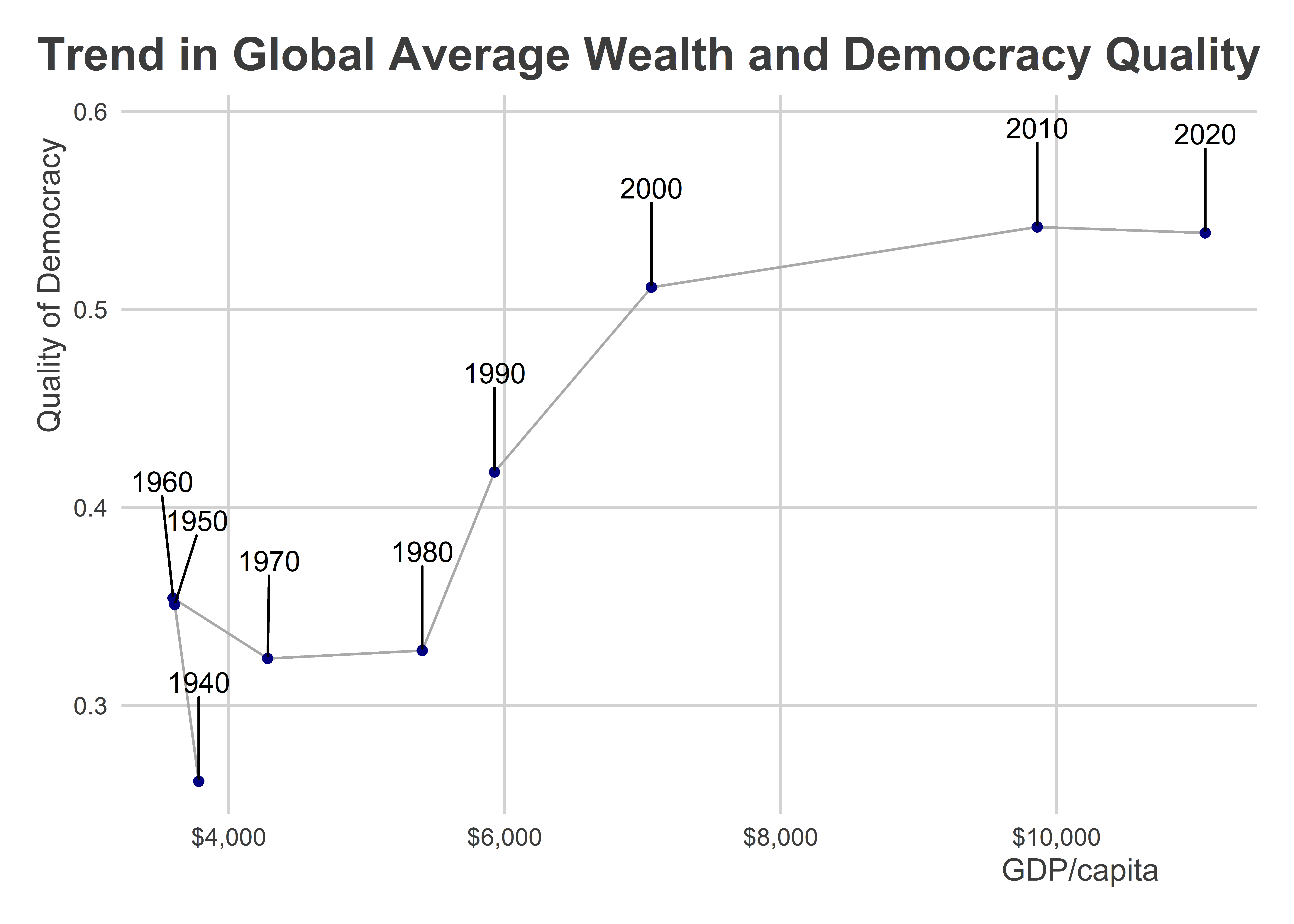
Note the use of geom_path() instead of geom_line(). The former connects data points with a line based on their order in the data while the latter (which we’ve used many times already) connects data points with a line based on their order along the x-axis.
11.4 Always, ALWAYS say no to pie
Did you know that there’s no direct way to make a pie chart in ggplot? That’s right. There’s not a geom_pie() layer.
This is a good thing, because it prevents people from saying “yes” to pie. Pie charts almost never are a good idea. Actually, let me rephrase that. Pie charts NEVER are a good idea.
You can force ggplot to make a pie chart if you really want to:
Data |>
  filter(year == 2015) |>
  slice_max(wbgdp2011est, n = 10) |>
  ggplot() +
  aes(x = "",
      y = v2x_polyarchy,
      fill = statenme) +
  geom_col(color = "white") +
  coord_polar("y", start=0) +
  theme_void() +
  labs(title = "Quality of Democracy in Top 10 Economies",
       fill = NULL)
To paraphrase a line from Four Christmases, it’s bad…and it sucks.
We can do better with a column plot:
Data |>
  filter(year == 2015) |>
  slice_max(wbgdp2011est, n = 10) |>
  ggplot() +
  aes(x = v2x_polyarchy,
      y = reorder(statenme, wbgdp2011est)) +
  geom_col() +
  labs(x = "Quality of Democracy",
       y = NULL,
       title = "Quality of Democracy in Top 10 Economies",
       subtitle = "Ordered from Largest to Smallest Economy")
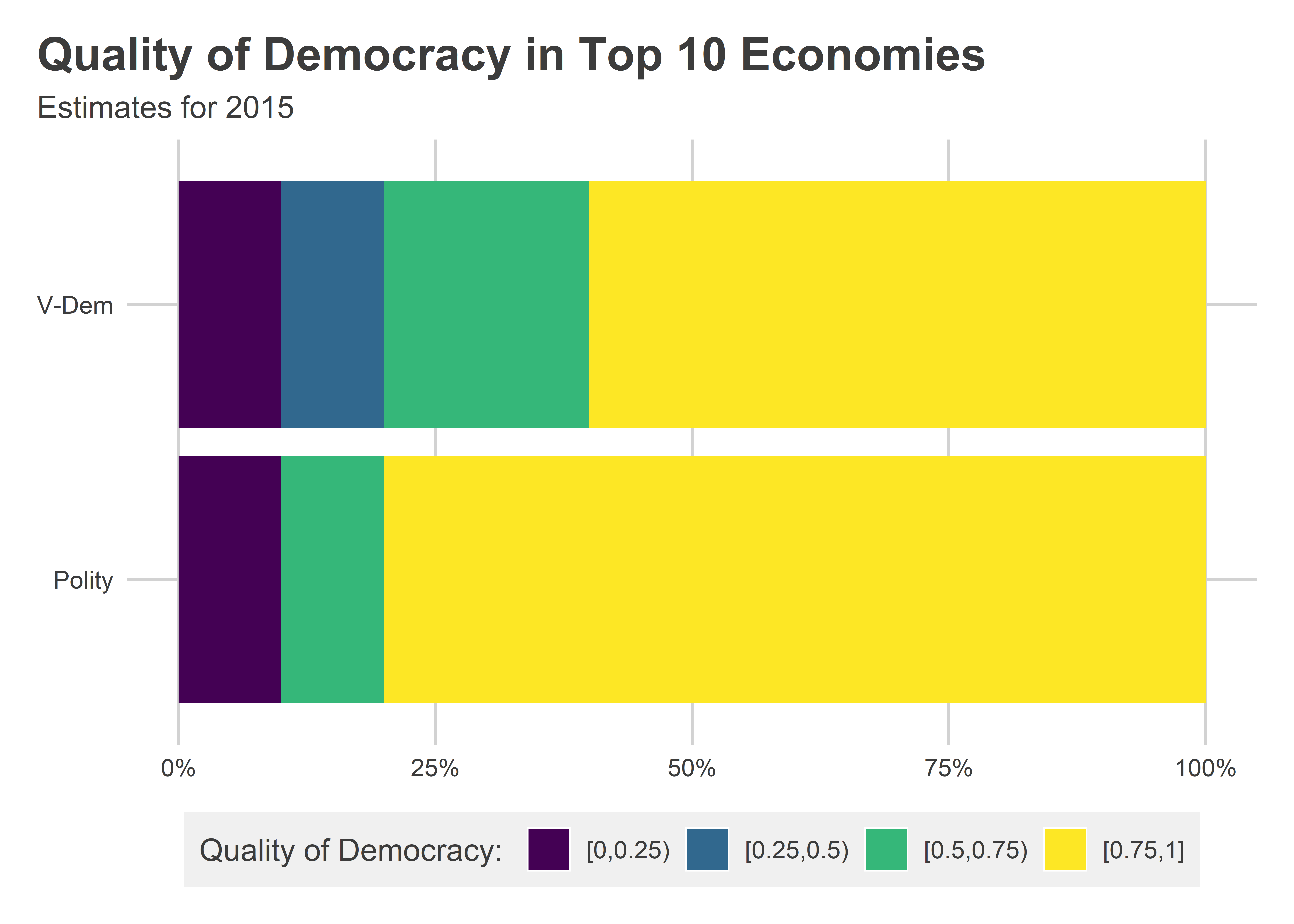
We also could create a segmented bar plot if we wanted to compare how these results look with different measures of democratic quality:
library(socsci)
Data |>
  filter(year == 2015) |>
  slice_max(wbgdp2011est, n = 10) |>
  select(statenme, v2x_polyarchy, polity2_i) |>
  pivot_longer(
    -statenme
  ) |>
  mutate(valuec = cut(value, breaks = seq(0, 1, len = 5),
                      ordered_result = T,
                     include.lowest = T,
                     right = F)) |>
  group_by(name) |>
  ct(valuec) |>
  ggplot() +
  aes(x = pct,
      y = name,
      fill = valuec) +
  geom_col(
    position = position_fill(reverse = TRUE)
  ) +
  scale_x_continuous(
    labels = scales::percent
  ) +
  scale_y_discrete(
    labels = c("Polity",
               "V-Dem")
  ) +
  labs(
    x = NULL,
    y = NULL,
    title = "Quality of Democracy in Top 10 Economies",
    subtitle = "Estimates for 2015",
    fill = "Quality of Democracy: "
  )
In short, there are plenty of alternatives to pie charts. You should always say “yes” to these, and always say “no” to pie (unless it’s the baked variety).