Understand the difference between mapping and setting aesthetics.
Set aesthetics globally vs. by geom.
Know how to save your data viz.
5.2 When to map or set aesthetics
In the previous notes, we covered some of the basics of working with ggplot.
Now we’re going to go a little deeper. Remember the three-step ggplot workflow?
Feed ggplot() data.
Tell ggplot what relationships to show using aes().
Tell ggplot how to show those relationships using geom_*() functions.
There are some important things to keep in mind when doing steps 2 and 3. In particular, it’s really easy to confuse when you want to map an aesthetic for when you want to set an aesthetic.
What’s the difference?
You map aesthetics inside the aes() function.
You set aesthetics inside geom_*() functions.
Here’s an example. Let’s load the gapminder data and the {tidyverse} and make a plot with ggplot where we map the color aesthetic to continent names.
## open {tidyverse} + {gapminder}library(tidyverse)library(gapminder)## make data viz (map colors to continents)ggplot(gapminder) +aes(x = gdpPercap, y = lifeExp,color = continent ) +geom_point() +geom_smooth() +scale_x_log10()
The above code contains a command in the aes() function that specifies color = continent. This option tells ggplot that it should map different colors to continent names.
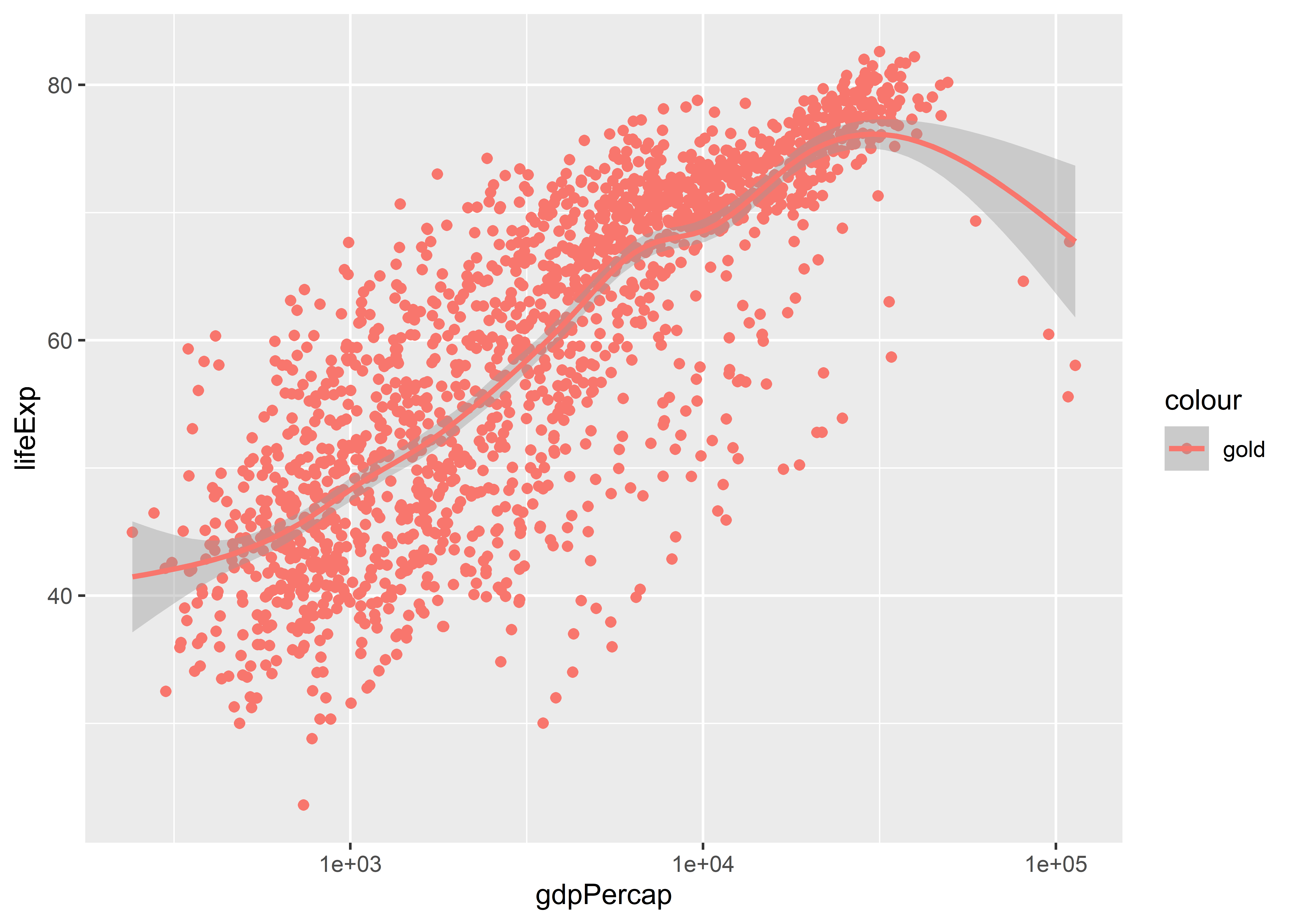
To do this, ggplot uses a default color palette for the mapping process (we’ll talk about how to customize this later). What it doesn’t do (at least using aes()) is let you set a specific color. Look at what happens if you try setting color = "gold" inside aes():
ggplot(gapminder) +aes(x = gdpPercap, y = lifeExp, color ="gold") +geom_point() +geom_smooth() +scale_x_log10()
Does the output look “gold” to you? It sure doesn’t. Instead, it’s red.
This is a classic example of mapping an aesthetic when what we actually need to do is set an aesthetic. To set the color of points and lines, we don’t specify them inside aes(). Doing so leads ggplot to mistakenly conclude that we are adding a new column to our data where each cell entry of that column is a category called “gold.” It then picks a color to map to that category. Since there’s only one category, it only maps one color. The default is red.
To avoid this, we instead set aesthetics inside a geom_*() function. In the below code, I tell ggplot to make the color of the points in a scatter plot gold and to make the color of a smooth regression line red.
This terrible looking, McDonald’s colored data viz looks just like it should.
There are lots of different aesthetics that you can either map or set with ggplot, such as size, color, alpha (which indicates transparency), fill, and on and on.
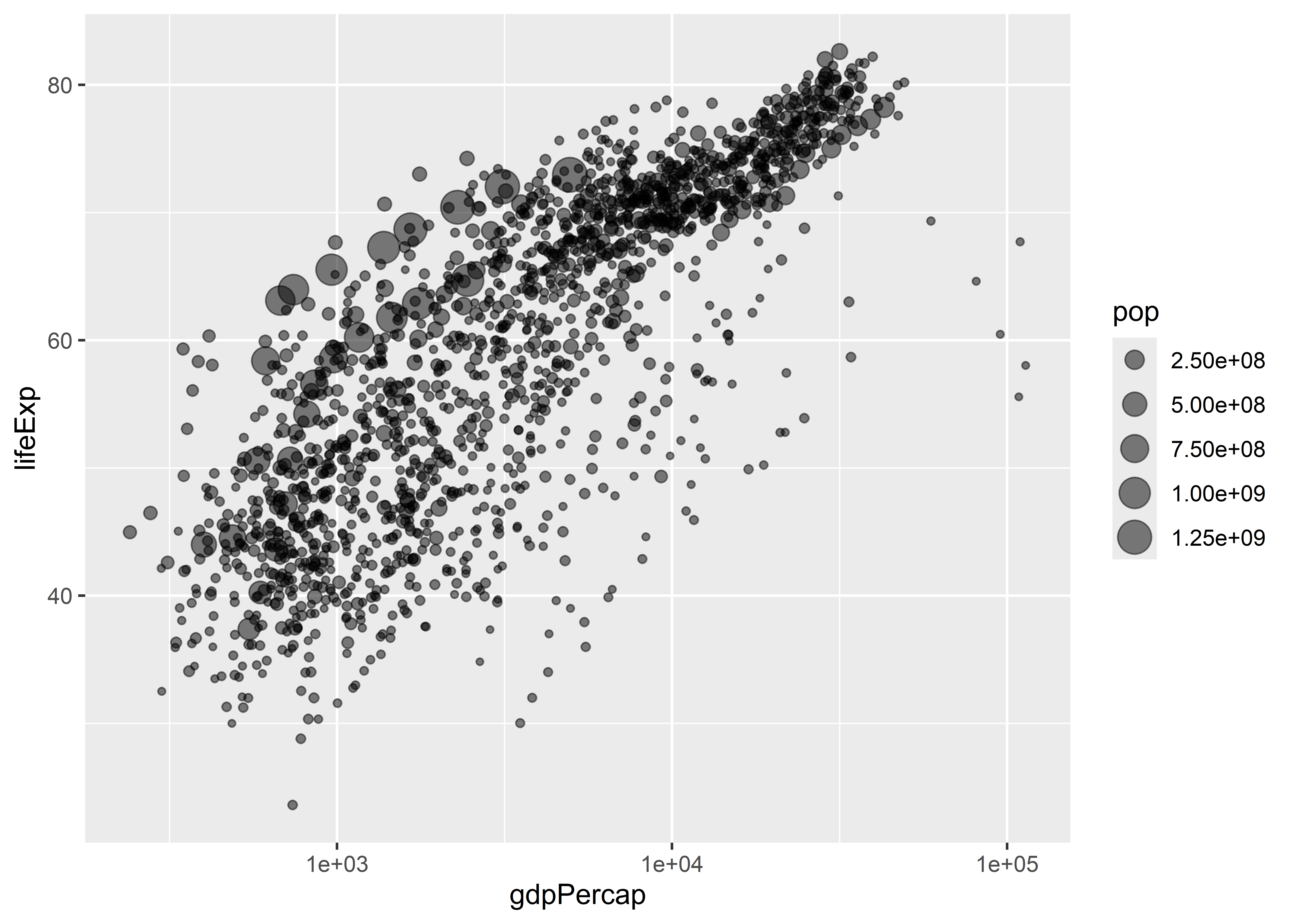
For example, say we wanted to map point size to population in a scatter plot and set the transparency of points using alpha. In the below code I include the command size = pop in the aes() function and then inside geom_point() I write alpha = 0.5.
The above code maps point size to the pop variable in the gapminder data so that geom_point() draws larger points for observations that have a larger population. The command alpha = 0.5 in geom_point() sets the transparency of points to 50%. I could have given it any numerical value between 0 and 1, where 1 (the default) means the object being plotted is completely solid and 0 means it is basically invisible.
5.3 You can map aesthetics per geom layer or globally
Not only can we map and set different aesthetics at the same time, we can also tell ggplot just to map an aesthetic for one geom layer rather than all of them. Look at the difference between the plot this code produces:
ggplot(gapminder) +aes(x = gdpPercap, y = lifeExp, color = continent) +geom_point() +geom_smooth() +scale_x_log10()
The first code maps color to continent name globally. That means that for each geom layer that we add, color will be mapped to continents. Conversely, the second code chunk maps color to continents only for the geom_smooth() layer. This is done by adding a new call to aes() inside the geom function.
Remember in the previous chapter when I mentioned you could map variables using aes() in a few different places? This is why you can do that, and this in particular is a case where the location in your code that you include variables using aes() matters for your output.
Notice, too, the difference in the legends ggplot produces for these figures. Ggplot legends will always faithfully reflect the aesthetic mappings you add to your plots. You can also change the location and appearance of legends, but this is a topic we’ll cover later.
5.4 Pick and choose your aesthetics wisely
Ggplot will dutifully map all kinds of aesthetics that you tell it to map. That doesn’t mean that every possible mapping is a good idea.
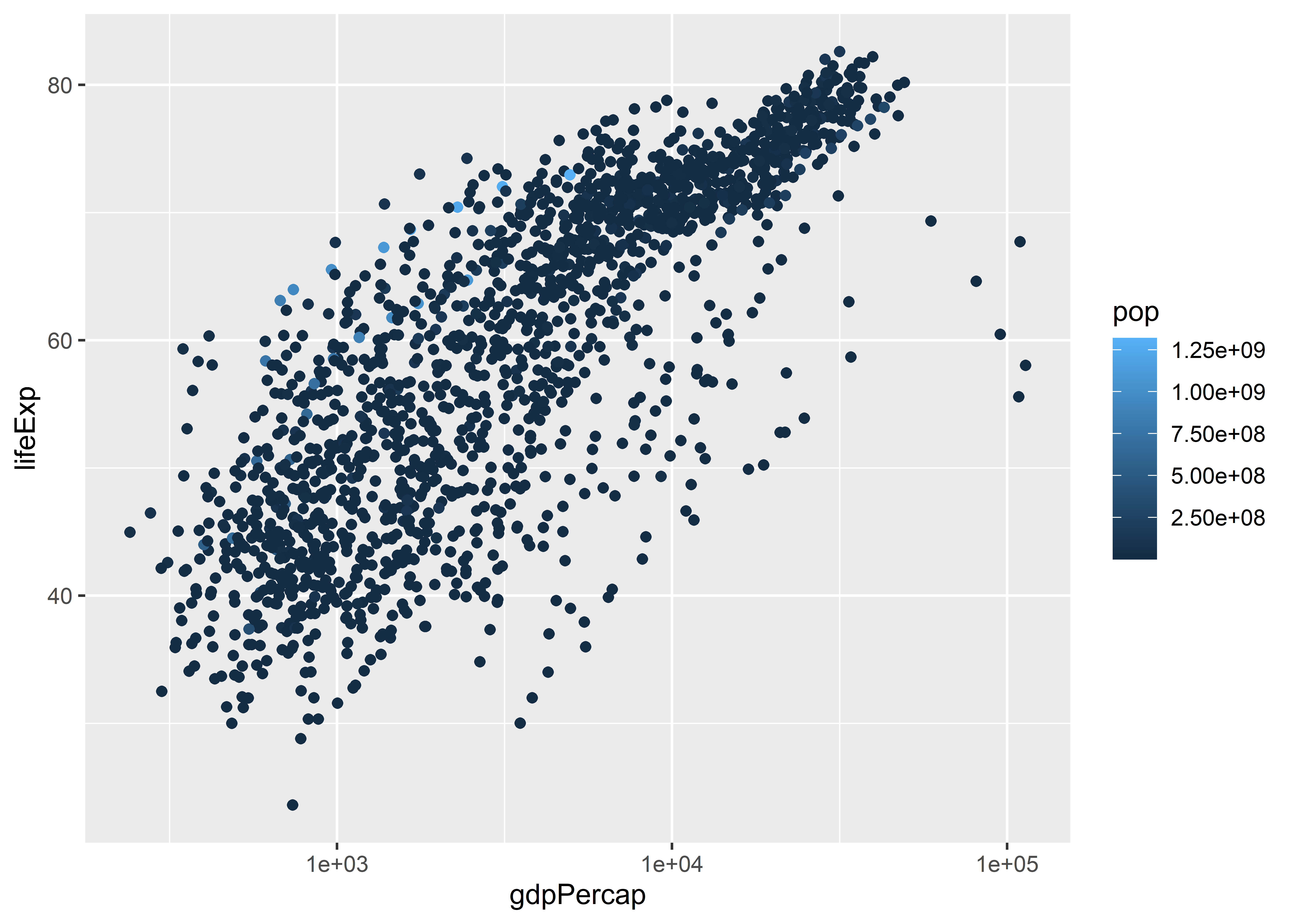
Take the example from above where we mapped point size to population. This was a sensible choice because people have an easy time intuiting that point size corresponds with the size of the observation. We could have used color instead. Would this choice have been as effective?
ggplot(gapminder) +aes(x = gdpPercap, y = lifeExp, color = pop) +geom_point() +scale_x_log10()
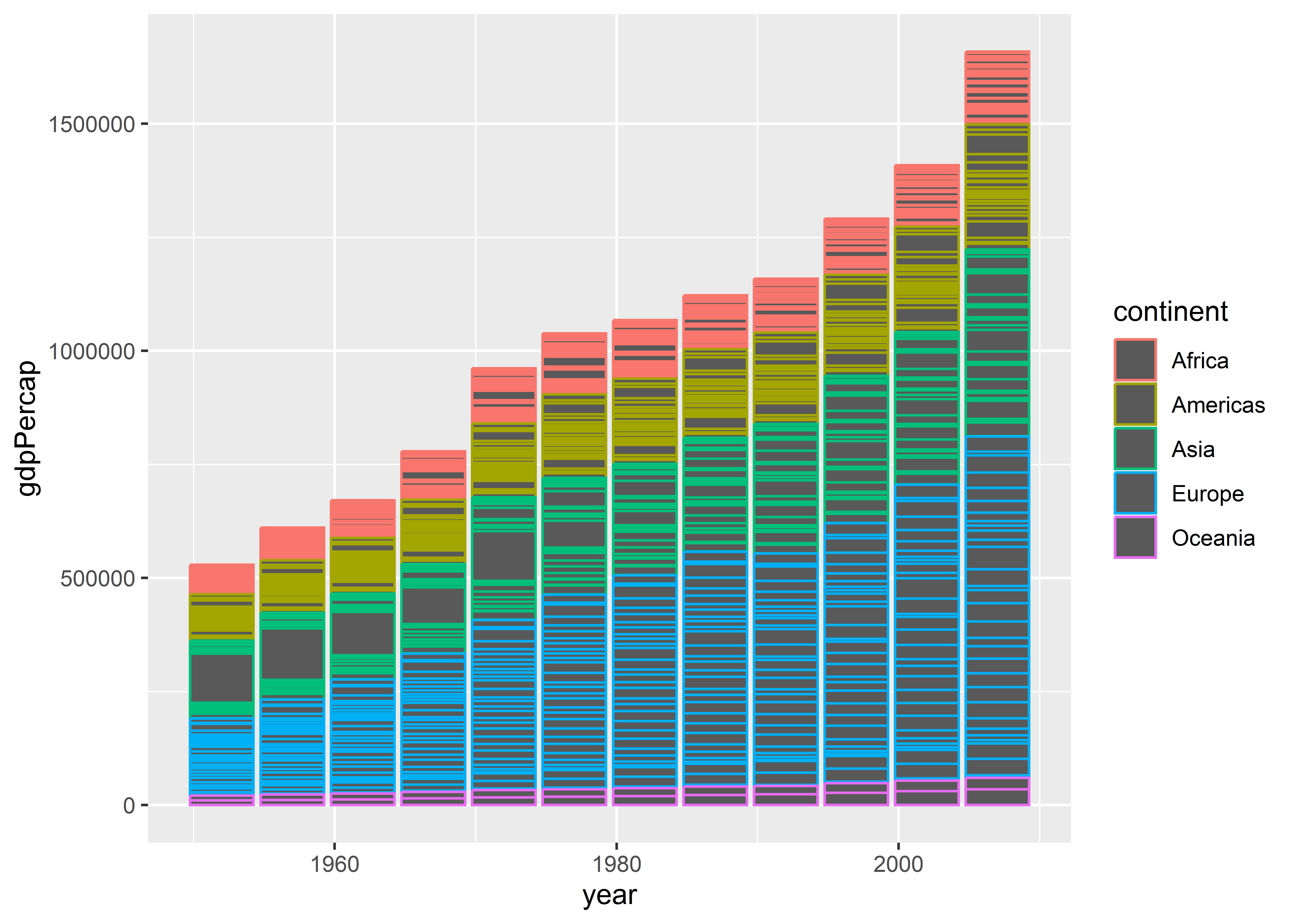
The answer is no. Here’s another example, this time for a column plot where we’ve mapped the color of columns to continents:
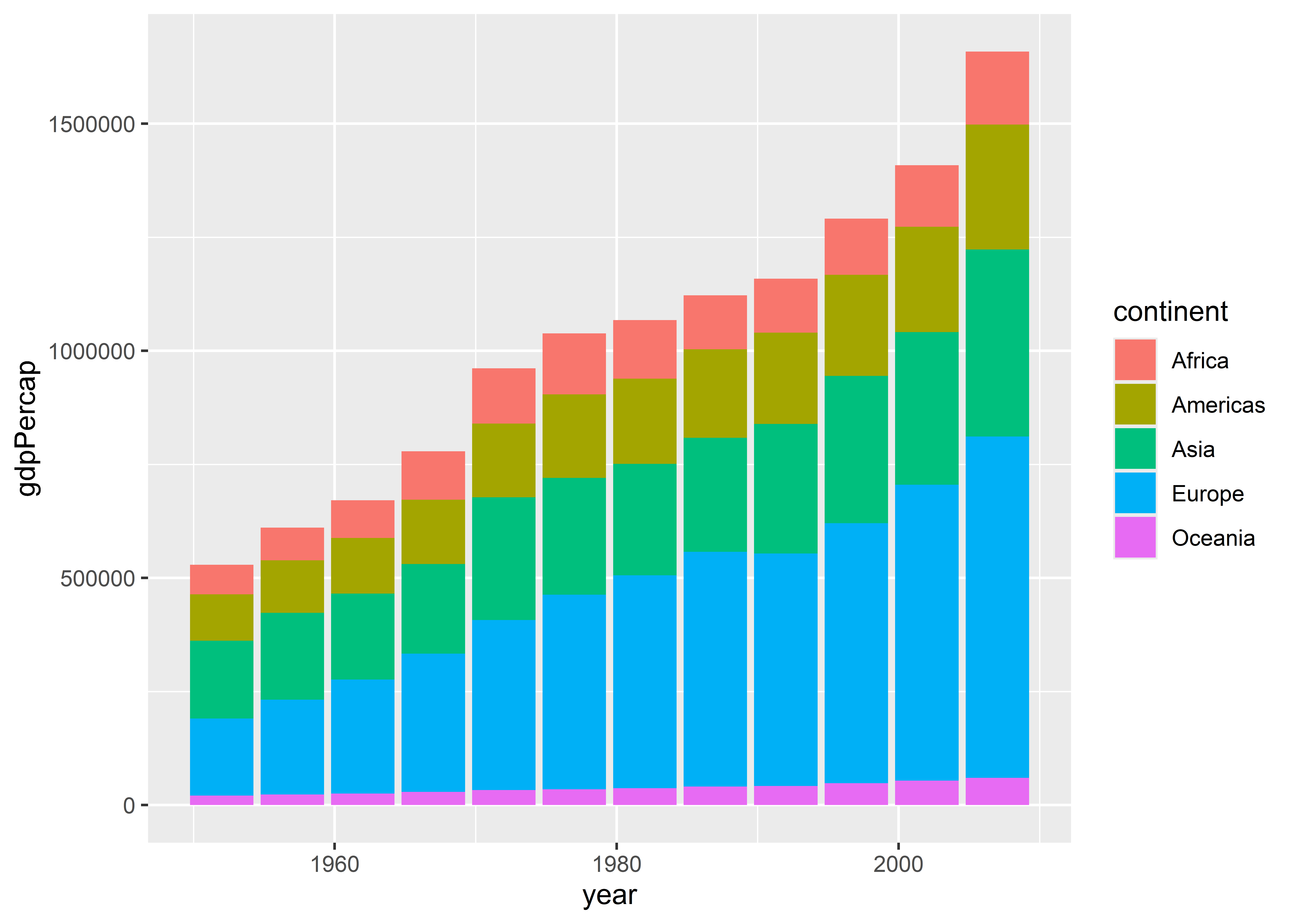
ggplot(gapminder) +aes(x = year, y = gdpPercap, color = continent) +geom_col()
There are a lot of empty dark grey spaces in the figure. That’s because when you produce a column plot, the color aesthetic colors the borders of the columns; not inside. We instead need to use the fill aesthetic:
ggplot(gapminder) +aes(x = year, y = gdpPercap, fill = continent) +geom_col()
If you get confused about color versus fill, try to remember that you “fill” empty spaces.
5.5 How to save your plots
After you’ve produced your data viz, you may will want to save it for later use for writing a report or to share on social media or some other outlet.
You have a lot of different options for saving your figures.
5.5.0.1 Copy and paste
You can copy and paste the data viz you produce directly from your Quarto file. Just right click on the figure that your code block produced and select copy and/or save to save it somewhere in your files.
5.5.0.2 Save using ggsave()
You can save your plots using the ggsave() function to save a plot directly to somewhere in your files.
Say you created a folder in your project called Figures. Here’s how you would use a combo of here() and ggsave() to save your work:
my_plot <- ggplot(gapminder) +
  aes(x = gdpPercap, y = lifeExp, size = pop) +
  geom_point(alpha = 0.5) +
  scale_x_log10()
# save your ggplot as an object

library(here)
# open the here package

ggsave(here("Figures", "my_first_figure.png"),
       plot = my_plot)
# save it to the Figures folder and name it
# "my_first_figure.png" to save it as a .png file
This is my favorite and preferred way of saving a figure. The biggest pros of using this approach are:
The ability to control dimensions.
The ability to control the sharpness of the figure.
Any time you make new changes to a figure, it automatically updates the figure in your files, too.
You can check out more options by writing ?ggsave() in the console.
5.6 Wrapping up
Be careful with mapping and setting aesthetics. Among the list of common mistakes new R users make when producing a data visualization, I’d say confusing these two things is near the top. Every time you run your code, make sure you take the time to actually look at what you’ve produced and determine whether it looks right or if something is off. This simple practice of slowing down will go a long way in making you a more effective and efficient data analyst.
Speaking of taking a look at our data and the visualizations we’re producing, in the next chapter, we’re going to talk about making sure our data visualizations are showing the right numbers.