12 Difference-in-Differences
12.1 Goals
Learning objectives:
- When treatment status changes over time for some observations but not others, you can possibly use a difference-in-differences or D-in-D design.
- D-in-D designs let you control for unobservable observation-specific and time-specific confounders.
- But, D-in-D designs require some assumptions to be met, like parallel trends or balanced panel data. If the first is violated you can’t trust the results from a D-in-D. If the second is violated, this design produces negative you weights (a bizarre phenomenon that I’ll need to show you to better explain it).
12.2 What’s the difference in the differences?
In the previous chapter I talked about regression discontinuity designs (RDs). These are a kind of quasi-experimental design (QED) that let you take advantage of plausibly random treatment assignment at or near a point of discontinuity or threshold for some continuous running variable that determines who does and doesn’t get treatment. In this chapter I’ll talk about another kind of QED. It’s called a difference-in-differences or D-in-D design.
The D-in-D has a lot in common with the RD. Actually, you could potentially use an RD instead of a D-in-D in some settings. A D-in-D involves a running variable. But this running variable typically is in units of time, and these units are discrete buckets — days, months, or even years.
There are other differences, too. D-in-Ds rely on panel data. This is a special kind of dataset where you see the same observation multiple times. For example, you might run a study on the effect of some policy intervention in different cities across the United States, and in your dataset, you might have data points for these cities at multiple points in time.
Another important difference is that D-in-Ds involve some units getting exposed to the causal variable while other units do not. For example, say some cities got access to a federal grant, but not all cities.
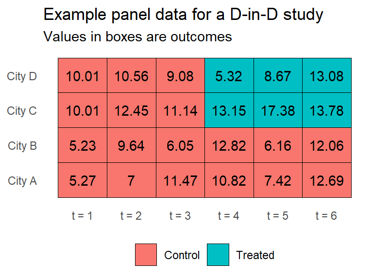
This scenario would give you a dataset that looks like the one in the below figure. It shows a hypothetical panel with four cities (A-D) observed at six points in time (t = 1, …, t = 6). You have some outcome observed for these cities at different moments in time, and you observe that two of the cities got treated after t = 3. This is just the right kind of data for doing a D-in-D design.
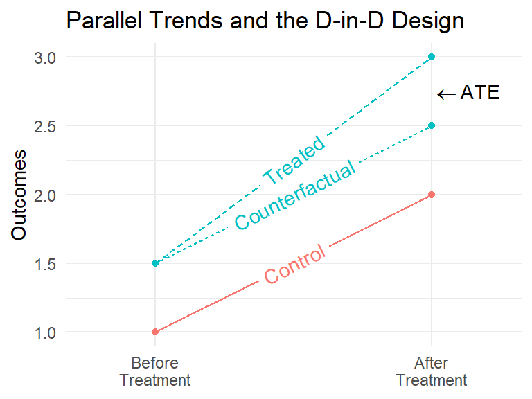
The difference-in-differences part of D-in-Ds comes from the fact that you are comparing differences in trends before and after an intervention for two groups of observations: those that were treated, and those that weren’t. The below figure offers an illustration. It shows two points in time, one before and one after units get treated. It also shows the trends in outcomes before and after treatment assignment. Notice that there are three trends. There’s an observed trend for the control units, there’s an observed trend for the treated units, and there’s an unobserved potential trend for the treated units. The D-in-D design assumes that if treatment had never been assigned, the trend in the outcome would have run parallel to the trend for the control group. The difference in the difference get in pre and post-treatment periods is the average treatment effect (ATE).
To formally calculate the difference in the differences, you start by calculating the difference over time for the control group:
\[ \delta_0 = Y_{0,\text{after}} - Y_{0,\text{before}} \]
Then, you calculate the difference over time for the treated group:
\[ \delta_1 = Y_{1,\text{after}} - Y_{1,\text{before}} \]
Finally, you calculate the difference in the differences:
\[ \delta_\text{D-in-D} = \delta_1 - \delta_0 \]
In the above example this would look like:
\(\delta_0\) = 2 - 1 = 1
\(\delta_1\) = 3 - 1.5 = 1.5
\(\delta_{D-in-D}\) = 1.5 - 1 = 0.5
The size of the difference in the differences tells you the causal effect of a treatment by adjusting for trends over time driven by other factors. If you look at the figure above, notice that the control unit has a different baseline level of the outcome than the treatment unit. Simply calculating a naive difference in means due to treatment isn’t going to give you an apples-to-apples comparison. The D-in-D design adjusts for baseline differences to isolate the effect of treatment exposure.
12.3 An Example with the Standard D-in-D Design
A classic example of the D-in-D in action is a 1992 study by the economists David Card and Alan Krueger called “Minimum Wages and Employment: A Case Study of the Fast-Food Industry in New Jersey and Pennsylvania.”
I have the data from this study saved on my GitHub. You can run the following code to read it into R:
library(tidyverse)
ck <- read_csv(
  "https://raw.githubusercontent.com/milesdwilliams15/Teaching/refs/heads/main/DPR%20201/Data/card_krueger_92.csv"
)
Card and Krueger wanted to test the theory that increasing the minimum wage will come at the cost of lower employment. The idea is that forcing businesses to pay their employees more will make it harder for them to employ as many workers. At the time, this idea was taken for granted by economists.
“Nature” gave Card and Krueger the perfect chance to see if this is true. On April 1, 1992, New Jersey decided it was going to increase its minimum wage from $4.25 to $5.05 per hour. Seeing an opportunity, these economists decided to survey over 400 fast-food restaurants to see what their number of full time employees (FTEs) was before this policy change was implemented versus after. They not only included NJ restaurants, but also some in Pennsylvania, just on the other side of the state border, to serve as a “control” group. There was no change to the minimum wage in PA, and because the fast-food market isn’t that much different on the PA versus NJ side of the border, Card and Krueger figured they could use the trend in employment for PA restaurants as a good proxy for what the trend would have been in NJ if no change to the minimum wage had been implemented. In short, they decided to use a D-in-D design.
To estimate the ATE in a D-in-D you can use a simple regression model specification. All you need is a treatment indicator, a time period indicator, and an observation indicator:
\[ y_{it} = \alpha_i + \tau_t + \delta d_{it} + \epsilon_{it} \]
In the above regression model, the term \(\alpha_i\) represents a unique average difference in the outcome for each unit \(i\) in the data. The term \(\tau_t\) represents the average change over time across all observations. You would call these terms fixed effects. Some also refer to them as time and unit intercepts. They’re just indicators for each restaurant in the data and which point in time (pre- or post-treatment) that a restaurant is observed. Including them lets you adjust for baseline differences between restaurants over time, allowing you to estimate the difference in differences-in-restaurant outcomes due to the change in minimum wages in NJ. Finally, \(d_{it}\) is an indicator for whether an observation \(i\) is treated at time \(t\), and the \(\delta\) represents the difference-in-differences. The outcome variable, \(y_{it}\), is the number of full time employees (FTEs) for each restaurant in the data before and after the minimum wage change.
Here’s how to tell R that you want to estimate this kind of model using the Card and Krueger data. Using the lm_robust() function from {estimatr} you can write:
library(estimatr)
lm_robust(
  ft_employment ~ min_wage_change,
  fixed_effects = ~ unit + period,
  data = ck,
  se_type = "stata",
  clusters = unit
) -> dd_fit
Notice in the above code the use of the fixed_effects option. This lets you specifically tell the function the variables it should treat as fixed effects. In this case, I told it to do this with the unit IDs (these are unique to each restaurant) and the period indicator (there’s a unique one for all restaurants before the minimum wage change in NJ, and after).
Also note the use of se_type = "stata" and clusters = unit. This tells lm_robust() that I want robust standard errors clustered by units (that is, restaurants). The reason is that you have multiple observations per restaurant. That means wave 1 observations for a restaurant aren’t independent of wave 2 observations for the same restaurant, so have to adjust for this as you calculate standard errors.
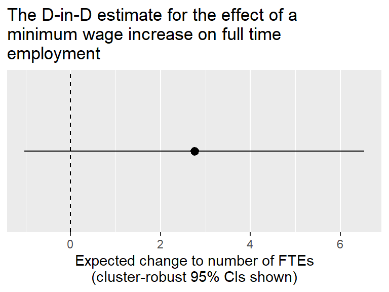
Check out the results. The below code creates a coefficient plot showing the D-in-D estimate for the effect of the minimum wage increase in NJ on the number of FTEs in fast-food restaurants. The results aren’t consistent with classic economic theory. The estimate is not statistically significant, and the estimate is positive. This isn’t great evidence that increasing the minimum wage has an adverse effect on employment. This what Card and Krueger concluded, too. You can imagine that they caught a lot of flak from their fellow economists for this finding.
tidy(dd_fit) |>
  filter(term == "min_wage_change") |>
  ggplot() +
  aes(estimate, term, xmin = conf.low, xmax = conf.high) +
  geom_pointrange() +
  geom_vline(
    xintercept = 0,
    linetype = 2
  ) +
  scale_y_discrete(
    breaks = NULL
  ) +
  labs(
    title = "The D-in-D estimate for the effect of a\nminimum wage increase on full time\nemployment",
    x = "Expected change to number of FTEs\n(cluster-robust 95% CIs shown)",
    y = NULL
  )
12.4 Beyond the standard D-in-D
In many settings, studies will use more than just a pre- and post-treatment period. They may have several periods. Also, different units may have gotten exposed to the causal variable of interest at different points in time.
In these more general settings, researchers will sometimes use a two-way fixed effects (TWFE) design. It looks very much like the specification for the standard D-in-D, but because of the unconventional nature of the data, most researchers will intentionally avoid using the D-in-D label.
The approach is quite similar to the regression framework applied above, however. To illustrate, let’s look at some Congressional data. You can read more about what’s in the data here: README
congress_dt <- read_csv(
  "https://raw.githubusercontent.com/milesdwilliams15/Teaching/main/DPR%20201/Data/CongressionalData.csv"
)
Say you wanted to know the effect of party membership on voting behavior. You can use a TWFE design to answer this question. The congress_dt dataset has data points for different congressional districts over time, and for each it has data on the partisan ID of congress members and how conservatively they voted. By calculating the difference in the differences over time in how conservatively the member of congress votes if a different party comes into power in a district, you can estimate the effect of party ID on voting behavior.
To implement the D-in-D design you can use lm_robust(), just like with the Card and Kruger data:
lm_robust(
  cvp ~ republican,
  data = congress_dt,
  fixed_effects = ~ state_dist + cong,
  se_type = "stata",
  cluster = state_dist
) -> dd_fit
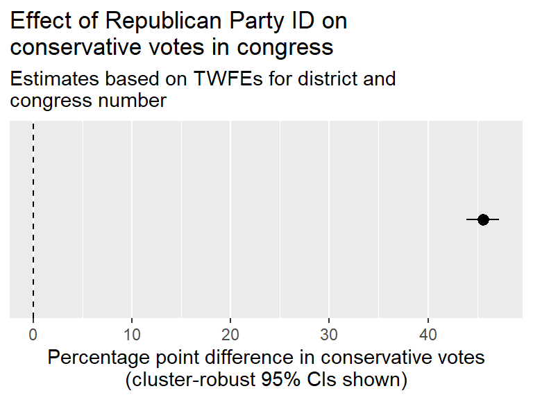
The below code makes a coefficient plot showing the estimate of Republican Party ID on how much more conservatively people vote in congress. The effect is positive, statistically significant, and substantial. Republicans vote conservatively by more than 45 percentage points on average.
tidy(dd_fit) |>
  filter(term == "republican") |>
  ggplot() +
  aes(estimate, term, xmin = conf.low, xmax = conf.high) +
  geom_pointrange() +
  geom_vline(
    xintercept = 0,
    linetype = 2
  ) +
  scale_y_discrete(
    breaks = NULL
  ) +
  labs(
    title = "Effect of Republican Party ID on\nconservative votes in congress",
    subtitle = "Estimates based on TWFEs for district and\ncongress number",
    x = "Percentage point difference in conservative votes\n(cluster-robust 95% CIs shown)",
    y = NULL
  ) +
  scale_x_continuous(
    labels = ~ .x * 100
  )
12.5 Dangers with D-in-Ds
Something you should ask yourself right about now is: how can you be sure that you’ve appropriately dealt with omitted variable bias? Shouldn’t you adjust for something like ideology like you did in the SOO chapter in the above example? What about the restaurant example? Review really quickly what you need to assume is true to trust the D-in-D design.
12.5.1 Parallel trends
Like all QEDs, the D-in-D design relies on certain identifying assumptions (things you need to be true for the D-in-D estimate to be unbiased).
The key assumption with D-in-D designs is the parallel trends assumption. In order to be sure that a policy intervention is the cause of changes in an outcome, you need to be convinced that both treated and untreated units would have had the same post-treatment trend absent the intervention.
Knowing whether parallel trends holds post-treatment is impossible. But you can at least get some reassurance by checking pre-treatment trends. Take the congressional data:
ggplot(congress_dt) +
  aes(
    x = cong,
    y = cvp,
    color = ifelse(republican == 1, "1. Rep.", "2. Dem")
  ) +
  geom_line(
    aes(group = state_dist),
    alpha = 0.3
  ) +
  geom_point() +
  labs(
    x = "Congress Session",
    y = "Conservative Vote\n(Probability Margin)",
    color = NULL
) 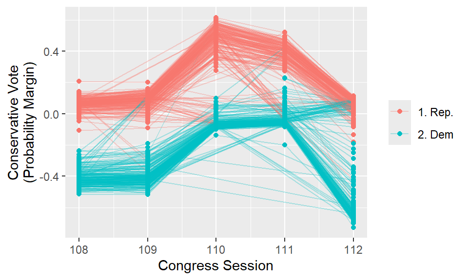
The D-in-D design (in this case, TWFEs) lets you identify whether a shift in the voting behavior of a congress member from a particular district is due simply to an average trend in voting for that district or due to the partisanship of the person in office. It seems that generally from one session of congress to the next, the trend remains roughly parallel and the biggest changes come from seats where you observe a change in party control of the seat. This provides some reassurance about the parallel trends assumption.
Importantly, the fact that parallel trends are observable in the past does not guarantee that it holds under treatment. The fundamental problem of causal inference is an ever-present reality in data-driven research. You can only ever assume parallel trends. You can never prove that this condition has been met. But seeing parallel trends across time, such as above, offers some reassurance that the parallel trends assumption is plausible.
12.5.2 TWFEs and the negative weights problem
TWFE designs can be a great tool, but they have a well-known problem. When there are many time periods and there’s some inconsistency in the timing of treatment (like what you observe in the congressional voting data), some things can happen under the hood of your regression model that introduce bias.
Most importantly, it is possible that the introduction of TWFEs in the model will generate negative weights for treatment. Let me show you what this means.
Remember how with SOO (selection on observable) designs when you control for covariates, you’re effectively subtracting out variation in the outcome and the causal variable explained by the controls, and then you’re using the left-over variation to estimate the causal effect of interest. You’re basically doing the same thing with TWFEs. You’re subtracting out average differences across observations and over time before estimating the left-over difference due to the causal variable.
This is where the problem comes in. The below code regresses cvp and republican on the congress session and state district fixed effects in separate models and pulls out the residual variation in each from each regression (that’s the variation left over in each that isn’t accurately predicted by these fixed effects) that gets picked up by the causal variable of interest (party ID). A third regression model is then estimated that regresses the leftover variation in cvp on the leftover variation in republican. The estimate from this model will be identical to the one you calculated before when using congress and district fixed effects.
cvp_res <- lm(
  cvp ~ as.factor(cong) +
    as.factor(state_dist),
  data = congress_dt
) |> resid()
rep_res <- lm(
  republican ~ as.factor(cong) +
    as.factor(state_dist),
  data = congress_dt
) |> resid()

lm_robust(
  cvp_res ~ rep_res,
  se_type = "stata"
) |>
  summary()
Call:
lm_robust(formula = cvp_res ~ rep_res, se_type = "stata")

Standard error type:  HC1

Coefficients:
              Estimate Std. Error   t value Pr(>|t|)  CI Lower CI Upper   DF
(Intercept) -1.793e-18   0.001061 -1.69e-15        1 -0.002081 0.002081 2072
rep_res      4.557e-01   0.006225  7.32e+01        0  0.443460 0.467876 2072

Multiple R-squared:  0.7772 ,   Adjusted R-squared:  0.7771
F-statistic:  5358 on 1 and 2072 DF,  p-value: < 2.2e-16
One thing that’s important to note about this research design is that treatment assignment (whether a Republican or Democrat is in office in a given district) is not constant over time. Different districts receive treatment at different moments in time, some actually go back and forth between being treated and not, and some are always treated while others never are.
This is just the kind of scenario that could lead you to get some negative treatment weights. These negative weights arise if the TWFE regression of treatment on the fixed effects gives you cases where a unit is treated but its predicted treatment is erroneously greater than 1. This is nonsensical, because treatment can only be 0 or 1, and the probability of getting treatment can’t be less than 0 or greater than 1. But sometimes linear regression models will give you predictions outside these bounds when you have a binary causal variable.
To check whether this is going on, the below code adds the residual Republican indicator to the congress dataset and then groups it by Republican status and calculates the share of the time that the residual for being a Republican is negative. The output tells you that almost 46% of the time when a district has a Republican in office, the residual for the Republican indicator is negative. You see the reverse problem for Democratic districts. Almost 70% of the time the residual is positive when a district is Democrat controlled. This means a bunch of control observations are getting a positive treatment weight, and a bunch of treated observations are getting a negative treatment weight. This doesn’t necessarily mean that your estimate of the treatment effect with the D-in-D is biased, but it’s concerning.
congress_dt |>
  mutate(
    rep_res = rep_res
  ) |>
  group_by(
    republican
  ) |>
  summarize(
    mean = mean(rep_res < 0)
  )
# A tibble: 2 × 2
republican mean
<dbl> <dbl>
1 0 0.682
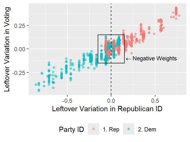
2 1 0.458It might help to visualize the problem. The below code generates a scatter plot using the leftover variation in Republican ID and conservative voting. While in the raw data, Republican ID is a binary variable, the process of adjusting for time and congressional district gives you a residualized version of the measure that is continuous. If you look at the data, it’s clear that a positive relationship exists between the leftover variation in these variables. However, notice what’s going on in the center of the figure. I’ve highlighted the data points in the middle of the scatter plot using a box to show that there are some districts with Republican members of congress that have a negative value when adjusting for TWFEs, and there are some Democratic members of congress that have a positive value when adjusting for TWFEs. In both cases, this is happening because the TWFE estimator gave you impossible predictions of the likelihood of Republican party ID (that is, estimated probabilities that are either greater than 1 or less than 0).
congress_dt |>
  mutate(
    rep_res = rep_res,
    cvp_res = cvp_res
  ) |>
  ggplot() +
  aes(
    x = rep_res,
    y = cvp_res,
    color = ifelse(republican==0, "2. Dem", "1. Rep")
  ) +
  geom_point(
    alpha = 0.5
  ) +
  geom_vline(
    xintercept = 0,
    linetype = 2
  ) +
  labs(
    x = "Leftover Variation in Republican ID",
    y = "Leftover Variation in Voting",
    color = "Party ID"
  ) +
  geom_rect(
    aes(xmin = -.15,
        xmax = .15,
        ymin = -.15,
        ymax = .15),
    alpha = 0,
    color = "black"
  ) +
  annotate(
    "text",
    x = .15,
    y = -.1,
    label = "''%<-%'Negative Weights'",
    hjust = 0,
    parse = T,
    size = 3
  ) +
  theme(
    legend.position = "bottom"
  )
To better see how this creates an issue, the next visualization zooms in on the data points in this box and for each it plots the observation-specific D-in-D effect or slope. Overlayed on top of this is an overall regression slope estimate. What you can see is that several observations with Republican IDs have a negative slope. The reason is that these observations have a negative residual value. Nonetheless, their level of conservative voting has a positive residual, indicating that these members are voting more conservatively than expected based on the TWFE predictions. You see the inverse problem for a number of Democratic districts.
congress_dt |>
  mutate(
    rep_res = rep_res,
    cvp_res = cvp_res
  ) |>
  filter(
    between(rep_res, -.15, .15),
    between(cvp_res, -.15, .15)
  ) |>
  ggplot() +
  aes(
    x = rep_res,
    y = cvp_res,
    color = ifelse(republican == 0, "2. Dem", "1. Rep")
  ) +
  geom_abline(
    aes(
      color = ifelse(republican == 0, "2. Dem", "1. Rep"),
      intercept = 0,
      slope = cvp_res / rep_res
    ),
    alpha = 0.1
  ) +
  geom_point(
    alpha = 0.5
  ) +
  geom_vline(
    xintercept = 0,
    linetype = 2
  ) +
  geom_smooth(
    method = "lm",
    se = F,
    color = "black"
  ) +
  labs(
    x = "Leftover Variation in Republican ID",
    y = "Leftover Variation in Voting",
    color = "Party ID",
    title = "The negative weights generated\nwith TWFEs"
  ) +
  theme(
    legend.position = "bottom"
  )
`geom_smooth()` using formula = 'y ~ x'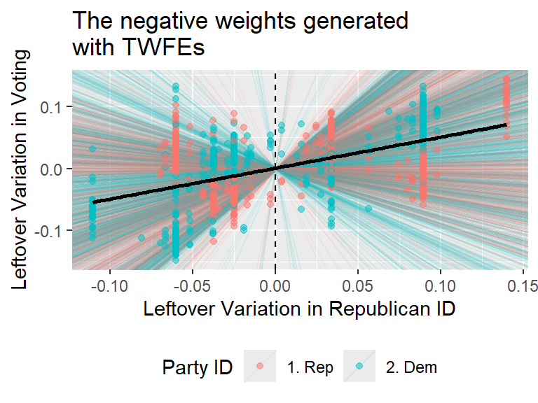
Whether the negative weighting problem really is a source of bias depends on how many observations are affected and whether the problem is symmetrical. But even when it occurs in small quantities, it suggests that something is improper about the way the TWFE estimator is working. Several recent methodological advances address this issue, but these methods are beyond the scope of this chapter. Those interested may want to check out options such as the “extended” TWFE method, which you can learn more about here: https://cran.r-project.org/web/packages/etwfe/vignettes/etwfe.html
12.6 Wrapping up
D-in-D designs are really useful, but you need to make some assumptions about the data to trust the results you get from this approach. The main assumption is parallel trends. This is the idea that treated observations would have identical trends with control observations if they weren’t treated. This assumption is impossible to verify, but with good argumentation and some empirical evidence of parallel trends prior to treatment, you can build support for your case.
You also need to be cautious when you extend the data to multiple time periods with inconsistent treatment timing with TWFEs. It’s possible that the TWFEs will give you nonsensical weights on the treatment indicator. It’s simple to check if this is going on, but knowing whether and how much this problem results in bias is impossible to know with certainty.