library(tidyverse)
oil_regime_data <- read_csv(
  "https://raw.githubusercontent.com/milesdwilliams15/Teaching/main/DPR%20201/Data/oil_regime_data.csv"
)4 Getting Started with Correlation
This chapter is best read in combination with “Chapter 2 - Correlation: What Is It and What Is It Good For?” in Thinking Clearly with Data (Bueno de Mesquita and Fowler 2021).
4.1 Overview
- Correlation tells us about how two features of the world occur together.
- To estimate a correlation, we need variation in the factors we want to study.
- Correlations can be useful for description, prediction, or causation, but we need to be careful and think clearly about how appropriate estimated correlations really are.
- Correlations are restricted to linear relationships. That means they have some limitations but are generally more useful than you might guess.
4.2 Ronald A. Fisher: An unlikely defender of smoking
According to Wikipeida, Ronald Fisher (1890-1962) was a “British polymath who was active as a mathematician, statistician, biologist, geneticist, and academic.” In a history of modern statistics, Anders Hald called him a “genius who almost single-handedly created the foundations of modern statistical science.”
Fisher also didn’t believe that smoking causes cancer, and he spent the last years of his life arguing with the British medical community about it. This piece by Priceonomics provides some good background on the debate.
It all started in 1957 when Fisher wrote a letter to the British Medical Journal denouncing its recent editorial position that smoking causes lung cancer. The journal called for a public information campaign to spread the word about the dangers of tobacco. Fisher bristled at this advice.
Fisher, well-known as a hothead prone to making enemies and never one to mince words, loved to smoke pipe tobacco. This habit, coupled with a fair dose of motivated reasoning, likely blinded the venerated and influential “father of modern statistics” to the scientific evidence, but whether bias or sound statistical reasoning drove this criticism remains the subject of debate.
Though today this issue is settled (smoking does indeed cause lung cancer!), the root of Fisher’s critique—that correlation \(\neq\) causation—is a point that we will return to again and again. Just because two things co-occur does not imply that one causes the other. Remember this as we start to explore the topic of correlation. Knowing what an observed correlation can and cannot tell us about the features of the world under study is one of the biggest challenges researchers face. Clear thinking is essential.
4.3 What is correlation?
As Bueno de Mesquita and Fowler (2021) note, “[c]orrelation is the primary tool through which quantitative analysts describe the world, forecast future events, and answer scientific questions” (p. 13). A correlation describes how much two features (or variables) of the world co-occur.
A correlation can be positive, meaning as one variable occurs or increases in value so does the other. A correlation also can be negative, meaning as one variable occurs or increases in value the other does the opposite.
As we think about variables, it’s important to note they can come in different types. Some variables are binary, meaning they can take only one of two values. Imagine a light switch, which can either be on or off. Or think of smoking. Someone either smokes cigarettes on the regular, or they don’t.
Continuous variables can take a variety of values. These capture features of the world like magnitude. Think of things like the number of people killed in a terrorist attack or ballots cast for a candidate in an election.
4.3.1 Binary Features
Let’s consider an example from Bueno de Mesquita and Fowler (2021) dealing with oil production and democracy. I’ve reverse engineered the data shown in Table 2.1 in the text and saved it as a .csv file called “oil_regime_data.csv.” Below I use the read_csv() function from the {readr} package to read in the data. Since {readr} is part of the larger tidyverse of R packages, in the code below I open the {tidyverse} which loads {readr} and a number of other packages into the R environment. The data lives on my GitHub, so to read in the data all I need to do is give read_csv() the relevant url. As I read in the data, I use the <- (assignment) operator to tell R I want to save the file I’m reading in as an object called oil_regime_data.
This data object contains two binary variables: democracy and oil_producer. These features can be either 0 or 1, where 1 means “on” and 0 means “off.” The table below is a snapshot of the first few rows of data. I’m using the kable() function from the {kableExtra} package to produce a nicely formatted table with a title.
| democracy | oil_producer |
|---|---|
| 0 | 0 |
| 1 | 0 |
| 1 | 0 |
| 1 | 0 |
| 1 | 0 |
| 0 | 1 |
We can calculate the correlation between these two features in R in a bunch of different ways. Time simplest is to use the cor() function in base R.
cor(oil_regime_data) democracy oil_producer
democracy 1.0000000 -0.2683325
oil_producer -0.2683325 1.0000000The cor() function is easy to use, but if you aren’t familiar with correlations, you probably have some questions about the output. Why does it look like a matrix, for instance?
By default, if you feed cor() a data frame or table, it returns a correlation matrix. This matrix describes all the correlations that exist between features in the data (even a feature with itself—hence the 1’s along the diagonal).
If you want to know what the correlation is between two features, just look for the value at the intersection of two of them. In the above, we can see that democracy and major-oil-producer status have a negative correlation of \(-0.268\).
What does this mean? Correlation coefficients can take values anywhere between \(-1\) and 1, where 0 means there is no relationship, 1 means there is a perfect positive relationship, and \(-1\) means there is a perfect negative relationship.
If you don’t want to deal with trying to find the correlation you’re interested in by looking at a correlation matrix, you can just write:
cor(
  x = oil_regime_data$democracy,
  y = oil_regime_data$oil_producer
)
[1] -0.2683325There are many other packages in R that users have developed to make estimating correlations easier and compatible with the tidyverse way of doing things. The {socsci} package, for example, contains the corr() function (with two r’s), which we can use like so:
# install.packages("devtools")
# devtools::install_github("ryanburge/socsci")
library(socsci)
Loading required package: rlangWarning: package 'rlang' was built under R version 4.2.3
Attaching package: 'rlang'The following objects are masked from 'package:purrr':
%@%, flatten, flatten_chr, flatten_dbl, flatten_int, flatten_lgl,
flatten_raw, invoke, spliceLoading required package: scalesWarning: package 'scales' was built under R version 4.2.3
Attaching package: 'scales'The following object is masked from 'package:purrr':
discardThe following object is masked from 'package:readr':
col_factorLoading required package: broomWarning: package 'broom' was built under R version 4.2.3Loading required package: glueoil_regime_data |>
corr(democracy, oil_producer)# A tibble: 1 × 8
estimate statistic p.value n conf.low conf.high method alternative
<dbl> <dbl> <dbl> <int> <dbl> <dbl> <chr> <chr>
1 -0.268 -3.58 0.000455 165 -0.404 -0.121 Pearson's pr… two.sided The output has a lot more going on than cor(). What I like about the corr() function is that (1) you can use the “pipe” operator and (2) it automatically reports statistics for doing inference. We’ll discuss inference later, but for now just know that the corr() function makes it really easy to do statistical inference with bivariate correlations—that is, to calculate the probability that a specific correlation would have occurred by random chance.
Returning to the data, remember that correlations have another use besides description. We can use them to make predictions. The correlation between democracy and oil-production tells us that major oil-producers tend not to have democratic forms of governance. Say we collected some new data and only the oil-producer status of these new countries was available. We could use this information to tell us the likelihood that these new countries also are democracies.
4.3.2 Continuous Features
What about continuous variables? Bueno de Mesquita and Fowler (2021) describe some data on crime rates and temperature in Chicago, IL across days in 2018.
I downloaded the data used in the text from the book’s website and saved it on my GitHub. I can write the following to get the data from my files and into R’s environment:
the_url <- "https://raw.githubusercontent.com/milesdwilliams15/Teaching/main/DPR%20201/Data/ChicagoCrimeTemperature2018.csv"
crime_data <- read_csv(the_url)
Rows: 365 Columns: 5
── Column specification ────────────────────────────────────────────────────────
Delimiter: ","
dbl (5): year, month, day, temp, crimes
ℹ Use `spec()` to retrieve the full column specification for this data.
ℹ Specify the column types or set `show_col_types = FALSE` to quiet this message.glimpse(crime_data) # use glimpse() to look at the structure of the dataRows: 365
Columns: 5
$ year <dbl> 2018, 2018, 2018, 2018, 2018, 2018, 2018, 2018, 2018, 2018, 201…
$ month <dbl> 1, 1, 1, 1, 1, 1, 1, 1, 1, 1, 1, 1, 1, 1, 1, 1, 1, 1, 1, 1, 1, …
$ day <dbl> 1, 2, 3, 4, 5, 6, 7, 8, 9, 10, 11, 12, 13, 14, 15, 16, 17, 18, …
$ temp <dbl> -2.6785715, -0.8571429, 14.1621620, 6.3000002, 5.4285712, 7.500…
$ crimes <dbl> 847, 555, 568, 600, 660, 585, 535, 618, 653, 709, 698, 705, 617…The data contains 365 observations for each of days of the year in 2018. Each day is an observation. The data also has 5 columns, each a different variable per observation. Each of the individual cells in the table is a unique value per observation and variable.
For those unfamiliar, that means this data is tidy. I don’t just mean that it’s clean. Tidy data is defined by the set of criteria I listed above, and it is a format that is often best for working with data. [Read more about it here.] To reiterate, a dataset is tidy if:
- Each row is a unique observation.
- Each column is a unique variable.
- Each cell entry has only one unique value.
The two features we want to look at are temp, which is a continuous variable that indicates the temperature on a given day in degrees Fahrenheit, and crimes, which is a discrete numerical variable that reports the number of times a crime was mentioned in the Chicago Tribune.
With data like this, it is a good idea to first look at it. We can do this really quickly in base R by writing:
plot(crime_data$temp, crime_data$crimes)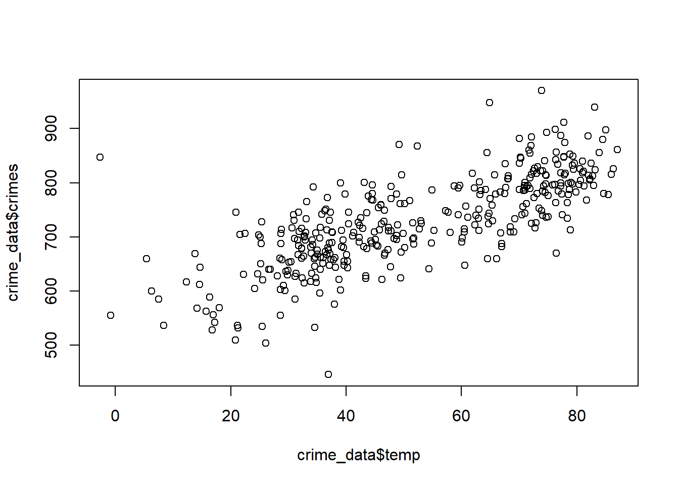
This is good enough for a first pass, but it’s rather ugly. The state-of-the art for data visualization is to use the {ggplot2} package in R. This is part of the tidyverse of R packages. Since we already attached the tidyverse, ggplot2 is already attached as well.
Here’s that same scatter plot produced with tools from ggplot2:
ggplot(crime_data) +
  aes(x = temp, y = crimes) +
  geom_point()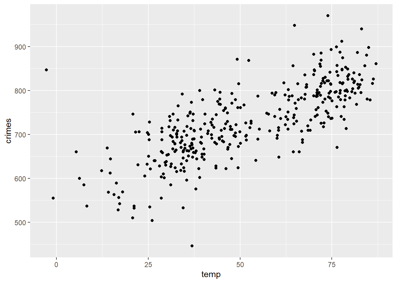
This is okay, but with a few additional flourishes, we can make a great looking scatter plot with the temperature and crime data.
ggplot(crime_data) +
  aes(x = temp, y = crimes) +
  geom_point() +
  labs(
    x = "Temperature",
    y = "Reported Crimes",
    title = "Crime is really heating up in Chicago",
    caption = "Crime and temperature (in degrees Fahrenheit) in Chicago in 2018"
  ) +
  theme_classic()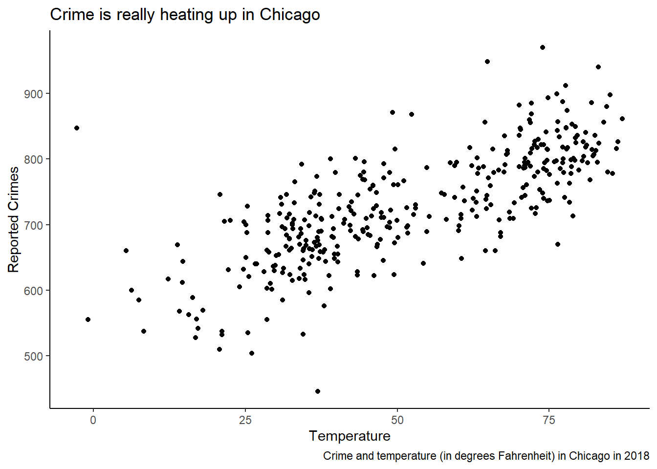
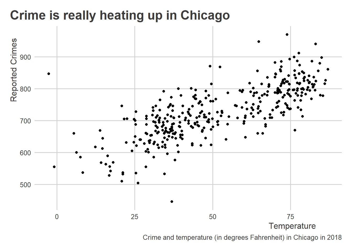
There are tons of ways to customize plots, and lots of different themes that you can apply. The ggthemes package provides some cool options. You can also access my personal favorite using the coolorrr package:
library(coolorrr)
set_theme() # sets the theme for ggplot globally

ggplot(crime_data) +
  aes(x = temp, y = crimes) +
  geom_point() +
  labs(
    x = "Temperature",
    y = "Reported Crimes",
    title = "Crime is really heating up in Chicago",
    caption = "Crime and temperature (in degrees Fahrenheit) in Chicago in 2018"
  )
As summarized in the previous chapter Chapter 3 , tools in ggplot2 are centered around a simple workflow:
- Feed your data to
ggplot(); - Tell it what relationships you want to see using
aes(); - Tell it how to show those relationships using
geom_*(); - Customize to your heart’s content.
All along the way, you can use + (just like the |> operator) to add new layers to your plot.
Returning to the data, it looks like temperature has a positive correlation with crime. To better see this, we can add a line of best fit to the data, or what we also would call a regression line.
ggplot(crime_data) +
  aes(x = temp, y = crimes) +
  geom_point() +
  geom_smooth(
    method = "lm", # add a linear regression line
    se = FALSE     # don't show confidence intervals
  ) +
  labs(
    x = "Temperature",
    y = "Reported Crimes",
    title = "Crime is really heating up in Chicago",
    caption = "Crime and temperature (in degrees Fahrenheit) in Chicago in 2018"
  )
`geom_smooth()` using formula = 'y ~ x'
I did this using the geom_smooth() function. This function lets us visualize one of several possible simple models of our data. In this case, I told the function to calculate and draw a linear model using the option method = "lm".
Remember all those years ago when you saw this formula in linear algebra?
\[y = mx + b\]
A linear model is based on this simple equation. It has a slope and an intercept. The process of finding these parameters is more involved than the process you learned in linear algebra, however. The variables you used there would have been clean and smooth. Real-world data are far messier. To capture this messiness, a linear regression model is usually specified as follows:
\[ y_i = \beta_0 + \beta_1 x_i + \epsilon_i \]
We have an intercept, \(\beta_0\), and a slope, \(\beta_1\), but we now have some random noise captured by \(\epsilon_i\). Notice, too, the \(i\) subscript on \(y\), \(x\), and \(\epsilon\). This alerts us to the fact that our data has multiple observations.
Unlike with the classic linear equation, in the case of a linear regression model we have to estimate the slope and intercept only being able to observe \(y\) and \(x\), but not being able to directly observe \(\epsilon\). We do this using an estimator, which is a rule or criterion that defines what estimate is optimal. In this case, we need an estimator that will tell us the best out of all possible alternative slope and intercept values.
This estimator is called ordinary least squares (OLS), which is the work-horse estimator used in lots of scientific research and in industry. There are many others that we could use to fit a linear model to data, too, but those details are better left for a more advanced course on modeling. OLS is a good place to start because it has close correspondence with correlation and its widespread use.
There is a tight correspondence between a linear model, which we visualized above, and a correlation coefficient, which we calculated earlier using data on democracy and oil production. Correlations summarize the strength of a linear relationship between two variables. That means that if a linear model makes for a good way to summarize the relationship between two variables, so is a correlation coefficient (and vice versa).
We can calculate the correlation between continuous variables just the same as binary ones. Let’s use the corr() function from {socsci} again.
crime_data |>
  corr(temp, crimes)
# A tibble: 1 × 8
estimate statistic p.value n conf.low conf.high method alternative
<dbl> <dbl> <dbl> <int> <dbl> <dbl> <chr> <chr>
1 0.755 21.9 1.63e-68 363 0.707 0.796 Pearson's pr… two.sided As you probably expected from looking at the data, temperature and crime have a pretty strong positive correlation (the correlation is about 0.75). Importantly though, and remember this, this finding says nothing about causation. That’s something we’ll get to later. Even so, this correlation is certainly a valid description of these two features of the world, and this knowledge can be useful for prediction—just like the democracy and oil-producer data. For example, armed with a linear model fit to this data from 2018, you could easily put together a “crime forecast” based on Chicago temperatures on a given day in 2019. Making the connection from correlation to linear regression is what lets us make such a forecast. In the next section, I’ll walk through how specifically correlation and linear regression are connected.
4.4 The Details of Calculating Correlations
We already talked about how to calculate correlation coefficients in R, and we touched on how we can also use linear models. In this section, I want to go deeper. While the technical details may seem boring or unnecessarily complicated, having a basic understanding of the mechanics of correlation and linear models will go a long way in helping you to think clearly about these tools and their appropriateness for your research.
4.4.1 Correlation Building Blocks: Mean, Variance, and Standard Deviation
A correlation is calculated using a bunch of different elements, including means of the variables of interest, their variances and standard deviations, and their covariances. We’ll address each of these one at a time.
First up is the mean. To calculate the mean of a given numerical value, we need to take the sum of all the observed values we have and then divide by the number of observations. The notation we use for the mean looks like the following:
\[ \mu_x = \frac{\sum_{i = 1}^Nx_i}{N} \]
The value \(\mu_x\) (the Greek letter is pronounced “mu”) is a statistic that represents the mean of some variable \(x\).
We can calculate means in R using the mean() function. For example, here’s the mean of the temperature column in the crime data:
mean(crime_data$temp)[1] 51.94336Sometimes, you’ll want to update the mean function by indicating na.rm = T to avoid getting an invalid value returned. This would be an important step if the data contain missing values. Here’s a new vector comprised of the temperature data from the crime dataset that includes an NA value.
new_temp <- c(NA, crime_data$temp)Look at what happens when we take the mean:
mean(new_temp)[1] NARather than give me the mean, it gave me an NA.
You can avoid this problem by instead writing:
mean(new_temp, na.rm=T)[1] 51.94336This option also applies to the other functions we’ll talk about.
Using other tools in the dplyr package, you can also calculate means in tidyverse-friendly ways. You can use summarize() from {dplyr}, for example:
crime_data |>
  summarize(
    mean_temp = mean(temp)
  )
# A tibble: 1 × 1
mean_temp
<dbl>
1 51.9You can also use mean_ci() from {socsci} if you want to report all kinds of additional statistics.
crime_data |>
  mean_ci(temp)
# A tibble: 1 × 7
mean sd n level se lower upper
<dbl> <dbl> <int> <dbl> <dbl> <dbl> <dbl>
1 51.9 20.6 365 0.0500 1.08 49.8 54.1Computing means using {dplyr} functions comes in handy when you want to save your output as a data object and/or if you want to perform computations by different subgroups in the data. For example, you can use the group_by() function to report the mean temp per month:
crime_data |>
  group_by(month) |>
  summarize(
    mean_temp = mean(temp)
  )
# A tibble: 12 × 2
month mean_temp
<dbl> <dbl>
1 1 26.3
2 2 31.0
3 3 37.4
4 4 42.3
5 5 67.0
6 6 71.9
7 7 76.8
8 8 76.7
9 9 69.4
10 10 53.3
11 11 35.6
12 12 34.0You could again use mean_ci to return a bunch of statistics alongside the mean:
crime_data |>
  group_by(month) |>
  mean_ci(temp)
# A tibble: 12 × 8
month mean sd n level se lower upper
<dbl> <dbl> <dbl> <int> <dbl> <dbl> <dbl> <dbl>
1 1 26.3 15.1 31 0.0500 2.71 20.8 31.8
2 2 31.0 12.5 28 0.0500 2.36 26.1 35.8
3 3 37.4 4.89 31 0.0500 0.878 35.6 39.2
4 4 42.3 9.09 30 0.0500 1.66 38.9 45.7
5 5 67.0 9.69 31 0.0500 1.74 63.4 70.5
6 6 71.9 7.20 30 0.0500 1.31 69.2 74.6
7 7 76.8 4.04 31 0.0500 0.725 75.3 78.3
8 8 76.7 4.56 31 0.0500 0.818 75.0 78.3
9 9 69.4 7.93 30 0.0500 1.45 66.5 72.4
10 10 53.3 10.8 31 0.0500 1.95 49.4 57.3
11 11 35.6 7.64 30 0.0500 1.39 32.8 38.5
12 12 34.0 6.08 31 0.0500 1.09 31.8 36.2The function mean_ci also automatically returns another statistic that Bueno de Mesquita and Fowler (2021) talk about in the text: standard deviation.
To calculate the standard deviation, you need to first calculate the variance. This is calculated using the equation:
\[ \sigma_x^2 = \frac{\sum_{i = 1}^N (x_i - \mu_x)^2}{N} \]
The parameter \(\sigma_x^2\) (the Greek letter is pronounced “sigma”) is the variance statistic. Notice that it is squared. This is done to make the correspondence between variance and standard deviation more obvious. That is because the standard deviation is just the square root of the variance:
\[ \sigma_x = \sqrt{\sigma_x^2} \]
Importantly, most statisticians advise using a modified version of the variance equation to adjust for small sample bias:
\[ \sigma_x^2 = \frac{\sum_{i = 1}^N (x_i - \mu_x)^2}{N - 1} \]
You can calculate the variance for a variable directly in R using the var() function:
var(crime_data$temp)[1] 423.1573Since the standard deviation is just the square root of the variance, you get the standard deviation by writing:
var(crime_data$temp) |>
  sqrt()
[1] 20.57079Of course, R also has a standard deviation function called sd() that you can use instead:
sd(crime_data$temp)[1] 20.57079While the mean captures the central tendency of some variable, the variance and standard deviation describe the spread. The standard deviation in particular summarizes the average distance that individual observations in the data fall from the mean. For example, based on the output from sd(crime_data$temp), the temperature in Chicago in 2018 on average varied 20.57 degrees Fahrenheit from the mean temperature of 51.94.
4.4.2 Constructing Covariance, Correlation, and Regression Slopes
Covariance is a lot like variance. The main difference is that it summarizes how much two features co-vary from their respective means. This fact should already signal to you that covariance has a direct link to correlation.
It is calculated as follows:
\[ \text{cov}(x_i, y_i) = \frac{\sum_{i = 1}^N(x_i - \mu_x) (y_i - \mu_y)}{N - 1} \]
For convenience, when we write \(\text{cov}(x_i, y_i)\), we’re referring to the covariance equation as applied to the variables \(x_i\) and \(y_i\).
The covariance between variables is calculated in R in a few different ways. For example, you can compute a covariance matrix (just like a correlation matrix):
cov(crime_data) year month day temp crimes
year 0 0.000000 0.000000 0.00000 0.000000
month 0 11.920337 0.361689 16.63410 69.020857
day 0 0.361689 77.586527 13.87667 5.913285
temp 0 16.634103 13.876673 423.15734 1314.442647
crimes 0 69.020857 5.913285 1314.44265 7162.889628You can also just compute the covariance for two variables:
cov(
  x = crime_data$temp,
  y = crime_data$crimes
)
[1] 1314.443The sign of the covariance (whether positive or negative) tells us how two features of the world relate to each other. It doesn’t provide a sensible scale, however. So, while the covariance is important, we usually need to combine it with some other elements to make it useful.
Enter correlation, which makes the covariance more intelligible by simply dividing the covariance by the product of the standard deviations of the variables under study:
\[ \text{corr}(x_i, y_i) = \frac{\text{cov}(x_i, y_i)}{\sigma_x \sigma_y} \]
Below is the covariance divided by the product of the standard deviations of crime and temperature calculated in R:
cov(crime_data$temp, crime_data$crimes) /
  (sd(crime_data$temp) * sd(crime_data$crimes))
[1] 0.7549993This is identical to what we get if we use the cor() function:
cor(crime_data$temp, crime_data$crimes)[1] 0.7549993A cool thing about the correlation coefficient is that its square is equivalent to the proportion of variance explained in each feature by the other. This is sometimes called the \(r^2\) statistic (because we usually refer to a correlation coefficient as \(r\) or sometimes the Greek letter \(\rho\) [pronounced “row”]).
Check it out:
r <- cor(crime_data$temp, crime_data$crimes)
rsquared <- r^2
rsquared
[1] 0.570024If you multiply the rsquared object by 100, you get a percentage:
100 * rsquared[1] 57.0024The above means that temperature explains about 57 percent of the variance in crime.
We can also make some modifications to the covariance to calculate the slope of a linear regression line. Say we have the linear model:
\[ \text{crimes}_i = \beta_0 + \beta_1 \text{temp}_i + \epsilon_i \]
The parameter \(\beta_1\), or the slope, tells us how much the expected number of crimes committed on a given day changes per each additional increase in the temperature in Chicago. Using OLS as our estimator, the best fitting value of \(\beta_1\) is calculated as:
\[ \hat \beta_1 = \frac{\text{cov}(x_i, y_i)}{\sigma_x^2} \]
The \(\hat \cdot\) symbol alerts us to the fact that we dealing with an estimate of the slope. This equation looks very similar to the equation for the correlation coefficient. However, rather than dividing the covariance of the variables of interest by the product of their standard deviations, we’re dividing by the variance of the variable we’re using to predict the other. In this case, we’re taking the covariance of temperature and crimes and then dividing by the variance in temperature.
Remember this plot we produced using the crime and temperature data:
ggplot(crime_data) +
  aes(x = temp, y = crimes) +
  geom_point() +
  geom_smooth(
    method = "lm", # add a linear regression line
    se = FALSE     # don't show confidence intervals
  ) +
  labs(
    x = "Temperature",
    y = "Reported Crimes",
    title = "Crime is really heating up in Chicago",
    caption = "Crime and temperature (in degrees Fahrenheit) in Chicago in 2018"
  )
`geom_smooth()` using formula = 'y ~ x'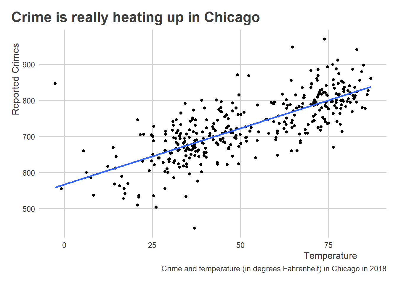
We added a layer to the plot using geom_smooth(), which drew a linear line of best fit using the data. To do this, we told geom_smooth() to use method = "lm" where lm = linear model. This command refers to an actual function in R called lm() that we can use directly on the data to calculate the slope and intercept of a linear model:
lm(crimes ~ temp, data = crime_data)
Call:
lm(formula = crimes ~ temp, data = crime_data)

Coefficients:
(Intercept)         temp
    567.272        3.106
Using lm() we first indicate the model we want to estimate using “y ~ x” syntax. This tells R that we’re dealing with a formula. We also feed lm() the dataset that contains the variables that appear in this formula object. The output is the intercept (this equals the average number of crimes committed when the temperature = 0) and the slope (this equals the average change in number of crimes committed per a one degree increase in temperature). Interpreting the above results, the slope tells us that a one degree increase in temperature is related to an increase in 3.1 crimes per day on average.
We can calculate this regression slope directly by just dividing the covariance of crime and temperature by the variance in temperature:
cov(crime_data$temp, crime_data$crimes) / var(crime_data$temp)[1] 3.106274For those really interested in geeking out about this, I wrote a blog post a ways back summarizing another way of calculating the regression slope that some people may find more intuitive.
Linear models, of course, have a second parameter: the intercept or \(\beta_0\). To make predictions, we need an estimate of the intercept as well. We can calculate the intercept, once we have the slope, as follows:
\[ \hat \beta_0 = \mu_\text{crimes} - \hat \beta_1 \mu_\text{temp} \]
In short, just take the mean of the variable you want to predict (crimes) and subtract from it the mean of the variable you’re using to make predictions (temperature) multiplied by the estimated slope.
Once you have estimates for the slope and intercept, you can now make new predictions for crimes on the basis of different hypothetical temperatures:
\[ \hat{\text{crimes}} = \hat \beta_0 + \hat \beta_1 \text{temp} \]
In R, using our data, we can calculate all of this from scratch and then generate some new predictions:
## estimate the slope
b1 <- cov(crime_data$temp, crime_data$crimes) /
  var(crime_data$temp)

## estimate the intercept
b0 <- mean(crime_data$crimes) - b1 * mean(crime_data$temp)

## predict crimes given some new temperature
crimes <- b0 + b1 * 75
crimes # report
[1] 800.2422According to the above, if the temperature is 75 degrees Fahrenheit, we should expect to see about 800.24 crimes committed on a given day.
Since R is a “functional” programming language, we could package all the above code into a new function (let’s call it predict_crimes()) that reports a forecast of crimes on a given day depending on the temperature:
predict_crimes <- function(temp) {
  ## estimate the slope
  b1 <- cov(crime_data$temp, crime_data$crimes) /
    var(crime_data$temp)

  ## estimate the intercept
  b0 <- mean(crime_data$crimes) - b1 * mean(crime_data$temp)

  ## predict crimes given some new temperature
  crimes <- b0 + b1 * temp
  crimes # report
}
To create a new function in R, you can use the function() function (that’s fun to say). Inside function() you tell R what command(s) you want your function to accept. In this case, this command will be called temp. This will be the numerical value of the temperature in degrees Fahrenheit. With our new function, we can now ask R to give us the predicted number of crimes in Chicago simply by writing:
predict_crimes(75)[1] 800.2422Making predictions in R doesn’t have to be this laborious in terms of syntax. In just a few chapters, we’ll dive deeper with making forecasts in R and introduce some useful tools for calculating and validating these forecasts.
4.5 Dealing with Nonlinear Data
Not all real-world relationships look as neat and tidy as the relationship between temperature and crimes. Some relationships have a U-shape and some look like someone let a toddler loose with a war-chest of crayons. In a lot of cases, like with democracy and oil-producers, the data are binary, making the idea of a linear relationship somewhat misleading.
To show you want I mean, consider the following scatter plot of oil-production and democracy:
ggplot(oil_regime_data) +
  aes(x = oil_producer,
      y = democracy) +
  geom_point() +
  geom_smooth(
    method = "lm",
    se = F
  )
`geom_smooth()` using formula = 'y ~ x'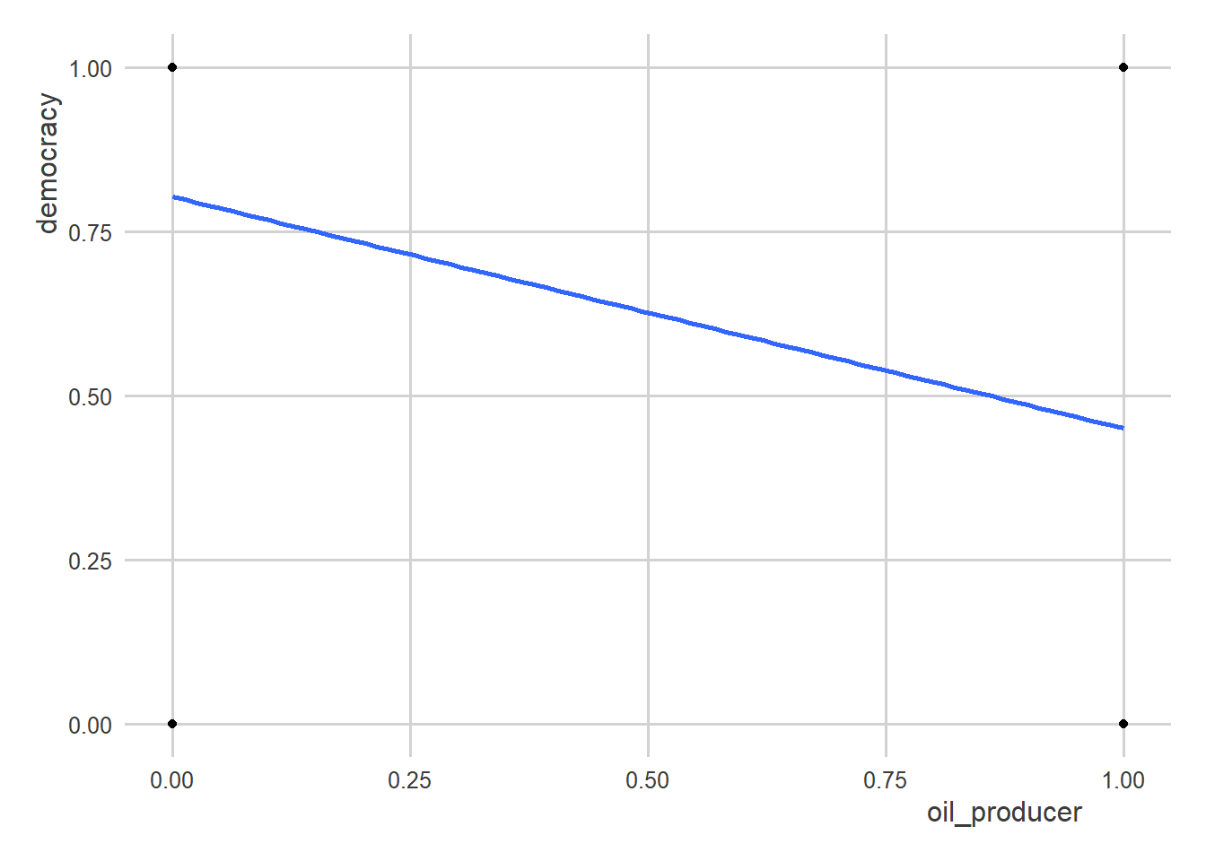
Clearly, a line is not the best way to summarize the data…or is it?
A nice feature of linear models is that they are surprisingly robust and helpful for summarizing lots of kinds of relationships. For example, in the above case, the slope of the regression line is actually equivalent to the difference in democracy rates in oil-producing states relative to those that aren’t.
Look:
# with lm()
lm(democracy ~ oil_producer, data = oil_regime_data)
Call:
lm(formula = democracy ~ oil_producer, data = oil_regime_data)

Coefficients:
 (Intercept)  oil_producer
      0.8027       -0.3527
# taking the difference in means
oil_regime_data |>
group_by(oil_producer) |>
summarize(
mean = mean(democracy)
) |>
ungroup() |>
summarize(
mean_diff = diff(mean)
)# A tibble: 1 × 1
mean_diff
<dbl>
1 -0.353Both approaches give you the same answer.
Now, for visualization purposes, I would not recommend using a linear model + scatter plot combo. Something like this would be better:
oil_regime_data |>
  group_by(oil_producer) |>
  mean_ci(democracy) |>
  ggplot() +
  aes(x = oil_producer,
      y = mean) +
  geom_col()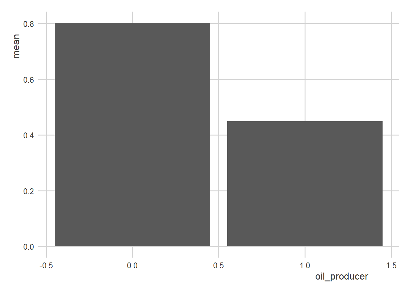
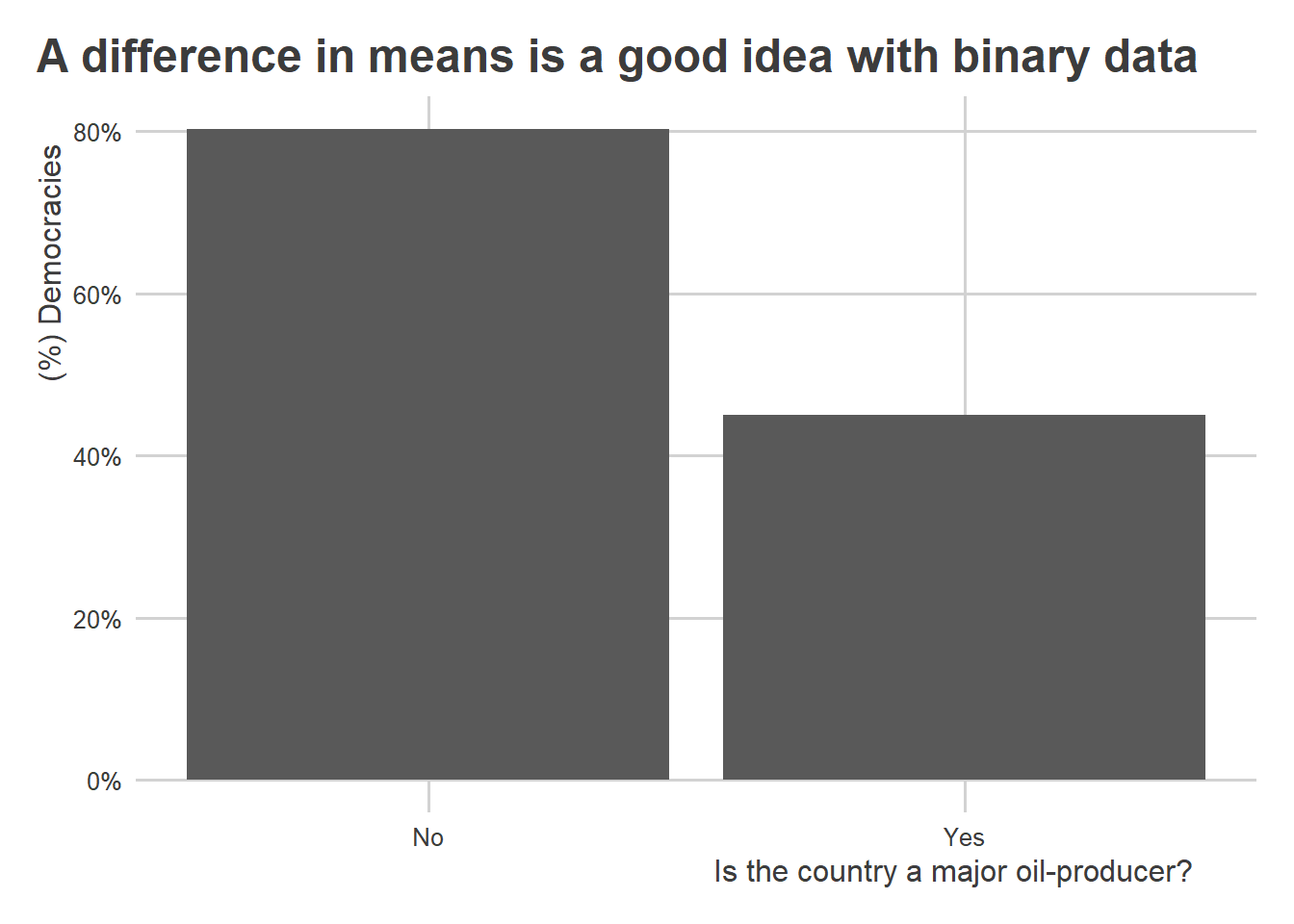
You could also improve it by adding a few more things:
oil_regime_data |>
  group_by(oil_producer) |>
  mean_ci(democracy) |>
  ggplot() +
  aes(x = oil_producer,
      y = mean) +
  geom_col() +
  scale_x_continuous(
    breaks = c(0, 1),
    labels = c("No", "Yes")
  ) +
  scale_y_continuous(
    labels = scales::percent
  ) +
  labs(
    x = "Is the country a major oil-producer?",
    y = "(%) Democracies",
    title = "A difference in means is a good idea with binary data"
  )
There are limits to how far you can go with linear models. Other kinds of models, such as logistic regression, are good alternatives when dealing with binary outcomes. Because the goal in this course is to refine your understanding of linear models for research, we won’t have time to consider other kinds of models. However, there are many helpful resources that you can google to learn more.