## open {tidyverse} and {estimatr}
library(tidyverse)
library(estimatr)

## make results replicable
set.seed(111)

## simulate data
  # say there are 1,000 property owners
N <- 1000

  # in the OES study, the ATE was ~ 6% points
true_ate <- 0.06

  # make the data
tibble(
  letter = rep(0:1, len = N) |> sample(),
  request = rbinom(
    n = N,
    size = 1,
    prob = 0.01 + true_ate * letter
  )
) -> Data11 Estimating and Reporting the ATE
11.1 Goals
- The average treatment effect or ATE is usually our target estimand in causal inference.
- R provides an infinite variety of tools for estimating the ATE, but there are advantages to using the
lm_robust()function from{estimatr}. - There are also many tools for reporting your results like regression tables and coefficient plots.
11.2 The Average Treatment Effect
The average treatment effect (ATE) is defined as the average difference in some outcome due to a causal variable or treatment. In the last chapter, we discussed the some of the intuition for the ATE. In this chapter, I’d like us to consider the ATE a little more formally, using mathematical notation. As we do, let’s consider a concrete example. When I was working for the United States Office of Evaluation Sciences, one of my assignments was to do a blind replication of an analysis looking at an intervention to reduce wildfire risk in Montana. You can read the final report of the analysis here: https://oes.gsa.gov/projects/wildfire-risk-assessments/.
The goal with this analysis was to assess whether letters mailed to property owners in Montana increased requests for on-site wildfire risk assessments done by the Montana Department of Natural Resources and Conservation (with the support of the USDA Forest Service). These on-site risk assessments are not mandatory (the government is prevented from coming onto someone’s property and doing this without their consent), but they can be helpful in preventing the spread of wildfires and limiting the damage wildfires cause to property and the risks they pose to wildlife and to human life. For this reason, it would be nice if a simple intervention (like sending a letter to property owners) could increase requests for on-site risk assessments.
To determine if such a simple intervention could have a positive effect on risk assessment requests, different households were assigned to either get a letter or to not get a letter. (Well, actually, the experiment was a little more complicated than this, but let’s just assume it was this simple for now.) Let’s formalize this process using some mathematical notation.
Let’s use \(T \in \{0, 1\}\) to denote treatment where 1 means a household got a letter and 0 means they didn’t. Let \(Y \in \{0, 1\}\) denote whether a household applied for an on-site risk assessment:
\[ \begin{aligned} Y_{1i} & = \text{outcome for unit } i \text{ if } T = 1\\ Y_{0i} & = \text{outcome for unit } i \text{ if } T = 0 \end{aligned} \]
Using this notation, the effect of the letters on applications for household \(i\) is:
\[\delta_i = Y_{1i} - Y_{0i}\]
This difference or “delta” tells us the causal effect of the letters. Often times, we’re more interested in the average causal effect rather than the effect for an individual observation. We would represent this as follows:
\[ \begin{aligned} \overline Y_{1} & = \text{average outcome for all units if } T = 1\\ \overline Y_{0} & = \text{average outcome for all units if } T = 0 \end{aligned} \]
With this notation, we can specify the average treatment effect or ATE as:
\[\text{ATE} = \overline \delta = \overline Y_1 - \overline Y_0\]
As you’ll recall, we face a practical challenge when it comes to calculating the ATE. Namely, we can’t actually calculate it—not directly anyway—because we cannot observe all potential outcomes in the study. Insted, the randomization process leads the the following revealed outcomes:
\[Y_i = Y_{1i} \times T_i + Y_{0i} \times (1 - T_i)\]
We can only estimate the ATE using these revealed outcomes. The simplest way to do this is to take the average of the outcome among the treated and compare it to the average of the outcome among the untreated:
\[ \begin{aligned} \overline Y(T_i = 1) & = \text{average outcome for all units where } T_i = 1\\ \overline Y(T_i = 0) & = \text{average outcome for all units where } T_i = 0 \end{aligned} \]
Using this notation we have:
\[\hat \delta = \overline Y(T_i = 1) - \overline Y(T_i = 0)\]
This “delta hat” is the best we can do, and under the right conditions (random treatment assignment), it actually is a pretty good approximation for the true ATE, as we discussed in the last chapter.
The cool thing about this estimator for the ATE is that we can calculate it using a linear regression model and the OLS estimator. The reason, if you recall from a previous discussion about linear regression in an earlier chapter, is that the OLS estimator gives us something analogous to the conditional mean of the outcome variable. By extension that means we can use it to calculate the difference in means between treated and control groups. So, taking the above outcome and treatment variables, we can specify a simple regression model like the following and treat the slope coefficient on the treatment variable as the ATE:
\[ Y_i = \beta_0 + \beta_1 T_i + \epsilon_i \]
If you were to calculate the \(\beta_1\) in the above and compare it to the \(\delta\) you’d get by taking the simple difference in means for \(Y\) for treated and control groups, you’d get exactly the same value. To put it a little more formally:
\[ \hat \beta_0 + \hat \beta_1 T_i \equiv \overline{Y}(T_i = 0) + [Y(T_i = 1) - \overline Y(T_i = 0)] T_i \]
11.3 How to estimate the ATE with your software
Different fields have different preferred approaches to calculating causal effects. In political science, our preferred method is to use a linear regression model, as I showed you can do in the previous section. There are other approaches, but linear regression is flexible, robust, and it provides a nice framework for adjusting for confounding covariates (which we’ll talk about in a later chapter).
During my time at the Office of Evaluation Sciences a lot of researchers used the R programming language and, increasingly, the standard operating procedure was to use the lm_robust() function from the {estimatr} package. This is preferred by OES this to lm() for a few reasons:
lm_robust()makes doing statistical inference much easier thanlm()since you don’t need to calculate robust or clustered standard errors after the fact.lm_robust()can be quickly converted to a form useful for data visualization with the right standard errors.lm_robust()makes dealing with fixed effects easier (we’ll talk about these later).lm_robust()makes it easier to calculate the right kind of standard errors for doing causal inference.
Let’s try out an example using some simulated data for the Montana Wildfires study done by OES. We have to simulate the data because the actual data used in the study isn’t publicly available. This isn’t because OES has anything to hide; it’s just that the dataset used in the analysis contains sensitive identifying information about property owners. This kind of information isn’t public domain, and part of the data-sharing agreement between OES and USDA was an agreement to keep the data private.
In simulating the data, we’ll also simplify the analysis. In the original study, the process of assigning households to getting a letter or not involved a procedure called block randomization. We’ll talk about this in the next chapter when discuss randomized controlled trials. For our purposes, we’ll just create some data where individuals have an equal probability of getting a letter or not. In our simulation, we’ll assume there are 1,000 properties to which letters could have been sent and that we have 500 letters to mail. Each property has the same 50% chance of receiving a letter. We’ll assume that the baseline likelihood that a property owner requests an onsite wildfire risk assessment is 1%. We’ll also assume that getting a letter increases this likelihood by 6 percentage points (this is about what we found in the actual Montana wildfires study).
Here’s what the first few rows of the data look like. We have two columns, one indicating whether a letter was sent to a property and one indicating whether a property owner later requested a risk assessment.
library(kableExtra)
Data |>
  slice_head(n = 5) |>
  kbl(
    caption = "First five rows of the data"
)| letter | request |
|---|---|
| 1 | 0 |
| 0 | 0 |
| 1 | 0 |
| 0 | 0 |
| 0 | 0 |
Here’s what we’d do to determine whether there is evidence that the letters were effective at increasing requests for onsite risk assessments. We’d give our data to lm_robust() and estimate a linear model where request is the outcome and letter is the explanatory variable. And that’s it!
lm_robust(
  request ~ letter,
  data = Data
) -> model_fit
Now, let’s look at the results. The output below shows the estimate for letter along with its standard error, the t-value, p-value, and the lower and upper bounds of the 95% confidence intervals. We can see that the estimated ATE is 0.062, which is very close to the true ATE of 0.06 (6 percentage points). This estimate is also statistically significant, meaning we can reject the null.
summary(model_fit)
Call:
lm_robust(formula = request ~ letter, data = Data)

Standard error type:  HC2

Coefficients:
            Estimate Std. Error t value  Pr(>|t|)   CI Lower CI Upper  DF
(Intercept)    0.006   0.003457   1.736 8.296e-02 -0.0007841  0.01278 998
letter         0.062   0.011788   5.260 1.767e-07  0.0388678  0.08513 998

Multiple R-squared:  0.02697 ,  Adjusted R-squared:  0.026
F-statistic: 27.66 on 1 and 998 DF,  p-value: 1.767e-07
Speaking of the null, remember that in the previous chapter we talked about the sharp null hypothesis. This is the hypothesis that the true treatment effect for each individual in the data is zero. This is a very special kind of null hypothesis because it is so precise. We talked about a procedure called permutation that we can use to make an inference to this sharp null hypothesis. However, in that chapter I hinted that in practice we don’t have to do permutation. We can instead use a special kind of robust standard error that approximates the kind of inference permutation provides.
This standard error is called the HC2 (heteroskedastic consistent 2) standard error. OES has publicly available guidance that they’ve published about these standard errors and why they’re the default recommendation for causal inference. You can read more about it here: https://oes.gsa.gov/assets/files/calculating-standard-errors-guidance.pdf. The gist of it is that HC2 standard errors tend to represent variation resulting from the random assignment of individuals to treatment or control. Remember that in the last chapter I discussed that the biggest contrast between a procedure like bootstrapping for inference versus permutation is that the former uses resampling to make inferences to a population while the latter uses reassignment to make inferences to potential outcomes for individuals in the data sample. When making causal inferences, we want to make inferences to potential outcomes.
The great thing about using lm_robust() for causal inference is that it assumes you want to use HC2 standard errors by default. If you notice in the output above, by taking the summary of the regression model there is a message in the output that reads Standard error type: HC2. This is alerting you to the fact that lm_robust() used HC2 standard errors for inference under the hood.
11.4 Summarizing the ATE with Regression Tables and Data Visualizations
One thing that we haven’t talked about so far is how to report the results from regression models. Now is as good a time as ever to discuss this. While there is an argument for covering this in the previous unit on correlation and prediction, the argument for saving this discussion until now is that it is all too easy to over-interpret regression results when talking about correlation. People often make the mistake of assuming that regression estimates tell you the effect of variables on an outcome, even when there’s no basis for making such a strong inference. If we’re going to report regression estimates, we should feel confident that these estimates are worth reporting and that doing so won’t be misleading.
There are a few different options available for reporting regression results in reports or scientific studies. The most common is a regression table. However, just because an approach is common doesn’t mean that it’s ideal. Because of advances in data visualization over the past few decades, other approaches have been suggested for visualizing the results of regression models. These either take the form of a coefficient plot or a prediction plot.
Let’s start with regression tables. Because people use R so much for their research, there are lots of available tools for producing professional looking regression tables in R. One of my favorites is {texreg}. If you don’t have it, you can install it by writing the following in the console:
install.packages("texreg")We can easily plot the results from one or more regression models side-by-side. Here’s a table with just our original model estimated in the previous section.
library(texreg)
screenreg(model_fit)
==========================
             Model 1
--------------------------
(Intercept)     0.01
             [-0.00; 0.01]
letter          0.06 *
             [ 0.04; 0.09]
--------------------------
R^2             0.03
Adj. R^2        0.03
Num. obs.    1000
RMSE            0.19
==========================
* 0 outside the confidence interval.
The above table is produced using screenreg(). This produces output that you can easily read in your R console. You can also produce html tables:
htmlreg(model_fit) |>
htmltools::HTML()| Model 1 | |
|---|---|
| (Intercept) | 0.01 |
| [-0.00; 0.01] | |
| letter | 0.06* |
| [ 0.04; 0.09] | |
| R2 | 0.03 |
| Adj. R2 | 0.03 |
| Num. obs. | 1000 |
| RMSE | 0.19 |
| * 0 outside the confidence interval. | |
By default, these *reg() functions produce tables with 95% confidence intervals. If you want to show standard errors instead, you can just say so:
htmlreg(model_fit,
        include.ci = F) |>
htmltools::HTML()| Model 1 | |
|---|---|
| (Intercept) | 0.01 |
| (0.00) | |
| letter | 0.06*** |
| (0.01) | |
| R2 | 0.03 |
| Adj. R2 | 0.03 |
| Num. obs. | 1000 |
| RMSE | 0.19 |
| ***p < 0.001; **p < 0.01; *p < 0.05 | |
Same if you want to show more digits after the decimal point:
htmlreg(model_fit,
        include.ci = F,
        digits = 3) |>
htmltools::HTML()| Model 1 | |
|---|---|
| (Intercept) | 0.006 |
| (0.003) | |
| letter | 0.062*** |
| (0.012) | |
| R2 | 0.027 |
| Adj. R2 | 0.026 |
| Num. obs. | 1000 |
| RMSE | 0.186 |
| ***p < 0.001; **p < 0.01; *p < 0.05 | |
There generally is no need to show more than 3 significant digits.
Finally, you can clean up the variable names and add a title:
htmlreg(model_fit,
        include.ci = F,
        digits = 3,
        caption = "Effect of Letters on Risk Assignemtn Requests",
        caption.above = T,
        custom.coef.names = c("Control",
                              "ATE of Letters")) |>
htmltools::HTML()| Model 1 | |
|---|---|
| Control | 0.006 |
| (0.003) | |
| ATE of Letters | 0.062*** |
| (0.012) | |
| R2 | 0.027 |
| Adj. R2 | 0.026 |
| Num. obs. | 1000 |
| RMSE | 0.186 |
| ***p < 0.001; **p < 0.01; *p < 0.05 | |
In some settings, communicating about your results with regression tables doesn’t do you many favors. In presentations or posters, a coefficient plot can be better. Here’s what one looks like with model_fit:
tidy(model_fit) |>
  ggplot() +
  aes(x = estimate,
      xmin = conf.low,
      xmax = conf.high,
      y = term) +
  geom_pointrange()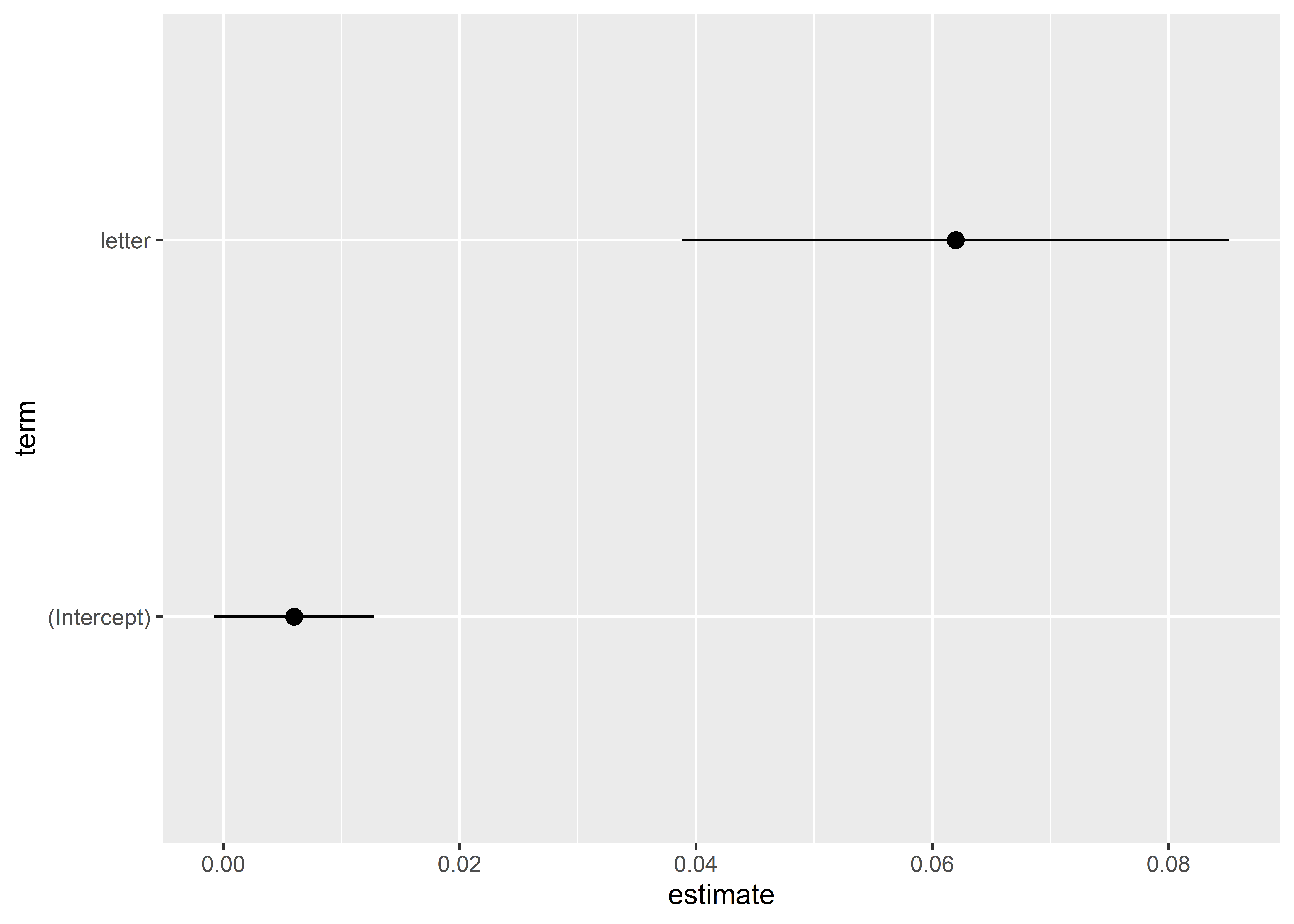
Generally, you’ll want to clean these up a bit. For example, you should provide some helpful labels and names of variables. It is also a good idea to add a vertical line at zero, because this helps viewers see whether an estimate is statistically significant.
tidy(model_fit) |>
  ggplot() +
  aes(x = estimate,
      xmin = conf.low,
      xmax = conf.high,
      y = term) +
  geom_pointrange() +
  # add a vertical line at zero
  geom_vline(xintercept = 0,
             linetype = 2) +
  # update the plot labels
  labs(x = "Estimate with 95% CI",
       y = NULL,
       title = "My Regression Estimates") +
  # update variable names
  scale_y_discrete(labels = c("Control",
                              "ATE of Letters"))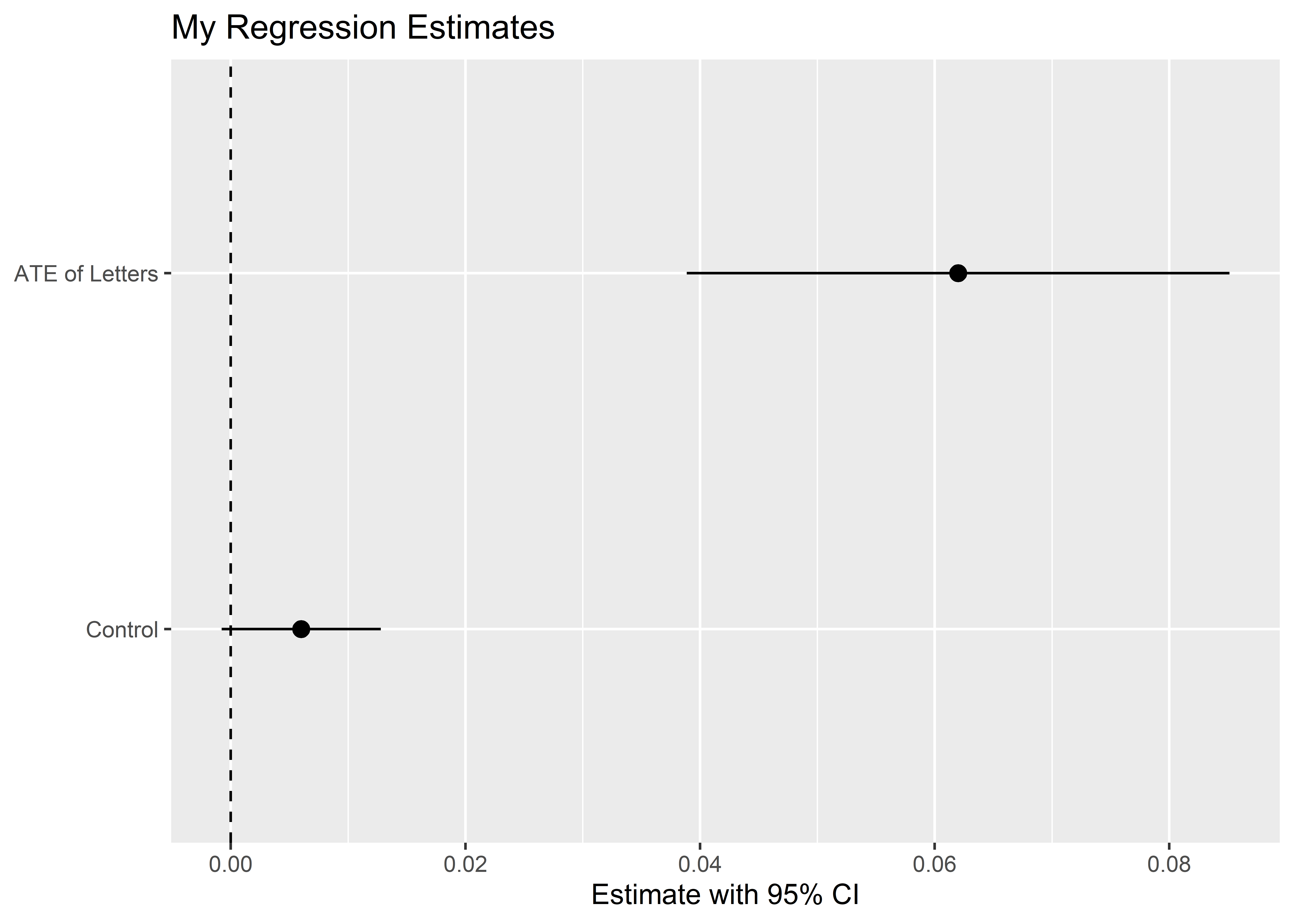
A final option is to summarize model predictions. In the case of causal inference, this gives us a representation of potential outcomes depending on treatment assignment. On this front, we can use tools from an R package called {oesr} which I played a role in developing with other colleagues at OES. Here’s an example of how to use it with the model_fit object:
## open {oesr}
library(oesr)

## prep the model for plotting
oes_prep(
  model_fit,
  treatment_vars = "letter",
  scale = "percentage",
  treatment_labels = "Letter",
  control_label = "No Letter"
) |>
  ## plot the output
  oes_plot()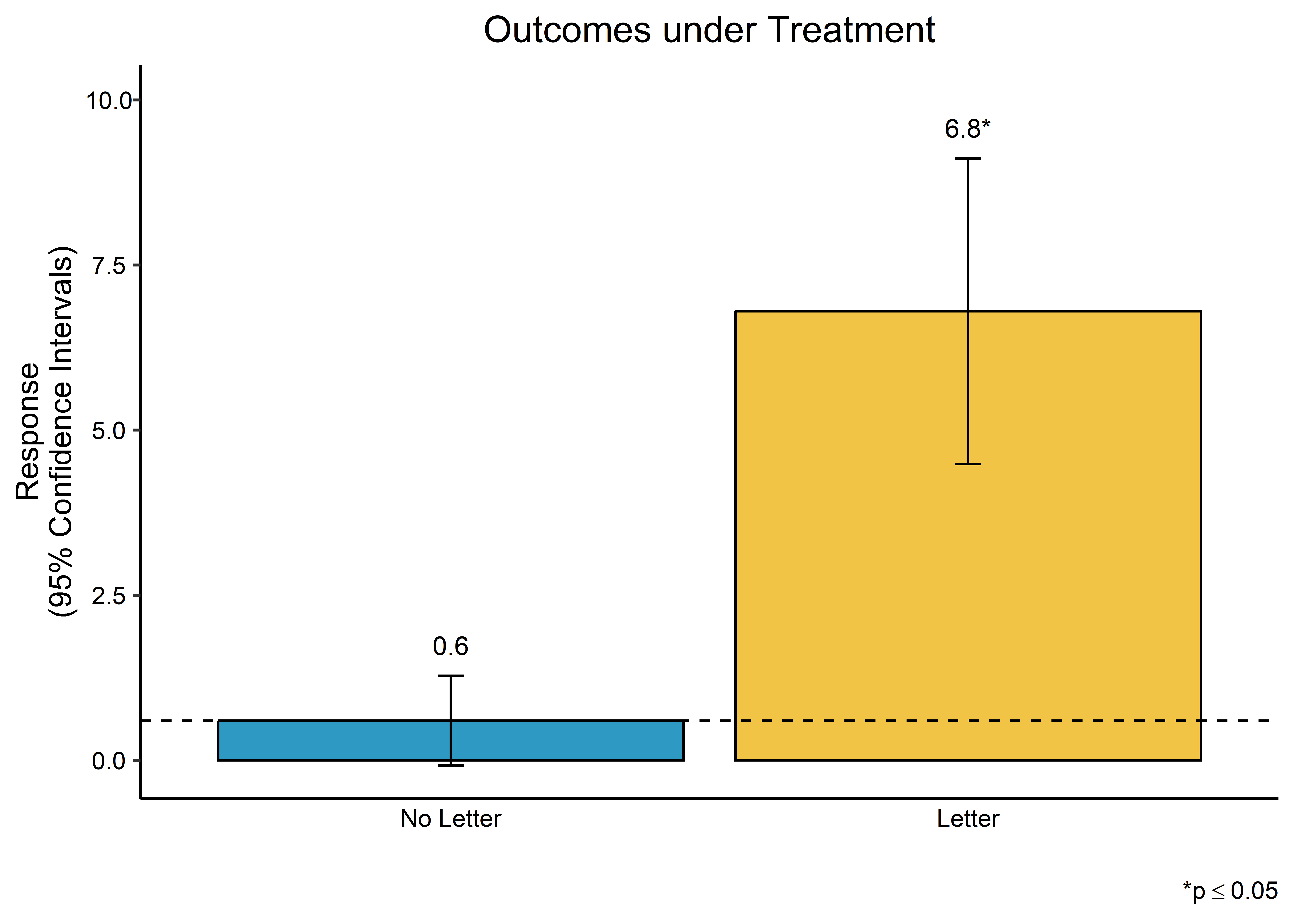
There are other options for reporting the results from regression models. Some additional packages to check out include {sjPlot} and {stargazer}.
11.5 Conclusion
The ATE is the most common estimator we use for causal inference, and it is easy to calculate. With the right software, it is also easy to estimate the ATE and do the right kind of statistical inference for causal inference. It is also easy to report the results of our estimates.
Having these tools in your back pocket will be essential as we start digging into the specifics of different kinds of research designs for making causal inferences. In the coming chapters, we’ll consider four approaches: randomized controlled trials, selection on observables, regression discontinuity, and difference-in-differences.