library(tidyverse)10 Getting Started with Causation
10.1 Goals
- Introduce causation and the potential outcomes framework
- Use a simulation to introduce the intuition behind the potential outcomes framework
- Provide intuition for hypothesis testing with causal inference using the sharp null
10.2 Cause and Effect
Causal inference is the process that allows us to infer whether some variable \(x\) causes some outcome \(y\). We can think of many examples in daily life where we engage in an intuitive form of causal inference. If you kick a ball (a cause) you expect it to hurl away from you (an effect). Or if you spend too much time out in the cold (a cause) you may not be surprised that you fall ill (an effect). In such cases, inferring a causal link between two events comes naturally. In fact, this ability to connect a cause to an effect is something we humans start learning to do as infants.
Sometimes, however, we can make bad causal inferences. We may observe two events co-occur with such frequency that we can’t help but believe causation is at work. But as we should understand by now, correlation does not equal causation.
The science of causal inference is what allows us to make more informed judgments about causal relationships in the world. Using some fairly basic statistical tools, we can easily quantify how unlikely a relationship that we observe in the data is to occur if no causal relationship exists between two variables.
To make these tools work, we first need to understand counterfactuals, which are a key part of what’s called the potential outcomes framework for causal inference. Consider the example of kicking a ball. When you kick a ball and you see it fly away from you in the direction you kicked it, you immediately infer that your kicking the ball caused it to move. Underneath this inference, however, is an implied counterfactual—what would have happened to the ball if you hadn’t kicked it? This counterfactual is a potential outcome—something that could have happened but for your kicking the ball. To infer causation, you must consider this counterfactual. The difference between what could have happened to the ball without your kicking it and what did happen because you kicked is what lets you infer a causal effect.
In this example, you draw this inference intuitively, but when working with data we need more than intuition. We need a way to quantify causal effects—to specifically identify what the difference is between potential outcomes.
This seems right enough, but the process of calculating precise causal effect is challenging for the simple reason that it is impossible to observe two states of the world simultaneously. Once you intervene (say by kicking a ball), the other potential outcome (say you didn’t kick the ball) cannot be observed. This is the fundamental problem of causation. Causal effects cannot ever by directly observed.
So how can we truly know that causation is present? In reality, we never can know for sure. The best we can do is use statistics to help us infer causation using data. In this unit of the course, we’ll focus on how we can do this. The next section walks through a simple simulation that will hopefully clarify the potential outcomes framework and how, despite the impossibility of observing couterfactuals, we can nonetheless calculate causal effects.
10.3 Simulating potential outcomes
Counterfactuals are “philosophically subtle” as Bueno de Mesquita and Fowler (2021) put it. I generally find that running a simulation helps me to better understand what’s going on with subtle statistical concepts. The reason is that when we simulate data we have total control over how data are generated. In the case of causal inference, it means we can control potential outcomes and observe them.
Let’s gather our tools:
And now, let’s simulate some data to illustrate. The below code creates a dataset with 100 observations and four columns. The first two columns simulate potential outcomes for a variable Y. The values in column Y0 are potential outcomes if individuals don’t receive some treatment, and the values in column Y1 are potential outcomes if individuals do receive treatment. The third column is a binary variable called Tr that takes the value 1 if an individual is assigned to treatment and the value 0 otherwise. The fourth and final column is the set of “revealed outcomes.” These are the values of Y that we observe by assigning individuals to either treatment or control.
set.seed(123)
tibble(
  # values without treatment
  Y0 = rnorm(100),

  # values with treatment
  Y1 = 1/2 + rnorm(100),

  # treatment assignemnt
  Tr = rep(0:1, each = 50) %>%
    sample(),

  # reveal outcomes
  Yobs = Y1 * Tr + Y0 * (1 - Tr)
) -> Data
In the real world, we would only observe treatment assignment and revealed outcomes. The full set of potential outcomes are hidden. But since this is a simulation, we get the privalege of observing the full set of potential outcomes. One thing we can do, therefore, is directly calculate the true average treatment affect (ATE). This is the average difference in potential outcomes when individuals receive treatment versus not. The below code calculates this quantity.
theATE <- mean(Data$Y1 - Data$Y0)
theATE
[1] 0.3020473This is the true ATE because it is the actual average difference in potential outcomes. Now, this is never something that we can estimate with real data. When using real data, we instead calculate the average difference in outcomes between individuals who got treatment and those who didn’t. The below code calculates this quantity.
estATE <- mean(Data$Yobs[Data$Tr==1]) -
  mean(Data$Yobs[Data$Tr==0])
estATE
[1] 0.3333896Note that linear regression models when estimated via OLS correspond to the mean. So we can also just use lm() to calculate the estimated ATE as well:
model_fit <- lm(Yobs ~ Tr, Data) ## estimate model
estATE <- coef(model_fit)["Tr"]  ## pull out estimate for Tr
estATE
Tr
0.3333896 As you can tell, the estimated ATE is not exactly equal to the true ATE. These two values almost never are identical. This happens because, when we estimate quantities using data, our estimates reflect a combination of three things. These are captured by the following equation:
Estimate = Estimand + Bias + Noise
- Estimate: the thing that we calculate.
- Estimand: the thing we want to estimate.
- Bias: factors that systematically skew our estimate up or down.
- Noise: factors that randomly skew our estimate up or down.
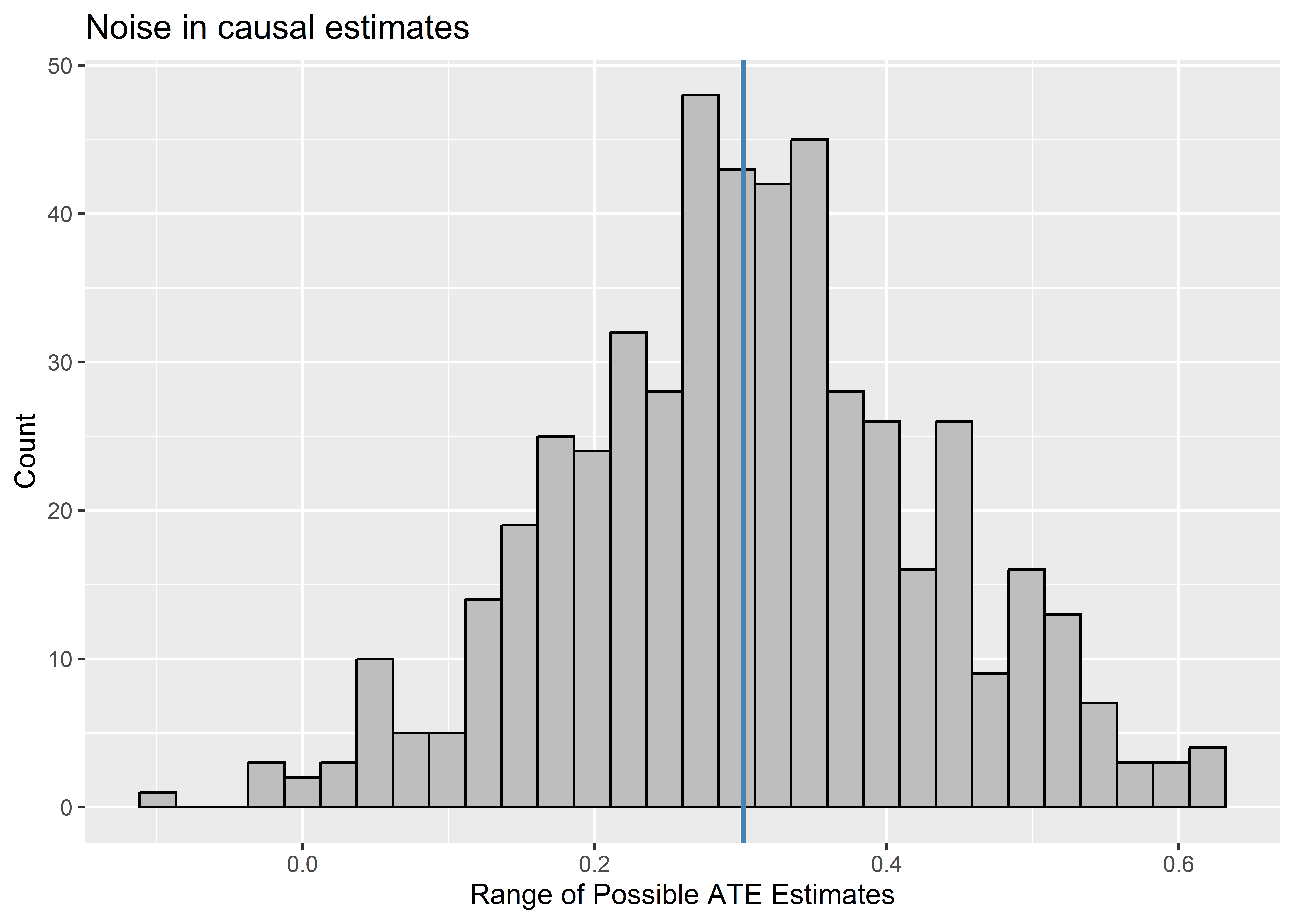
In the case of the data-generating process we simulated above, Noise enters the equation through random treatment assignment. If we could repeat the process of assigning individuals to treatment, we’d see that we could have gotten a range of different ATE estimates. To show that this is the case, the below code simulates what would happen if we could repeat the process of treatment assignment and, thus, of revealing outcomes. For each time treatment is reassigned and new outcomes are revealed, a new estimate of the ATE is calculated. The distribution of estimates is shown using a histogram. A blue vertical line is added to the histogram to show where the true ATE falls relative to the set of possible ATEs that could have been estimated with reassignment. As you can see, these are approximately normally distributed around the true ATE, which is just what we’d expect if random noise, rather than bias, is reponsible for why some individuals get assigned to treatment versus control.
## repeat experiment 500 times
1:500 |>
  map_dfr(
    ~ Data |>
      mutate(
        Tr = sample(Tr),
        Yobs = Y1 * Tr + Y0 * (1 - Tr),
        it = .x
      )
  ) |>
  ## summarize possible ATE estimates for each experiment
  group_by(it) |>
  summarize(
    estATE = coef(lm(Yobs ~ Tr))["Tr"]
  )  |>
  ## visualize the distribution
  ggplot() +
  aes(estATE) +
  geom_histogram(
    color = "black",
    fill = "gray"
  ) +
  geom_vline(
    xintercept = theATE,
    color = "steelblue",
    size = 1
  ) +
  labs(
    x = "Range of Possible ATE Estimates",
    y = "Count",
    title = "Noise in causal estimates"
  )
10.4 Causal Inference and the Sharp Null
It would be great if experiments worked like above, but the reality is that we often can only assign treatment and reveal outcomes once. From here, the best we can do to make causal inferences is to conduct a hypothesis test to help us quantify how unlikely our observed ATE is if we assume the true ATE is zero.
Hypothesis testing, which we’ve already discussed, operates in much the same way with causal inference as it does with descriptive inference. But sometimes with causation it often is justified to test a very special kind of null hypothesis for a treatment effect: the sharp null.
The idea for the sharp null comes from the same Ronald Fisher we talked about several weeks ago (the one who said smoking doesn’t cause cancer). The idea is simple. If the null hypothesis is true then any difference in means between treatment and control groups is simply due to the luck of draw with the randomizing process itself. The treatment effect is assumed to be zero, not just on average, but for each and every observation in the data. Thus, if the sharp null is true, then we can pretend that all the observed outcomes in the data are equivalent to their counterfactuals. That means we can re-randomize treatment and get a range of treatment effects under the sharp null and use this distribution to make an inference about how unlikely our observed estimate of the ATE is if this sharp null hypothesis is true.
This process is called permutation and it’s a computational approach to statistical inference. It’s sort of like bootstrapping which we talked about in a previous chapter, where we use our data to directly make inferences by shaking it up. However, the difference is that with bootstrapping we’re resampling the whole dataset while with permutation we’re just reassigning one variable to new rows in the data in order to see what difference reassignment makes. The below code demonstrates a way you could perform permutation on the data we simulated above. It reassigns which rows in the data get the treatment 500 times. For each time, it calculates the ATE based on this new treatment assignment. It saves the output in an object called perm_ATEs.
1:500 |>
  map_dfr(
    ~ Data |>
      mutate(
        Tr = sample(Tr)
      ) |>
      summarize(
        it = .x,
        permATE = coef(lm(Yobs ~ Tr))["Tr"]
      )
  ) -> perm_ATEs
What I like about this approach (and most computational approaches for that matter) is that we can plot the empirical distribution of possible treatment effects under the null. We can call this the empirical null distribution because this is really, empirically, the true null distribution if the sharp null hypothesis is correct. The below code creates a histogram of this distribution using the output from the permutation procedure implemented above.
ggplot(perm_ATEs) +
  aes(x = permATE) +
  geom_histogram(
    fill = "gray",
    color = "black"
  ) +
  geom_vline(
    xintercept = c(0, estATE),
    linetype = c(2, 1),
    color = c("black", "darkblue"),
    size = 1
  ) +
  labs(
    x = "Range of ATEs under the Null",
    y = "Count",
    title = "Empirical distribution of ATEs under the null"
  ) +
  annotate(
    "text",
    x = 0.45,
    y = 40,
    label = "Obs. ATE",
    color = "darkblue"
  )
Since we have this empirical sharp null distribution, we can also directly calculate the p-value for the sharp null hypothesis. This p-value is simply the proportion of the time that we get an ATE estimate that is as extreme as the one we observed with the original treatment assignment. The below code provides a way to calculate this value using the output from the permutation approach demonstrated above.
perm_ATEs |>
  summarize(
    pvalue = 2 * min(
      mean(permATE <= estATE),
      mean(permATE >= estATE)
    )
  )
# A tibble: 1 × 1
pvalue
<dbl>
1 0.116This p-value is literally just the proportion of times the permutation process gives us an ATE at least as extreme as the one we estimated with the original treatment assignment.
10.5 Conclusion
Making causal inferences is a part of our daily lives, but while it seems mundane, this daily act is philosophically profound. In order to make causal inferences we need to imagine potential outcomes that are impossible to observe at the same time. This is why causal inference is a form of inference.
Looking ahead to the next chapter, we’ll talk about some techniques in R for making causal inferences that don’t require us to do the above permutation approach. As we do, we’ll also walk through some more precise analytical formulations of the potential outcomes framework for causal inference.