Understand the intuition behind linear regression.
Know how to use it to describe the relationship between variables.
Know how to use it to forecast/predict outcomes.
Learn some tools to test how well the linear regression fits the data.
Understand some common pitfalls and mistakes when using linear regression.
As we already discussed, regression is good for three things: description, forecasting, and causal inference. In this chapter, we’ll go deeper with the first two. Description is all about data exploration which can then be used to engage in informed speculation about why different patterns exist in the world. Forecasting is all about making precise predictions that can be used, for example, to make informed decisions on the basis of anticipated future trends. The remainder of this chapter provides some applied examples in R for how to go about both kinds of analysis.
6.2 Regression…Linear Regression
Remember our Chicago crime data? Let’s read it into R.
library(tidyverse)
Warning: package 'tidyverse' was built under R version 4.2.3
Warning: package 'ggplot2' was built under R version 4.2.3
Warning: package 'tibble' was built under R version 4.2.3
Warning: package 'tidyr' was built under R version 4.2.3
Warning: package 'readr' was built under R version 4.2.3
Warning: package 'purrr' was built under R version 4.2.3
Warning: package 'dplyr' was built under R version 4.2.3
Warning: package 'stringr' was built under R version 4.2.3
Warning: package 'forcats' was built under R version 4.2.3
Warning: package 'lubridate' was built under R version 4.2.3
── Attaching core tidyverse packages ──────────────────────── tidyverse 2.0.0 ──
✔ dplyr     1.1.2     ✔ readr     2.1.4
✔ forcats   1.0.0     ✔ stringr   1.5.0
✔ ggplot2   3.5.0     ✔ tibble    3.2.1
✔ lubridate 1.9.3     ✔ tidyr     1.3.0
✔ purrr     1.0.2
── Conflicts ────────────────────────────────────────── tidyverse_conflicts() ──
✖ dplyr::filter() masks stats::filter()
✖ dplyr::lag()    masks stats::lag()
ℹ Use the conflicted package (<http://conflicted.r-lib.org/>) to force all conflicts to become errors
Rows: 365 Columns: 5
── Column specification ────────────────────────────────────────────────────────
Delimiter: ","
dbl (5): year, month, day, temp, crimes

ℹ Use `spec()` to retrieve the full column specification for this data.
ℹ Specify the column types or set `show_col_types = FALSE` to quiet this message.
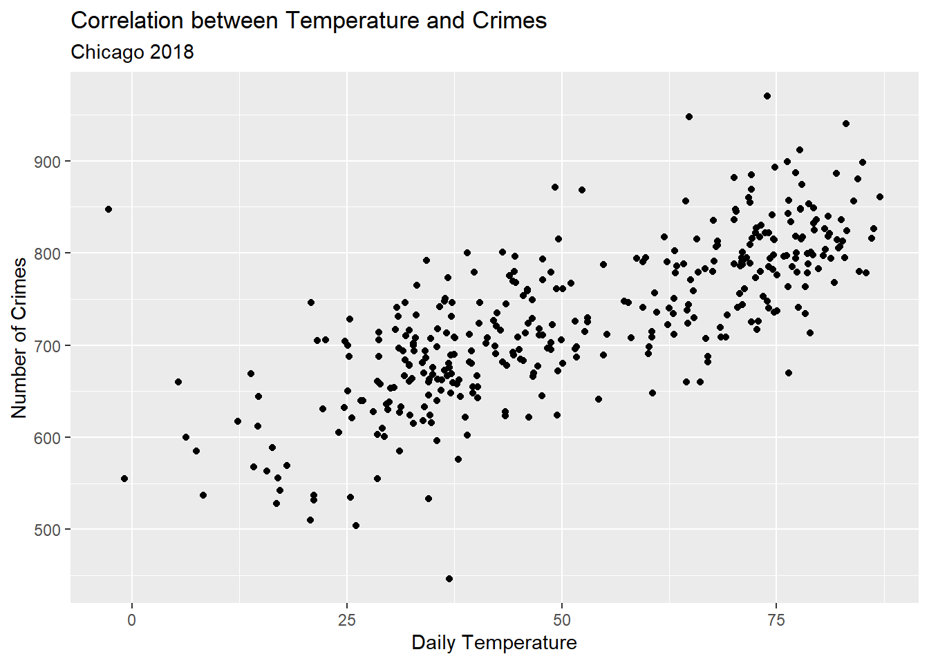
This data contains information about two features of the world: crime rates in Chicago and the daily temperature in Chicago in 2018. The below figure is a scatter plot showing how these two features jointly vary (how they are related to each other). As we can see, there is a positive relationship between these two variables. Hotter temperatures are correlated with a higher crime rate.
ggplot(Data) +aes(x = temp, y = crimes) +geom_point() +labs(x ="Daily Temperature",y ="Number of Crimes",title ="Correlation between Temperature and Crimes",subtitle ="Chicago 2018" )
This visualization is an effective way to show the relationship between these variables, and it provides a nice example of descriptive data analysis where the main goal is to look at our data and summarize relationships. The goal is not to make causal claims, but instead to summarize patterns in the world as accurately as possible. Accurate description is a necessary starting place for thinking more deeply about why certain patterns exist or in developing better forecasts.
While a scatter plot is nice, using regression for description lets us put a precise number on a relationship. It tells us, on average, how much a unit difference in one variable corresponds to a difference in another. This objective is very similar to what we can accomplish using correlation. With R, you can estimate a correlation coefficient cor(). For instance, here’s code for estimating the correlation between temperature and crimes in Chicago in 2018 along with its output.
cor(x = Data$temp, y = Data$crimes)
[1] 0.7549993
A correlation of 0.75 is a strong positive correlation, and this one number already gives us a good summary of the data. Remember that a correlation can take a value from -1 to 1, where -1 means there is a perfectly linear negative relationship and a 1 means there is a perfectly linear positive relationship.
This information is useful, but the correlation coefficient’s biggest limitation is that it doesn’t provide a sense of magnitude. It tells us that higher temperatures closely correspond with more crimes, but it doesn’t tell us the rate at which this happens. To do this we instead would want to use a linear regression model.
In its simplest form, a linear regression lets us summarize the relationship between two variables using two different parameters: a slope and an intercept. When using regression, we usually express the relationship between two factors using an equation like this one:
A linear regression model expresses the relationship between an outcome variable and an explanatory variable as a linear function. You’ll sometimes see the outcome variable called a dependent variable or response and the explanatory variable called an independent variable or predictor. Choice of term usually depends on the field of study and the goal of the analysis.
The relationship between the outcome and explanatory variable is captured using the slope (\(\beta_1\)) and intercept (\(\beta_0\)).
The intercept tells you what the outcome is when the explanatory variable is equal to zero.
The slope tells you how the outcome changes for each one value increase of the explanatory variable.
To estimate these parameters we have to deal with the fact that our data are noisy, which is to say that the explanatory variable won’t be able to accurately capture all the variation in the outcome. This is where the error term, or \(\epsilon_i\), comes into play. This value is specific to each observation in the data, and it represents idiosyncratic factors that explain the values of the outcome variable that are beyond the explanatory variable’s ability to capture.
Unfortunately, the true values of \(\epsilon_i\) are impossible to observe, which means we aren’t working with all the available information about the outcome’s data-generating process (d.g.p.) as we calculate the slope and intercept. We therefore need an estimator to give us a rule or criterion against which we can benchmark different values for the slope and intercept and evaluate their goodness of fit (GOF). There are lots of perfectly valid estimators to choose from, but the most commonly used in the context of linear regression is called ordinary least squares or OLS.
Before we talk more about OLS, I want to quickly address a common misunderstanding about the OLS estimator. OLS is used so often with linear regression that you’ll often see people write “OLS model” instead of “linear model.” This is an abuse of terms. OLS is not a model; it’s an estimator for finding the parameters of a model. You can use many different rules (estimators) other than OLS to estimate linear model parameters, which is why it’s important not to think that one is equivalent to the other.1 Okay, rant over…
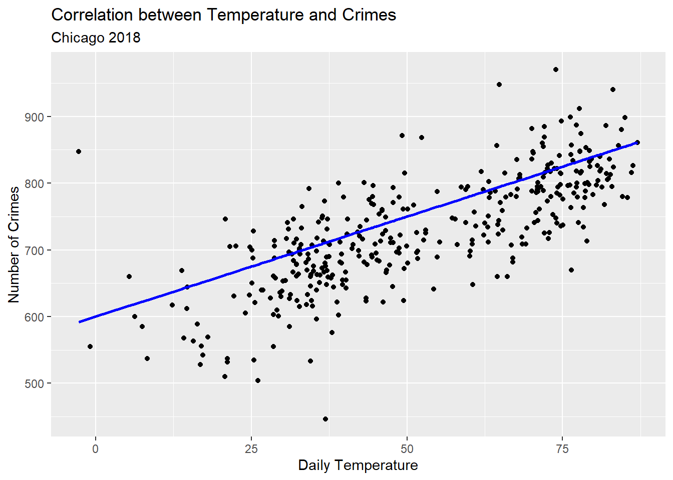
OLS works by finding the best values of the slope and intercept that minimize the squared difference between predicted values of the outcome and the actual values of the outcome. In the case of our model of crime, any values we give to \(\beta_0\) and \(\beta_1\) let us get a conditional average for the number of crimes depending on the temperature. Say we pick 600 for the first and 3 for the second. Our regression line would fit the data like so:
ggplot(Data) +aes(x = temp, y = crimes) +geom_point() +geom_line(aes(y =600+3* temp),color ="blue",size =1 ) +labs(x ="Daily Temperature",y ="Number of Crimes",title ="Correlation between Temperature and Crimes",subtitle ="Chicago 2018" )
Warning: Using `size` aesthetic for lines was deprecated in ggplot2 3.4.0.
ℹ Please use `linewidth` instead.
Notice how I told ggplot to set a new y aesthetic equal to 600 + 3 * temp inside the geom_line() layer. This lets me plot the linear prediction from my model using my personally selected parameter values.
There are many possible lines that I could have drawn through the data. For each one of these possible lines, we could calculate the residual, or the difference between the fitted and actual value for a given data point like so:
In the above, the subscript \(i\) is meant to alert us to the fact that there’s a different residual for each observation in the data. The \(\text{Crimes}_i\) is the observed number of crimes that take place on a given day and \(\widehat{\text{Crimes}_i}\) is the expected number of crimes based on the parameter values we give to the slope and intercept.
Using some different combinations of the parameters, we can check how well they do by calculating the sum of the squared residuals or SSR. The equation for SSR looks like this:
Let’s make some new columns in our data that equal the residual error in our predictions from different versions of the model and then summarize the results:
Data |>mutate(error1 = crimes - (600+3* temp),error2 = crimes - (650+2* temp),error3 = crimes - (550+4* temp) ) |>summarize( # this returns the SSRacross(error1:error3, ~sum(.x^2)) ) -> errors# show the outputerrors
If we compare these, it looks like the first fit does best. The others don’t fair quite as well. If we wanted, we could keep trying a bunch of different combinations until we found the one that fits the best. This would take a lot of time, though. Thankfully OLS is here to save us the trouble.
OLS uses SSR to benchmark the goodness of different parameter values. It defines the best values as the ones that minimize the SSR such that no other possible combinations get get you something smaller. Smart people have found that the parameter values that meet this criteria have a closed-form solution—which is just a fancy way to say that we just need to use a simple equation to get the answer.
In previous notes, we already discussed this solution. The best fitting slope will be the covariance of our explanatory and outcome variables divided by the variance of the explanatory variable:
If we compare the SSR with these parameters with those we got from our other hand-picked values of the parameters, it should be smaller than the alternatives. And, in fact, it is:
ssr <-sum((Data$crimes - (intercept + slope * Data$temp))^2)errors # original errors
That’s a lot of code to write and remember. Thankfully, we don’t have to write all of that code to get the slope and intercept in R. We can use the function lm() instead.
## estimate paramters with lm()fit <-lm(crimes ~ temp, data = Data)## print outputfit
lm() is used to fit linear regression models. By saving it as an object, in this case as fit, we can use the output to do other things with the model, like look at the coefficients or (later on) make predictions.
For example, to look at the coefficients we can use a function called coef(). Let’s do that and compare them with the parameters we calculated using the more round-a-bout way:
params; coef(fit) # FYI a ; lets you run two separate things in the same line.
 intercept      slope
567.271621   3.106274
(Intercept)        temp
 567.271621    3.106274
Exactly identical.
As we discussed in the previous chapter, we can tell ggplot to add a linear fit to some data for us by adding the geom_smooth() layer to a scatter plot like so:
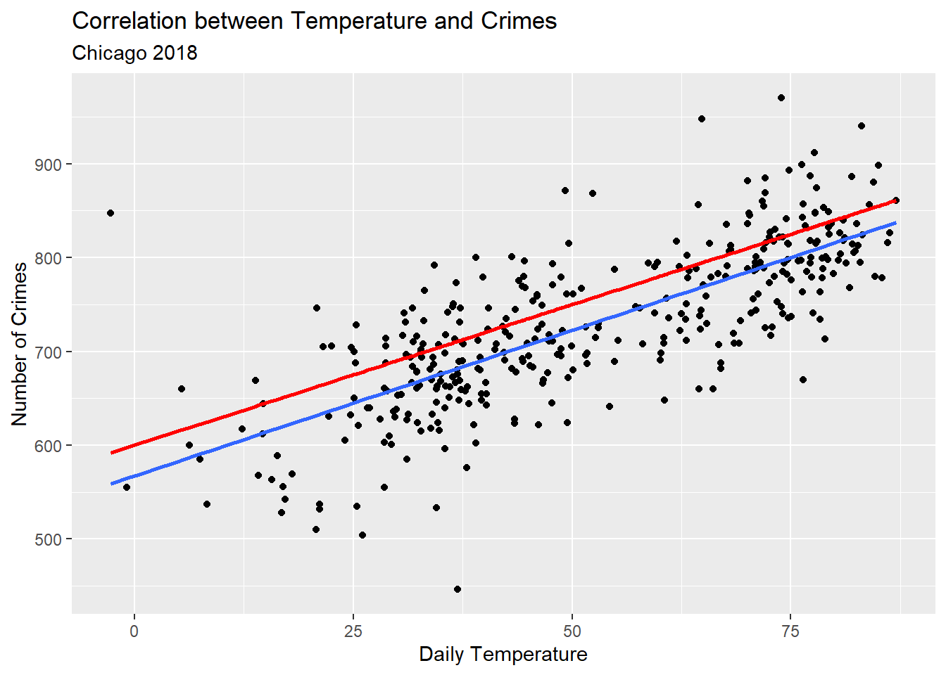
ggplot(Data) +aes(x = temp, y = crimes) +geom_point() +geom_line(aes(y =600+3* temp),color ="red",size =1 ) +geom_smooth(method ="lm",se = F ) +labs(x ="Daily Temperature",y ="Number of Crimes",title ="Correlation between Temperature and Crimes",subtitle ="Chicago 2018" )
`geom_smooth()` using formula = 'y ~ x'
The blue line above is the OLS fit for the data. The red line is the fit using the parameters I hand-selected earlier.
6.3 Why OLS?
The reason we use OLS (most of the time) to find the parameters of a linear model is due in part to precedent and in part to convenience. OLS was invented at a time when we didn’t have computers, so people had to fit the parameters of a linear model by hand. As shown above, we have a simple equation to calculate these parameters. All it would have taken folks a 100 years ago was some dutiful number crunching. Other kinds of solutions, like minimizing the absolute deviations (which we won’t use in this class), don’t have a closed-form solution. You need a computer to find it for you.
OLS also provides a close analogue to the mean. In other words, its predictions can be interpreted as a conditional mean or average of the outcome given the explanatory variable. With respect to the Chicago temperature and crime data, for each value of temperature, the linear model fit via OLS tells us what the average number of crimes should be. Solutions like minimizing the absolute deviations provide something closer to finding a conditional median—still useful, but not as commonly used.
6.4 What if the data isn’t linear?
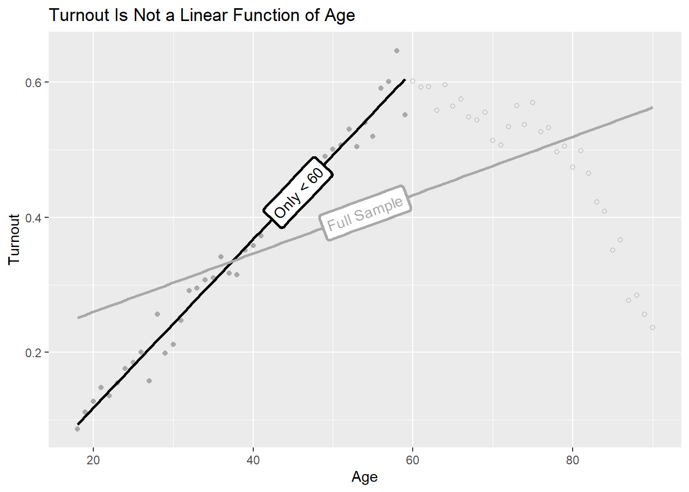
Not all data make for a good fit with a linear regression model, which means the slope we get with a simple regression may not provide the most accurate description of the relationship between two factors. Bueno de Mesquita and Fowler (2021) talk about an interesting case dealing with the relationship between age and voter turnout. Here’s some simulated data and a scatter plot showing something similar:
turnout <-tibble(age =18:90,turnout =c(seq(0.1, 0.6, length =sum(age <60)),seq(0.6, 0.5, length =sum(age %in%60:80)),seq(0.5, 0.2, length =sum(age >80)) ) +rnorm(n =length(age), sd =0.02))ggplot(turnout) +aes(x = age,y = turnout) +geom_point() +labs(x ="Age",y ="Turnout",title ="Turnout Is Not a Linear Function of Age" )
If we lop off all observations beyond 60, a linear regression model makes for a good fit. But if we use the full data, we can see we have a problem.
library(geomtextpath) # use functions in geomtextpath to add labels to linesggplot(filter(turnout, age <60)) +aes(x = age, y = turnout) +geom_point(color ="darkgray") +geom_labelsmooth(method ="lm",label ="Only < 60",hjust =0.7,linewidth =1,se = F,color ="black" ) +geom_point(data =filter(turnout, age >=60),shape =21,color ="darkgray" ) +geom_labelsmooth(data = turnout,label ="Full Sample",method ="lm",linewidth =1,se = F,color ="darkgray" ) +labs(x ="Age",y ="Turnout",title ="Turnout Is Not a Linear Function of Age" )
`geom_smooth()` using formula = 'y ~ x'
`geom_smooth()` using formula = 'y ~ x'
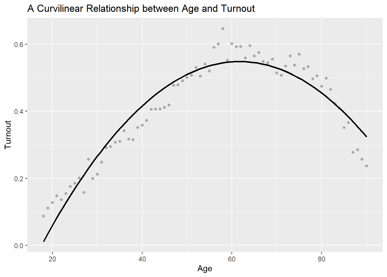
Thankfully, linear regression models provide a great deal of flexibility. We could, for example, add a squared term to the model. This will turn our linear regression model into a quadratic regression model. The idea is that we want to fit a curve to the data rather than a line. We can give instructions to ggplot to do this for us:
p <-ggplot(turnout) +aes(x = age,y = turnout) +geom_point(color ="darkgray" ) +geom_smooth(method ="lm",formula = y ~poly(x, 2),se = F,color ="black" ) +labs(x ="Age",y ="Turnout",title ="A Curvilinear Relationship between Age and Turnout" )p
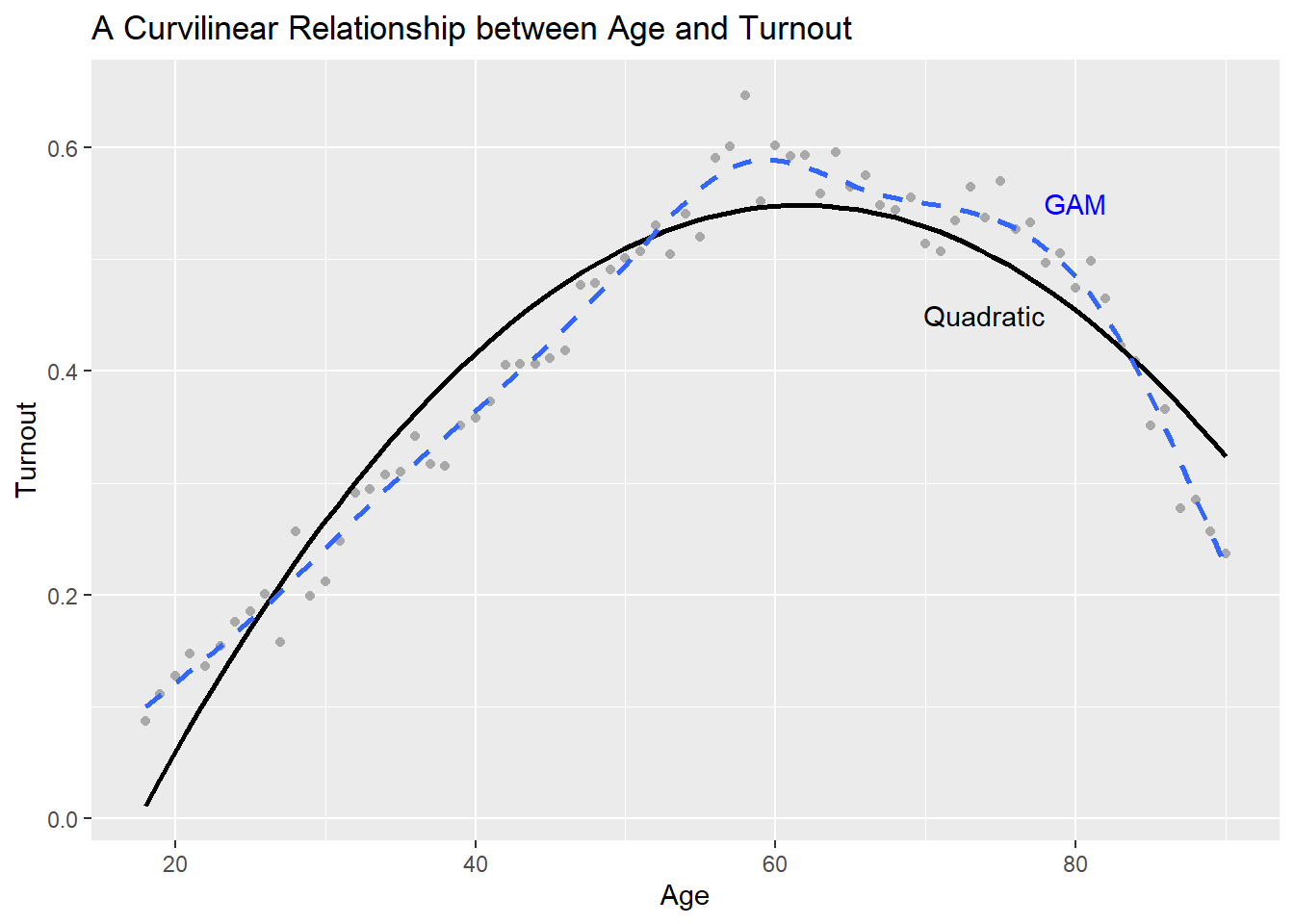
We can keep adding polynomials (terms to the nth power) until we’re satisfied with the fit. There are also other forms of regression that are even more flexible. A common example is a generalized additive model or GAM. We can tell ggplot to produce this, too:
p +geom_smooth(method ="gam",se = F,linetype =2 ) +annotate("text",x =c(80, 74), y =c(0.55, 0.45),label =c("GAM", "Quadratic"),color =c("blue", "black") )
`geom_smooth()` using formula = 'y ~ s(x, bs = "cs")'
Linear models with polynomial terms are still technically linear, even though they capture non-linear relationships. All we do is take the square (or any number of higher order powers) of a variable and add it as a variable in the linear equation. Hence:
In addition to summarizing relationships, we can use linear regression to make forecasts. We do this by specifying a linear equation using our fitted parameter values and new values of the explanatory variable. For example, say the meteorologist says that the temperature will be 50 degrees tomorrow in Chicago. Using a linear model fitted using 2018 temperature and crime data we could create a crime forecast or “crimecast” for tomorrow given the expected temperature. The equation would look something like this:
Of course, this prediction won’t be exactly right. In fact, there’s a good chance that it will be wrong because temperature alone does not determine the frequency of crimes (remember that the model also contains an error term \(\epsilon_i\)). Nonetheless, it should give us a prediction that is roughly in the ballpark of tomorrow’s actual number of crimes.
However, let’s say that being in the right ballpark isn’t good enough and we need a more reliable crimecast so that the Chicago Police Department can ensure it is adequately staffed for whatever tomorrow brings. One thing we might consider doing is extending our linear model to either a polynomial model or a GAM. Usually, this process will yield a smaller SSR than just a simple linear model—which is to say, the model will make for a better fit for the data.
Because we’ll see such an improvement, it’s tempting to keep adding polynomials or making the model more and more flexible until we get the best possible fit for the data. However, as we do this, we will eventually run into a problem called overfitting, which happens when you go from a simple model to a complex one.
On the one hand, you may think that the more complexity you include, the better your chances of making good predictions. While this sounds intuitive, this strategy ignores the fact that all data are the result of some combination of signal and noise. The more precise you make your model, the greater the risk that it picks up spurious patterns in the data (noise) and treats them as meaningful (signal). It therefore is important to think carefully about the variables you include in a regression model. Just because it gives you good predictions doesn’t guarantee that you used the right variables or the right specification.
A good way to validate a model to guard against overfitting is to split the data into a couple of subsets. Let one subset of the data (usually about 70% of the full dataset) serve as a training dataset. We call it this because we want to use it to “train” a linear model or fit it’s parameters with this data. You can then use the other subset of the data as a test dataset. It’s called a test set because we will use it to test the predictive performance of the model.
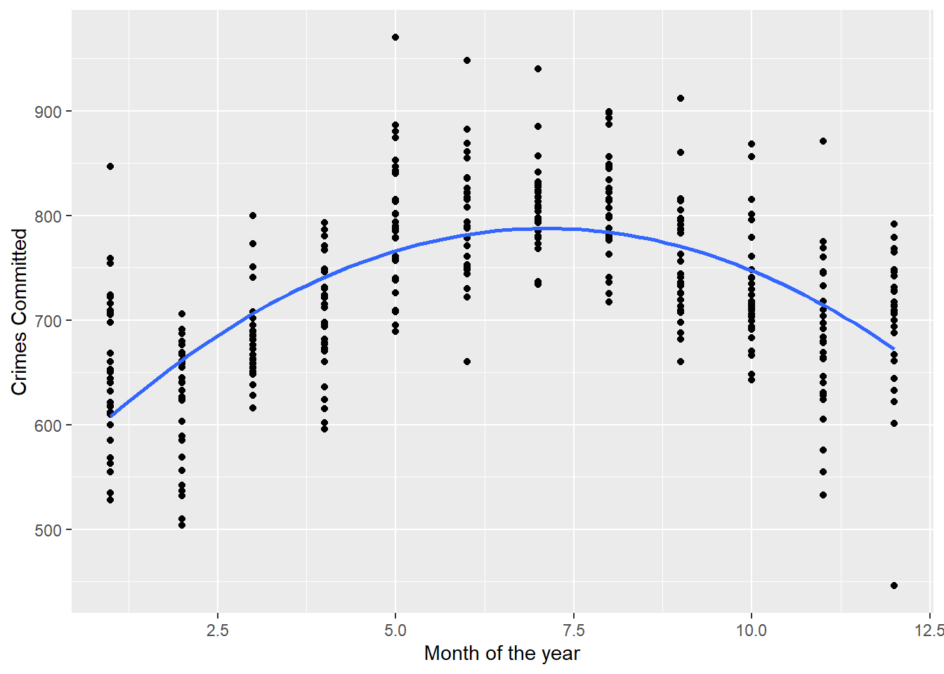
Using this approach we can compare two alternative models for our crimecast. In one, which we’ll call the “simple” model, crime will just be a simple linear function of temperature. In another, which we’ll call the “seasonal” model, we’ll include a polynomial time trend based on months in addition to accounting for temperature. This might make for a useful addition to the model because over time we see an obvious quadratic relationship between the month of the year and the number of crimes. It is possible that time of year may also predict crimes independent of the temperature on a given day.
ggplot(Data) +aes(x = month, y = crimes) +geom_point() +geom_smooth(method ="lm",formula = y ~poly(x, 2),se = F ) +labs(x ="Month of the year",y ="Crimes Committed" )
The first thing we need to do is split our data into training and test sets. We’ll do this by randomly selecting 70 percent of the observations to be in a training set and leave the remaining for the test set:
## make sure results are replicable by setting seedset.seed(111)## make training and test sets# get a vector of row numbersrownums <-1:nrow(Data)# randomly pick 70 percent for the training datatrainnums <-sample(rownums, size =floor(nrow(Data) *0.7))# keep rows in trainnums for the training datatrain <- Data[trainnums, ]# use the rest for the test datatest <- Data[-trainnums, ]
Next, we’ll fit the simple and the seasonal regression models:
simple <-lm(crimes ~ temp, data = train)season <-lm(crimes ~ temp +poly(month, 2), data = train)
As a quick check, we can look at the SSR for each model to see which provides the best within-sample fit for the training data. The code below creates an ssr() function that I then use to calculate the SSR for each regression model
## calculate ssr# make an ssr() functionssr <-function(model) {sum(resid(model)^2)}# calculate ssr for simple modelsimple_ssr <-ssr(simple)# calculate ssr for season modelseason_ssr <-ssr(season)# comparec("Simple Model"= simple_ssr, "Seasonal Model"= season_ssr) |> scales::comma()
  Simple Model Seasonal Model
     "721,796"      "709,786"
From the above, it’s clear that the seasonal model has the smaller SSR. Based on this alone, we’d probably conclude that accounting for months, in addition to the temperature, does a good job of explaining variation in crimes committed in Chicago. However, does this hold up when we make out-of-sample predictions using the test data? As it turns out, the answer is “no.” The below code calculates the SSR using the simple and seasonal regression models fit above but using data points in the test set that weren’t used in model fitting. You can see from the code output that the out-of-sample SSR is worse (bigger) for the more complicated seasonal model.
The takeaway message isn’t that simple is always better. That would just as erroneous as saying that complex is always better. There is no crystal ball that will show us the best model for our data. We therefore have to think clearly about how we specify a forecasting model and use our best judgment.
This short section is not the end of all that there is to learn about forecasting. Unfortunately, there isn’t enough space here to cover all the nuances you would want to know. I highly recommend checking out Tidy Modeling with R if you want to go deeper. This open access book provides applied examples for making predictions and comparing models, and it also teaches you how to use the {tidymodels} R package. This package is basically a {tidyverse} extension to statistical modeling, providing what’s called an augmented programming interface (API) for implementing a wide range of models using a relatively straightforward programming workflow in R.
6.6 Final notes
While there are many statistical models beyond the linear model, and many different estimators besides OLS, these tools will take you a long way. I personally treat them as my defaults unless further exploration of the data suggests they aren’t appropriate. The reason is that linear models are actually quite robust and, as we discussed, can be made to accommodate nonlinear data. As you progress in your skills as a data scientist or analyst, you’ll learn about many other complex and shiny alternatives. Fancy models are a great resource and you definitely will want to add them to your toolbox down the road. But, my advice to you is this: start simple before you try something more complex. As we saw above, complexity might look good at first, but it also increases the chances of registering spurious patterns in your data as meaningful. This will lead you to draw misleading descriptive inferences about relationships between variables or yield more error-prone forecasts.
One more thing to note about regression for description and forecasting is that these goals are distinct from causal inference, which we’ll talk about in the next part of this book. The fact that a relationship exists in data, or that a variable is useful for making predictions, does not imply causation. By that same token, a causal relationship is not necessary for making valid descriptive inferences and generating solid forecasts. That may not seem intuitive, but the fact is that we can speak descriptively about patterns in the world and generate good forecasts without knowing why. We of course can use a deep understanding of underlying mechanisms that explain why a set of relationships exists to inform our modeling choices. However, at the end of the day, the objective with description is data exploration, and the objective with forecasting is to make precise predictions. Causal inference requires a different approach to data analysis and a good qualitative understanding of how the data were generated.
Bueno de Mesquita, Ethan, and Anthony Fowler. 2021. Thinking Clearly with Data: A Guide to Quantitative Reasoning and Analysis. Princeton University Press.
For what it’s worth, many so-called generalized linear models (GLMs), such as a logistic regression, can also be estimated using OLS.↩︎